
![]()
Material Design is the coming thing, with the release of Android L later this year, Material Design will be across most of Android, including Google Play. We’ve seen moves in this direction already, but a new version is on the way and it’s about to get flatter.

Android Police has managed to get a hold of a version of the Google Play store and have given it the once-over.
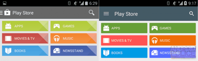
As you can see, it’s a new look as you can see, with flatter and a refined colour palette for each of the categories. The design has also extended into the individual listings, under each category, with the coloured top bar now descending further into the listing.


There’s other tidbits in the new design, such as a new featured format for each Google Play category. There’s a new animation on the hamburger menu button, which transitions to a Back arrow and back. And new icons for each of the Google Play categories.
![]()
Lastly, there’s apparently more indications of more robust per-device app restoration which could come to the fore, to allow you to setup a tablet or phone app profile (Finally!).

There’s a deeper dive into the new Google Play over at Android Police, with more screenshots and we recommend you take a look. Meanwhile, we can’t wait to get Android L and all the great design refreshes it’s going to bring.


when will they start rolling this out? really did the material design
Actually, I’d expect this to rollout with Android L when it releases. Could be wrong, but that’s when I’d be expecting it.
Flatten “ALL THE THINGS”.
Done right, it looks good. The new icons and overall design is a clear improvement on the current style.
“Uglify all the things as well”
More wasted space in the top bar at the same time as smaller icons (!) Does anyone else notice that the icon for the app has gone, replaced by a more in-you-face hamburger menu that animates into a left arrow?
There are many faults with the Play store (starting with the dumb name) and they seem hell bent on addressing none of them and instead changing the colours….
“Uglify all the things as well”
More wasted space in the top
bar at the same time as smaller icons (!) Does anyone else notice that
the icon for the app has gone, replaced by a more in-you-face hamburger
menu that animates into a left arrow?
There are many faults with
the Play store (starting with the dumb name) and they seem hell bent on
addressing none of them and instead changing the colours….
——-
And if you are never going to actually moderate comments, don’t turn on the thing that stops comments appearing till you moderate them. Its annoying.
This update of the Play Store app is looking great.
Really hope it goes live soon.