
![]()

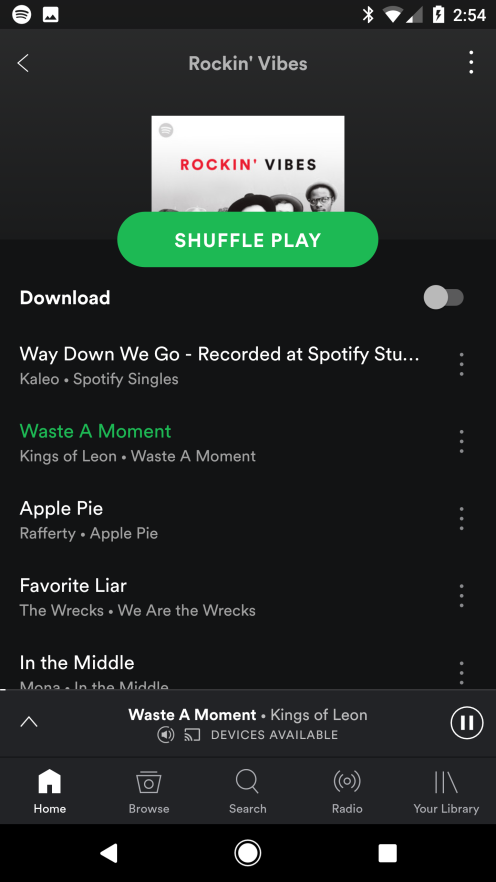
If you’re a Spotify user, and an Android user, then you might have noticed something different. The navigation bar, which once appeared up the top of the app, now appears down the bottom. Gone is the ‘hamburger’ menu, which meant that many app features were a couple of clicks away, replaced with a bottom navigation bar which puts things like Home, Browse, Search and Radio one click away.
Bottom navigation — like this — is hardly new. In fact, it’s been commonplace on Apple’s iOS for years, but it’s only more recently that Google’s begun to adopt it as a far more user friendly way to interact with applications, and developers like Spotify are now leading the charge.

Google began implementing bottom navigation earlier this year, with Google+ in January, and in Google Photos a bit later on. For some apps, the bottom navigation interface makes a lot of sense, but it doesn’t work everywhere.
I find myself hoping that Google Play Music gets an update to bottom navigation soon, because the current interface is downright infuriating to use when in the car (and legally mounted, of course). In fact, I’d go as far as saying it’s almost unsafe, whereas Spotify’s interface is far more driver friendly.
For more information about Google’s push here, you can read the Material Design spec which sets out how bottom navigation should work — basically, you click on it, and it takes you to that view. One click. Simples.


Do you use Android Auto for Google Play Music? It’s quite good! Not there yet but heading in the right direction.
Getting to playlists is the biggest effort in Google Music! Hopefully soon.
Just got Airbnb update as well which includes the new design with bottom-bar navigation as well which is pretty awesome. Hope more apps can catch up.
Wow, which means Google really tries to be Apple this year.
Roll up, roll up, place your bets – how long before google brings back physical buttons for navigation? On it’s journey around the screen, navigation has visited virtually every location, usually in an opaque, user hostile fashion. Now we are back to tabs (circa 2.1), but at the bottom rather than the top. I guess it’s at least more obvious to the user where it is and what it does than it’s predecessors – but I don’t understand why people still pay any attention to what google say on the matter. It’s obvious they don’t really have a clue and… Read more »
+1
I think it’s highly unlikely physical buttons will return to Google’s phones. Even Apple will probably lose the home button next year with its iPhone.