 Samsung’s mobile products are extremely popular, but one common complaint has been the performance (or lack thereof) of one of the key components of the Samsung architecture, namely TouchWiz. Even we’ve been critical of TouchWiz and its lags and stutters, and questionable design sense, and the disconnect between various aspects of the user experience.
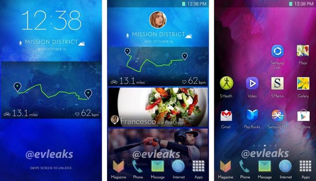
Complaints ranging from child-like icon designs, cluttered interfaces and bloated design have filled much of the discussion about TouchWiz, and sadly, little has changed. However, from the image you can see above, courtesy of @evleaks, it looks as if things could be about to change.
There’s a change of font, but that’s not too remarkable, as fonts are fairly readily changed by users and developers alike. More stark are the new looks for standard applications, and a layout somewhat familiar to users of HTC’s Blinkfeed. The whole design just looks a bit flatter and cleaner, somewhat like what Apple did with the change from iOS 6 to iOS 7.
We know that @evleaks has been on the money before, but equally, he’s missed the mark a couple of times as well. Will TouchWiz take this form? Who knows, but any improvement to its current status would probably be welcomed by many.