It’s no secret that we use and like Todoist here at Ausdroid (it’s one of the things I write about regularly), but sometimes it can be a bit hard to know what others are up to. The notifications have been an all or nothing approach when you open them, all are marked as read which doesn’t help if you need to get back to one later; but that has changed with the latest update.
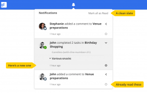
The presentation of notifications in Todoist (app and web based) has now changed to a point where, like Android itself, you can selectively acknowledge them and leave others to attend to later. Notifications display as a circle, filled if they’re unread or just an empty circle if they’re read. The change is reasonably subtle, but makes a big difference if you’re in and out of Todoist for multiple reasons through the day.
It’s great to see a successful company like Todoist not resting on their laurels, and continuing to improve their product and user experience.
What changes would you make to your productivity tools to make them even better?