

With the world gripped by the new COVID-19 lifestyle getting accurate information on the spread of the disease can be of critical importance. While we have mostly enjoyed low numbers comparability in Australia I’m sure our Victorian friends can attest to the disruption, fear and uncertainty that COVID-19 can bring.
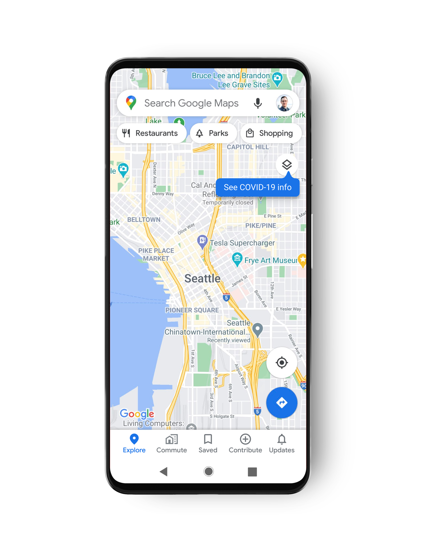
To help people access more accurate information on the KNOWN areas currently affected by COVID-19 Google Maps has worked with data providers to introduce new COVID-19 data layers to Google Maps on Android and iOS. To activate the new layers open Google Maps, tap on layers and select the new COVID-19 layer.

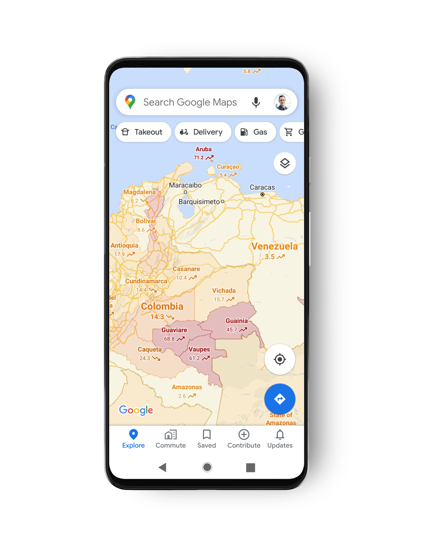
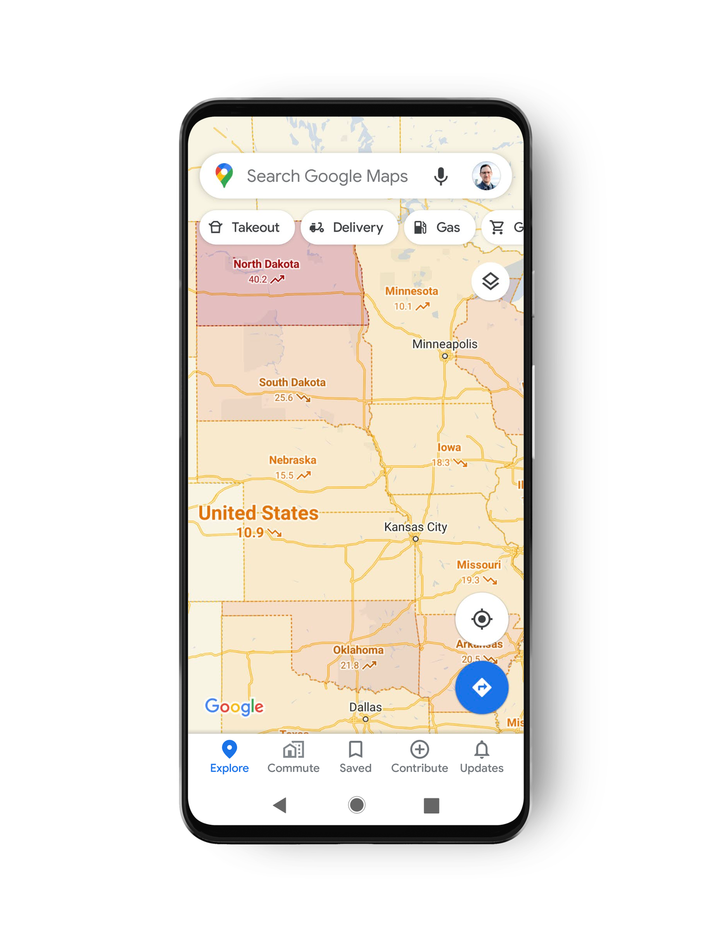
Depending on the number of known cases the map will be coloured to indicate the presence of COVID-19, the colours indicate the 7-day average for the number of new cases per 100,000 people:
- Grey: Less than 1 case
- Yellow: 1-10 cases
- Orange: 10-20 cases
- Dark orange: 20-30 cases
- Red: 30-40 cases
- Dark red: 40+ cases
Depending on the data available the maps can show current data on the prevalence and change in COVID-19 numbers at a Country, State or county level. Data for Google maps is sourced from multiple authoritative sources, including Johns Hopkins, the New York Times, and surprisingly Wikipedia. All source data comes from reliable provides including public health organisations like the World Health Organisation, government health ministries, along with state and local health agencies and hospitals.

It’s important to remember that even with up-to-date known information a pathogen like COVID-19 can still be circulating in areas undetected. Using a guide like this to avoid known hotspots is useful. However, nothing should stop everyone from practising good hand hygiene, social distancing and if you can, wear a mask.


I suspect this is a server side toggle, I can’t see this layer yet.