
Google’s always adding new features to Google Maps. It’s one of the company’s primary ways of getting consumers on board with their services and has developed into one of those “default” ways we do things. People look to Google Maps for information about places and venues, directions to/from those places and, more recently, information about public transport services. It’s that last one that’s gotten a fresh coat of paint today.
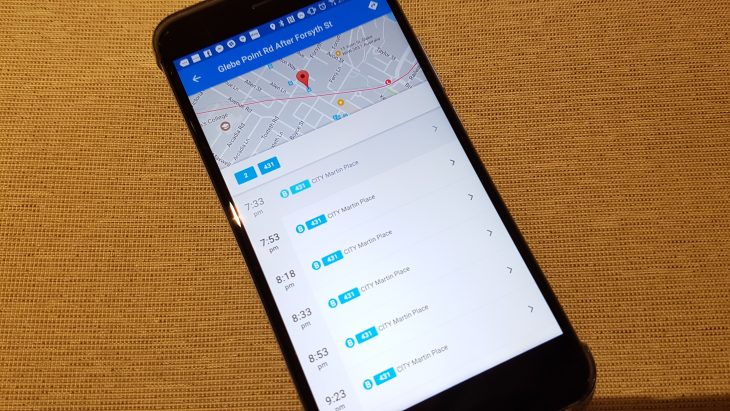
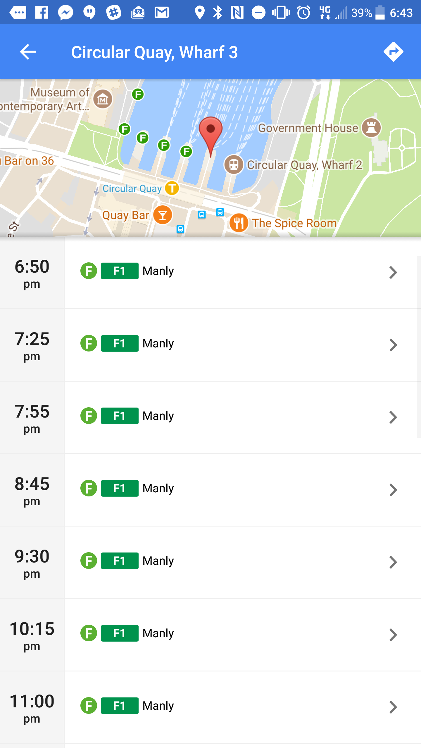
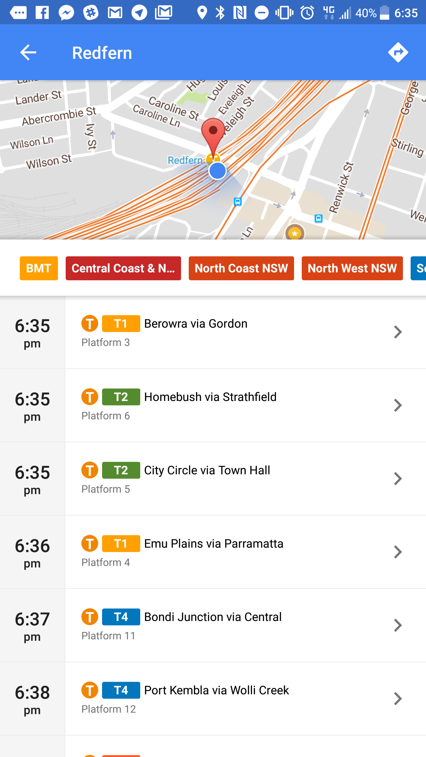
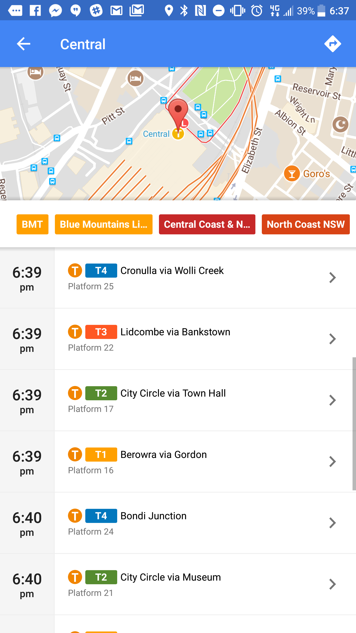
Until today, the timetable display for trains, trams and buses was fine, with its simple rows of times and services. That’s changed – it’s now a filterable display (by service), with a more structured layout of arrival times.
A welcome change, and it applies to trains, light rail, trams, buses and ferries.


We’ve checked a few different transport locations in Australia and around the world and found the new layout seems to be worldwide.
The new look has been rolled out on Android, but doesn’t seem to have made it to the web or iOS apps yet (check out the old display – from iOS – below, compared with the new Android display).

Google Maps has seen a renewed round of enhancements recently with improvements to the design of place display, exploring around you and more. It’s great to see that Google’s not resting on its laurels and is continuing to improve their service.
Noticed any other recent changes in Maps? Anything you’d like to see? Tell us in the comments!


