
Google’s been going through a bit of a visual refresh cycle of late, working out how to present better information rather than more. Your News search results are the latest to benefit.
Curiously announced by way of an animated GIF on Twitter (no blog post, no extensive insight into the thought process…), the redesign sees bigger images, and a focus on publishers’ brands.
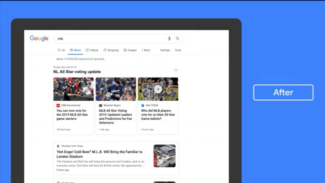
Elevating brands names over their coverage extends the concept of a “masthead” and perhaps plays a little into the news publishing space. With icons presented alongside the publication name, this echoes similar changes to web search results in May and also business profiles on Maps from June. It’s almost as if Google’s raised it needs a coherent easy to present business identities.
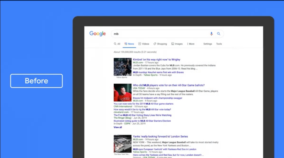
There’s also better organisation of results (according to Google, anyway). For each result, you were previously presented with a ton of links to different articles about the same story, now you’ll just see the main content.
Google’s web news results were looking pretty tired these days, harkening back to the search Giants earlier days of design (or lack of it). The changes mean you’ll have to dig for further coverage, but it does get an extra result into view above the fold. Less is in fact, more.
The Google News Initiative says the redesign will be rolling out over the next couple of weeks.


