Android TV has become one of Google’s platforms that never really changes a whole lot, but at Google I/O they did talk about a major re-design, which we haven’t exactly seen yet. It seems that update might not be far away, and one of the big changes is to the way content is recommended.
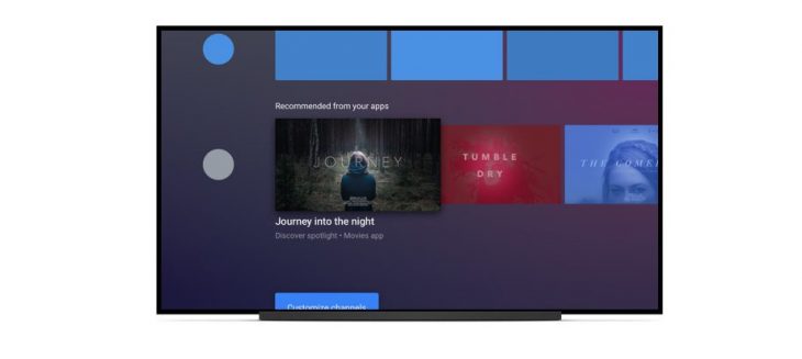
It always used to be that recommendations from Android TV apps would show at the top of the homescreen. It’s handy, but it can be a bit untidy, and for some people, the recommendations are mostly fairly useless. In Android Oreo for TV, recommendations are a bit different. In short, Oreo opens up new “channels” for recommendations, allowing for better organization of recommendations.
Currently, when an app creates recommendations with the legacy notification based API the content is added to a channel for that app. The channel may already exist if there was recommended content for it when you upgraded from Android N (or below). If the there is no channel for the app, it will be automatically generated for you. In either case, the user can’t add or remove programs from the channel, but they can move, hide, and show the channel. When an app starts to use the new API to add its own channels, the system removes the auto-generated channel and the app takes over control of the display of their content.
Google will be phasing out recommendations in their current form over the next year, and the tools to upgrade to Oreo’s system are already available. In the meantime, apps using legacy recommendations on Android Oreo will have their recommendations placed in a default channel at the bottom of the Android TV homescreen.
As 9to5Google point out, though, this is largely an academic discussion, because besides the Nexus Player, no one really seems to update their Android TV implementations often (if at all).