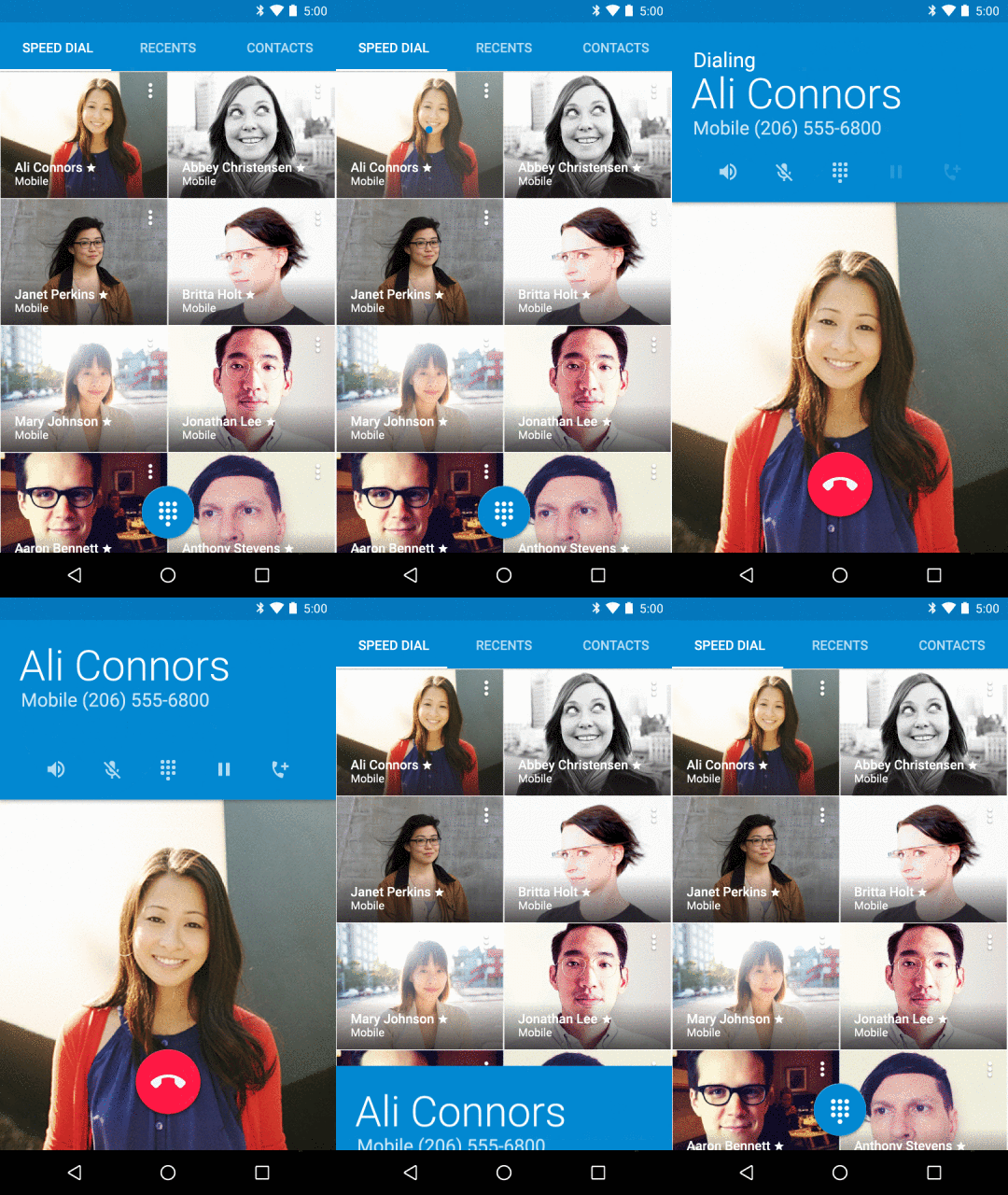
With the official release of Android 5.0 Lollipop yesterday, Google has taken to the Official Android Blog to talk a little bit about the design that went in to the latest release. As we all know, Material Design has been talked about a lot since Google I/O earlier this year, but now with Google’s apps being updated to support the new design language, we’re starting to see, touch and feel the new design, and it’s kind of pretty.
For those of you hungry for news, there’s not much here, but for those wanting a bit of an understanding of how and why Material Design, this might be informative.
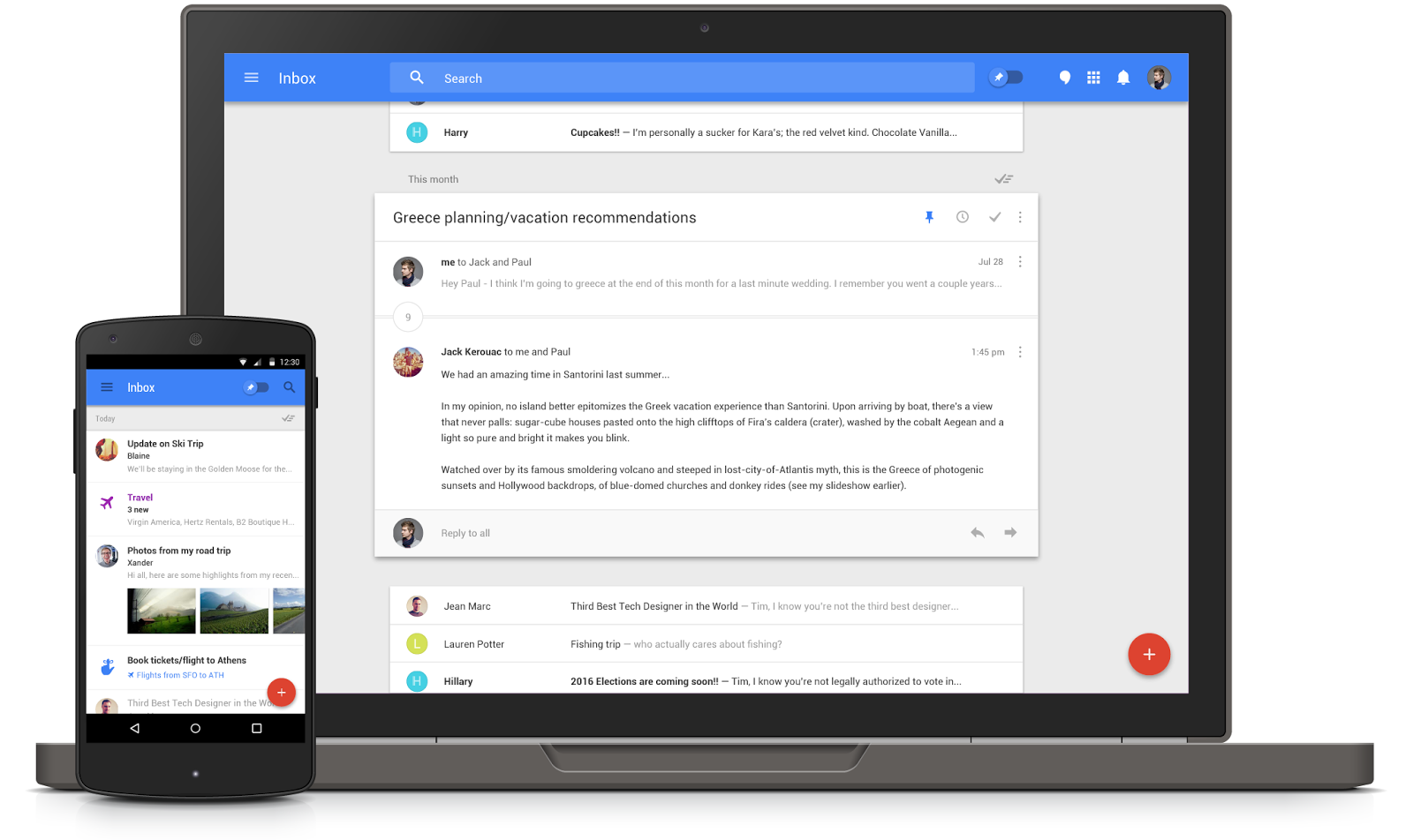
Google are of the view — and quite rightly — that more and more, we’re using more than one screen. We aren’t just using our computers at work anymore. We’re using phones on the way to work, and even for work, and all these devices tie together, but they don’t usually look or work the same way.
Google wanted Material Design to address this a bit, so that apps on your Android look a lot more like the web versions of those apps. Above, you can see the example of Google’s new Inbox service, which looks almost the same on mobile as it does on the web. It’s not just a simple web-view on your mobile; it’s a full featured app that just looks like the web app. So, it’s beautiful, the same layout, and it’s nice and fast.
It isn’t all about consistent design though. It’s also about the use of animation to explain how the system works, and to make the user experience just that little more enjoyable.

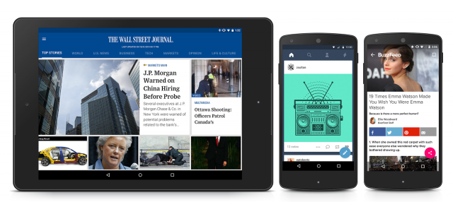
Of course, Material Design isn’t just being restricted to Google’s apps. The new design language has been made available to all developers, with the encouragement to adopt it in their own apps as well. We haven’t seen too many apps adopt Material just yet, but it is happening. People are making slow steps to the new layout, and when even more start to pick it up, we’ll have a far more consistent and enjoyable Android experience.
Google’s blog tells us that Wall Street Journal, Tumblr and Buzzfeed (ugh) are already working on apps with the new layout, and they look pretty good.
Of course, as Android 5.0 Lollipop makes its way to more devices, so will Material Design for the core system apps that you use on a regular basis. Will OEMs like Samsung and HTC pick up the design language as well, or stick with their own tried and tested languages? Who knows. I certainly hope that they pick up more of material than not, but that’s just me. Some people like TouchWiz and Sense, and for them, the change might be a little unwelcome.
What are your thoughts on material design? Do you like it? Loathe it? Find it too simplistic? Let us know!


I don’t like white screens with dark text – horrible to use at night (hard/harsh on my eyes)
It’s a shame that we will be very likely to see Samsung TouchWiz Lollipop, HTC Sense Lollipop, and other similar from the other major manufacturers.
I really wish Google had made it part of the licensing contract to allow these companies to use Lollipop, that they must release GPEs globally of ALL their devices which get Lollipop.
I hope the GPE program is still alive and that we’ll hear more about it soon. If we are going to be forced to buy a premium device now if we want ‘guaranteed’ (and also preferably timely) firmware updates then I want a GPE of my own choice. A Sony Xperia Z3 Compact GPE would be my dream phone right now. The minimalist elegant design of the phone would be a perfect frame for stock Lollipop. Not to forget the decent camera spec, long long battery life, dust and waterproofing, and the one-hand friendly size. But if I can’t have… Read more »