It’s been almost two years since Google updated the Chromecast app to become the Google Home app to support Chromecast, as well as Google Home speakers. Now it’s set to receive a makeover using Google’s newly implemented Material Design guidelines.
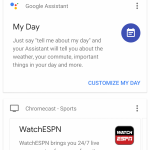
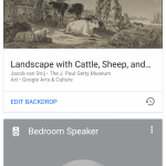
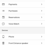
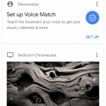
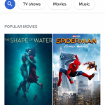
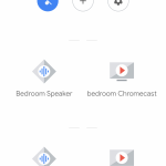
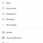
The app update, as discovered by Quinny899 on the XDA Forums, shows a move away from the old slide out Nav Drawer, instead moving towards a toolbar at the bottom of the screen. There’s a focus on content discovery on the Browse page, with direct links to search TV Shows, Movies and Music front and centre. The biggest change is in the devices section though, which looks much cleaner.
Current Design:
New Design:
The change was apparently enabled via server-side switch, so no there’s no APK you can download to get the new look. The app appears to be fairly well polished, so hopefully it won’t be too long before we see this one rolling out.




From bad to worse. How can you make such a mess of a UI as google do with this one? Actively obtuse and useless.
The look is all well and good, but will it actually do anything new?
Anybody else still having to regularly restart your wifi to get your Chromecast to work? Never had this issue until last week.
I’ve recently had to start turning the wifi on my phone (galaxy s8+) off and on again so that it can “see” the chromecast (original). I had thought that my chromecast might be on the way out but this has been it’s only issue. Perhaps there is a software/firmware issue at play?