So a couple of weeks ago, we let loose the information that I was reviewing an iPhone for Ausdroid. I know it’s not what you’d typically expect to see on our site, but given our readership is so eclectic, we figured when the opportunity came along, we’d take it.
So here I am, just over a month later, with an iPhone 14 Pro in my pocket. I’ll start by saying I don’t hate it; in fact, for the most part, I’ve been pretty happy with the experience. This isn’t my first experience with iOS, so there is a level of comfort and familiarity I’m already working with. But it is the first time in a number of years that I’ve had more than a fleeting look at the best that Apple has to offer.
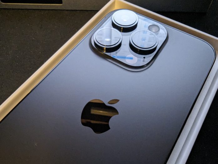
The hardware, design and UI elements
While I’ve not personally had an iPhone as a regular device since the very early days of smartphones, there are many of them in my life with friends. Even some of the most die-hard Apple fans struggled to distinguish visually between the iPhone 14 Pro from the previous generation.
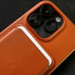
Yes, it’s IP68 rated and whether or not you trust yourself and the engineering behind the glass front and back will be pretty clear by whether you choose to adorn the phone with a case. Personally, given the protection offered by a case and the potential cost of replacement at $1,749 or more, I’d spend the money on a quality case to protect the investment.
Perhaps the only hardware-based letdown with the iPhone 14 Pro that I’ve noted is the fact that, while it does connect to 5G, it’s not mmWave. Many users won’t see the difference, but for those really looking for the raw speed of mmWave of 5G – The Pixel 7 Pro is still the go-to device.
The biggest difference between the Pro over other iPhone models is the camera capabilities, which we’ll explore a little later. What immediately strikes the eyes is the typical, unmistakable “Apple” design and the delight of a high resolution, high brightness and high contrast screen. For those of you who like the numbers, it’s a 6.1-inch OLED display running 2556 x 1179 resolution at 460PPI and a dynamic 1 – 120Hz refresh.
There’s still plenty of space in the market for 6.8-inch devices, but the 6.1-inch size is a real sweet spot in my opinion. It’s small enough to fit in most pockets; it’s also usable with one hand; yet big enough to be useful for media playback.
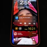
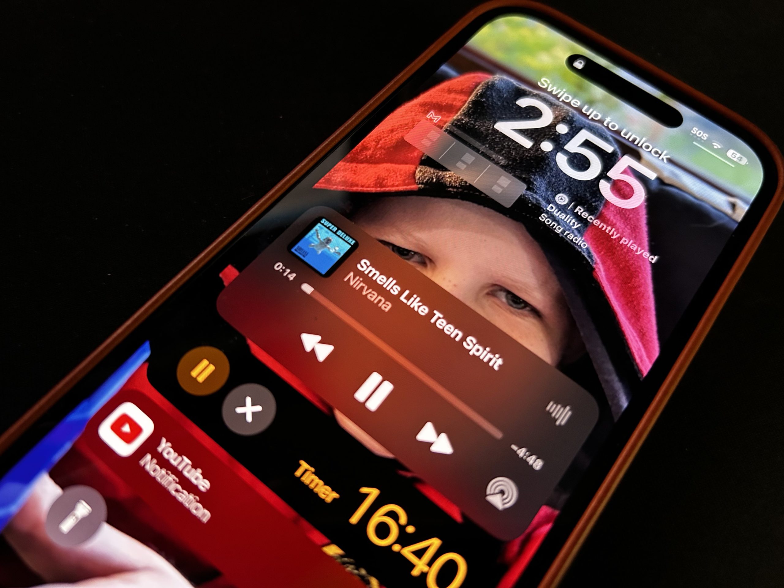
A feature that has been adopted by Apple in this iteration is the always-on screen for notifications, time display and easy access to playback controls. The issue I have with the always-on display is that while it’s going to be running at an extremely low refresh rate which saves battery, it’s bright enough that even two weeks into the review, I was still hitting the power button to turn the screen off.
That is where my issues with the always-on finish, though, because there are some extremely user-friendly elements to it. From personalisation with a photo of your choice being the background, even when dimmed to the widgets you wish to display while the screen is dimmed.
Performance: The A16 Bionic is impressive
For a number of years, it’s been somewhat futile to run benchmarking to compare different manufacturers’ devices because they detect these and ramp up the hardware. Fine if you want a top-end benchmark of what the hardware can do, but it doesn’t give you a clear impression of the capabilities in daily use; so we tend to talk user experience which frankly, Apple does very well.
The chip onboard the iPhone 14 Pro is the latest generation of Apple’s own ARM-based chip, the A16 bionic. Where the use of benchmarking is useful is showing the evolution of hardware from one generation to the next which Geekbench clearly shows the A16 Bionic being a step above the previous generation.
This translates to a seamless user experience although probably not significant enough if you’ve got the iPhone 13. What users get is easy multitasking, smooth app use and with Apple’s unified memory system the performance isn’t just quick, it’s consistent from the first boot.
Battery Anxiety isn’t an issue…
If you look at the official specs of Apple devices, one thing is conspicuous by absence: The battery capacity. Where this is a marketing spec for many other providers, Apple simply moves past this and markets the battery life based on use case eg. Up to 23 hours video playback on iPhone 14 Pro.
What this translated to for me was comfortably a full day of battery, almost every single day. Only during the setup of the phone did I get to the end of my day (unplug at 6 am and return to charge at around 11 pm) with less than 30% of battery remaining, regularly having high battery remaining.
I just never found myself worrying about battery life during the review period with the exception of the days I went for two days without charging.
Most of these days, I’d have several hours of screen time lots of messages, social media, email and streaming media (Music, Netflix, YouTube etc) so there’s plenty going on, which makes the results that much more impressive.
It’s worth noting though that I am on the road for work and often have 3 or 4 periods of 15 minutes plus, using the phone on CarPlay which also charges the phone.
If you’re an experienced Apple user, then you’ll be very familiar with the lightning connector. It’s still present for the iPhone 14 Pro and is likely to be with the iPhone 15 but with the forced change to USB-C in Europe; I wonder if this will translate to an international rollout for Apple.
I’m a fan of the wireless charging inclusion here (15W on Magsafe or 7W on Qi), which meant that my wireless charging pads around the home became that much more useful. I didn’t have to worry about cables (or lack thereof) being available and ensuring that the phone was well charged with wireless charging giving a top up as required.
Where iOS impressed
There are plenty of features within iOS that met my expectations as a proud Android user, or even impressed me. One that I was genuinely excited to try since the announcement at WWDC is the Dynamic Island. It just seems really simple, smart and functional, and mostly it is.
The simple rundown is that if there’s any media playing or other apps that may be time-sensitive (timers, alarms etc), the dynamic island will show a small, always active notification next to the camera cut out for quick access.
If you’ve seen it operating, there are a few simple functions within the feature. You can press and hold to expand it to an actionable window to control playback. You can collapse it by swiping from the outside towards the centre, or switching between compatible activities by swiping from once side to the other. It seems a little complex to start with, but once you’ve done it a few times you develop muscle memory and it’s very simple.
I like the concept and the way that the space is used, particularly because it uses space at the top of the screen, which is almost unusable because of the cutout camera position. But I also find that Dynamic Island is bringing attention to the fact that there is a physically significant chunk of the screen “missing” to the under-screen camera.
The iPhone 14 Pro is effortlessly brilliant, but in reality, it’s so much more than most users will ever need. Perhaps this is a plus though, given the cost, allowing users to enjoy their device for longer without performance degradation.
The iPhone 14 Pro is available through a plethora of retailers and carriers in Space Black, Silver, Gold and Deep Purple. If you’re keen, but the price is a bit too much… Hold off because there are regular sales that could bring it down just enough for your budget.
Notifications are better but still feel a bit clumsy
Switching from Android to iOS is a pretty easy experience these days, but once you do move over there are some adjustments to make. Multitasking and task switching are better aligned and largely similar. App navigation is slightly different with the iOS vs Android standards and both have their merits. I’m still adjusting to the way iOS handles notifications though.
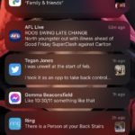
When I previously trialled iOS for a month, this was a major source of frustration for me. Not just that were notifications presented how I’m used to, the fact that changing notification sounds wasn’t a viable option for many apps. With the evolution of iOS since that time notifications are a lot better but are still a little clumsy.
For my mind, they’re not as logically grouped by app; then time delivery of the notification. There also isn’t a clear indicator as to how many notifications you have sitting there in the way that Android gives you.
The camera is a market leader in some areas
When it comes to phone cameras these days, there are a lot of very good options on the market. The iPhone 14 Pro has an impressive array of cameras that delivers a huge feature set. There are three lenses, wide-angle, ultra-wide and telephoto, that make up the camera set.
The main lens is a 48MP which produces some excellent photo quality in a number of settings and utilises the 24mm focal length well.
One area where I believe the iPhone has advanced greatly in the last two generations of devices is low-light photography. I’m an unashamed Android fan, and for years the Pixel has been the leader in low-light photography. I still believe this is the case, but the iPhone is now snapping at the heels of the Pixel’s capabilities.
During some recent travels to the NT, I took the opportunity to take plenty of photos. It was interesting to see the contrasting presentation of the Pixel 7 Pro night photos vs the iPhone 14 Pro. The Pixel 7 Pro shots are more true to life, while the default settings on the iPhone deliver vibrant, almost oversaturated colour and light outputs.
As you can see, the photos that the iPhone 14 Pro produces under low and very low light conditions are really impressive. The details are sharp, and the processing delivers good lighting and consistent images.
As a point-and-shoot camera, the iPhone 14 Pro easily matches any other phone on the market. But if you’re inclined that way, you can utilise manual adjustments for settings such as exposure time, aperture and lighting filters. Going a little further, you can access RAW images, which capture a lot more detail; it drastically increases file sizes though.
All of this is complemented with the telephoto lens that has 3 x optical zoom and up to 15x digital.
Video is where the iPhone steps up
To average users these days, there’s little to pick between cameras on a variety of phones. If you need some specifics, such as PAL recording, then an iPhone is your only viable option right now.
There’s a pile of recording options from 720P to 1080P and 4K at a variety of frame rates. But the stabilisation plays a big part in the value of the video camera, and on the action mode, it’s genuinely excellent, but if you’re using your phone to regularly shoot video, even just for the ergonomics – a gimbal could make life easier, but it’s not really necessary for the video itself.
Is the iPhone 14 Pro a good buy?
Having spent some time with an iPhone 13 last year, I can’t say that this is an absolute must-have upgrade unless you’re looking for a significant camera step-up. But if you’re coming due for a new phone after two or three years and want to be part of the Apple ecosystem, it’s on the shopping list for sure, perhaps more so for remote users when Satellite SOS — currently only available overseas — launches in Australia.
The lack of storage options is a bit of an aggravation. However, I understand why. Apple wants you to buy a phone with more storage, and Apple wants you to buy more iCloud storage. That doesn’t stop it being annoying, as a user, to need to spend hundreds of dollars on storage that you may not use just to ensure your phone doesn’t run out of space.
If I were paying for a new phone, after my experience with the iPhone 14 Pro, I’m confident that the performance would suit the needs of most users for at least 2 years to come. The photos and video you’ll get are excellent, so the only decision to make is how much storage you need.
Given some of the options available in the iPhone range, the iPhone 14 Pro makes sense for power users, particularly camera buffs. But unless you need that higher end of performance and camera, or really want the dynamic island feature; it may be worth looking at a different model for financial savings.
The iPhone 14 Pro costs $1,749.00 for the 128GB version, $1,899.00 for the 256GB, $2,249.00 for the 512GB and an eye-watering $2,599.00 for the 1TB version and is available from Apple direct, or through retail channels.
I’ve genuinely enjoyed my time reviewing the iPhone 14 Pro and will take a look at the iPhone 14 Plus in the coming weeks, so stay tuned for more details on that.







Thanks for this review, Phil.
One thing I’d have liked to see in it, is how, if any, the lack of choice in launcher and browser impacted use. One of the big selling points for Android, is the range with which it can be customized by users, to suit their workflow. With all I’ve read of IOS, users have to make their workflow suit the OS.
If I was in the market for a new phone, and I had the cash to burn, the 256Gb is the model I’d consider adding to my short list.
Time to change the name of this site. Someone here is forgetting his roots, not to mentioned he promised not to post iphone crap on here.
Whether Phil promised not to post iPhone stuff or not, it’s a legitimate exercise to review other platforms and see how they stack up. Yes, the iOS / Android dichotomy is kind of meaningless these days, as virtually all smartphones do most of the same things in almost the same way, but there’s still merit in comparing the two.
As to changing the name of the site… no that wouldn’t be a good idea.
I converted. After using Android since the HTC Hero IN 2010 I am now using the iphone 14 Pro and I love it. Pixel 4 was the last android phone i loved, Pixel 6 was too big so I went to the Flip 3 which was cool but had too many compromises on battery and camera. When i became bored of the Flip i looked at the Pixel 7 which was again too big so moved to iPhone. iOS has come a long way since boring grids of icons on the homescreen, now it has the app library, widgets, notifications… Read more »
Hey Matt, good to hear from you. I’m the same.. I loved the early Android days, the hacking, mods, all the rest of it (when I had time to flash a new ROM each week and work through the bugs etc) … but frankly that time is long since gone. These days, like you, I just need a phone that works so I can do other things that are far more interesting. I switched to iOS a couple of years ago not expecting it to last … and it has. It’s just effortless. Battery life is solved, the apps are… Read more »
Life long Android user and Ausdroid supporter… but last year Google did enough screwing up that I tried an iPhone 14 Pro. Six months later and I have the AirPods, Watch, TV and Mac and I’m loving the ecosystem, it really is fantastic what they’ve done.
What were the screwups? I am curious.