Google Search is a key component of Google’s Android strategy, it’s part of how they monetise Android and in Android 5.0, Google has given the app a makeover to include Material Design stylings as well as adding multi-account support.
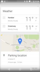
In Google Search, the cards now come up with most cards receiving bright colourful headers to differentiate them from the others around them. Weather and Parking reminders still seem to be quite clean, but sans colourful header.
The new headers are nice, but it’s the slide-out menu that’s caught our eye. On the search bar in Google Now, you’ll see a hamburger menu, which lets you pull out the side menu. In the side menu is an option for you to drop down into an account management area. The new account management area lets you switch between existing accounts, or if required add new accounts to Android.
Settings and Customize (you know, the magic wand icon) options for Google Now have been moved into the new slide out menu, and each of these new areas while offering no new options have been given a semi-Material Design makeover. There aren’t the moving, flowing and animated style of Material Design, but it is a step away from Holo and takes style cues in line with Googles move towards material design. Checkboxes are replaces with toggles, the lovely bright blue header, it all just looks – better.
This latest Google Search – version 4.0.26 – has apparently leaked around the internet, so if you want to try it out you can. But with the update, you may find some ‘funky’ issues as the apk and the functions appear to be linked to the updated Google Now Launcher. Our recommendation is simply wait, if Google wants to rollout the new Google Search to earlier versions of Android, you’ll get it in due course. But as you can see by taking a look a the screenshots, it’s pretty darn nice.
Check out the Android 5.0 Archive


