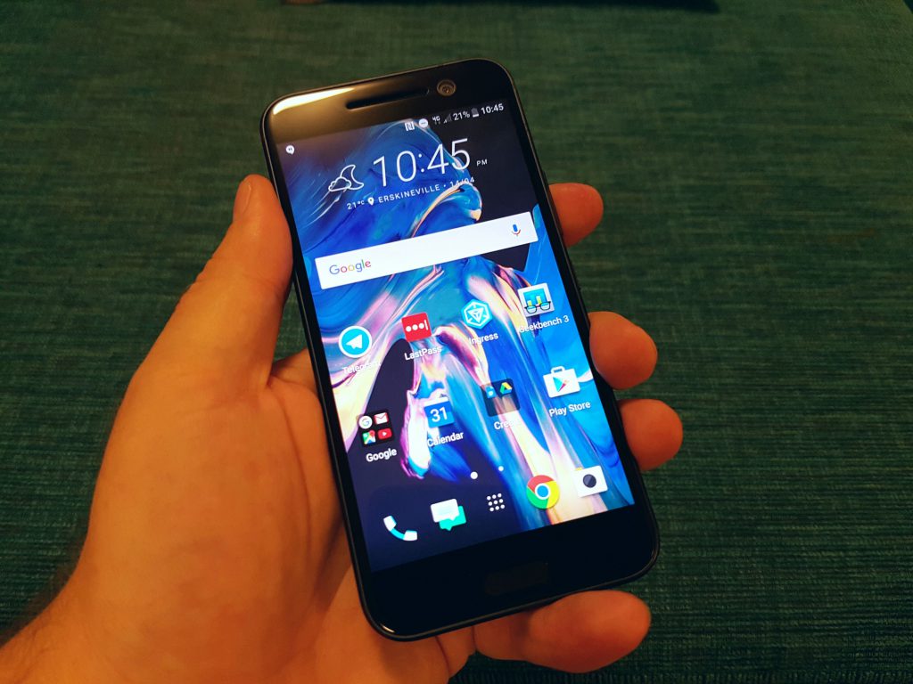
HTC found themselves in the middle of a storm of good news and positive vibes this week after the announcement of the HTC 10, the company’s latest flagship smartphone. Packed with best-in-class specs and sporting a distinctly “HTC” design, the phone is currently top of our 2016 flagship poll, and we’re lucky enough to have it land on our review bench – although, only just.
Ditching the three-year-old “One” moniker (that’s now moving downmarket to the midrange in the form of the One X9), the 10 is everything you expect of a 2016 flagship phone – striking good looks, a 5.2-inch 2K screen, a blazing fast processor and finally a great camera that’s in step with its peers.
Ausdroid’s review unit is the black version of the phone … okay, so it’s actually (very) dark grey – the lines that run across the back in the now-familiar HTC unibody design are actually black … but for all intents and purposes, this is black.
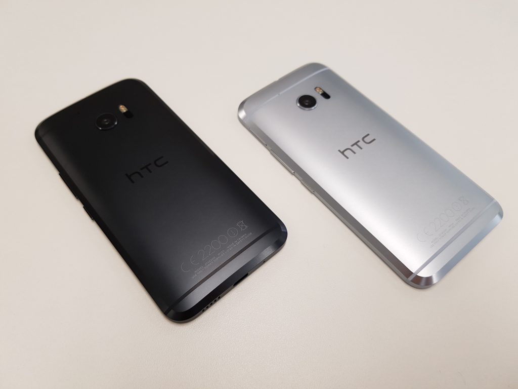
With only an afternoon and an evening to check the phone out, I can only offer a little by way of first impressions, so I’ll stick to initial thoughts on performance, the phone’s design and a little bit of a play with the camera. I might wander into some other territory along the way…
The Power of Benchmarks
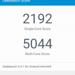
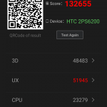
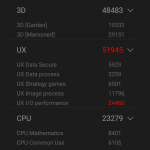
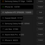
HTC talks about “the power of 10”, and that’s more than just a marketing catchphrase. The 10 oozes power and strength, from its bold unibody design to the Snapdragon 820 beating away at its heart. The benchmarks basically make it a dead heat between HTC’s 10 and Samsung’s Galaxy S7, with the 10 winning in Geekbench’s single core score but losing in multicore. Antutu meanwhile found no fault with the phone except for a slightly lower score in I/O access.
Put simply, the phone’s fast. But that’s not a surprise. Every flagship phone this year has the same specs – a fast CPU, 4GB RAM (hasn’t that base requirement shot upward in the last 12 months?), and a QHD screen. The 10 does seem to blaze through its workload ever so slightly faster than the other 2016 flagship in my possession though – the Galaxy S7. It’s just slight. The phone’s waiting for you to touch it and tell it to do something so it can burn through the task.
Unibody Design, evolved
Don’t think I’ll let the opportunity to talk about the design slip by, either. HTC copped a lot of flack last year for the design of the One M9, which barely saw any changes from 2014’s One M8. The company was seemingly caught with its pants down by Samsung’s massively upgraded industrial design in the Galaxy S6. It wasn’t just Samsung that moved the bar in 2015 though, with many other companies managing to bring that “premium” design to market – in each case some combination of glass + metal design that felt incredible in the hand and just seemed to outclass the M9.
As the “premium materials” trend continues in 2016, the industry expected to see a change in HTC’s design language, and that change is here. It would be foolish to expect a design that’s not instantly recognisable as a HTC phone though, and that’s exactly what HTC has delivered in the 10.
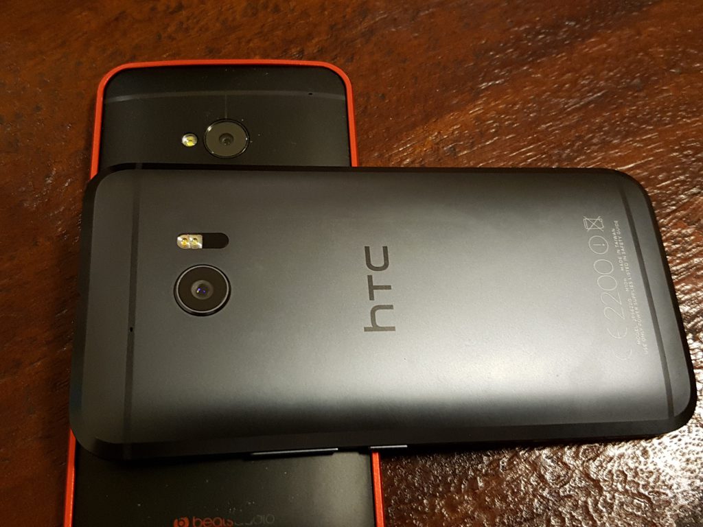
The heritage of the One series’ unibody design is absolutely evident in the 10’s body and shape. In terms of texture it actually feels more like the M7 than anything that’s come from the series since. It’s nice to see a reversal of the ridiculous jeweler-like attitude to phone design that saw the M9 gifted with a silly number of hours polishing its finish, and return to basics – a nice metal body that finally doesn’t feel like it’ll slip out of your hand … at least not as much as those that came before it.
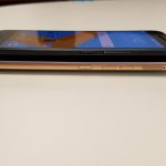
The familiar curve of the back makes a return, but this year it’s shallower than ever allowing the phone to rest relatively flat on a table instead of wobbling around – the slight camera bump actually aids this stability immensely. There’s a wide, pleasing bezel as the rear curve meets the side of the phone and you really can’t feel an edge or join where one the alumimium meets the glass on the front.
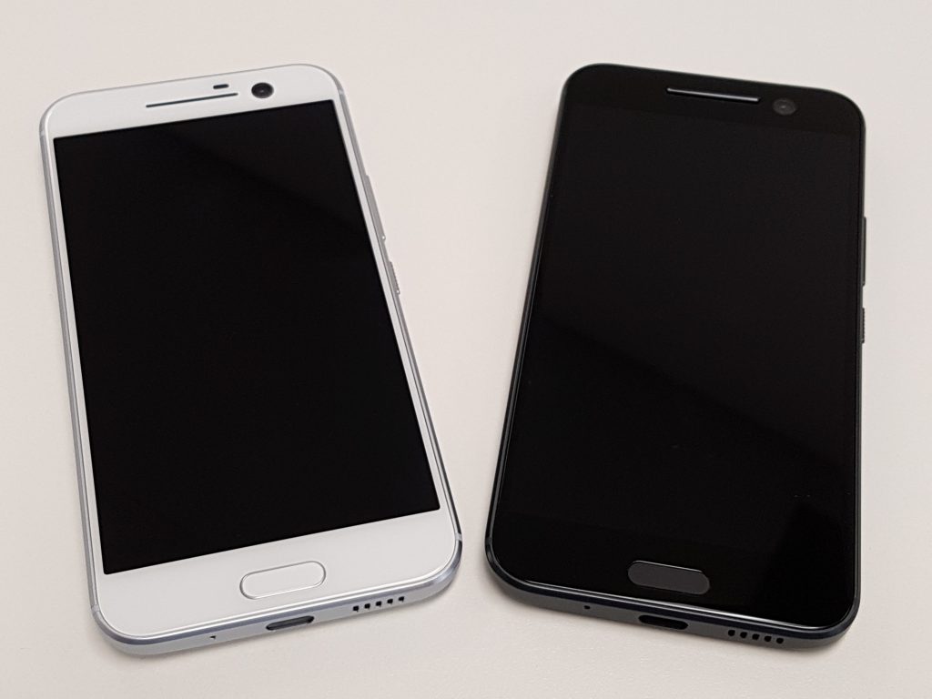
The front is the largest departure from any flagship HTC phone yet. It’s the first worldwide flagship from HTC to have a fingerprint sensor, and the company made the decision to mount it on the front of the phone. It also doubles as a capacitive home button (there’s no physical button press action) and it’s flanked on either side by capacitive Back and Recent Apps buttons – and they’re standard Android triangle/square design.
That fingerprint reader is fast, though it’s hard to say how reliable it is. Samsung has learned its lesson two years running on fingerprint reader size and has delivered its tallest yet on the Galaxy S7, while HTC’s reader isn’t as tall (although it could have been – there’s space for it), and I’ve had a few issues reading a fingerprint at an angle. Fans of Nexus Imprint will be happy to hear that the fingerprint reader can turn on the screen and unlock the phone with just a single touch, although it does need to be a little longer than a tap.
An interesting change to the front of the phone lack of HTC branding on it, although there’s a fairly large space between the fingerprint scanner and the bottom of the screen that looks like someone at some point wanted to stencil it in. It’s a bit puzzling that they didn’t opt for a taller fingerprint scanner, really. That extra stretch of bezel pushes the phone just over the height of the Galaxy S7, but it also means there’s a definite stand-off between the screen and the buttons.
Otherwise from the front, with the modest speaker grille at the top, you could mistake this phone for being almost any other. It almost looks a little Motorola-like. That sounds like a negative, but it actually just means the phone itself doesn’t distract you from whatever you’re doing. There’s no branding, no alternating colours, no different materials… in our case at least it’s just the black finish beneath the glass front, and the screen. Beautiful.
The phone’s probably the most comfortable HTC flagship of recent years in your hand. It’s good to see the company revisiting some elements of its design that worked while simultaneously moving the design forward. Where last week I felt that HTC needed to embrace a new industrial design a la Samsung in 2015, this week get the feeling that this chapter of the company’s design language isn’t actually over.
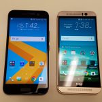
Here’s how the phone compares with last year’s M9:
Camera
In the last 18 months Android phones have started to boast incredible best-in-class cameras, and with HTC proudly showing off its DxOMark score of 88 – equal to the score it awarded to Samsung’s impressive Galaxy S7 – this year’s HTC camera warrants some serious inspection.
The camera itself is a 12MP unit that carries HTC’s UltraPixel moniker. This means it’s got some pretty large pixels that can catch more light, resulting in a brighter image than you’re used to seeing from a smartphone camera before, especially in low-light.
Unfortunately, the reality of receiving our review unit the day before the embargo drops and with working a full time job in Sydney means there’s been a bit of time to test the phone out with late afternoon and evening low light shots, without the chance to take it through a lot of bright, sun-drenched environments. We’d expect it’ll do well at that and will put the camera through its paces more in the full review.
The 10’s camera seems to have a slightly wider angle than the Galaxy S7’s camera, though only a little – certainly not to the extent enjoyed in Sony’s Xperia Z5 earlier this year. In low light (outdoor on Thursday evening), there were mixed results as the camera struggled with light sources and luminous objects in some cases and produced lovely sharp and balanced images in others.
One of the things I’m a bit disappointed about is the lack of a quick launch gesture for the camera. Where Samsung’s adopted the ingenious double-tap on the home button to launch the camera from anywhere on the phone, the HTC 10 offers only a double downward swipe from screen off (there are a few gestures on offer in this state) state, meaning your best way to quickly launch the camera is either to hit the power button and double-swipe, or hit the home button and find the camera icon. A little disappointing.
That is unfortunately it for first impressions of the HTC 10. With just a few hours with the phone there’s only so much that can be covered. It’s just not been possible delve into things like the software or battery life. Look out for our full review coming soon as Dan puts the phone through its paces.
Got any burning questions you want answered about the HTC 10? Ask away in the comments!






no irda, no fm radio, deal breaker for me
Dear Ausdroid writers, please don’t take this personally but if you finish a post with “Got any burning questions you want answered about the HTC 10? Ask away in the comments!” then wouldn’t it be good if the writer replied to readers/supporters asking questions? If you are unable to answer the question, fine just acknowledge that in your reply. People including myself seem genuinely very interested in this new device from HTC are obviously very keen to find out more about it from a local Australian perspective. If you think I’m out of line or I’m just a grumpy bum… Read more »
Hi Jamie. We’ve had very little time with the phone. Indeed, Jason burned the midnight oil to pump out a first impressions post; he only picked the phone up some ten hours before we could publish anything. Testing out the speakers, and looking for an FM radio, were not high on the list. We asked readers to ask questions, as we usually do, so that we could either (a) answer them here, with information we already had, or (b) address same in the review. As it happens, the latter is what we’ll likely do.
OK, thanks for taking the time to explain Chris. I’m looking forward to the full review on this one as I’d love to see HTC do well with the 10.
We all appreciate the hard work the team puts in.
The thing I’m really interested in is battery life especially as the LG G5 reviews are very poor in this area.
Yeah we’re a little worried about that (in re the LG G5) too. It’s too early to offer much useful commentary on the HTC 10 battery. Dan will be testing this out more thoroughly this coming week.
“meaning your best way to quickly launch the camera is either to hit the power button and double-swipe, or hit the home button and find the camera icon. A little disappointing.”
I’m pretty sure you can just double swipe with the screen off and it’ll wake up and activate the camera. You don’t have to press the power button first.
Otherwise really nice impressions. Now waiting for the full review – but take your time. No need to rush it.
I’m thinking he means that when you are using it, with the screen on, it is fastest to hit the power button to turn the screen off then do the double swipe, as you can’t do any other quick launch with the screen on.
That’s my read (and recollection) too.
Yep. It’s faster when you’re in an app to turn the screen off and double swipe. It’s a bit weird, but definitely faster than going home, finding the app and launching it.
Nice job Jason. How were the speakers and has HTC definitely dropped the FM radio on the Aussie version?
Is FM Radio really an issue? Every time I’ve mentioned it previously people just complained, so I stopped.
Nah not a big issue for me but a lot of people out there still like the old fashioned FM radio so they don’t have to use data.
Edit: It wouldn’t stop me buying it, looks great
If it has FM it’s another plus so good to know, but not crucial.
It’s very handy at NRL games. There’s a significant delay when streaming commentary so a traditional FM radio is nice. It’s not a deal breaker though.
Yep, same when I went to the V8 Supercars in Tassie the other weekend. They broadcast commentary on their own FM radio station but I couldn’t find an app for it so I had to use an old Nokia brick phone to listen. Definitely not a deal breaker though.
I would have liked to hear about the speakers, too. Afterall, it’s one spec which likely distinguishes it from the S7 and G5.
It’s a shame the black model doesn’t have a silver rear like the white model. All black is too plain on the 10.
The phone is en-route to Daniel at the moment, so we can’t test anything just presently. Jason’s focus was the camera performance and a quick run over the hardware, before boxing it up and sending it to Dan for review purposes.
The product spec sheet doesn’t refer to FM radio, so I would assume that’s gone. That I know of, we’ve not really put the speakers through a full test yet.
Ok, courier finally dropped off the phone….finally.
No FM Radio software installed and there’s no mention of it in the hardware listing apps I’ve tried.
Speaker wise, the sound is ok. Actually pretty good considering there’s no dual front-facing speakers. Clarity is surprisingly good. Not bad at all.