
According to multiple sources, Android Police has gotten an early look at a new Launcher from Google that is expected to launch with their new Android devices, Marlin and Sailfish. As with all rumours what we’re got here may not be final, or even released. However, everything we’re seeing here gels with Google’s current strategies and all feels like a natural evolution for their Launcher and Google now/ Assistant functionalities.
The big ticket items are:
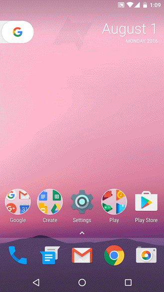
- The app draw has been replaced by a slide up pain, indicated by the ^ above where the app draw icon is typically found, simple drag anywhere on the lower bar or tap on the ^ icon to bring up the new app draw.
- The Google search bar has been removed and been replaced by a non-removable calendar widget and there is now a pull out ‘G’ tab that takes you to a combined Google Now and “Ok Google” interface, or tap on the G to bring up a search box.
With previous rumours pointing to a redesign of the nav buttons it’s likely what we are seeing here isn’t the final version of the new Launcher. When Google assistant is launched later this year we are expecting the new home icon to be updated and the current Google now functionality either enhanced or replaced.
It is unclear at this stage if this launcher will replace the current Google Launcher in the play store and be available to everyone or if it is going to be exclusive to Google hardware. Google CEO Sundar Pichai did indicate in a recent interview that they would b adding software exclusive to Google into their future hardware efforts. Could his be the first such example?
It’s also unclear, and unlikely, if these new services will have API access for 3rd part developers to integrate into their launchers. As someone who “needs” an extra row of icons on their homepages I just can’t move off Nova Launcher but also don’t want to miss out on the new hotness. Not having had the swipe left for the Google now page has been a serious frustration for the past few years, and I think it’s about to get a whole lot more frustrating.
How do you like the look of the new launcher? Let us know below.


I like it. I’m into exclusives for those that buy Google products as well. With the new rumoured nav icons it will look great.
I’m into it; the date not so much, but the G icon yes. It made little sense having a whole bar at the moment when you still have to tap it to search. The G icon still requires a tap, it just doesn’t take up so much screen real estate, plus it looks cute sticking out the edge like an important flagged post-it or something; the only annoying thing is you will have to then tap again in the expanded field to do a voice search. But then we still have the option to be going “OK Google” anyway to… Read more »
Well that calendar widget can s*d off, it makes no sense at all. And the same with the google tab on the left – why not just swipe from the left for the google’s junk page?
And they’ve even gone as far as making the folders icon round now – balls with everything seems to be the google motto.
Did you just censor the word “sod”? 😉
Folders have been round for a while now; although they currently show as stacked icons inside it rather than the grid in the above animations.
The pull out G tab reminds me of the app drawer locator from Cupcake/Donut : ( … it doesn’t appeal to me… makes it look really side heavy, which they have tried to balance with the calendar widget.
The app drawer swipe is a nice idea, also gives you an extra icon on the bottom row… but not as many as Nova et al.