Samsung has a pretty tight hold on much of the Android market, running at around 31% of the global market in 2018 and looking to strengthen that number in 2019 with continued sales of the Galaxy Note and the Galaxy S series devices. What Samsung has missed in the last few years is a really good, high-end (just shy of flagship) device that can compete with the “value” option offered by Apple in the iPhone XR – this is where the Galaxy S10e fits.
Make no mistake, the S10e has some very solid specs that only 6 months ago would have seen it wearing the flagship label, but also at a higher premium that the current asking cost of $1,199 at full RRP which coincidentally is $100 cheaper than the XR.
It’s not just a price game though, so let’s see what makes Samsung’s Galaxy S10e tick.
What’s inside?
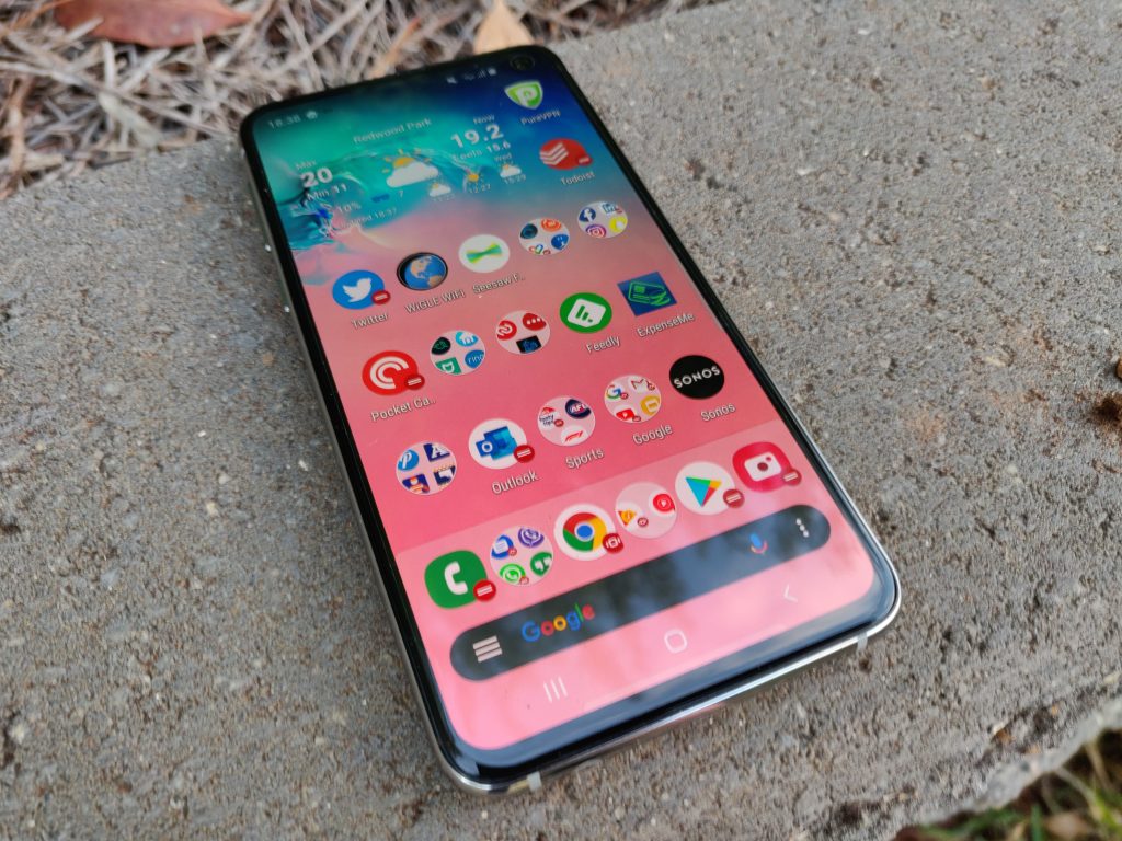
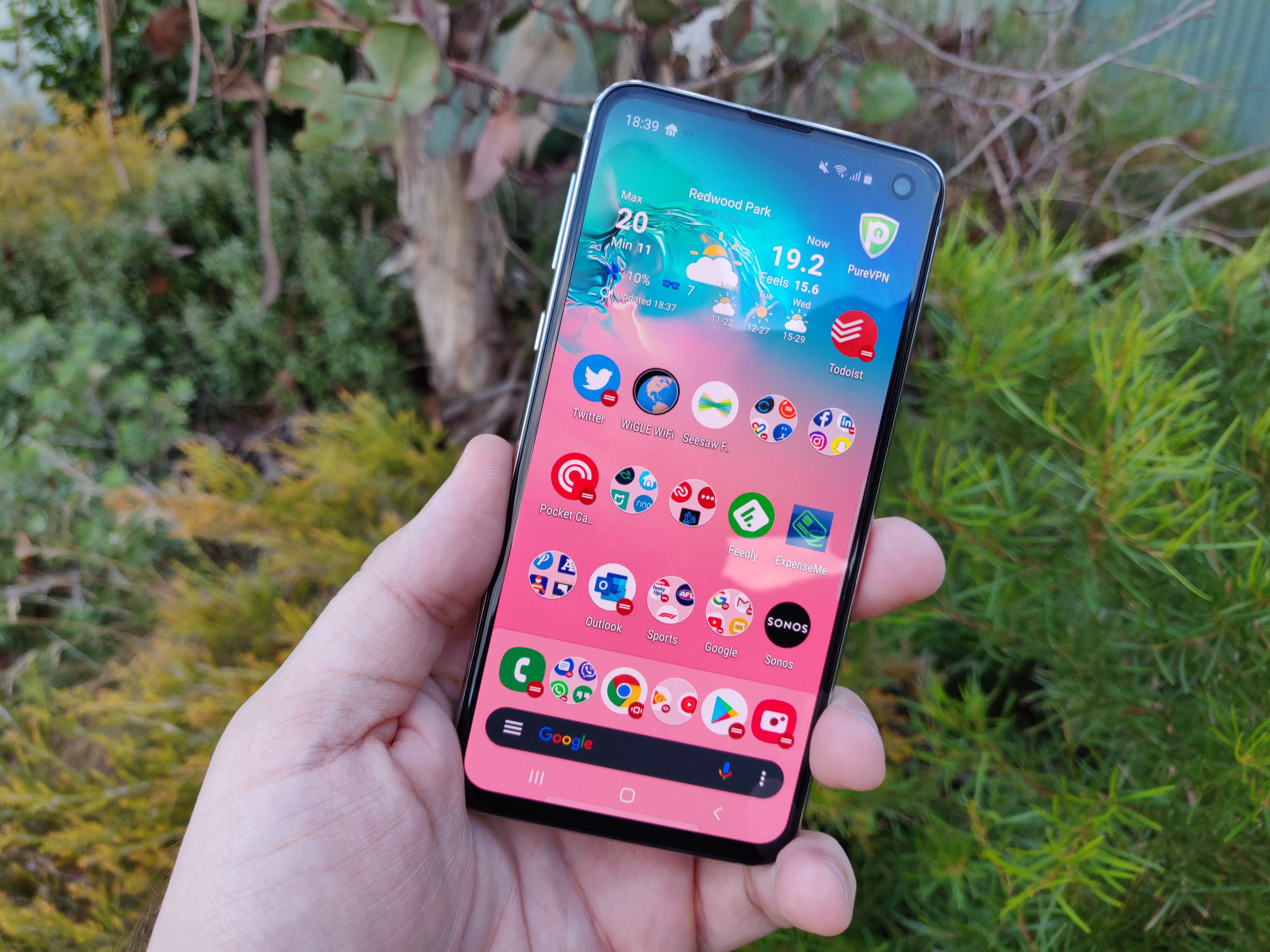
The S10e is (in comparison to most devices in the current generation) quite small at a mere 5.8 inches and when looking at the screen offers users the hole punch camera which – despite early reservations – I found myself looking straight past after only a day or so adjustment from a notch phone.
In this I am extremely confident that the default background is no accident, the top right corner where the camera is has a transitioned dark background almost camouflaging it during general use.
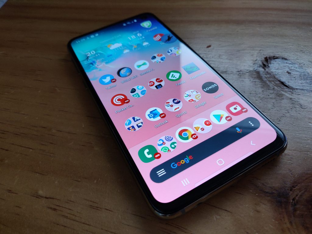
I also had a minor concern over the 19:9 ratio which was quickly alleviated when I held the phone, the smaller form factor made the wider hold on the phone feel very natural and made it quite conducive to single handed operation.
What really struck me with the S10e was how well the line between size, weight and feeling “right” had been walked. It’s very easy to have a smaller phone feel very light and plastic resulting in it feeling like a toy. There’s no such feeling here, it feels solid and like it will take a drop or two (I haven’t tried it…) without too much drama.
That said, at $1,199, I would be putting a case on it.
This sentiment has been echoed by almost everyone I’ve handed the phone to during review ad to how good it feels in your hand. One of my work colleagues nailed it when she said that “it’s just a really nice size, shape and weight for single handed use”.
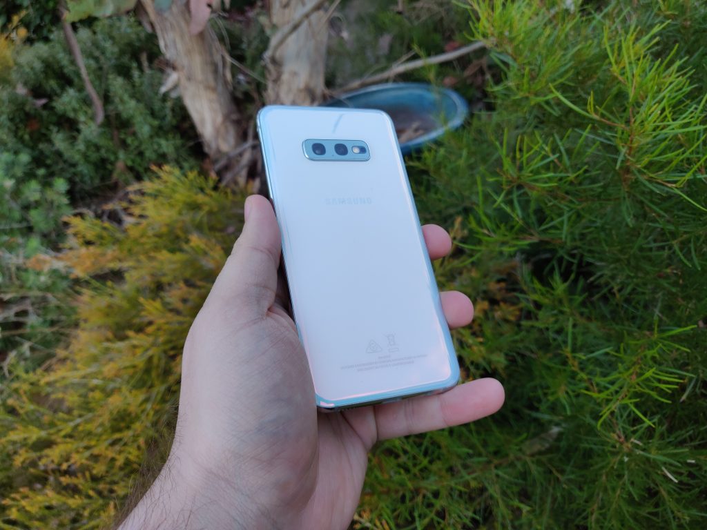
In what I can only describe as an interesting, but reasonably functional decision – the fingerprint reader is embedded in the power button very close to the top of the right hand side of the device. A fairly natural place for your thumb to fall if you’re right handed or the index finger for left handed users. Interestingly, I suspect due to the size of the device this has not been the case with other similarly placed fingerprint readers in other devices. In face the feedback I’ve had from left handed users on those is that it’s quite awkward in its placement.
If you choose not to use the fingerprint reader though, there’s always face unlock or the trusty old pattern/PIN code options which are all perfectly valid in their own right. I tend to go with fingerprint readers personally at this point as I find them to be handy when I grab my device from my desk or out of my pocket, by the time I’m looking at my phone its already unlocked. I did find a few misreads from the fingerprint reader which caused a little bit of frustration for me at times, but with other unlock options – it wasn’t that big of a deal.
On the positive side, there are a number of nice inclusions starting with a headphone port. I know we harp on about this a bit, but at the moment it still causes some discussion when you talk about removal of the 3.5mm port with a lot of people. I have a couple of sets of really nice wired headphones, I also have some wireless. When flying they don’t like you using wireless, but if your phone is running low on charge you can’t use your USB Type C connector for your headphones and charge the phone.
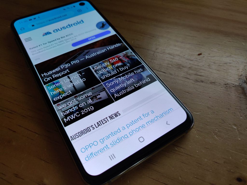
The biggest and probably only complaint I have about the physical hardware on the S10e would be the rounded edges. Not because I don’t like the look or feel of them, but because I am unconvinced as to how well they’ll age and as a result have a detrimental effect on the resale value of the phone in 6 – 12 months time.
All up you’re looking at a solid design, nice piece of hardware that is going to make the vast majority of users very happy in their day to day lives. But (you knew this was coming right?) there is a couple of issues that need to be talked about before anyone rushes out to buy one.
What’s it good at?
There’s a lot of things that the S10e does well, and does right. The screen is outstanding at sub 6-inch 1080 x 2280 resolution and 19:9 ratio running 438ppi. The design makes you feel as though you’ve got a solid device in your hands thanks to the aluminium frame giving it a very rigid feeling.
It’s far easier to isolate the criticisms of it, than to spend a lot of time going through the good points – so here goes.
What’s it not so good at?
Let’s talk about battery life and stop me if you’ve heard this before…
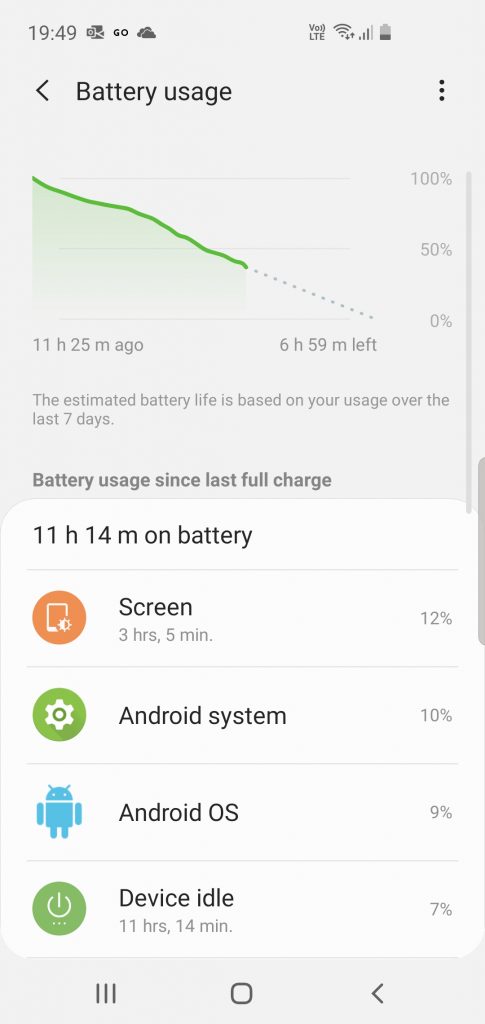
The Galaxy S10e is an excellent phone but I wish the battery would last longer. Don’t get me wrong, after the battery issues Samsung have faced in the past – I don’t blame them for playing a conservative game here with the 3,100mAh battery. This feedback isn’t new either, similar to other recent reviews that we (and other sites) have done on various other Samsung devices in recent times. The saving grace here is the charging speed with the supplied with the phone which gives you 15W charging and will – in my experience – add about 4 hours of battery life with a 10 – 15 minute top up charge.
I’ve had quiet days on the phone while I’ve been reviewing it and I’ve got the full day (6:30am – 11pm) from the battery. But the reality was that more often than not, if I didn’t spend a chunk of time in the car where it gets a boost to the battery while plugged in for Android Auto – then I was looking for a 15 – 20 minute plug in to ensure I got through to the end of the day without the phone dying. On heavier use days where I had more screen on time, calls, data needs (email, social media etc) and general messaging I was looking for power by 2 – 3pm to ensure I made it home with battery – amusingly I had people note it was like I was on an iPhone.
Ouch.
The specs
Internally the S10e is very capable of packing a punch, with an Adreno 640 GPU and Exynos 9820 CPU. There are two models available: 128GB Storage with 6GB RAM or 256GB Storage with 8GB RAM, both viable options for users who want to maintain their device performance with a bit more RAM than the last generation of devices that have 4GB memory available.
If you’ve picked up the dual SIM version you’ll find capability to have up to a 512GB MicroSD Card to additional storage in preference to the second SIM.
The main camera is a combo of a 12 MP, f/1.5-2.4 aperture with OIS and a 16 MP, f/2.2, 12mm (ultrawide) camera that (while not matching the capability of the S10 or S10+) is very capable of excellent quality images that will meet the needs and more importantly expectations of users who want to get good photos from of their family and friends at social gatherings. The selfie camera is a 10 MP, f/1.9, 26mm (wide) lense that has excellent capability to capture selfies in low light conditions.
There’s a headphone port mentioned earlier, USB Type C and the expected suite of connectivity which includes Wifi, Bluetooth, GPS and NFC for G Pay or Samsung Pay. All engineered into an IP68 rated body with a 5.8” display.
One UI on Samsung’s S10e is smooth, easy to use and understand and really importantly – predictable in its behaviour. It’s far from a stock Android experience and very much to my pleasant surprise it’s a really nice user experience. Samsung has clearly learned a lot about UI design.
A look at the camera
It’s a Samsung phone at the pointy end of devices so it shouldn’t be a surprise to anyone that the S10e takes really nice photos. The light capture and color reproduction are excellent, particularly when you consider it’s a dual camera vs some of the other devices today have 3+ lenses to improve the capture quality.
The capability as a stand alone camera is actually really impressive. Generally I only use my phone as a “happy snap” option, so it’s usually in auto mode with auto flash as well but I found myself being drawn to investigating what the more manual options are and how that can influence the outcome you achieve.
The slow-mo and super slow-mo are very cool but I’m not sure what regular use this would be for the majority of users. But the overall story is going to be very familiar for most users… provided the scene you’re shooting has solid lighting, you’ll get good results. In low light, or with inconsistent lighting, the results I’ve captured have been really, really poor.
Of course you can improve the end results with some basic editing in your chosen software, but I personally wouldn’t want to expect to have to do this to be happy with the results of my camera phone.
I’m pretty happy with the camera software interface that Samsung have given users on their latest generation of phones running OneUI. It’s quick to load, really quick – but more importantly its very easy to use, navigate, understand and get some good results.
I did have some minor issues with shutter lag, fortunately it was consistent enough to work with and seems to be related in part at least to some of the other applications that are running in the background. Keeping a minimum of apps running, it minimised the lag and made the camera easy to use and capture those split second moments.
Samsung have included an Instagram mode that automatically grabs images, feeds you through the filter stages and into the Instagram posting process. For the social media addicts out there, this could be quite the sale winning feature.
Should you buy one?
Honestly, yes – it’s an outstanding phone but it’s a tough sell when you consider the cost for most users. I’ve actually found myself drawn to the size, the performance and the general feel of the S10e, unlike other review phones I’ve had in the past when I finish the review my SIM goes straight back into my normal phone – the S10e it was still in there until I had to return the device.

At $1,199 RRP it’s not a budget model per-se it’s a “lesser flagship” and that’s a mistake I’ve seen a lot of people making already – myself included. The S10e is a beast, just a smaller one. It gets the job done very well, does it differently and will certainly be more to the tastes of a high number of users.
The design is sleek, the screen is excellent to look at and very easy on the eyes and the overall performance is brilliant. For my mind the sale option here is: users who want a flagship device but don’t want to buy one the size of the S10+ – it’s not a competitor it’s a complimentary product. I personally had a lot of women comment how much more comfortable the S10e was to hold vs the six-point-something inch phones are and more convenient for single handed use.
If you’re shopping on dollars alone, you’re not going to be looking at the S10e, if you’re looking for a flagship you may well be looking a touch higher in specs but Samsung have hit a really respectable middle ground with the S10e that will undoubtedly sell well with the brand placement that the Samsung Galaxy models have.





Bought this phone wrongly thinking it would have a working fm tuner. The face recognition only works in bright light. The side finger print sensor is no good so I have to unlock it with pin. The touchscreen doesn’t react when I touch it often and I have been unable to answer calls because it doesn’t respond when I touch the green answer call icon.
Lmao that’s stupidly expensive
$999.00 at the moment and if you have an old Samsung device you could get an additional couple of hundred off that price –
Will buy grey stock which will have dual SIM. Shame on samsung for not going option to aussi
My last Samsung phone was the Galaxy S7. After that, all three small Pixel phones. Yeah, I change phones every 6-12 months. Samsung won me back this time with the bigger, brighter, better calibrated display in a smaller package. It’s just more practical for my use. Glad you enjoyed yours too Phil! I’m hoping Google can do better in the display department with the Pixel 4.