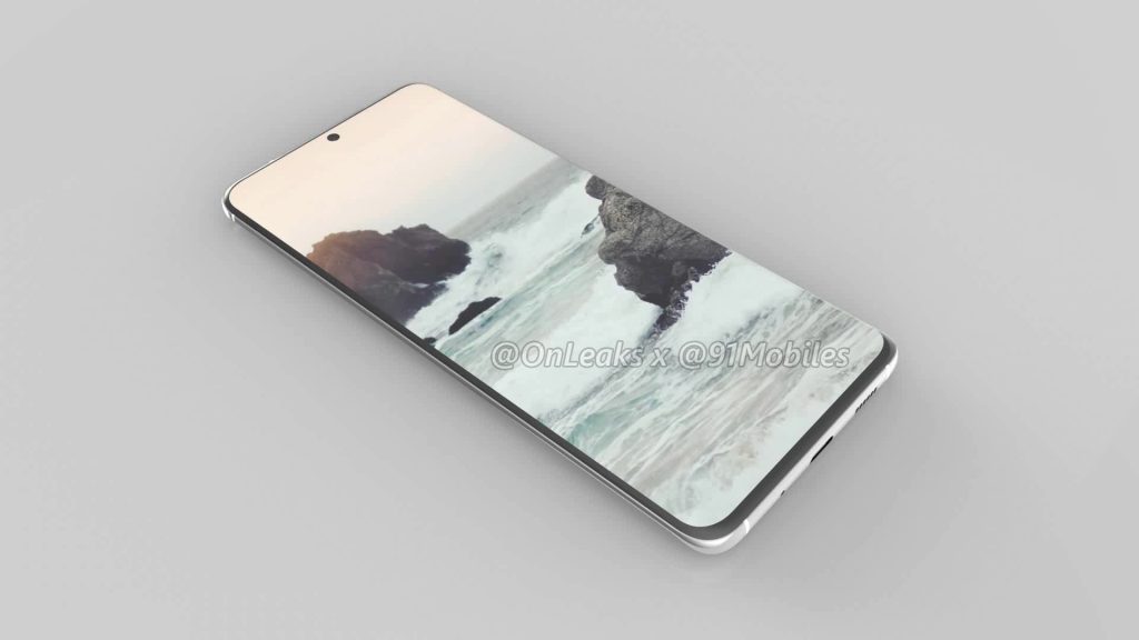
That time has snuck up on us again. MWC is just a few months away now and thus all the phones that are launching around that time will start appearing in leaks so that once again there will be very few surprises for us. Today it is the Samsung Galaxy S11’s turn with CAD renders showing it off in full 360 degrees.
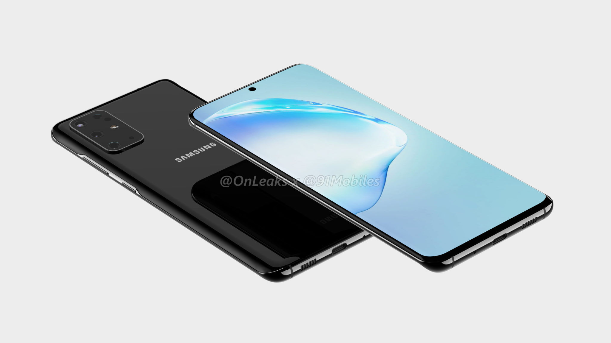
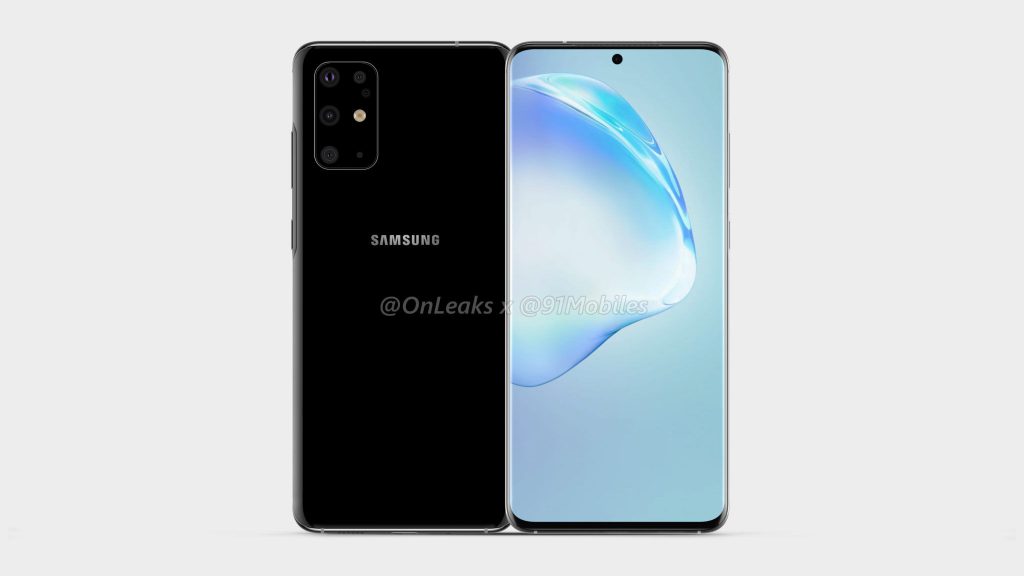
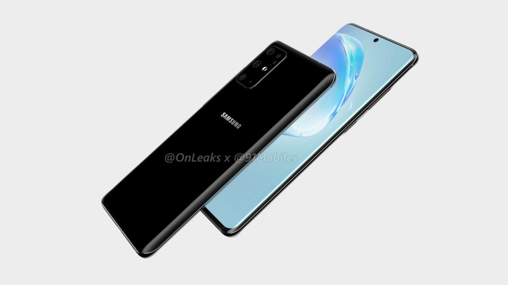
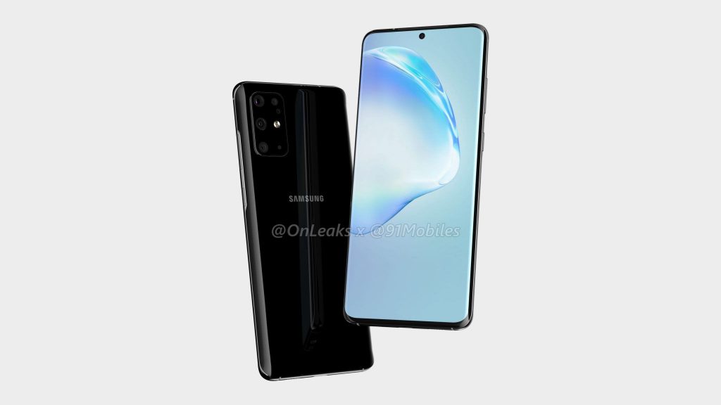
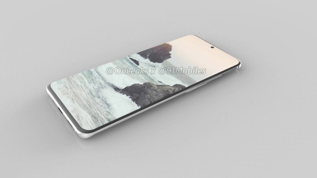
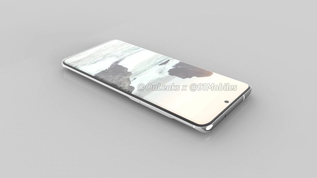
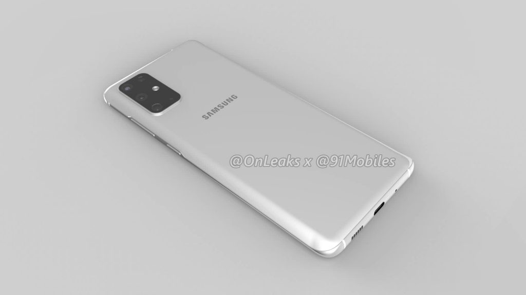
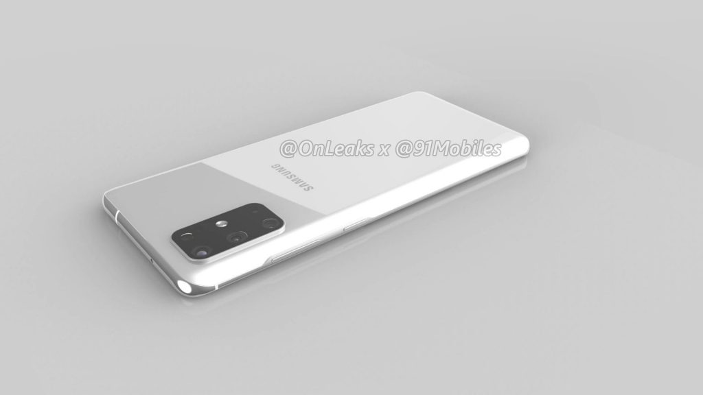
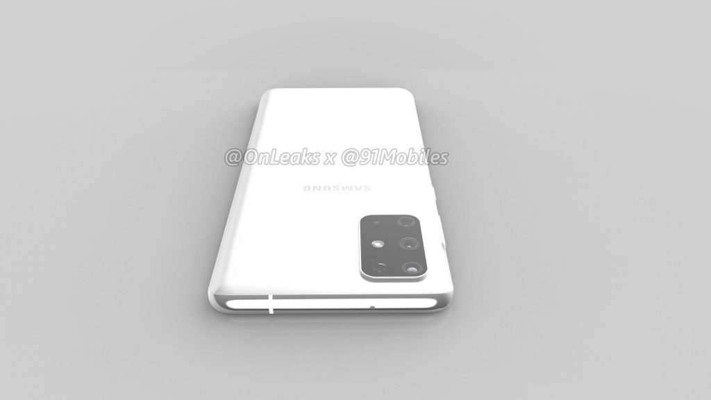
Thanks to @OnLeaks and 91Mobiles renders made of the CAD drawings of the Galaxy S11 have been shown off and there are no surprises but some interesting changes.
Starting with the big change is the camera. This year Samsung moved back to the top of smartphone photography with their premium devices and looks to do more of the same next year with a penta (that’s five) lens camera system on the rear. This is inside a rectangular camera module similar to the square that so many manufacturers are favouring these days.
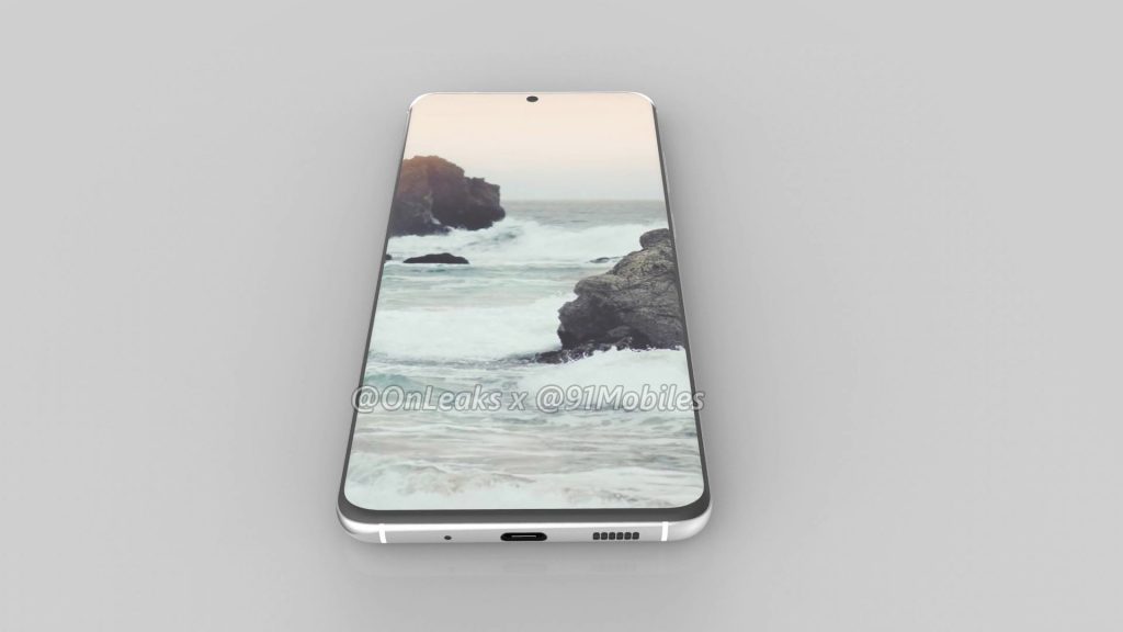
Once again the S series phone will have a punch hole in the display for the selfie camera but this time it looks to be a lot smaller and is located in the centre of the top of the display — just as they did for the Galaxy Note 10.
The sides of the device are also shown and it is good to see that Samsung did not include the Bixby button — finally — nor waste any internal space with a headphone jack. Charging is through the USB-C port (as well as most likely wireless charging) on the bottom of the phone.
The phone itself is said to be 161.9 x 73.7 x 7.8mm in size with the camera module causing a bump taking that section to 8.9mm. The display is expected to be a 6.7-inch curved display but the curves look less pronounced compared to the Galaxy S10 which is nice to see.
The Galaxy S11 looks to be another attractive device from Samsung and we look forward to seeing it released. Hopefully it can hit the high mark Samsung are aiming for but equally hopefully they have some decent competition from other manufacturers around the same time.



What!! Only 5 cameras??
Ha ha yes , I was thinking the same thing , We want at least one for each day of the week ! Joking Samsung ! Personally I think all these phone makers are losing the plot . I don’t expect a DSLR in my phone , Just give me 3 lenses standard, tele and wide , I do not need a phone camera to be able to turn pitch dark into a summer’s day , that looks utterly wrong ! Give me the usual features , 3.5 mm Headphone jack , SD card , with a bit of AI… Read more »
Your last bugbear annoys me too. 16:9 Aspect ratio, I hate 18:9 and up to 21:9 aspect ratio. Why have a skinny screen resembling the shape of a ruler? A 6″ phone with 16:9 will have an on screen keyboard that’s noticeably wider and therefore easier to use, when watching videos on an 18:9 in profile, the video is now smaller, or watch a video in landscape you’re more likely to have black bars on either side, as no movie or tv show is filmed at 18:9. I much prefer 16:9. Sorry, I get carried away!!!