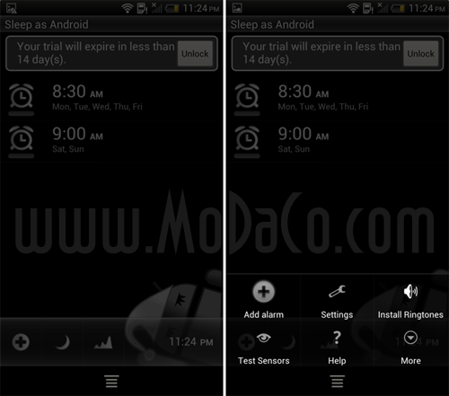
If you were wondering how the menu button would appear on HTC’s new range of ‘One’ series devices, be confused no more. MoDaCo have taken some screenshots that show that the menu button will appear as an on-screen button when the app needs it (ie. a majority of the time). Most of the feedback so far seems to be that this is the stupidest implementation ever and we tend to agree. Why couldn’t HTC just add the button to the capacitive line up below the display? Surely this would have saved screen real-estate. What do you guys think?
Source: MoDaCo.


Hw does the menu button look on galaxy nexus? ???
quick random google search for buttons, Check out screenshots
http://www.addictivetips.com/mobile/add-permanent-search-button-to-on-screen-controls-galaxy-nexus/
A true ICS app that isn’t using the menu button doesn’t have the ‘three dots’ button. A legacy app that uses the menu button has the ‘three dots’ button. ie menu
I’m running the RUU leak from this phone on my Sensation, and the on screen menu button was the biggest pain in the ass ever…luckily the dev was easily able to remove it.
I’m sure this cold be done again, when root is achieved…but how would the menu be accessed then?
This is epic fail…
If your having onscreen menu buttons running on the Sensation with HARDWARE buttons then the fail is the ROM, not ICS
No, the ROM is a port of the leaked HTC ONE X ROM…hence the onscreen menu button. But as I said, the dev removed it by tweaking one of the UI files.
Well that explains the menu issue…. So as I said….. rom issue not ICS issue 😉
as I said at Modaco; it’s horrendous. They should have had a hardware Menu button and left the multitasking one as a long-press of Home. On screen buttons are a waste of valuable screen real estate.
Really, the only reason they’ve had to do that is because apps don’t take up the full screen space. 1280×720 res, same as the Nexus. Except on the Nexus, obviously the navigation bar is on screen, so there’s a certain amount of pixels that are reserved for the app space in between the top and bottom bars. Basically it’s a stupid design choice and they should have just dropped the capacitive buttons and went on-screen like the Nexus. Or because no one else had followed the lead of Samsung/Google as yet (despite it being the way of the future with… Read more »
Because the ‘menu’ button is on its way out. When developers finally start designing their apps with ICS in mind, they won’t implement a menu anymore. Leaving a button permenantly on the device to support these ‘legacy’ apps seems not the best choice to me, considering that in a year’s time, the majority of apps won’t be needing it.
agree fully….. I wonder why the ausdroid guys don’t get it?
The menu button is dead! Let it go!
It’s not dead yet though, a bit premature to kill it off – this next wave of handsets should still support it, then by the time the apps catch up we can remove it.
I disagree… as a ICS owner I’ve noticed that well over half my apps are no longer using the ‘menu’ button on ICS. As to what apps are using it some have the menu button but with no menu attached (compiled incorrectly) and a handful still use the sub menu button. Google has said this is a very easy fix to update to the action bar, aka the new ‘menu’ system so that the menu key isn’t used. See for yourself, a few tweaks of the code and a compile and wowla the menu button is no longer used! (… Read more »
this
/thread
I just want to add further to this: The reason they want to get rid of the “menu” button.. is so it’s more obvious 😛
One great thing the iPhone nailed was menus… There’s never a question in the users mind like.. should i push menu here? by pushing developers into skipping the menu button, they’ll get more screen real estate and make extra settings and functions more obvious.
Well the iPhone ‘nailed’ it by wasting huge amounts of space to have a menu bar always on the screen cause they didn’t have a menu button. I found android menu button a much better idea, the menu was hidden until you want to go looking for a menu or setting. Its not very hard to press the menu button and see what happens. But what happened was poorly ported iphone apps and lazy devs started to use a mix of both onscreen ‘menus’ and the menu button ‘menu’, it created a messy interface that confused the user cause some… Read more »
This is not such a smart move on HTC’s part.