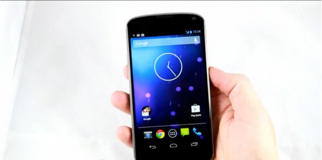
LG Sweden apparently got a bit trigger happy earlier today, posting a video showing off their new, shiny Nexus 4. I think it looks a lot nicer in the video than it has in the renders leaked previously, and the user is kind enough to show off a little of Android 4.2. It looks like they’ve put an extra column of icons in the application drawer, and they’ve given the old analogue clock a bit of a makeover. You also get to see the new quick notifications in action, and thankfully Google abandoned the double-swipe on the status bar to activate them in favour of a neat button in the top-right of the screen.
Check out the video below and let us know what you think.
Source: Android Police.


That’s really awesome!!!!
Seriously not 4G??
Not real happy. Last week sold my galaxy nexus and got the RAZR hd. Wish I had waited now.
i feel stupid buying the S3 when this is a much cheaper phone with similar specs. just price wise, $350 compared to $700 for brand new at the time of release is ridiculous.
Sell it and buy this. im sure you can get more than $400 fot it still
Fail at reporting…. The two finger swipe is still there. One finger drag down brings the standard menu, two fingers is a shortcut into the quick settings.
Check out the verge video they have, it’s a great 15 min video that shows of a few features like the lock screen widgets. Finally the calendar can be on the lock screen! And quick unlock shortcuts work when using a lock code now
Check it out
I wonder what the rules are for the extra column of apps? Probably something along the lines of a minimum 4.3″ + HD screen? Makes sense in one way because the dock fits five icons, but then again it doesn’t make sense because the home screens only fit four wide. Weird.