
Yahoo-owned Flickr, a mainstay of online picture-sharing services for many years, today launched a redesigned website and Android app, alongside an announcement that all users will now get 1 TB of space in which to store their photos.
The new website puts a greater focus on photos and does away with the traditional (read: old) uniform grid spacing. It shows you larger previews of images and doesn’t constraining them into the square grids of yesteryear. Public profile pages have been given an overhaul, too – they’re now not-dissimilar to Instgram‘s web profiles, introduced by the Facebook-owned competitor a few months ago.
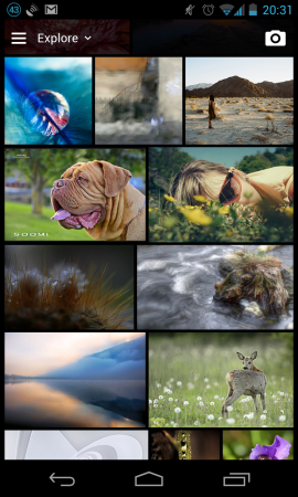
Similarly, the company’s Android app has seen a redesign which should put it in the running for James‘ new Beautiful Android series, aping many of the website’s new layout in an Android-native application. The new UI is not entirely compliant with Android’s design guidelines, but works well nonetheless.
Flickr’s offer of 1 TB free space is an appealing one, especially when compared to services like Dropbox or Google Drive, where the space offered is measured in tens of GB’s. Many features and benefits that used to be limited to Pro users are now available to the public, and while most users will likely never notice them missing, you can still upgrade to an Ad-Free or Doublr account for a yearly cost.
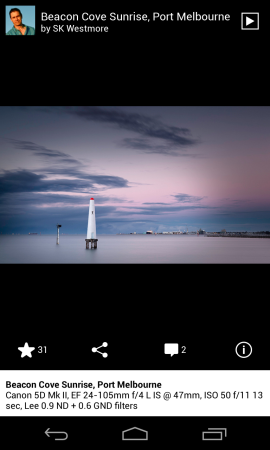
The app’s sliding panels design is pleasant to use – it’s very snappy and responsive, and lets you drill right down to a photo’s EXIF data, just like the web interface. A neat touch is the app automatically loading a higher resolution image when you zoom in, cutting down on excess data usage until you need it. It would be nice to see it use the new Navigation Drawer standard, but that’s only a few days old now – we’ll take what we can get.
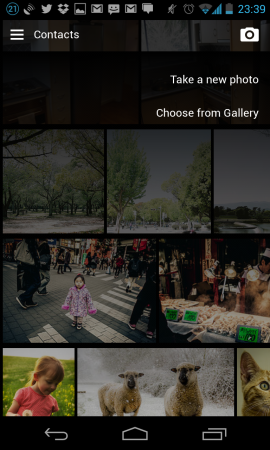
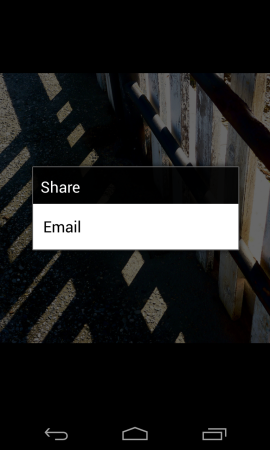
There’s still room for Flickr to expand the products on offer. Rather than performing Google+-, Facebook– or Dropbox-style automatic upload / backup service for all of your pictures (especially with the new 1 TB storage limit), it remains a curated service where you upload only the images you want. The app also uses nonstandard – but not unpleasant – interfaces for its selectors and menus, picking images to upload and sharing pictures (while that last one’s actually a serious offence in the Android world, it seems likely it’s a result of choices made by the owners of the picture).
Overall, it’s a solid update for Flickr and the bonus storage should help the service continue to claw back its way back to relevance in a market that had, until very recently, started to forget it.
Do you use Flickr in preference to other image sharing applications? Will these new features entice you back, or keep you happy? Let us know in the comments!




Jason, one critical point you missed is how much space this piece of bloatware chews. 13Mb. While that is not an issue for the current crop of medium to high end Android devices, it is an issue for most of those of us stuck down at the budget/bottom end.
A photo viewing app with all these editing features that’s 13MB is bloatware? Really?
I would like to see you make an app with all these features that’s smaller!
PS: Made me go and re-activate my Yahoo account after years, just to try it out. The interface is nice and enticing, both on the web and on Android, and the 1TB free space is a bit of a Gmail in 2004 moment which said F*ck you to the rest of the industry. Nice job Marissa Mayer!
The new app is a positive, but what Flickr has done to its account structure has (in the opinion of a number of pro photographers I know) put a nail in Flickr’s coffin. Pro accounts can either (a) keep their pro accounts, which offer less features than the new free accounts, or (b) ‘upgrade’ to a free account, which gives them more features, but storage space limited to 1TB (which was previously unlimited for Pros). Bit of a tough choice. For my 2c,Flickr has presented an ugly interface and strange free/paid paradigm for too long, and there are better solutions… Read more »