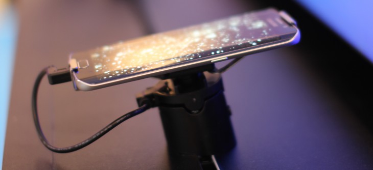
It was a grey Saturday morning in Sydney, and what better way to start the weekend than by experimenting with a new arrival; Samsung’s latest release the Galaxy S6 Edge.
There’s been a lot of hype here. Samsung has developed quite the reputation in the mobile handset market, from inconspicuous beginnings of the line with the original Samsung Galaxy S. It’s clear that they’ve come a long way. Android has come a long way too, and that’s no small part of it. We’ve gone from phones that could barely be described as smart, to a phone that could be described as one of the most stunning pieces of industrial design that I’ve laid hands on.
I’d like to introduce you to the Galaxy S6 Edge this weekend, and after I’ve spent a bit more time with it, I’ll prepare a more fulsome review.
What’s in this beast?
The box, as you can see above, gives little away about what’s inside. Turn the box around, and there’s not too many more secrets revealed:
- 4G LTE Cat 6 (this means its network performance is lightning quick)
- 64bit Octa Core Processor (arguably one of the most powerful and capable chipsets on the market)
- 5.1″ Quad HD sAMOLED display
- 16MP rear camera featuring OIS, and a 5MP front facing camera
- Wireless charging capable
- KNOX capable
- 64GB of on-board memory
Its a nondescript packaging for what is quite a surprising phone. While other manufacturers like to put a depiction of their phone on the phone’s packaging, Samsung haven’t gone down that path, and it’s only once you crack the box open that you get an idea of what the Edge looks like. Our review model is Black Sapphire, which is sort of black with a blueish hue. It’s not as big as the Sony Xperia Z3 I’ve been using for the last six months, but it sure packs a lot in.
Special mention probably should be made of the Octa-Core processor; it’s the first time we’ve seen an Australian-launched handset featuring the Samsung Exynos chipset in a top-shelf model. More detailed testing (probably by those a bit more technically capable than I) will reveal the real difference between these two beasts, but there’s no doubt in my mind — it’s damned fast.
My only gripe about the physical aspect of the phone is that it’s a little awkward to hold. The Edge-style edges give the phone a very narrow side, which makes holding it just the slightest bit uncomfortable. I can’t help but think that it’ll be a lot better an experience with a slim case on the phone; the curved front, and dead flat back give the phone a decidedly unusual shape, and in the hand, you notice the difference.
How’s it run?
Honestly, it runs pretty well. Setup from the box is nice and quick, and very Lollipop; the confusing mess of Samsung’s previous out-of-box experiences has been swept to one side, replaced with a very standard set-up process which is much quicker, and more familiar to users coming from other handsets. There is, of course, a Samsung-designed transfer app which can make transferring some other kinds of data from your old phone much easier.
Once you’re up and running, the sheer power of the Octa Core chipset inside the Edge comes to bear, with very little delay in loading apps, installing and uninstalling, and so on. There is, still, some completely inexplicable lag, though it isn’t overwhelming; it’s most noticeable when pressing the multi-tasking button, with up to a second’s delay before the multi-tasker actually appears. This behaviour, though, is not constant — sometimes its significantly quicker, and there’s no real rhyme nor reason to the delay.
In this day and age, it seems somewhat insane that there’d be any lag whatsoever on a modern handset, and for the most part, the experiences of the past are not repeated here; the S6 seems to suffer slow-down and lag significantly less than its forbearers.
In general terms, the Samsungness of the operating system has been significantly toned down, again increasing the appeal to users who may be more familiar with the Android experience on other handsets. Samsung’s stock launcher is still full of bright colours, but it’s a lot nicer to use. Finally the dock icons are configurable again — you can move them around, or replace them completely. The Settings menu, which was excruciating on the Galaxy S4, and improved on the Galaxy S5, has been refined further, to the point that it’s now very close to the stock Settings experience available elsewhere, which yet again increases accessibility to users who’ve not used Samsung phones before.
Out of the box, there wasn’t a significant amount of bloaty software installed, but what there was could be readily disabled and hidden from view.
That Camera, though
For too long, the gold standard in mobile photography has not been often found on Android handsets; while many Androids include a capable camera, they’re far from fantastic, and are often disappointing in more trying conditions (e.g. low light, fast motion, or fast response). The Edge could be the first Android I’ve used that’s finally got the camera right, to the point where it really could be described as gold standard.
The camera loads quickly. Very quickly. From screen-off, a quick double-tap on the home button launches the camera, and it’s ready to take the first photo in well under a second. Once the camera is open, the response is fantastic. It feels as if it takes the photo at exactly the instant you tap the capture button, and with some quick testing, it performs on par with another phone well known for its rapid photographic capabilities.
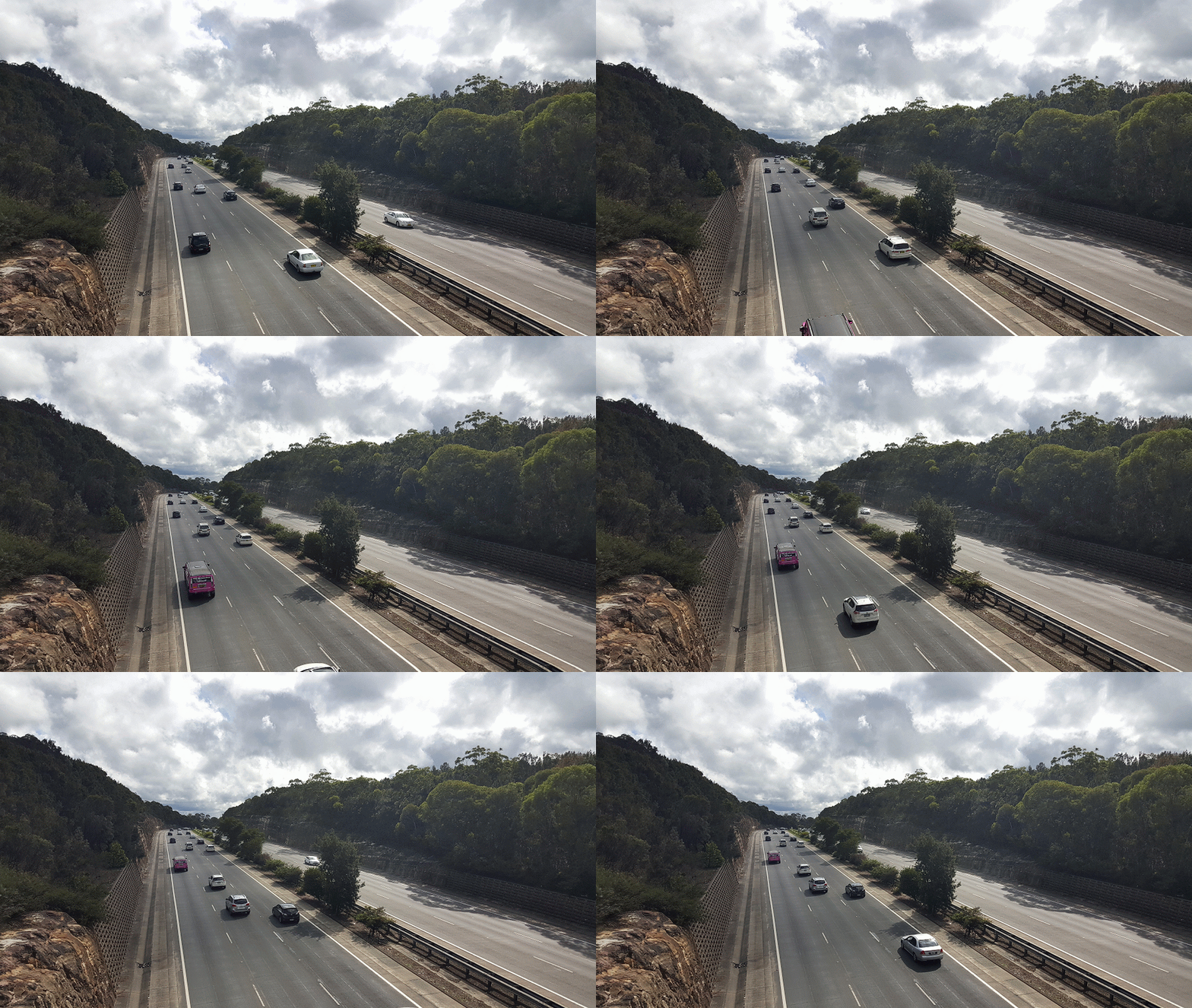
I’ve taken the Edge around town a bit today to show off some of it’s photographic skills, which you can see below.


This is just a very small sample of what the S6 Edge is capable of, and by the time the final review is posted, there’ll be plenty more photos to show off the full dynamic range of the, dare I say it … spectacular camera that lies within.
Charging and Battery
There’s always a compromise, and here it is. Initial impressions are that the battery life isn’t fantastic, though it’s not the worst I’ve seen either. Samsung’s decision to go with a non-removable battery is understandable; it brings the thickness of the phone way down, and probably makes it stronger and more durable as well. On the flip-side though, there’s no carrying a spare battery anymore.
Samsung has finally seen the light and included Qi charging in the Edge, but my initial impression there wasn’t great either. It doesn’t work on my standard Qi charging pad which I’ve used for a couple of years, and upon which every other Qi device I’ve owned has managed to charge without issue. I tried a couple of other Qi devices on it, to make sure it wasn’t broken, but no, it appears its the Edge that doesn’t like it, not the other way around.
I’ll give it a try on another Qi pad and see if that changes by the time the review comes around.
Conclusion
So, after using the S6 Edge for 24 hours, what are my first impressions, neatly wrapped up?
Simple. This phone is gorgeous. It looks great, and feels great too (though that in-hand feel is going to take a bit of getting used to). The camera is gobsmackingly good, both on the rear and on the front. Taking selfies (for those who suffer from narcissism) is a breeze with the option to tap on the heartrate sensor to capture a photo.
The battery life doesn’t initially fill me with confidence, but it needs a few full days’ worth of use to really get the measure of that. I also get the immediate feeling that the S6 Edge is a phone that really needs to be in some sort of grip case; it probably isn’t fragile, but it sure feels it. The combination of lots of glass, thin metal bands around the edge, and lots of glass just makes me think one solid drop, and it’s a goner.
I can see myself falling in love with the Edge, if only the battery life stabilises out a bit and can get through most of a day. I fear the Xperia Z3 has spoilt me; two days’ battery life out of a phone is the exception (sadly) and not the rule (even more sadly). I’ll report back soon.


Loving my Edge. Coming from an HTC M8, Samsung’s interface doesn’t feel quite as ‘snappy’ such as the slight pause with the recent tasks button. However, the screen is ridiculously good and although the edge functionality is superfluous, Android’s UI actually suits it. Most apps now use the pull-in side menu on the left and rapid-scrolling on the right edge (jumping to letters in lists). Now it feels more tactile like menus flow over the side, and running your finger up and down the edge to scroll. It’s simple, but it “feels” better. Plus, somehow the curved edges provide the… Read more »
I got mine yesterday and I was saying the same thing about the screen making things look three dimensional. Photos on instagram just seem to pop.
my friend’s just had an update which improved on the speed and the recent apps button pause.
Great review. Loved the photos.
Aurora Aerios charger works really well with the GS6. Just tried it out http://youtu.be/KmLUQ1ALCww
FYI your video is on private
Fixed now – whoops
Video is private
Fixed – whoops
The lag on the multi task button seems like a common problem! My Note 4 does the same thing, possibly this is the same as the home button and due to the button having dual functions! A short press is multi tasking and a long press is the menu button, I assume it’s the same on the S6?
By default long press of multi tasking button launches a split screen view
I’m also enjoying my M9 but I think I may be flipping it for that camera. I just hope the battery life turns out ok with the QHD display.
My wife’s Galaxy S5 with wireless charging back doesn’t like my el-cheapo QI pad either – I ended up having to buy a genuine Samsung one. Will see how my S6 goes once it arrives (only ordered it this morning)