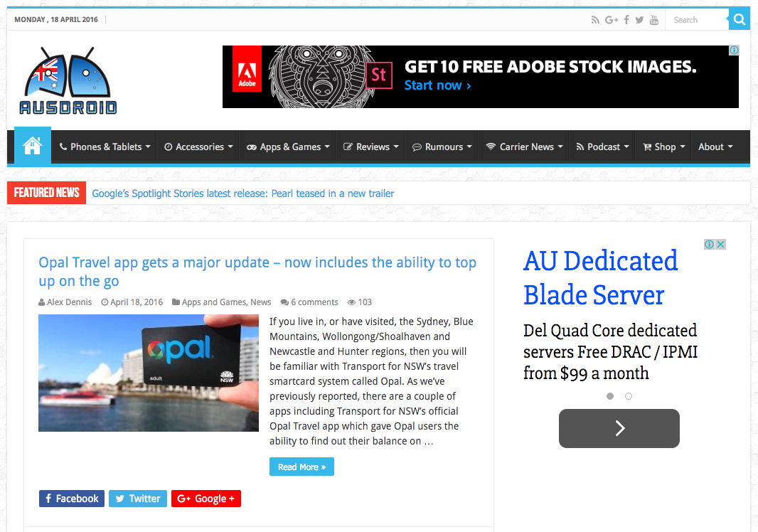
Ausdroid is now in it’s sixth year (as of the 20th of March) and in that time we’ve gone through an awful lot of changes. We’ve grown from a one-man-band to a merry band of many, we’ve gone from a hobbyist project to a small business, and we’ve gone through a number of iterations of design too.
Let’s face it, some of the earlier implementations of Ausdroid weren’t much to look at. In fact, many of them were downright ugly. We had designs inspired by The Verge (which they’re still using.. eugh), which we’ve come up with ourselves, and some fairly minimal themes. In fact, our most recent design (codenamed Alpha) was quite successful, but we began to see its limitations.
So much of the functionality we wanted on Ausdroid did not come natively with the Alpha design; much of it was hacked on after the fact, and while it worked, it wasn’t particularly coherent in terms of design, and it was rather intensive to produce and maintain. Ausdroid’s theme could readily bring down a server if we saw too much traffic … and we had to be rid of it.
And so, most of you will notice, we’ve launched a new theme today. It’s based on a commercially available theme with some fairly extensive modifications, all made with the goal of keeping it sleek and fast, and quick to produce and render. You should have noticed, by now, that the site is substantially quicker, and this should remain the case.
We welcome your feedback on these changes, in the comments on this post, so that we can tweak and perfect the design over the coming days and weeks.
New Infrastructure, Too
We dabbled with Ausdroid in the cloud, using Google’s Cloud solutions. However, it quickly became apparent that this just wasn’t going to be suitable for us. We expect a lot from Ausdroid’s hosting environment, and sometimes we need the power that only a dedicated server can provide.
For this reason, we’ve moved away from Google’s Cloud and we’re now on a dedicated server hosted by Digital Pacific (thanks guys!)
It’s a lot faster, gives us a lot more control. You should see a lot more stability around here.
Let us know your thoughts, your feedback and anything else. Please. Your feedback is actually important to us, and we know we don’t have a monopoly on design sense (or even a grasp of it), so if you think something would look better some other way, speak up, and we’ll do what we can.


Love it! Easier on the eyes.
Site design is great, but I have always thought the logo is NQR. Maybe it is just me but the font used looks wrong. The little droid in Australian Flag colours fits with the overall theme.
Great improvement Chris, easy to read and looks really professional. Keep up the good work.
The changes seem to have broken the thumbnail images in Feedly RSS feed. It simply displays the same thumbnail picture for all articles at the moment.
Well that’s annoying. I’ll take a look at the feed and see if I can fix it up.
yeah looks real good to me, great work folks.
Like it, especially the new font for article, and the previous story link which may have always been there but I never noticed it before.
Love the new design.
Thanks George!
Looks fantastic on a hi res tablet. Banner ad is cut off on my phone in portrait.
The only thing I’m not a fan of is when you slide down a page, the side bar slides in from the right with different articles. I find it distracting, clutters the screen and being right-handed, make me cautious about where I click on the right side of the screen, as I don’t want to click an article and move away from what I’m currently on.
Agreed Andrew. I like it as a concept, but the execution isn’t great. We’ve switched it off for now.
Cheers.
I’m sure you guys will be able to find some way to work it into the main site and not be obstructive. Love the new site design though. Much speedier than before. Also works exceptionally well on mobile.
I’m not sure the ‘Related Articles’ section is working correctly. In what way is the Opal travel app, Telstra’s marriage equality re-re-think and Alcatel’s new phone related to Ausdroid’s site redesign?
I also find the overall whiteness of the site a little glaring.
It’s not super intelligent; it goes off posts in the same category, and as most things (but not all) are categorised as ‘news’, it can be a bit unintelligent. I’ll take a look at the code and see if we can exclude the ‘News’ category from the search to find related content, which should tighten it up a bit.
Some constructive feedback: Disqus comments really need to be embedded directly below the article, not 4th in line behind author bio, previous and next articles, then related articles. I also despise the way Disqus loads on demand when you scroll. Other mobile sites that use Disqus tend to load it automatically and it makes it a much more comfortable browsing experience. Also, surely those horrible Cammy (etc.) ad banners directly below your Ausdroid logo have to go. I understand you need ad revenue but seriously, undermining your only corporate logo for the whole page?
Thanks for this feedback. We’ll look at whether we can move Disqus up a little. Shouldn’t be too hard. We’ve turned off the Disqus lazy-load; it was useful with the old theme that took a while to render, but with this theme, there’s no real advantage, so Disqus should now load instantly. As for the advertising … we’d like to be rid of it, but you’re right, it’s our revenue (and one of few sources of it). The Cammy banners are a limited run, and will be disappearing this week. We may look at moving the logos around a bit… Read more »
Have also moved the comments closer up to the article, and put related articles under the comments block.
LOVE IT! It’s less cluttered, easy to read, clean and fresh.
Really, less cluttered… it looks like clutter city to me. Is a mess
To me there is too much white.
And some of the thin title’s font, coupled with the blue on white isn’t that easy to read
its great but i don’t think the share buttons are needed on the main page if people want to share they should click into the post
Agreed; we’ve moved the sharing buttons off the archive/front page/category view; they’ll now show on the single post page only. Thanks!
Much better.
Agree … much smoother and resposive scrolling … like it
Liking the new look on mobile devices. Good job guys 🙂
Big props to Chris for all of his work on both the redesign and our server moves. Without Chris keeping the lights on around here it would be impossible for the editors and writers to do our thing. Thanks Chris
Looks good, just having some jaggy scrolling issues on mobile and big delay in Disqus loading. But then, that could be the fault of the powerhouse that is my N4…
Disqus is loaded ‘on demand’ at the moment; it doesn’t load until it’s scrolled to or until a comment link is clicked. Designed to improve first-render time, because usually it loads within a second or two once it’s needed.
Yeah, the previous design did that too but I’ve definitely noticed several extra seconds. That said, it honestly could be the current health of my phone. I’m sure you’ll get more feedback if it’s really a site issue. Good work on the redesign.
Loving the new design. Very lean, crisp and faster too.
Good job.
Looks great! I really do prefer it over the previous design. A great improvement 🙂