[dropcap]I[/dropcap]t’s April 2017, and rather than reviewing a HTC One M (something as I’ve done for the last few years), I’ve been handed a phone from HTC’s new U series, the HTC U Ultra. HTC is pushing the Ultra as the preferred handset, which is natural given that it’s got higher specs than the HTC U Play.
I’ve been a bit of a fan of HTC since they were an Original Design Manufacturer making phones like those from O2 and Dopod. Then HTC started making their own phones, notably the first Android phone the HTC Dream (G1 if you’re in the US). I like the build quality of their phones, and their unique sense of design.
Design is what’s in store for you with the HTC U series, as they say the first taste is with the eye and they certainly stand out with that stunning shiny blue rear. There’s other software tweaks included, which HTC says makes the phone all about U and as usual, I’m keen to see what that means exactly.
The HTC U, both the Play and Ultra have launched on Vodafone as a carrier exclusive, but is also heading to JB Hi-Fi and Harvey Norman stores.
There’s apparently a more powerful HTC flagship coming later this year, but if you’re in the market for a new phone, the big question right now is “Is the HTC U Ultra for u?” Let’s find out
HTC U Ultra Hardware Design and Build Quality
Let’s start with the look of the phone, and for a start the HTC U series in the metallic blue is gorgeous. The colour is a bold choice, but it’s so beautiful that you’re drawn to it as soon as you lay eyes on it, a big plus in a busy retail environment.
The U Ultra It’s also available in ‘Cosmetic Pink’ in the U Ultra, as well as ‘Brilliant Black’ and ‘Ice White’ for the U Play, but those don’t do it for me, it’s the Sapphire Blue or nothing as far as I’m concerned.
The phone has a pearlescent mirror finish which HTC calls liquid surface, thanks to the glass on the rear but the downside is that it’s a fingerprint magnet. I haven’t had to worry too much about this as I’ve chosen to use the phone in the included clear plastic case supplied in the box. I`m also worried about scratching this premium looking surface, so there’s that too.
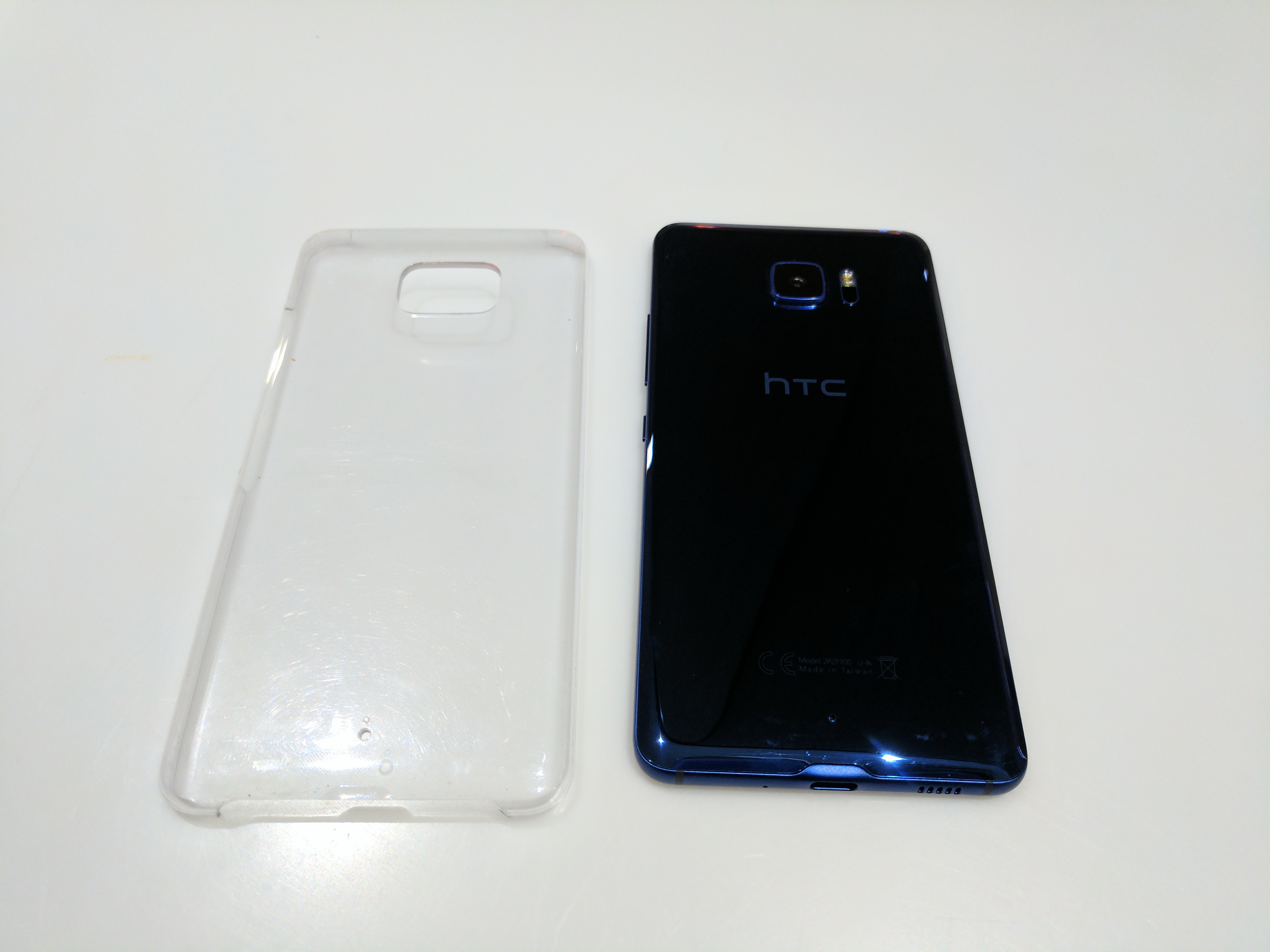
There’s not much except a quite large camera bump on the rear of the phone to interrupt that liquid surface, unlike previous phones there’s no antenna lines, though you’ll find those on the top and sides if you look hard enough. What it does have is a massive camera bump and flash/laser auto-focus. I`m not a fan of the size of the bump, and think HTC should have designed around it with either a wedge shape, or just making the phone thicker and filling it with more battery.
The liquid surface rear curves round to a metal side, which is almost seamless and the metal surface makes it easy to grip the phone. This makes the in-hand feel comfortable, but it’s also wide. We’ve seen a trend towards thinner, but taller phones of late with the G6, and the Galaxy S8 and this is a wider phone to hold which can make using it one-handed a little harder to manage.
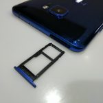
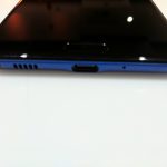
There’s not a lot on the sides of the phone to mar the clean lines either, there’s a volume rocker with a textured power button below on the left and a USB-C port on the bottom. A dual SIM/MicroSD tray on the top is about the only other thing on the side, but as it lies flush you’ll rarely notice it.
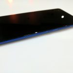
The front isn’t as pleasing. Flip it over and a rather uninspiring, almost featureless black slab greets you, broken up only by a rounded off rectangular fingerprint sensor on the bottom and a front-facing camera.
That front mounted fingerprint scanner was hard to hit, I often had to reposition the phone to get a good read, but when you hit it right it’s very fast. I’ve come to appreciate the rear-mounted fingerprint scanner of the Pixel and other smartphones and just find it hard to hit a front mounted sensor. That said, for some people it’s front mounted or nothing.
I’m totally not a fan of capacitive keys either, and the U Ultra has them; at least HTC has put them the ‘right’ way round for a stock Android user.
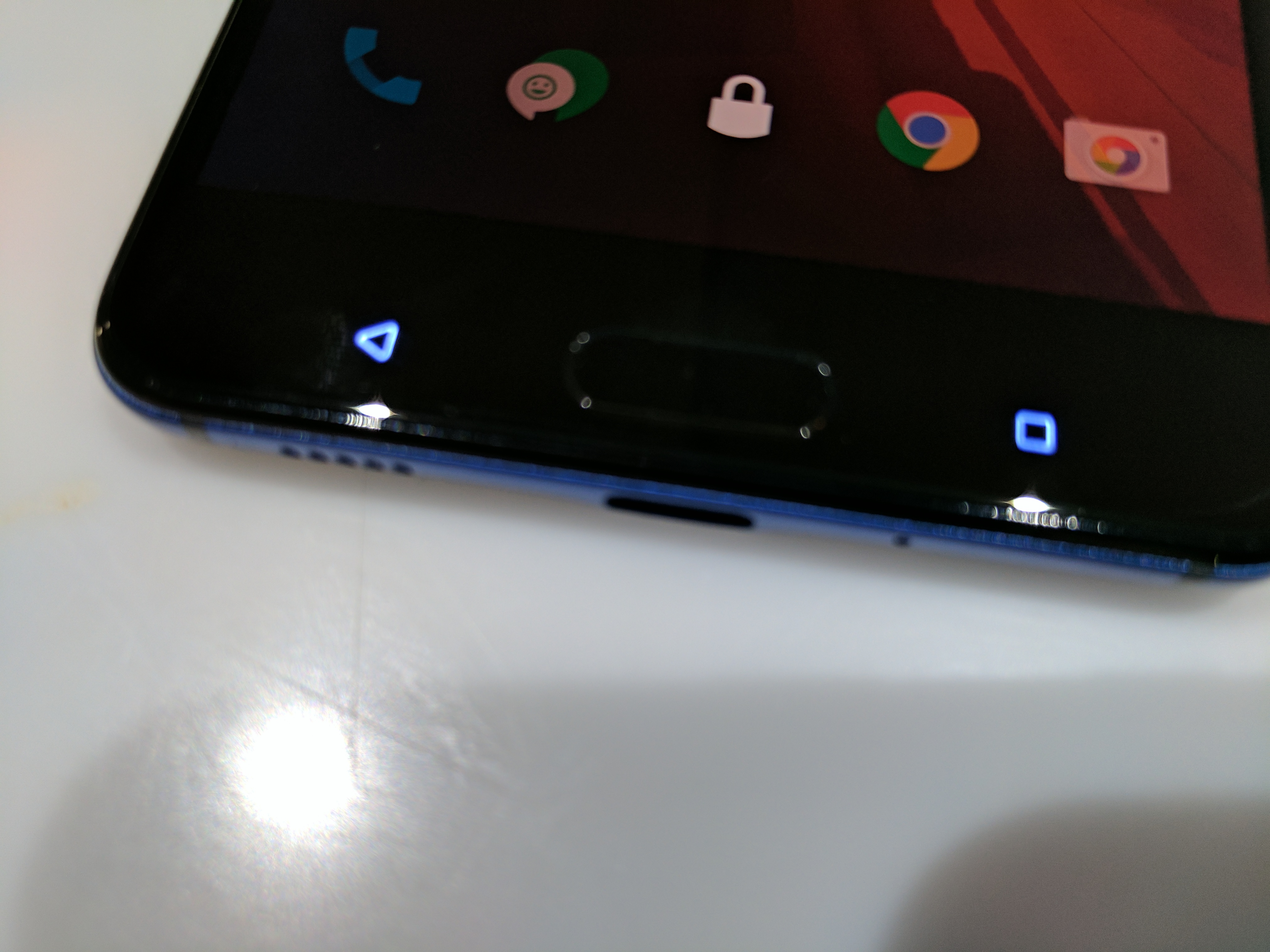
There’s one feature missing from the U Ultra which makes it harder to compete with this years flagships too: IP68 water and dust resistance. It’s not the be all and end all, but it’s something to consider.
What’s inside
The HTC U Ultra is essentially the flagship for HTC at the moment. We’ve been promised a higher spec model later in the year, but for now this is it but it’s using last years processor of choice, the Snapdragon 821.
The SD821 is a great processor, don’t get me wrong, I have no issues with it in my Pixel. It’s the comparison to the Pixel experience though that is really telling when you get down to it. I’ve become accustomed to instant, lag-free response and there’s small drops occasionally that occur just often enough for you to notice, but not often enough to really get angry about.
The phone does run pretty well for now though, HTC Sense is fairly light on and there’s no garbage gumming up the works so 4GB of RAM is for the most part more than enough. However there are times when the system drops apps and you may need to reboot
Storage wise HTC is starting off on the right foot with a base of 64GB, a microSD card slot bolsters the storage to a level where you don’t feel confined or forced to manage apps, pictures or videos.
A QHD resolution 5.7” screen is welcome with a higher dpi for smoother fonts and clearer pictures, but it’s also LCD so it’s not, and never will be Daydream certified. But for Google Cardboard it works.
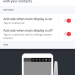
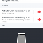
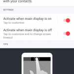
More interestingly, and a key design point for the U Ultra is the 2.05” 160×1040 resolution secondary display. HTC has apparently put a lot of thought into this part of the phone, and it adds a whole new area for notifications. I’ll admit to being skeptical about this display, but after two weeks I’ve been won over.
That secondary display is handy, but limited. The secondary display can have reminders, contacts, app shortcuts, weather and calendar events, and music controls.
While it’s great to have easy access to Google Play Music, I rarely use it, tending more to listening to podcasts, but Pocket Casts doesn’t show up there so it’s not as useful to me as it could be. I also rarely call people, so fast access to contacts isn’t useful to me, but for others it could be highly useful. I did find weather useful, as were the app shortcuts.
The secondary display does seem like it could be a little more useful in future versions given more time to develop functions and utility. I’d like to see what happens in the U Ultra version 2.
In terms of sound, gone are the days of dual front-facing stereo speakers, instead on the U Ultra you get a single speaker on the bottom of the phone next to the USB-C port. It’s a pretty decent sound to be honest from such a small speaker, good for playing a video or something but you’re not going to blow anyone away with the quality.
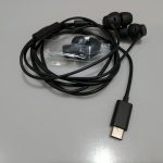
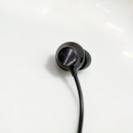
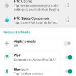
The other side of the sound equation are the HTC USonic headphones. Surprisingly for me and my usually odd-shaped ear holes these fit like a glove and really stayed securely in there. I’m not quite willing to go for a run in them, but they were pretty comfortable. The comfort is thanks to an array of rubber tips that come in the box, which means you can size up your ear canals for the best fit.
The in-line mic control on the earphones is a pleasant surprise, though with a single answer/play/pause button it lacks the utility of a more expensive set of earphones which generally come with a volume rocker as well.
The use of USB-C for the headphones is interesting, and forward thinking, but it’s been implemented poorly. The fact that these earphones only work on HTC U handsets is restrictive, and then combine that with the fact that there’s no USB-C to 3.5mm adapter available in Australia – it’s available in other markets, just not here – and it’s just a bad way to implement a new feature.
Apple may be earning the ire of millions by removing the headphone jack on the iPhone 7, but at least they throw in an adapter to
plug in headphones.
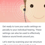
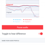
The adaptive sound for me was also hit and miss. I didn’t really feel any difference one HTC had scanned my ear canals if anything there was a little more bass, but that’s about it.
HTC U Ultra Camera
HTC has struggled previously with their cameras, in the U Ultra they’ve opted for a 12MP, 1.55µm pixel sensor with a f/1.8 aperture on the rear. That sensor with the larger pixel size is essentially what they’re calling “UltraPixel 2”.
A dual-LED flash and laser auto-focus on the rear, makes for what is, these days, a fairly standard camera setup for most flagship class phones.
A 16MP sensor on the front rounds out the camera specs. There’s no real bells or whistles with the front-facing camera, HTC has simply thrown a high MP resolution camera sensor on and left it at that. The front facing camera is, well, it’s there. It’s not hugely impressive, but I’m not the average selfie taker.
In good light, the camera on the HTC U Ultra excels, as most do these days, taking great shots like the ones I took around the The Grounds of Alexandria in Sydney, which is apparently the 9th most Instagram’d place in Australia and from these pics you can tell why.
In low-light, it’s certainly not bad, but could be better. During Canberra’s Skyfire II took a snap of an F18 flying past and it caught it pretty well even in the failing light. I took a pic in almost complete dark using nothing but the yellow light of a street light and it was fairly grainy, as was a pic over the lake in the pre-dawn light – but that’s a pretty hard test of any smartphone camera.
HTC has packed their phone app full of features, as has been their wont for a number of years now. HDR, Panorama, Slow Motion and Hyperlapse video and of course a Pro mode with RAW photo support. HTC also includes their Zoe video app, essentially a fast way to capture quick videos like GIFs that you can share.
The interface is fairly straightforward, and you can also launch the camera app with an easy double press of the power button, which gives you relatively fast access for taking a shot ‘from the hip’ as it were.
Suffice to say that the camera on the U Ultra is good, without being great, but in this day and age we can be pretty happy with Good on a smartphone camera, but on a $1,200 phone I really would be expecting more along the lines of great for my money.
HTC U Ultra Software
HTC has launched the HTC U series running Android 7.0, with the latest version of Sense, their OEM skin, integrated. HTC hasn’t always been great with their platform updates, but have attempted to keep their higher end devices on the latest version of Android, even if it is up to half a year after Google releases it.
The U Ultra comes with the January 1st security patch, when it was released in March. HTC hasn’t really committed to updating security patches as yet, but it would be good to see this kept more up to date.
Over the years, HTC’s Sense has evolved from what was a necessary inclusion on fairly ‘ugly’ stock Android, to a bloated, over-grown unnecessary encumbrance, to where we are today where Sense is not over-bearing and slides into the background for the most part.
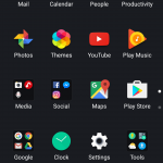
HTC has, like many other OEMs, changed the Homescreen, App drawer and Settings menu how they look, are organised and function – but even all this, for the most part, can be solved with a simple change of launcher to Nova, Action Launcher, or soon, hopefully the Pixel Launcher. Or, if you’re feeling adventurous, you can delve into the HTC Themes option which has a range of options ranging from the bizarre and gaudy, to simple stock like Android. Even the TouchPal keyboard (which is terrible) which is included on the U Ultra can be changed easily.
The settings menu can be a little difficult to navigate if you’re coming from another phone, like a PIxel or even other major OEMs. But it’s all there and you’ll find a wide variety of customisation within, including features like gestures – Double tap to wake, and the aforementioned double-tap power to launch the camera – as well as controls for the LED notifications, not complete unfortunately as I’d love to turn the ‘charged’ LED notification off.
Blinkfeed
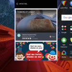
HTC’s Blinkfeed makes an appearance again on the U Ultra, it’s one of those inclusions where if you use it, you love it, if you don’t you find yourself not swiping right. You do get the most when you allow it access to your social media accounts, your location and start configuring Blinkfeed, or ‘Highlights’ as HTC calls it, but for me, I don’t really surf Facebook or go out to dinner (sorry Yelp recommendations).
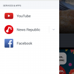
HTC uses an app called News Republic to show what they feel are interesting articles in Highlights, as well as on the Lockscreen if you let it. I found News Republic to be quite annoying and disabled it after a while as it kept showing me recommendations for restaurants in the UK.
Thankfully, you can turn off both News Republic and Blinkfeed in settings, so don’t worry too much about these if you find you don’t like it.
Sense Companion
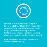
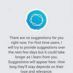
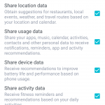
I’m a little confused by Sense Companion. When loading up the phone, you’ll be prompted to allow access to a lot of things, Location, Usage, Device and Activity data, and I allowed it full access, but I never got anything which I’d consider truly useful.
There’s optimisations for the phone including Boost+, but I’ve been wary of apps which offer to manage memory on my phone for some time. There was also notifications to charge my phone, something I felt was not really necessary, it felt a little forced, but if you hadn’t noticed your waning battery life, then it’s probably useful.
I never actually received a notification for a new place to eat out, despite being out around several notable areas in Canberra such as Manuka or Civic where there’s a great many cafes restaurants and more. I would like to see some of these as I do love food.
The weather notifications I did get, and welcomed. The secondary display can show quite granular, by the hour, weather forecasts including warning me of an incoming rain shower while out Pokémoning.
HTC U Ultra Performance and Battery
I’m quite a heavy smartphone user, as most are these days and find that most of the apps I use are often syncing in the background or delivering information in the form of social media, e-mail, alerts, messaging and more.
3,000mAh didn’t use to be considered a small battery, but in this day and age, it’s beginning to show. I found the U Ultra to be not quite up to the task of lasting a day on battery, possibly due to my heavy usage, but even phones like the Nexus 6P or Pixel lasted longer than this.
A morning ride, with podcasts playing and yes, catching some Pokemon along the way, will see the battery down to 30% after an hour and a half. On a more ‘normal’ day, leaving out the notoriously battery hungry Pokemon I found the battery still suffered, even just listening to podcasts and not really leaving the screen on, or using it I was only really able to get through to 1-2pm before needing to charge.
Charing on the U Ultra is quite fast though, with HTC utilising Qualcomm’s Quick Charge 3.0, there’s no wireless charging here which is a deal-breaker for some users, but a fast charge when plugged in is infinitely more impressive to me in the long run.
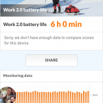
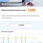
I don’t generally put much stock in benchmarks, instead preferring to rely on real-world performance observations which I’ve put in above. The benchmarks we’ve been using of late however give a broad, standard look at the performance and here’s how the U Ultra stacks up:
| Device | PC Mark Score | Battery Life |
|---|---|---|
| HTC U Ultra | 5348 | 6h32m |
| HTC 10 | 5,467 | 7h18m |
| LG G5 | 5,798 | 6h32m |
| Samsung Galaxy S7 (SD 820) | 5,860 | 8h25m |
| Samsung Galaxy S7 (Exynos) | 4,793 | 8h08m |
| Samsung Galaxy S7 Edge (Exynos) | 4,808 | 9h06m |
HTC U Ultra Connectivity
The HTC U Ultra has all the wireless connectivity options you could want, a wide-range of LTE bands cover the Australian bands, dual-band Wi-Fi 802.11 a/b/g/n/ac and Bluetooth 4.2, I had no issues with any of the wireless comms, and the Bluetooth signal is quite strong meaning I could walk away from the phone and still get music or podcasts playing over the air with no issues.
Wireless connectivity is fine, but Wired connectivity? Well, there’s some issues.
On the good side, we have USB-C with support for USB 3.1, which means you get great data transfer speeds, and you get that nice reversible plug and of course the increased power available using Qualcomm Quick Charge 3.0.
On the downside, you don’t get any headphone jack. I’m not overly affected by this, having moved over to bluetooth earphones years ago, but I was in a position mid way through this review where I hadn’t charged my earphones and didn’t have the HTC earphones, which connect through the USB-C port, on-hand and hence couldn’t listen to podcasts.
It’s a mix of good and bad, there’s much to like here, but the lack of headphone jack isn’t a 100% acceptable
HTC U Ultra Conclusion
HTC’s U Ultra is a mixture of really pretty, and decent hardware, but is really priced at way too high a price for what it offers.
I’ve been using the U Ultra for a solid 3 weeks now, and it’s not been the handset that I wanted it to be. There’s been some performance issues, I’ve found the camera to not be quite at the level that I was expecting, it has the feel of an older model design styling and there’s no waterproofing. Overall it’s not been the exciting device I wanted.
That said, it’s as pretty as hell in that sapphire blue colour and certainly turns heads, but it’s not as high end as it should be for that price.
You’ll note that it’s the price I keep coming back to. With rumours circulating of a ‘premium’ high-end smartphone from HTC just around the corner, the U Ultra is an enigma as to where it stands in the HTC range. Is it a stop-gap? I just don’t know. HTC has certainly priced it as a flagship, but it doesn’t check all those boxes.
For my money, there’s better options out there, but if HTC decides they want to re-think the position on the price, this would make a heck of a purchase at the super mid-range price point.







Single speaker???
HTC have rocks in the heads with that pricing…
The LG V20 with a much better DAC and dual-display can now be had for less than $650…
On a side note, daydream certification does not really make a difference to me. It’s supported by such a small number of phones, and out of those, only the pixel has any appeal…
As someone who is looking to replace his G4 this year the main thing I always look for is value for money. Only a 61% rating from this review, so I ‘ll give it a miss. Btw, I see hardware (versus costs) as the most important thing, as software I think is irrelevant considering everyone seems to put on their own favourite apps anyway.
Random question – what’s the messaging app in the shot highlighting the capacitive keys?
The icon? It’s HTC’s SMS app.
So finally u gave 80% rating for it ….???
Well played
HTC is just all over the place. This phone looks an exact clone of the Samsung that I just can’t look past it being a knockoff. HTC has some great design language with their earlier M phones but now it seems they are just desperate to get ahead by copying at all chances. The blue is very nice but yeah … I just can’t get past the rest. They need to go back and focus on themselves rather than trying to match the rest (literally)… they are letting their devices fall over where out counts – performance, support etc.