After stagnating for over a year, the YouTube app for Android TV is finally getting an overhaul with some much needed tweaks to the interface and fan requested features.
The first feature, perhaps the most significant in terms of usability is that you can now turn off AutoPlay in the settings menu. You also get a five second window to stop new videos playing, but if you’re not a fan of AutoPlay – turn it off.
The app has seen decent visual changes in both the menu, player and settings menu.
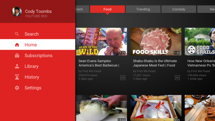
The navigation drawer is now much lighter, with Uploads, Watch Later and Purchases removed. In the main view you now get tabs across the top with different topics such as Trending, Food, Technology and of course, the YouTube Originals selection gets a bit more promotion.
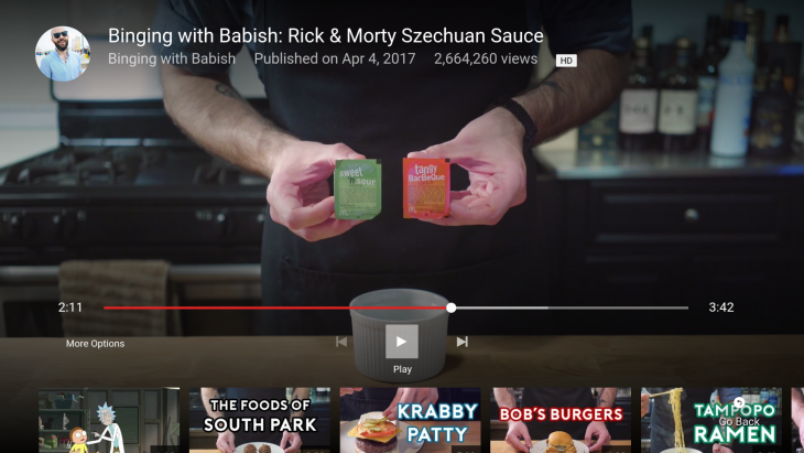
The player itself gets a better control system, with the red bar that used to grace the player removed and the controls dropped down so you can still see the video playing in the background. The fast forward/reverse buttons are gone, replaced with skip to next video/last video (a preview of each pops up when you hover).
There is also now a ‘more options’ menu that houses all the options that used to sit beneath the controls, the more options is now off to the left.
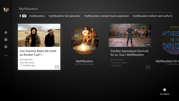
While changes to the player and interface look to be a usability improvement, changes to search may not be. Some elements, such as search suggestions are now a little harder to reach.
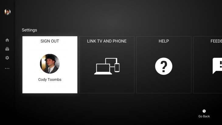
The YouTube Settings menu gets an overhaul, there are now large tiles instead of more easily viewed settings toggles.
There’s been some tweaks to colours which are a bit darker, with the white text font a little brighter and larger especially on the navigation drawer. The redesign is mostly pretty good, but may take some getting used to like any update.
If you’re an Android TV user, check your Google Play for an update and get downloading.


