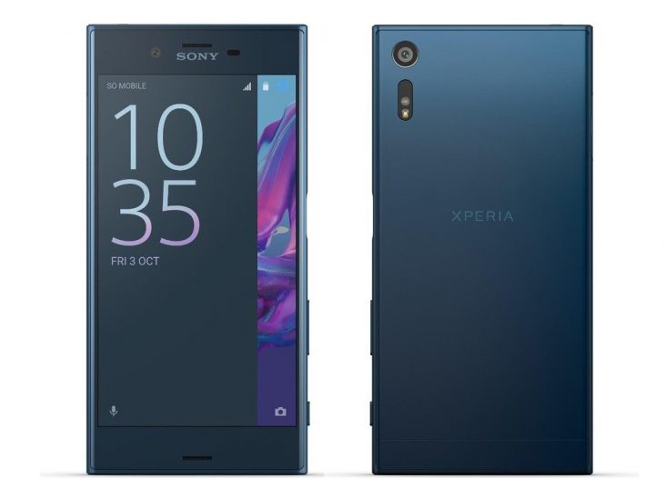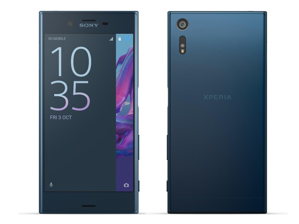
Old. Boring. Tired. Uninspiring. This is how I, and a lot of other people, see Sony’s phones. In a world of beautiful curved 18:9 displays and minimal bezels Sony’s phones stand out for all the wrong reasons. Their phones, for so long now, have had the exact same design language — blocky, square sharp corners and massive bezels. Finally it seems like they are going to change to a more modern and appealing design.
In an interview with The Indian Express Sony’s Indian managing director Kenichiro Hibi has said that although the design of the X series devices will stay the same their new generation of phones will not.
We have deployed an omnibalance design as long as the X series continues to be available in the market. Also, we are planning to launch new generation of products and you can expect a complete new design from the devices
Mr Hibi went on to infer that Sony will be looking at adopting a near bezel-less design for its next generation flagship which he said will launch “soon”. Of course he was not willing to share more than that but considering we are getting close to the Christmas shopping period they would have to announce and launch very soon if they were to take advantage of that. If they do not make that in time we would expect an early 2018 announcement, launching late Q1 2018.
Sony make some decent phones. Their hardware is solid and their software is quite good. Unfortunately their design is terrible and their sales have suffered because of it. It is good to see them finally admit that they need a design refresh (however long overdue) and I definitely welcome it.
Would you consider buying a Sony with a design refresh that includes an 18:9 display and a near bezel-less design?


I don’t want a 2:1 display (WTF is with calling it 18:9 anyway) I just want the phone to shrink around the existing screens
I actually don’t mind the bezels. It’s provides proper real estate to grip the phone with. I am actually able to hold my Z3 Compact with one hand and take photos using the physical shutter button. Can’t do that with any other phones especially if the screens goes all the way to the bottom, or if it has capacitive buttons.
At least they look different to the pack. Immediately recognisable as a Sony. But yes they do need to reduce the top and bottom bezels.
Don’t go overboard, we have a choice between two types of corner – ‘sharp’ and ’rounded’. Most fashion victim designers have gone all rounded, to the extent of rounding the display too to get rid of bezels – but have created problems of dead area and notches in the rectangular screen space as a consequence.
Sony are probably better off keeping with sharp corners to be distinctive in a world of boring and problematic roundness.