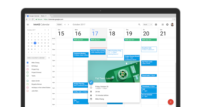
In a blog post this morning Google has announced that the Material Design update for Calendar on the Web we saw leaked a couple of months back is now official and rolling out.
The refresh includes an updated colour scheme and responsive design that is able to scale to your screen size automatically. As well as looking better, the update also includes several usability updates as well.

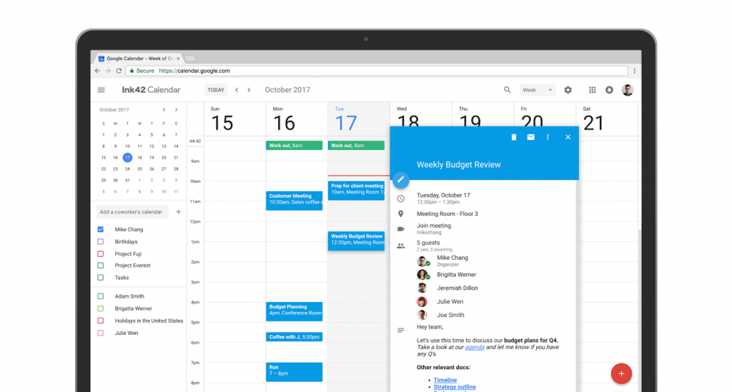
The updated functionality is mainly aimed at enterprise level users with tools to see conference room bookings and facilities more easily. Invites can now include rich formatting and hyperlinks allowing you to link spreadsheets, documents or presentations relevant to the presentation.

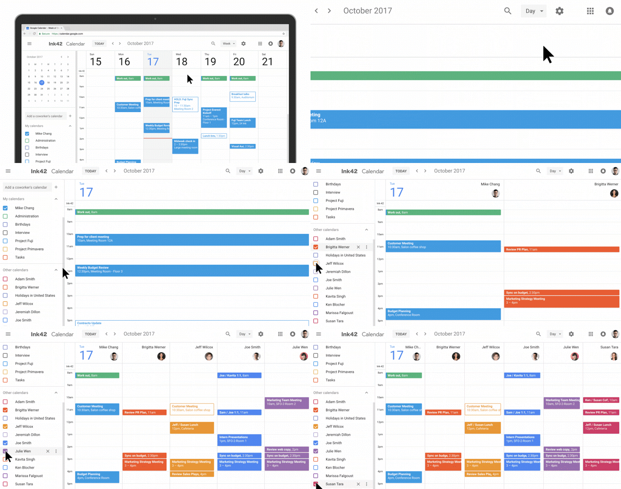
You can also manage multiple calendars in a side-by-side ‘Day’ view in separate columns, great for managing a managers calendar.

That’s not all though, for those looking to update attendees, a new option allows you to hover over invitees in the invite to see contact info. There’s also easier access to Day, Week and Month views.
The rollout of all the features is set to be completed by late next month but you should have t


