
If there was ever any doubt, it seems that 2018 is the year of the notch. Sure, it originated last year with the Essential phone but was made popular, acceptable and mainstream but the iPhone X. Like it or not it is here to stay (for this year at least). OnePlus are following the design cues of seemingly every manufacturer, aside from Samsung, this year with the OnePlus 6.
In an interview with The Verge Carl Pei explained their reasons behind the inclusion of the notch. It seems strange that they would reach out and do this before the phone is even official but I suspect they wanted to get ahead of the notch naysayers before any (more) negative publicity. Carl explained to The Verge that in a bid to maximise screen real estate the notch needs to be there if you want the maximum sized display possible.
What you are essentially doing is moving the entire notification bar up, giving users more content on their screen
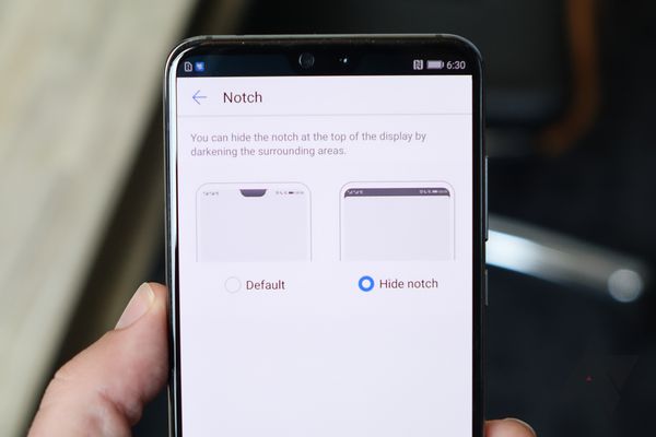
So many phones this year have had notches but very very few of them have had software capable of dealing with it. We have seen Huawei introduce a software tweak that allows for the top section of the display (Jason is currently working on an article regarding this), the height of the notch, to become a black bar, thus hiding the notch. OnePlus are expected to have a similar tweak on their phone with Carl stating that they had implemented their notch with a lot of thought and care.

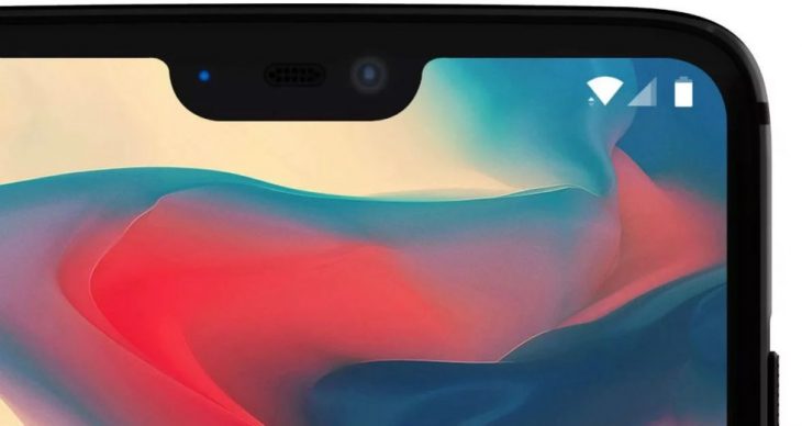
OnePlus have made the notch as small as possible without affecting the functionality of the earpiece, camera or any sensors. Their notch will be 19.616mm x 7.687mm.
Our notch, it will be there…. it’ll be bigger than the Essential Phone, smaller than the iPhone.
OnePlus have gone to painstaking lengths to ensure that their notch does not affect the function nor aesthetics of the phone and have tested the Play Store’s top 1,000 apps with it. The clock is moved to the left of the display and the notch will be automatically hidden whenever video is played — something the iPhone X does not do.
According to Carl, screen manufacturers now give all phone manufacturers the “opportunity to make cutouts at the top of the screen” so it is no surprise OnePlus decided to do this to maximise the display size. As a result the OnePlus 6 will have a screen-to-body ratio of 90 percent with the largest display OnePlus have ever used. The phone will not be any bigger than any other OnePlus phones.
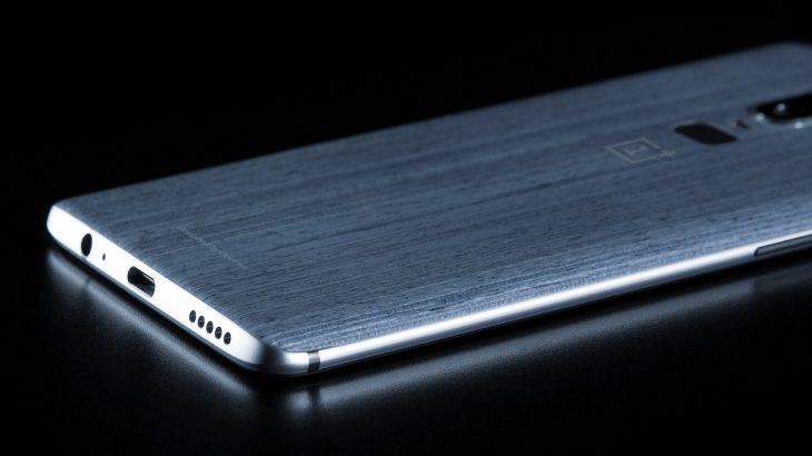
OnePlus also confirmed that the OnePlus 6 will not be identical to the OPPO R15, something we confirmed yesterday when Evan Blass leaked an image of the back of the OnePlus 6.
So there you have it. The notch is effectively the new bezel and status bar icons are absorbed into the space either side of it. I also like the idea of hiding the notch in general use ala Huawei’s P20 line: hopefully more manufacturers implement this tweak.
I’m now convinced that the notch is the way of maximising the display for now and it can be functional without affecting the aesthetics of the device. How about you?


I’ll never understand some people. They continue to put up with abominations like the hamburger menu, placed at the top of the screen, away from your fingers & thumbs, hiding key functionality. But someone puts a gap in the top menu bar to incorporate a camera to image their ugly mug – in an area that generally has nothing in it and is wasted – and suddenly they lose their minds. There are many more important things to get up in arms over first – like the massive overpricing of the phones in the first place, the lack of support… Read more »
Absolutely ridiculous… it’s like having a seat in your car or home that you cannot sit in. Please stop trying to find reasons why it is there . It is a mistake. Will always be a mistake.
Hey, while your at it why not place a pillar in your lounge room between you and the tv. I’m sure you’ll find a way to talk that up to… sheesh.
So your opinion is the only opinion. I absolutely disagree with you. If you had of read the article you would see you can control it
Which proves my point…there is no need to have it as it has no benefit…it serves NO purpose whatsoever. So let’s move the seats around so I can use another instead…sheesh…
Double post
What Apple understands and a lot of tech journos don’t is the aesthetics of imperfection. Add an irregular detail to a simple shape and you make it more visually interesting and memorable than a similar shape without that detail. It may not be logical and might actually hurt useability but aesthetics is just about the only meaningful differentiator left in the smartphone space.
What twaddle, can you name one other Apple product at all that references “aesthetics of imperfection” Apple as a whole is obsessed with exactly the opposite.
It’s a pretty well known and widely accepted design concept, maybe your understanding of design is “twaddle”. Apple is just one of many smartphone manufacturers starting to implement it to differentiate their products, you can also see it in the orange power button on the Pixel 2 XL, the original galaxy edge, and the original LG v20.
Can you provide me with some sources for this as I’m keen to understand more about how Apple reference this design, particularly what Jony Ive has said on the subject as head of design.
Where is this found in Apple products as I must be missing something.
Kudos to you Scott for stating the facts rather than majority of journalist out there who says “copying iPhone X notch” as a form of clickbait. You are the first person I know who provided the correct information. In regards to the notch, I think it’s pointless, the S8 has a great screen to bezel ratio and this poor excuses from other manufacturers who included a notch is not really practical in my books. You lose that screen real estate when you watch a movie, play games and look at websites and this is th main use for a smartphone.… Read more »
If the notch is controllable to do things like have the time on one side and signal (mobile and wifi) on the other then it would work well for me. Black with white text and icons and maybe a colour status indicator to replace the status light.
Other than that I don’t want anything to appear in the notch, of course everyone is different hence the control
The way Apple did it sucks.
That reasoning is BS. They should’ve gotten rid of that chin, too, if they wanted more screen real estate. Why settle when you can copy?
from the Verge “At the bottom of each display is a ribbon for connecting it to the device’s logic board, which necessitates at least a thin “chin.””
Unless they want to wrap the display underneath like the iphone which would increase the costs a lot.
Can the be located across the top negating the need for chin and notch?
I’m not sure why, but the notch thing continues to make me unreasonably angry *rageface* 😉 Maybe that will change when I actually use a phone with the notch in the wild. I’ve got the S8+ and there’s no lack of screen without the notch.
Re the ‘turn rest of bar black’ Huawei workaround, I think it’s like the ‘disable Bixby button’ i.e. by dint of effort you can almost make it like they hadn’t done it in the first place.
I’ve never really had a problem with it as a concept, it was only ever Apple’s execution that bugged me. With the ability to turn the status bar black, the concept is much more workable.