[dropcap]T[/dropcap]here’s no getting away from it, last year’s Galaxy Note 7 was a massive success for Samsung, garnering favourable reviews almost across the board. The subsequent issue of phones catching on fire thing was a pretty big setback for them which affected their financial bottom line. Samsung turned that around however, ultimately recalling the phone after an interim solution failed to address the issues. To restore consumer confidence, Samsung released details of what went wrong, and put in place an 8-point battery safety check for the company’s entire range of mobile devices, including the Galaxy Note 8.
There are a lot of fans for the Note series; the fact they sold out refurbished Note 7 (FE) handsets in South Korea shows the Note brand was ready to regain the crown. At the launch event for the Note 8, Samsung addressed the controversy and then moved onto address those same Note fans, unveiling the Galaxy Note 8.
Unfortunately, the upward trend in smartphone pricing continues, with the latest Note handset priced at $1,499, which compares rather unfavourably with US pricing to the tune of about $200 more expensive. Outright pricing need not deter customers, though, as the Note 8 is available from almost every carrier in Australia. We’ve rounded those up for you if you’re still looking around.
Another way Samsung is looking to take care of their fans is with a screen replacement program called ‘Screen Assure’. Galaxy Note 8 owners get a free screen replacement and that’s a big factor to think about when you’re buying a phone. Especially a phone with an ‘Infinity Display’ that’s fairly expensive if you need to replace it when you’ve dropped it.
In his review last year, Duncan fell in love with the Note 7, then dealt with some withdrawal issues when the phone was sadly recalled. Writing the Note 8 review, for me at least has become a similar experience – though without the fiery ending. The Note 8 is good…damn good. Want the low-down? Here we go.
The Phone – Design and Hardware
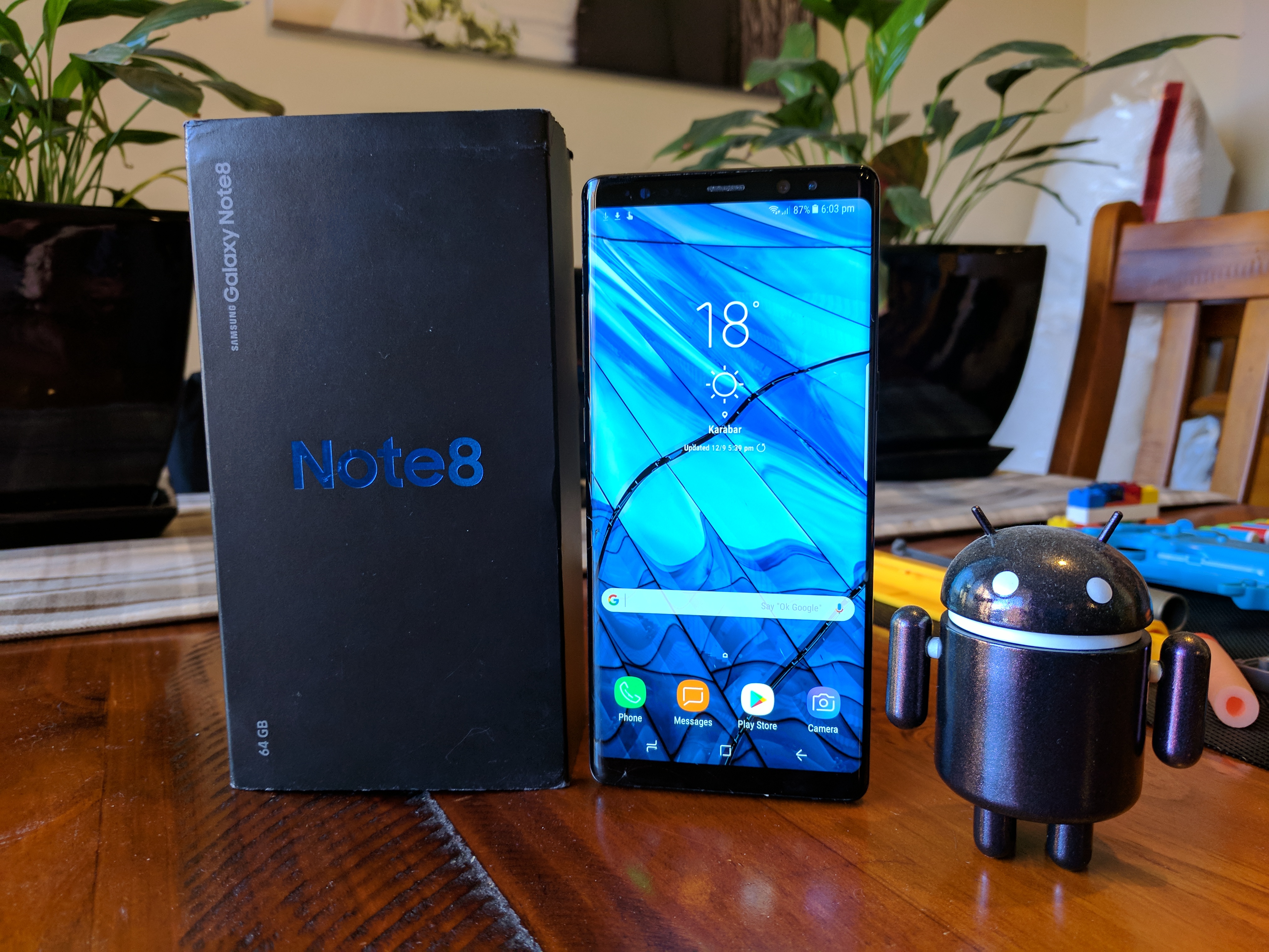
Samsung’s Note series has always been premium in terms of design and indeed components, and the Note 8 is no different.
Starting with simply how the phone is designed, you get a beautifully tall handset which is determined by the use of the 6.3” 18:9.5 Aspect Ratio ‘Infinity Display’, which Samsung introduced on the Galaxy S series earlier this year. As a design decision, the screen allows the phone to be a little taller, but much slimmer making one-handed usage a breeze, though reaching that top area one-handed is still quite hard. That larger screen gives you a lot of usable space for things like dual-window mode or even just writing more on the screen when using the S Pen.
The WQHD+ (2960 x 1440) resolution on a 6.3” AMOLED display gives a very pixel dense 521 pixels per inch making it well suited for viewing details. There’s less gradation in things like text, and it looks stunning in terms of colour and clarity.
The screen is so good in fact that DisplayMate gave the Note 8 screen their first ever A+ rating…and for good reason, it has a peak brightness of 1240 nits, reflectivity of just 4.6% and covers 112% of the DCI-P3 colour space – and it looks just as good in person as it sounds. It’s big, bright and holy god it’s beautiful. Samsung sure knows how to make a display for a mobile phone.
The single downfall I found with the dripping curves of the Note 8 screen was in usability. Text selection or tapping a target right on that curve is difficult, it takes a few attempts, and though it works eventually it’s not the best user experience.
The infinity display is all glass, as is the rear of the phone with an aluminium chassis joining the two pieces together. It’s a symmetrical look and feel for the handset which can have the effect of holding it up the wrong way when you pick it up blindly, but as a phone design it’s beautiful and very pleasant to hold – though I’m still queasy about all glass design phones, so this will be going in a case. Samsung mixes things up with their designs in terms of functions. The power button and volume rocker are on opposite sides of the phone with a Bixby button on the left just under the volume rocker. This can be beneficial with muscle memory reminding your fingers which way the phone should be when you pick it up.
While the top of the phone is fairly boring, housing only the SIM card/MicroSD card slot (yes, there is one), the bottom of the phone is very busy. The Note 8 has a USB-C port, headphone jack (yes, they were courageous enough to leave it in), the S Pen holder (and S Pen obvs) as well as a bottom firing speaker.
The rear of the phone has a new feature with a dual-camera setup now housed in the ‘box’ that Samsung now has. That box has a dual-colour LED flash, and the fingerprint sensor, which is just as hard to reach, if not harder given it’s a taller phone, than the Galaxy S8. Samsung has doubled down on other forms of biometric security including face recognition and of course iris scanning which launched on the Note 7 makes a return and is very much pushed as preferable to the fingerprint sensor. I, and many other people however prefer to use fingerprint scanning and that sensor is placed awkwardly – though a case does make the sensor a little easier to find.

Colour wise, Samsung Australia has given us short shrift here in Australia offering only the Maple Gold and Midnight Black colour options. The Orchid Gray colour launched with the S8/S8+ is not offered here, nor is the absolutely stunningly beautiful Deepsea Blue which launched with the Note 8. If you’re a holdout for these colours, Samsung did introduce the Coral Blue version of the S8/S8+ as a mid-season refresh recently so there is hope is that these colours will be made available here, but at this stage Black or Gold are your options.

That’s not to say that the Black or Gold aren’t beautiful, because they are, that Deepsea Blue is stunning – although if they want to release that British racing green they launched with the Galaxy S6 I’d be ok with that too.
As a whole though, everything fits, and fits well. It also looks good, even if you get the ‘boring’ black colour. It’s just a beautiful phone to look at.
In terms of compromise I just don’t see it here, the phone is beautiful to look at and is built with precision and care. Build tolerances are very small, with no ridges or creases for things to get lodged in over time.
Powering the Note 8, Samsung hasn’t skimped either. An Octa-Core Samsung Exynos 8895 SoC runs the show. In other parts of the world – the US and China – the Note 8 is powered by the Qualcomm Snapdragon 835 but here, we get the Exynos and I have no issues with that, there’s some areas that could be better but for the most part the Exynos equivalent is very, very good.
Also included is 6GB of DDR4 RAM, a big step up for Samsung, and a spec bump we’re starting to see in other manufacturers handsets such as the HTC U11. We’ve always said that Samsung with their Touchwiz, now Grace UI, overlaid over Android would benefit from more memory and it’s evident on the Note 8. The UI runs much more smoothly than I’d previously remembered any Samsung phone running, it simply shaves of those micro-seconds of waiting for something to happen making the transition animations that Samsung seems to love now seem more fluid.
The storage is at base, 64GB. Samsung announced the phone with 128GB and 256GB models but in Australia they only sell the 64GB model. It’s a controversial decision with some competition going with higher end options, but the inclusion of a microSD card slot in the Note 8 does offset some of the rage at least. With 4K video and some games exceeding a few GB these days, that additional expansion is not just nice to have, it’s almost a necessity.
The camera bump is not really a bump, but more a ridged border around the fingerprint sensor, and of course the dual-camera sensor setup on the rear. That dual-camera houses two 12MP sensors in a side-by-side configuration. It’s similar to the Galaxy S8 setup, but considering the quality of photos you get out of the Galaxy S8 it’s not a bad thing. The addition of a telephoto camera capable of 2x Optical Zoom is a bonus, but we’ll get to that later.
The rest of the hardware is great too. You get IP68 water and dust resistance so you don’t have a lot to worry about with the phone getting dirty or wet, it’s not time to go diving with the phone (we’ll get there later), but it’s a good spec to have when your phone gets dirty that you can stick it under a tap and clean it up nicely. A headphone jack is a major win for anyone not quite ready to adopt Bluetooth headphones yet, but it’s likely this will be the last Note model with it, so enjoy it while you can. A pair of AKG headphones is included in the box, so you can take advantage of those when you need them.
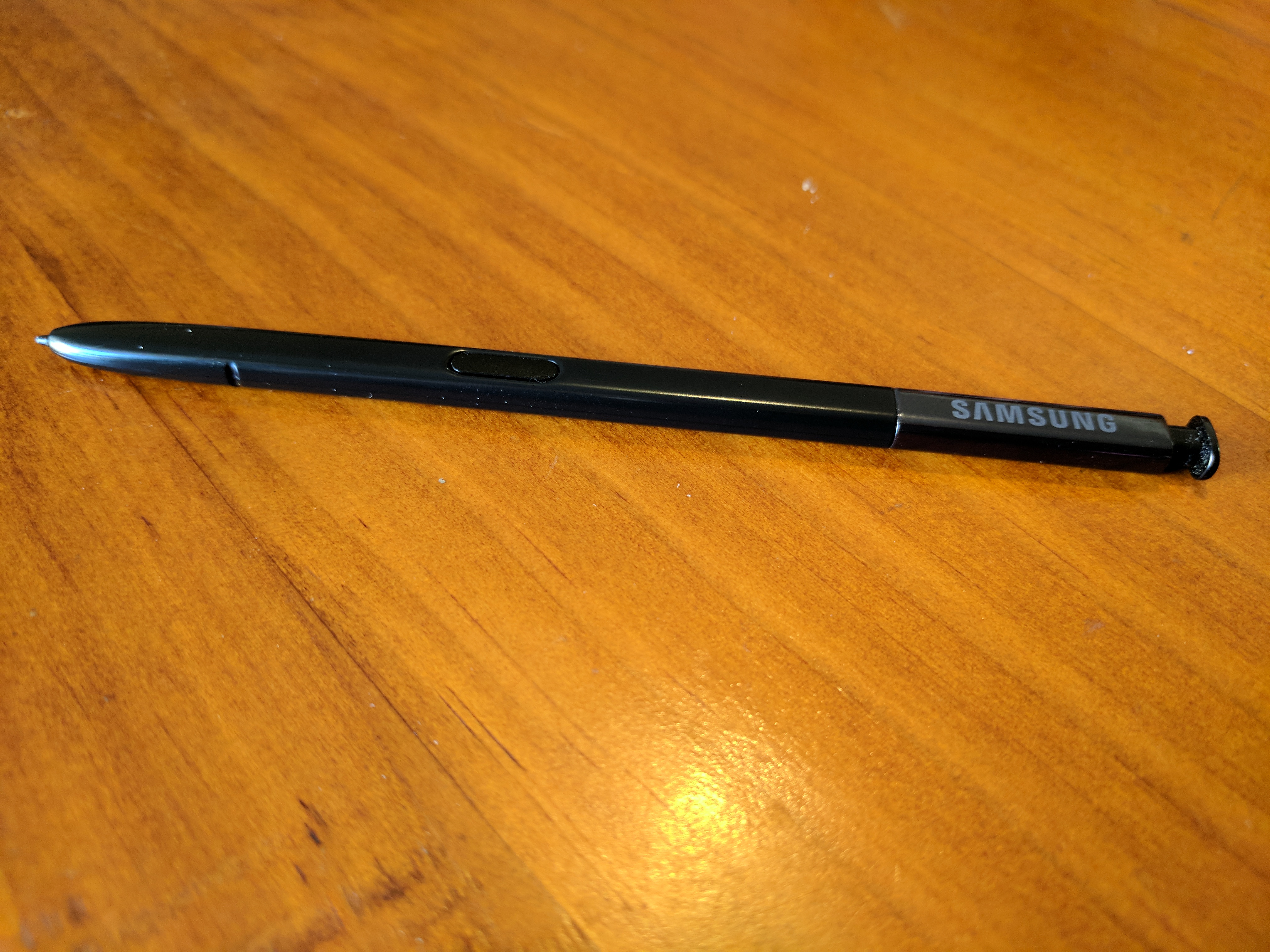
Lastly, the S Pen is back. It’s essentially what you’ve come to know and love, and all those features you use with it are back with a few little minor alterations to make it easier to use, like having the app ring full of S Pen enabled apps appear on the screen whenever you eject the S Pen from its home on the bottom of the phone. The excellent screen-off memo writing feature is back, and it too has been improved upon with additional pages of notes able to be added. It’s pleasing to see Samsung putting their software developers to good use these days improving function rather than adding in drippy sound effects or re-designing Android where it doesn’t require it.
The Camera
Samsung has got it right with the camera. That’s pretty simple, if you’re after class leading camera on Android hardware then Samsung is right at the top of the list. Adding in a dual-camera setup on the Note 8 has allowed them to improve on a few functions like the 2x Optical Zoom which is handy, but it also allows them to play around with depth of field effects like bokkeh – an effect which brings the fore or background into crisp focus while blurring the rest.
The depth of field option has been labelled Live Focus by Samsung, it’s an effect you have to choose when taking a photo as it differs from a standard snapshot by taking in all the information about a pic effectively tripling the size of the image information. You can select from the close-up or wide-angle view, then change the background blur as required.
There are a number of other options in camera you’re able to choose like Panorama, Slow Motion, Pro Mode (RAW files yaaay!) and other effects but the fact you have to choose them which makes them somewhat less useful than I’d like. It’s not going to be a standard feature of your photos for sometime at least until the hardware catches up, but luckily if you have time to frame your shot and plan it out you probably won’t need it.
You can access Bixby Vision, or Stickers from the camera menu, swiping left and right through the options. The stickers are a bit of fun, but Bixby Vision remains pretty useless for now.
Luckily, if you’re not really into using effects, and more inclined to open the camera and snap a shot off the cuff like most mere mortals, then you’re going to be very pleased. There’s much to be said for Samsung’s image sensors, allowing you to capture great photos in good, or even low-light thanks to the f/1.9 aperture on the main camera.
Low Light:
There’s of course some softening of the image around the edges and the colours are sometimes a little bit too warm (though it looks better on a computer display) which isn’t the ideal end result, but unless you’re looking for some of these things you won’t notice them what you will notice is a great photo that for the most part just picks up whatever your shooting and captures that memory.
I’m very much pleased with the 2x optical zoom option which lets you capture just a little closer to what you want, or use the ‘Dual-Capture’ option to perfectly capture a portrait, or the surrounding areas as well, and then switch between them. There’s an option to zoom up to 10x digitally, but unlike Sony’s 5x digital zoom I found Samsung’s digital zoom offerings to be a little less well implemented, so there’s a point to Sony.
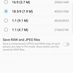
The camera sensor has some weird options though, with the 12MP sensor only capturing in 4:3 Aspect Ratio (AR) if you want the full 12MP. If you use the default setting, you’ll be capturing in 18.5:9 AR which fits the screen a lot better, it’s not a problem as such, but something to be aware of when you’re out taking shots.
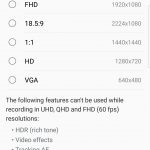
When it comes to video there’s also some riders. You can’t capture the High Dynamic Range (HDR), use video effects or the Auto Focus Tracking when using Ultra HD, Quad HD or capturing Full HD video in 60fps (standard FHD is fine). There’s limitations but hey, I’m Ok with that because what the phone does capture is fantastic in video. Like when I took this video on a recent trip away with the Note 8:
There’s one final tick for Samsung in the camera department – double press power to activate camera. It’s a wonderful shortcut I got used to on the Google Pixel and it’s been useful on every phone I’ve used since to capture those shots where something is happening right there and then – like a turtle surfacing nearby as you’re standing on a dock waiting for a boat.
If you’re really wanting a better look at what the camera on the Note 8 is capable of and how it does it, check out Neerav’s article which has even more sample shots.
What does it do well?
In short, the Galaxy Note 8 does almost everything well. From the design of the phone, except for a few key points you can see further down.
I’m decidedly happy with the new 18.5:9 aspect ratio of the screen which allows you to hold the phone more comfortably in one hand than the previous wider phone designs of yesteryear, though with a Galaxy Note you will be pulling out that S Pen to use occasionally so it’s not the phone that you want to use one handed it’s just more comfortable to hold. Of course that begs the question of whether you want to use the S Pen, because if you don’t then you really should be looking at a Galaxy S8+ which you’ll find for an excellent price in a range of beautiful colour options, with the only real other feature missing is the dual-camera.
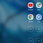
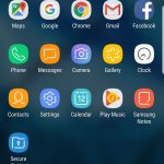
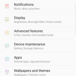
The software side of the equation it seems Samsung has finally done right. From scaling up the amount of available memory to the way they leave Android alone for the most part. Of course if you’re used to stock Android on a Pixel (Nexus) then you’ll notice small things like the Settings menu, launcher and Quick settings/Notification area are very much ‘Samsungesque’ but it’s in an easy to navigate, and staid design that finally made me relax into using Grace UX – a win for Samsung. Of course Bixby is another thing which you can read all about further down. It’s not all roses with the Note 8 software though which I’ve outlined below.
I’m not a fan of useless bloatware on devices, but I’m more forgiving when the base storage starts at 64GB. Samsung, indeed every company, has an agenda when it comes to including apps on their devices. For Samsung it’s a partnership with Microsoft which sees some of their apps installed, but having Word, Excel etc present is more a help than a hindrance for me at least.
S Pen
I gotta say I love the S Pen. As a long time Palm Pilot user I love the stylus life and with the S Pen you get a lot more utility than you got with any of those old PDAs.
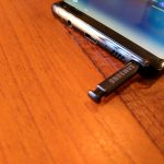
Samsung has been improving the S Pen hardware for some time, this year it’s got IP68 waterproofing to match the phone and it’s got finer grain sensitivity than the Note 5 (the previous Note that remained on-sale) which makes for a very fine nib when you need it. The S Pen itself is quite nice to hold, though for me it borders on being too thin, but it works as a pen to annotate all your drawings, sign something, get better screenshots or just doodle on a photo.
The biggest win for me in terms of function of the S Pen is the Air Command menu that opens up automatically when you extract the S Pen. It’s easy to use, and also has the option to add other shortcuts if you want to customise.
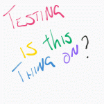
Samsung has improved the S Pen functionality on the Note 8 with a new feature called Live Message that will create a gif of you writing a message that you can share essentially anywhere you want. There’s different types of backgrounds (including photos), and you can choose brush type and colours to use. Where would you want to use it? Well, my wife loves the messages I send this way.
Another improvement is with the screen off note-taking (this feature is GREAT!) is that you can now take longer notes than ever before allowing you to really take a bunch of notes without the phone screen ‘on’ and distracting you.
So, there’s a lot to like about the S Pen, Samsung is undoubtedly the top of the heap when it comes to stylus driven improvements on mobile – but I do have one issue: Remembering that it’s there. I don’t always use it and it’s like a massive surprise to remember the S Pen is there every time. If you’re a dyed in the wool Stylus fan though, this thing is great.
What doesn’t it do well?
There’s a couple of key areas that I feel that Samsung fails at with the Note 8: Battery Life and Bixby.
Battery Life
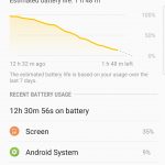
That battery saving is really needed too because after last years kerfuffle the Note 8 has less battery than the Note 7 and it shows. There’s a key difference you’ll see when reading reviews of the Note 8 from the US verses the rest of the world, with Samsung using the excellent Qualcomm Snapdragon 835 in the US and China, while in the rest of the world we get the Exynos 8895.
While the performance of the Exynos 8895 is on par in terms of speed, it seems Qualcomm has it in terms of power management. It’s not fair to do a direct comparison but anecdotally when moving from the SD835 packing Sony Xperia XZ Premium (which has a 3,230mAh battery) to the Galaxy Note 8 (which has a 3,300mAh battery) I got better results from the XZ Premium with longer life and more screen on time than average.
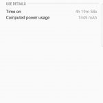
Put it this way, I was on a cruise ship for 10 days, during that time I maxed out with no Cellular radio activity (Wi-Fi only) at around 12 hours with about 4 hours screen-on time. Even before getting on-board I was averaging about this sort of time frame anyway. While the XZ Premium with full radio managed to hit a much better usage profile for me at least, Jason also found the SD835 packing HTC U11 had excellent battery life on par with the XZ Premium, so while understandably Samsung has been conservative here, there’s also better results to be had in modern smartphones.
Bixby
I just can’t fathom nor forgive Samsung for putting this useless Bixby button on the side of this beautiful phone. I can’t remap this to something useful, but thanks to your latest software update I can at least disable it – but even that is still not enough.
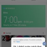
As a whole if you’re using Bixby then you’ll find that Samsung has a looooong way to go when it comes to phone assistants. Not even talking in the contexts of virtual assistants like Google Assistant, Cortana and even Siri, Bixby is just bad at performing functions like even understanding you. Whether it’s a result of not having the correct Australian English data required to translate what I say into a function or just that Samsung doesn’t care, but Bixby is not useful to me and I spent more time trying to get Bixby to understand me than was even worth my (or anyone’s) time investing into it.
Samsung needs a virtual assistant to integrate with their eco-system of automated home products like Samsung Things, or even their home appliances like fridges, washing machines and air conditioners, but until they can get it right, Bixby should not be a foremost concern to them. Launching Bixby and forcing it on users who have paid good money for a near perfect piece of hardware is a travesty that Samsung would do well to pull back from for the time being until they can really nail down both the voice recognition side of things as well as the functionality side.
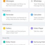
Samsung has included tutorials on what Bixby can do, including examples like ‘Open Calculator and calculate 5 times 10’ or ‘Open Facebook and post the picture I took’.
If you want to take the time to start using Bixby it may get better, but it’s just not something I care to invest too much time in after multiple voice failures. A premium device like the Note 8 (or S8/S8+) are not devices you want to launch beta features on, it’s a strange decision but one you’ll have to live with if you go for the Note 8.
Frankly, they’d have done better to have it as a configurable button which could launch (amongst other things) the infinitely more useful and user friendly Google Assistant.
Software
Samsung and software has traditionally not been a great mix, but they’ve been getting better over the years to the point where the latest iteration of Grace UX is one of the best Samsung has ever presented, it’s far from perfect – but it’s a sight better than it used to be.
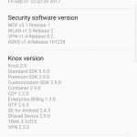
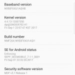
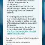
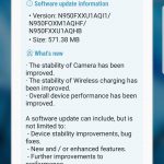
Launching with Android 7.1.1 on board just prior to Google announcing Oreo we haven’t actually heard Samsung’s plan for updating the phone to Android 8.0. I’ve received a single update for the Galaxy Note 8 which improved a few things, but I am still on the August Android security patch.
There’s so many features that Samsung include that you either love or you hate. Most of these are from accidentally loading something and this is one thing I found with the Note ‘Edge’ features for quick launching contacts (People Edge) or apps (Apps Edge). These features are simply a love/hate thing; I personally didn’t find them that useful, whereas Chris is happy to swear by the functions it puts at a swipe from any screen. To each their own.
Overall the Galaxy Note 8 software is pretty decent – but there are some issues.
Samsung really needs to work on a couple of areas with their software design, the app folders are ugly and restrictive, their keyboard is still laughably bad in terms of tap target recognition, word suggestion and even just being a good keyboard.
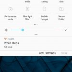
Samsung needs to tone down that white background in the notification panel and the settings menu as well. My advice to Samsung is if you’re using an AMOLED display use a black theme – or at least offer one. AMOLED allows the system to turn the pixels off instead of turning them black. Turning pixels off saves much needed battery life with a very minimal effort.
There’s also the continued duplication of Google Services that ship as standard on Android that Samsung insists on shipping with Galaxy devices. Sure, we all get that Samsung wants to have their own eco-system but there’s a point where the inclusion of Samsung’s Dialler, Messaging and Contacts apps, or Samsung Notes or Samsung Health is quite annoying and let’s face it, Samsung apps are not the ubiquitous Microsoft apps we’re all used to using.
I think we’re past the (early) years of Android where people were happy to be locked into OEM-specific app silos. People now want to share their data across different phones as they upgrade, and they want to be able to store their data where they like – e.g. Google Keep vs Samsung’s Notes, or Samsung Health vs Google Fit. Each has their strengths, but including the OEM’s preferred apps, while understandable, probably needs to stop.
Should I buy a Note 8?
If you have the money to purchase it outright, or even get it on contract you should, because the Note 8 is one of the best handsets you’ll find at the moment.
There’s some drawbacks with the Note 8, it’s an excellent quality handset but you’ll find pretty much all this (minus the dual-camera and S Pen) in the Galaxy S8 Plus which begs the question: How much will you use the S Pen, or that dual-camera with the 2x optical zoom and the interesting Bokeh effects. There’s also smaller options in the S8 and other great handsets like the Sony XZ Premium, HTC U11 and of course the excellently priced OnePlus 5 which is still currently available in Australia.
One also needs to consider the value for money; that is, is this phone worth $1,499 when devices which offer 95% of the features are available for as little as half the price.
The Note 8 has a great design, though that fingerprint sensor placement is still annoying, but in the end the Note 8 has that shelf-appeal quality that makes people look at the phone in awe, and with a more conservative battery this year, it won’t (we hope) have any issues there.
At $1,499 the Note 8 is by far one of the most expensive handsets we’ve seen go on-sale here in Australia, at least until Google decided to say ‘hold my beer’ for the Pixel 2 XL, so it’s up to you to decided if this price tag is doable for you – if it is though, you’ll be very impressed with this phone.

















Great review thanks! Also confirms what I hoped, which is that I shouldn’t have device envy over my S8+.
ps. minor thing but you’ve typo’d the resolution as 18:9.5 rather than 18.5:9
Thank you for doing the underwater video test; now I can confidently do the same.
Except for the fingerprint placement; replaced by face recognition for me and the white backgrounds in several places, the phone’s a fantastic thing. Although I don’t use any voice assistants and have disabled Bixby, that useless button right there is kinda annoying.
Note I did that with the Note 8 in one of those underwater bag things they sell. I wasn’t willing to test it out using just the IP68 rating.
Note8! Pardon the pun.