HTC Sensation was the last time I used a HTC branded phone, and I haven’t come across a compelling reason to buy one since. HTC’s phones, while usually well designed, lacked that certain punch required to get them over the line.
HTC did have a hit on its hands with the first couple of HTC M series phones but in the end the design stagnated and sales suffered. Since then HTC has been trying to get back in the black with a series of various phones. Last year with the U11, HTC had a stunning device when viewed from the rear. This year they have brought that stunning design to the U12+ while also moving it into the minimal/smaller-bezel era.
In 2018, HTC will not be releasing various levels of the flagship. It is the U12+ and that is it. All the eggs in one basket. It seems risky but it also seems clever and prudent, focusing all HTC’s efforts on one main device. We received a pre-production U12+ unit and as such the following thoughts should not be considered our final thoughts on the phone. Read on to find out what I thought about the U12+.
Is it high end hardware?
Before we list all the hardware specs let’s quickly discuss what is in the box. While we do not have a retail unit just yet we have been informed by HTC that inside the retail box you will receive a phone (phew), a “Clear Case, a pair of USonic headphones and a Quick Charger 3.0.” It is great to see HTC including a case. Something as good as this needs some sort of protection at times.
There is a lack of a USB Type-C to 3.5mm headphone jack adapter but HTC does include the USonic USB headphones if you are not interested in cutting the wires just yet. In the review box there was a microfibre cloth as well and if you buy this phone that cloth will definitely come in handy (see design section).
Inside the phone is some serious hardware. HTC may be late to the party in 2018 but the company has used that time wisely. The phone is powered by a Qualcomm Snapdragon 845 with 6GB of RAM and 128GB of onboard storage which can be extended with the microSD slot by another 400GB if required.
As you may have guessed from what is in the box, the headphone jack once again did not make it into the phone. By now it is not a huge loss for most out there and is becoming very commonplace. At least HTC provides USB-C earphones in the box for those who do not have Bluetooth ones.
Speaking of Bluetooth, HTC has included version 5.0 which is a great addition (something some manufacturers have neglected to do this year — maybe waiting for release was the way to go?).
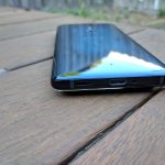
Other various specs include a USB 3.1 Type-C port, it is IP68 certified (dust and water proof up to 1.5m for 30 minutes — haven’t tested this), and a 3500mAh battery that supports Qualcomm QuickCharge 3.0. The phone itself is slightly slimmer and shorter than the Pixel 2 XL but is 1mm thicker at 156.6 x 73.9 x 8.7 mm. At 188g it isn’t the lightest phone around but I do not think that is a bad thing. A solid feeling device feels more premium and safe.
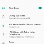
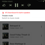
The bottom of the phone houses the second speaker and when combined with the earpiece speaker an amazing stereo sound results. HTC BoomSound makes an appearance when playing media of any type allowing you to switch from Music Mode to a very deep, heavy bass Theatre Mode. I actually preferred Theatre Mode for all my music but your tastes may vary.
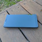
The front of the phone is fairly plain with a pair of selfie cameras, the earpiece which doubles as a speaker and a notification LED. The sides of the phone is where the magic is with this phone.
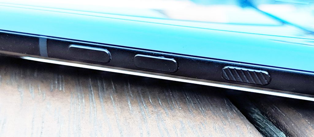
First up for the side of the phone I am going to discuss the hardware buttons, or lack thereof. As I remember it, the HTC Sensation suffered from a power button that broke for many people, myself include. Ever since then I’ve looked for ways other than the power button to wake the phone up and put it to sleep from a fear of overusing the power button and breaking it. HTC has totally solved that phobia with their new pressure sensitive buttons.
The volume buttons and the power buttons are raised on the side of the device but do not actually do anything: that is, they do not move or compress. The “buttons” feel the pressure of your fingers on them and perform the required action. It could well be my favourite thing on this entire phone and has to be seen to be believed. I encourage everyone to go and check them out even if you are not in the market for a new phone.
I say it could well be my favourite thing but unfortunately it is not. By now you may have seen reports of ghost touches and mis-touches from these pressure-sensitive buttons. The phone I have, the buttons work, most of the time but there is a very occasional ghost touch where the display will turn off quickly as if I had pressed the power button. The HTC U12+ review unit that we have, and that others have reviewed, is a pre-production unit which may well have non-retail software.
Edge Sense 2
HTC introduced Edge Sense last year. Edge Sense has been hardware underneath the sides of the phone that are sensitive to squeezing. This action can then be used to launch actions, apps and more. We saw it debut on the U11 which Google then borrowed for the Pixel 2 (HTC made the Pixel 2 remember) and now this year Edge Sense have evolved into more than just squeezable sides — hence the new moniker, Edge Sense 2.
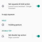
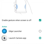
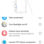
Edge Sense 2 still has the squeezable sides and can launch a vast number of things: the Edge Launcher, the Camera app, the defaul voice assistant, an app of your choosing, take a screenshot, turn the torch on/off, instant voice recording, turn Wi-Fi hotspot on/off, music control, expand/collapse notification shade and as a back button. All of these can also be used for press and holding the Edge Sense area. It would have been nice for HTC to include things such as shortcuts that launchers can use — eg. to open a specific card within Stocard etc.
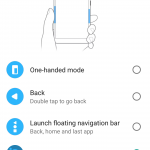
A new feature this year is the double tap of the edge sense area. HTC have it set to a default of a “one-handed mode” which some people who struggle with larger phones prefer. The U12+ actually detects which hand you are holding the phone in and shrinks the display to the side where your thumb is. The double tap can also be used to launch any of those listed above.
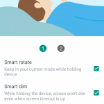
The above are all things that it is meant to be able to do. Unfortunately I did run across issues where the Edge Sense 2 squeeze would not register the final press no matter how hard I pressed. It would register me touching the sides but not reach the press firmness required to launch the requisite activity. It would continue to do this until finally it would launch. There were also issues with the double tap. It would continually launch the double tap activity without going anywhere near double pressing anything. This became so annoying that I had to end up turning off the function.
HTC has told us (and we have also seen rumours of this from a known HTC insider) that HTC is planning a software update soon after launch that refines button sensitivity and makes some tweaks to Edge Sense 2, along with other changes and improvements.
At this point in time we can only say that with these issues the phone is not great. It is still a good phone, but the tweaks that could make it great are just not fully functional at this stage.
That design
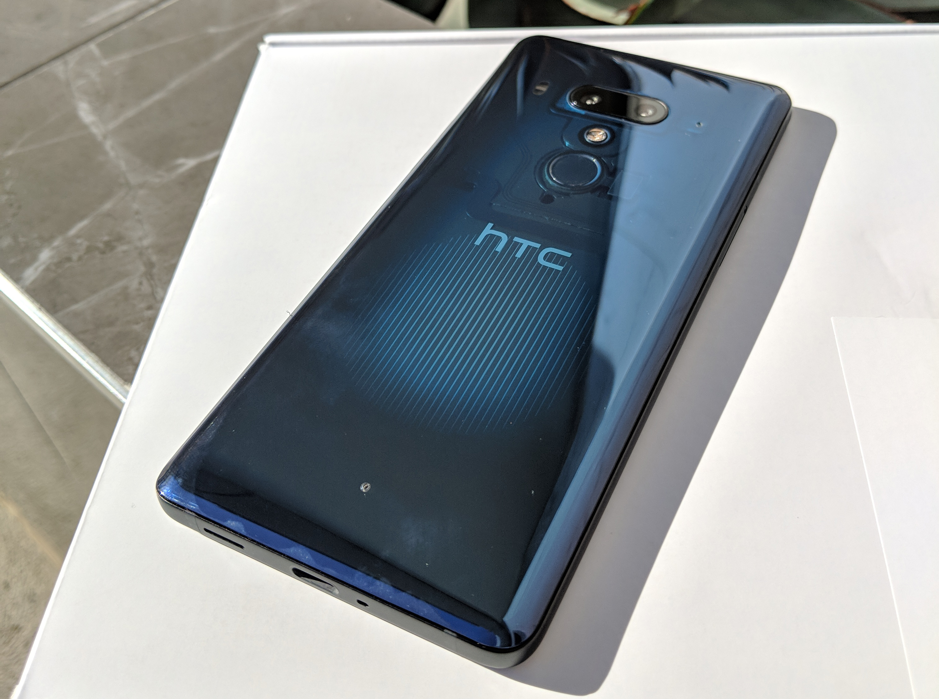
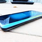
For the review unit HTC sent us the Transparent Blue and we can see why. Not only is the Liquid Surface rear of the phone a beautiful subtle blue it is semi-transparent. Once again it is something you have to see to believe. You can subtly see through the rear of the device and can see some of the hardware, including the camera hardware.
Yes, the Liquid Surface IS a glass coating as so many of the premium phones are doing this year but unfortunately there is no wireless charging with this glass rear but with QuickCharge 3.0 wireless is superfluous.
I have two minor issues with the coating of the phone is that it is a bit of a fingerprint magnet — this is where a nice woollen sleeve or that microfibre cloth mentioned above will come in very handy — and it is extremely slippery. It is not slippery in the hand, far from it, but if you sit this on a table you had better hope that table is perfectly flat as the phone will slip and slide towards the edge of the table if there is any unevenness at all. It isn’t the first phone I’ve had do this and it is not the worst at it and it is not a huge issue but something you need to be careful with.
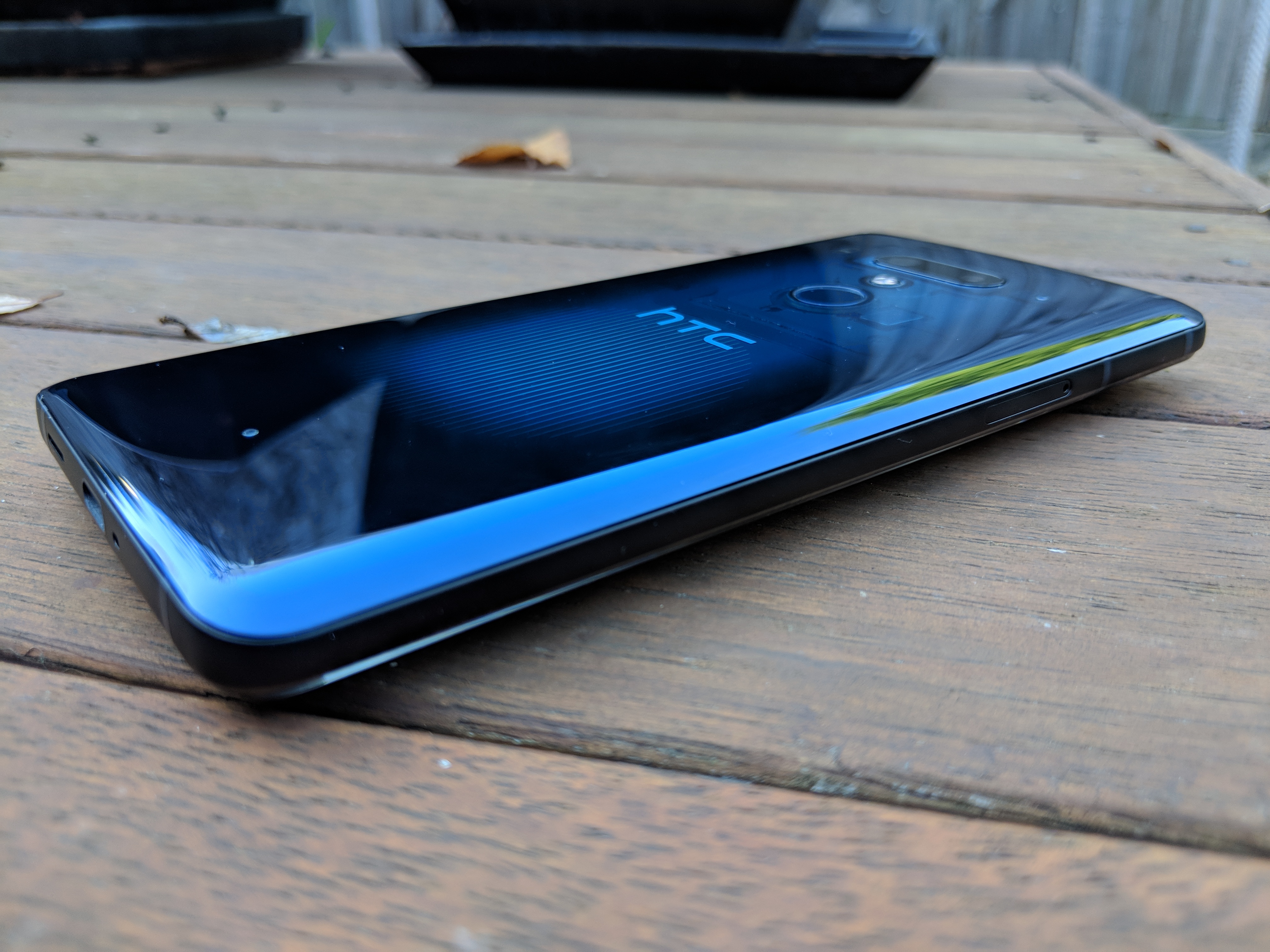
The other colours available are a ceramic black and a flame red (it changes colour from pink to gold depending on the angle you look at it).
The design of the phone itself has also received a nice refresh from last year. Gone are the massive bezels and in are much smaller bottom and top bezels. The side bezels are extremely slim and make the Pixel 2 XL bezels seem massive.
The LCD display
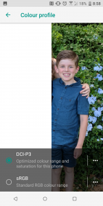
First up the specs are that the display is a 6.0 inch, 1440 x 2880 pixel resolution, 18:9 aspect ratio Super LCD6 protected by Gorilla Glass 5. The display is DCI-P3 and HDR10 compliant (Netflix approved) — the “warmth” and “coldness” of the colours can be adjusted to how you like it easily through the software additions HTC have made.
The display is not as vibrant as the AMOLED display on the Pixel 2 XL but by itself you do not notice this — you can make the colours more vibrant if you wish in the settings mentioned above but they are definitely pale when compared to the Pixel 2 XL, a phone that is NOT known for vibrant colours. I like that HTC have decided to stick with the 2K display again and although there is most likely a hit to battery life I feel it is worth it. I’ve had people tell me that you cannot tell the difference between the two — I just prefer the size things are by default with the 2K displays.
The all-important camera
In 2018 if your camera cannot take decent photos the phone is dead in the water. Last year Jason was impressed with the pictures the U11 took but then came the measuring stick for Android cameras in the current day – the Pixel 2. While Google went with the single camera and softwared the heel out of everything to create amazing images HTC has this year decided to head into the game with dual cameras front and rear.
The rear camera setup is a dual 12 MP (f/1.8, 1.4µm, Dual Pixel PDAF) + 16 MP (f/2.6, 1.0µm) setup with phase detection & laser autofocus, OIS, gyro-EIS, 2x optical zoom and a dual-LED dual-tone flash. The secondary camera on the rear of the U12+ is used for bokeh and depth mapping. There is of course HDR which HTC is calling HDR Boost 2 which can be used not just for low light but to boost detail at any time of the day.
HTC has paid a lot of attention to the camera and it has resulted in it achieving a DxOMark score that is higher than the Pixel 2, the Galaxy S9+ and every other dual camera smartphone out there. That all sounds well and good but how does it perform in real life?
In real life scenarios we (and I say we because Jason was lucky enough to test out a U12+ at Vivid in Sydney in camera shootout with a few smartphones) found the camera to be great when analysing the pictures by themselves. Next to the Huawei P20 Pro the night mode suffered (as it did on every other smartphone camera) but that is not saying it was a bad picture by any stretch of the imagination — It was great.
The camera did not open as fast as I would have preferred with the Pixel 2 XL camera opening much faster but the auto-focus was fast enough to capture decent images without having to mess around with the focus.
The video camera has HDR available as well as OIS and gyro-EIS and as such was able to capture decent video even while walking, camera in one hand, child in the other:
The rear camera is also able to capture 1080P slow motion 240fps video and while the specs aren’t what they are on some phones the results are still amazing. The time for the slow motion is unlimited and the slow motion portion of the video can be edited afterwards.
The front facing camera is a dual 8MP (f/2.0) camera system with all the bells and whistles that other manufacturers include. There is the portrait mode (or bokeh effect) with which the depth effect can be manually adjusted or done automatically by the phone. Add in some Snapchat-style filters and some softening filters and you have a standard selfie camera for 2018.
How is the HTC Sense software circa 2018?
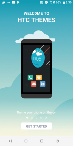
As time has gone on manufacturers (well, most) have pared down their skins that sit atop of Android and HTC is no exception. HTC Sense is much improved over it’s early offerings and now you could easily say it is as pleasing as any other manufacturer out there. There are no garish colours in an attempt to distinguish it from other manufacturers but instead a soft Material Design-styled UI which has all the usual settings where Google intended them to be.
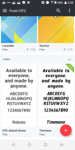
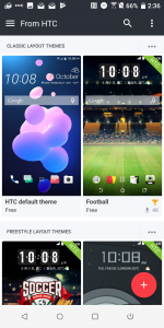
HTC does offer the option of installing themes over the top if that floats your boat but their default theme is simple and easy to use. It sits atop Android 8.0 with a promised upgrade to 9.0. Security updates will be rolled out (probably) quarterly with a formal commitment on its way to us soon. With such a light skin, Project Treble support and some strong commitment to this phone by HTC you would expect updates to arrive in timely fashions.
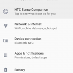
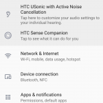
I have already covered Edge Sense 2.0 above and the software that is used to set the actions is easy to use and is not hidden within an app but within the Settings app — just where it should be. HTC have done a great job integrating their system customisations within the System app — they are easy to find and their icons look like they fit in and belong there. More manufacturers should do this.
HTC has included their own version of Face Unlock which is fairly quick. It is definitely not that fastest face unlock out there but it works well in most light situations as it automatically brightens the display to see your face in low light. The OPPO R11s Plus and the OnePlus 5T (twice as fast as the OPPO) leave it for dead — theirs is as if you do not even have a lock screen activated. The U12+ on the other hand turns the lock screen on, then the face unlock icon and the phone then unlocks. A failed unlock can be retried by tapping the icon. You can check out the speeds in the video below:
When I first turned on the U12+ I was greeted with their launcher and Blinkfeed. Blinkfeed is their news feed that has its own dedicated home page — just like Google Now and the Google launcher on Pixel devices. Having used Google Now feed on Nova since it was first available I was at first disappointed with the feed that showed up for me after setting my preferences. The news articles were several weeks old but just as with the Google Now feed, the more I used it the better it got. I don’t think I have ever stuck with a manufacturer’s launcher for more than a week but I have been comfortable using HTC’s for two weeks. Well done HTC: finally someone who gets what we want, customisation and a news feed that works.
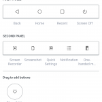
HTC have also added nav bar customisation which is fantastic. The customisation allows you to add buttons to the already present three usual nav bar buttons. Not only that there is a second nav bar that can be accessed by swiping the usual one away (but it comes back immediately after using a button on the second bar). The options are great and HTC has done us all a favour. See my choices below.
HTC does include a custom keyboard, TouchPal. TouchPal was once one of the best keyboards around in the Android world — not any more. It didn’t take me long to change this out for GBoard.
You have an audio section? Really?
Usually I do not include an audio section in a phone review unless there is something exceptional about said audio. HTC has included their BoomSound once again and they say it is their best, loudest, sharpest boom sound to date and I have no reason to doubt it after using it.
There are stereo speakers as mentioned above which provide a heap of loud, high quality sound. I normally do not use the speakers on my phone to listen to music and while I still don’t I have a few times just to check it out and I was impressed so if this is you then the U12+ is right up your alley.
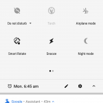
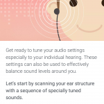
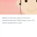
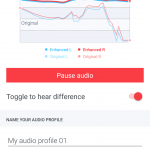
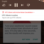
Included in the box are USB Type-C earphones HTC calls HTC Usonic earbuds. Using them the phone customises the sound to your ear structure apparently so the sound best suits you. You can create multiple profiles although I’m not sure why because you cannot change how your ears are structured. The earbuds do include active noise cancelling which can be turned off using the notification shade. For an in-the-box set of headphones they sound fantastic but if you want to use them on a non-HTC phone you are out of luck. They did not work in my Pixel 2 XL — “incompatible”.
Can I forget about charging it overnight?
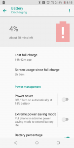
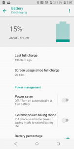
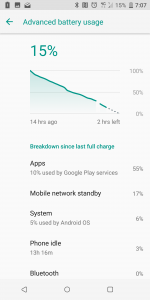
Unfortunately not. The 3500mAh battery, while it can be charged awfully quickly using Qualcomm QuickCharge 3.0, will not see you through more than a day — well, it did not see me through more than a day. Taking the phone off charge at 6am, using it to stream some music, podcasts, tether for a couple of hours and general emailing and surfing, I was able to get around 12-14 hours of usage on average on a single charge.
Not the best I have ever used but certainly not the worst. I have been a heavy user of power hungry apps and services (NBA playoffs streaming, tethering my laptop at work etc) in the past few weeks so I am confident that it could last a day on my normal use.
For those super heavy users there is QuickCharge 3.0 for you. If you want you can fork out some extra money and purchase a QuickCharge 4.0 charger for faster charging (5 minutes of charging gives 5 hours of battery life), as the U12+ does support it but unfortunately only include a QC3.0 charger in the box.
Even though the phone has a glass back HTC decided to not include wireless charging for two reasons- they did not want to make the phone any thicker and they don’t see much point when it has QuickCharge 4.0 support — and I agree.
Why should I buy the U12+?
- The touch sensitive buttons, once they are working consistently as designed
- It is a gorgeous looking phone
- HTC Sense is not only a well designed Material Design UI but is actually useful
- Edge Sense 2.0 once it is working consistently as designed
What should I be wary of with the U12+?
- Battery life is only a day
- No wireless charging
- Glass, glass and more glass.
- At this pre-release stage Edge Sense 2 and the pressure sensitive buttons until a fix arrives
The conclusion in a nutshell
In a nutshell if HTC supports the U12+ with timely updates (not just security updates but also Android version updates) then there is no reason I would not, and could not, recommend this phone to anyone. The phone is a definite upgrade to last year’s model with a better camera, better software enhancements and of course better hardware. The design is stunning to say the least, especially the Transparent Blue and for some the lack of a notch is a plus.
Unfortunately at this stage the parts of the phone that stand it apart from all the others are not fully functional just yet. With a software update rolling out for it in a few weeks that will hopefully be fixed. HTC are swapping our pre-production U12+ for a retail unit so we will bring you our final thoughts on the update, the buttons and Edge Sense 2 after we have tested that out.
The end result of whether HTC succeed with the U12+ though will come down to their support for it. Will they be able to fix the obvious software/hardware issues they we and many other reviewers are currently experiencing? Will they be able to advertise it enough to get it into people’s thinking when considering new phones? Will they be able to offer an attractive enough package to get it over the line? Carrier support will also help this phone immensely, although Australians are slowly but surely moving away from carrier-purchased phones.
The HTC U12+ is a phone that can take amazing pictures consistently, has fast, attractive software, innovative hardware and to top it off, looks great. Unfortunately I have to put a “HOLD” on recommending purchasing this phone — until HTC manage to fix the Edge Sense 2.0 and the pressure sensitive buttons issues I cannot recommend it. Hold out to see if HTC can bring the fixes required to make it great. If they can fix the touch issues then there is no doubt in my mind I could easily recommend this phone to anyone.
As for pricing and availability details HTC are still in the process of finalising all the details and we will bring them to you as soon as we find out.
Stay tuned for our update to this review once we receive final hardware and the software update.
















Got the HTC u12 a couple of days ago and it’s worked like a treat! No issues with the buttons and the squeeze feature is a great. Don’t find myself using the double tap on the side often.
That’s a great, comprehensive review Scott. Thank you. I’ve always had HTC and atm am loving my Htc10. I use Telstra 2yr plan so I leapfrogged 9 and 11.
After reading other reviews about the haptic buttons I was tempted to go for the Samsung 9plus as my plan has expired. You seem to be a fan of the idea of the haptic buttons as long as they operate as expected? I’m very interested in your followup review of the buttons as that will help me decide.
Have you heard whether Telstra will carry the 12Plus?
Cheers
Shane
The side “buttons” sound great, a feature more phones should adopt – assuming they work properly ^_^.
Great Comic-Con stuff btw
You have to look at how HTC have launched this in Australia and what Sony have done with the latest flagship phones, or rather haven’t done to promote them and the lack of interest LG has with phones and ask – do they actually want to sell product in Australia or more to the point, have they given up on selling / find it impossible to sell meaningful numbers of phones here, given Apple and Samsung’s stranglehold on the market?
“there is no wireless charging with this glass rear but with QuickCharge 3.0 wireless is superfluous.”
Strong disagree – like wireless headphones, wireless charging is something I can’t go back from – there have to be more people who share that opinion.
i suppose i am the opposite and the review is my opinion. I have used wireless and when compared to the speed you get with wired i don’t see why you would ever bother with wireless. I do know others who share your opinion too though.
Have to agree with Scott, wireless charging in its current form is pretty useless. While wireless charging you can’t pick your phone up and use it, and because it’s not as efficient as regular charging, it is going to be out of action for longer. At least with cabled charging you can pick your phone and use it while it is charging, and it charges much faster. I can see future wireless charging being useful once we get to charging over a distance i.e. phone charges within 1m + radius of the charging pad, but it its current form cabled… Read more »
100% agree, the lack of wireless charging in high end phones is infuriating. The battery in my S7 is well past its best, but it’s not generally an issue because whenever I put the phone down (at work on my desk, or at home on coffee table) there’s a wireless charger.
No matter how much bigger batteries continue to get, phones still only last a day at best (when new!), and so constantly topping up the battery with a wireless charger is by far the best solution.
Some good points Chris but many phones last more than a day now – my P20 Pro is currently at 64% battery life after taking it of the charger at 6.00am this morning – 15-20 calls, podcasts on the 1 hour plus each-way commute and some web browsing – so maybe the relevance of wireless charging is dependant on the phone you buy – plenty out there with 1+ day battery life.
All phone batteries degrade with time, so unless you’re buying a new phone every year (not a bad option) battery issues will always creep in over time.
Such a shame that they shipped the phone with those button issues, not sure how something like that gets through QA. Pixel 3 for me this year I think.
retail review unit arriving tomorrow/wednesday so I’ll soon know whether they have fixed up the issues
Hey Scott, I just read on another website that HTC has just pushed out some firmware that apparently fixes the side buttons. Have you seen the firmware yet on your device? Possible re-Review?