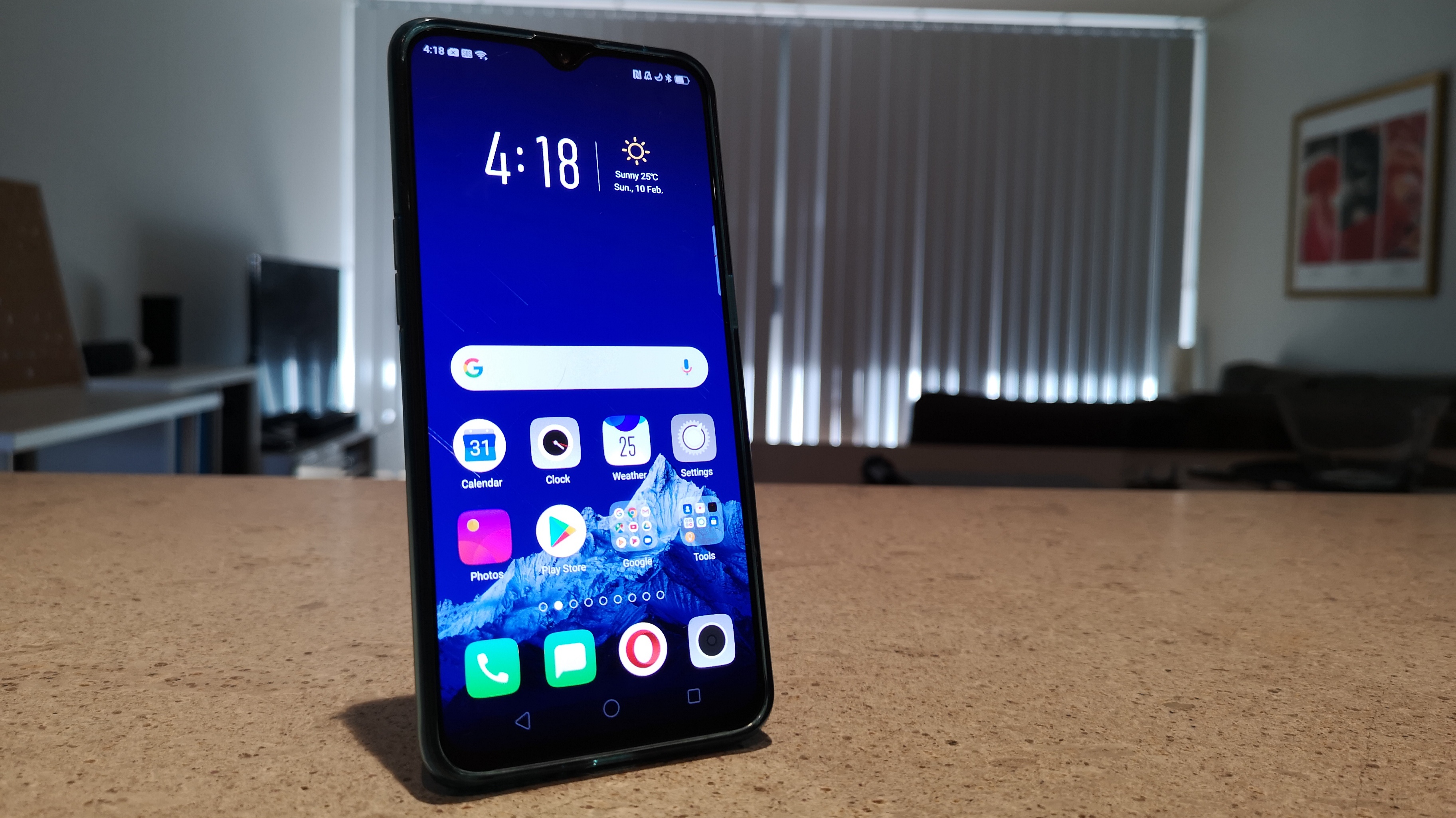
Stop me if you’ve heard this one before. Oppo: masters of building great hardware, delivering device after device with stunning build quality packed full of specs. ColorOS: Oppo’s Android-based operating system, disappointing with weird limitations and baffling UI choices, though improving with each iteration.
While the story remains the same with most of Ausdroid’s Oppo hardware reviews, the beats change a little every time. By now, seeing what’s changed with each new Oppo phone feels like checking out the latest update to an app – specs are bumped, design is updated, software is upgraded (well, sometimes), and there’s a very reasonable price tag attached.
I say this at the start because it’s important. Just a few months ago, Oppo impressed us with the hardware in the R15 Pro, and now we’re back checking out the R17 Pro. We know Oppo doesn’t like even numbers, but the jump from 15 to 17 doesn’t really do justice to the changes they’ve made.
The R17 Pro is an extremely impressive piece of hardware, showing improvements over Oppo’s previous hardware at almost every turn.
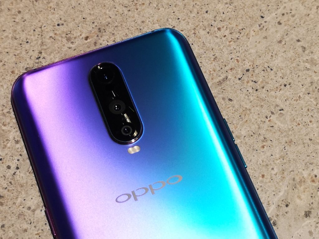
It’s all wrapped up in an absolutely STUNNING treatment of emerald green or radiant mist (purple and blue) coloured rear glass. We’ve seen Oppo embrace colours in their product range offer the last couple of years, but this is on another level. It’s gorgeous. It may have even snatched the mantle of 2018’s best looking phone from Huawei’s Twilight colours on the P20 Pro and Mate 20. The rear glass is also 3D etched to make the surface press slippery.
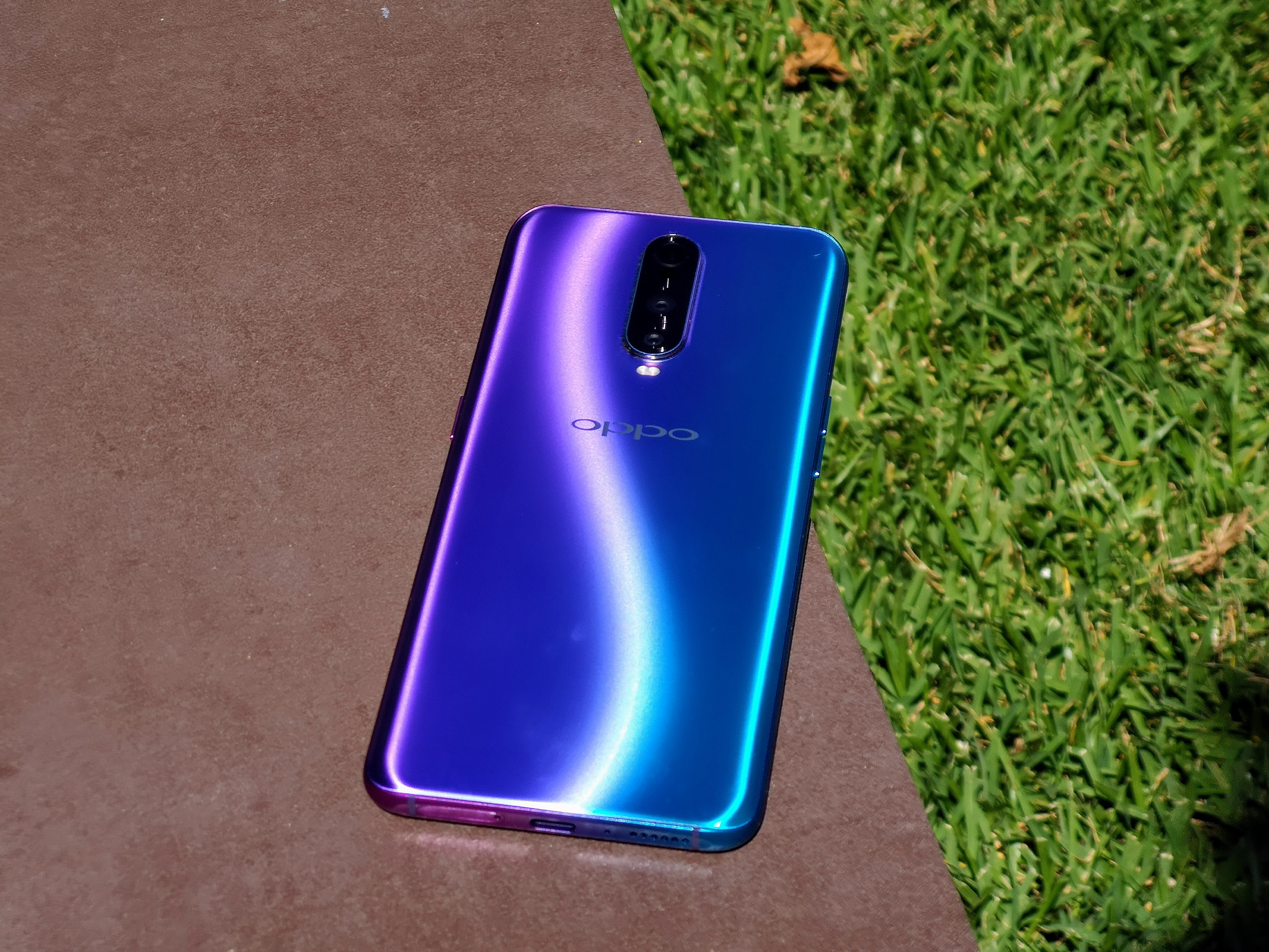
Seriously, Oppo – well done. Please keep playing with colour!
Let’s take a look at some of the phone’s big features.
The Screen
A fantastic, bright and clear AMOLED display that shines even when the brightness is turned down. It’s 6.4 inches corner to corner and runs at Full HD+ (1080p with extra pixels to extend it to an 18:9 aspect ratio).
Oppo’s experimenting with the notch this year. We’ve seen a standard notch on the R15 Pro, a completely notchless design with a slide-up camera in the Find X, and now the R17’s minimal “waterdrop” notch is quite welcome, housing just the front-facing camera with a speaker built into the edge of the device just above it.
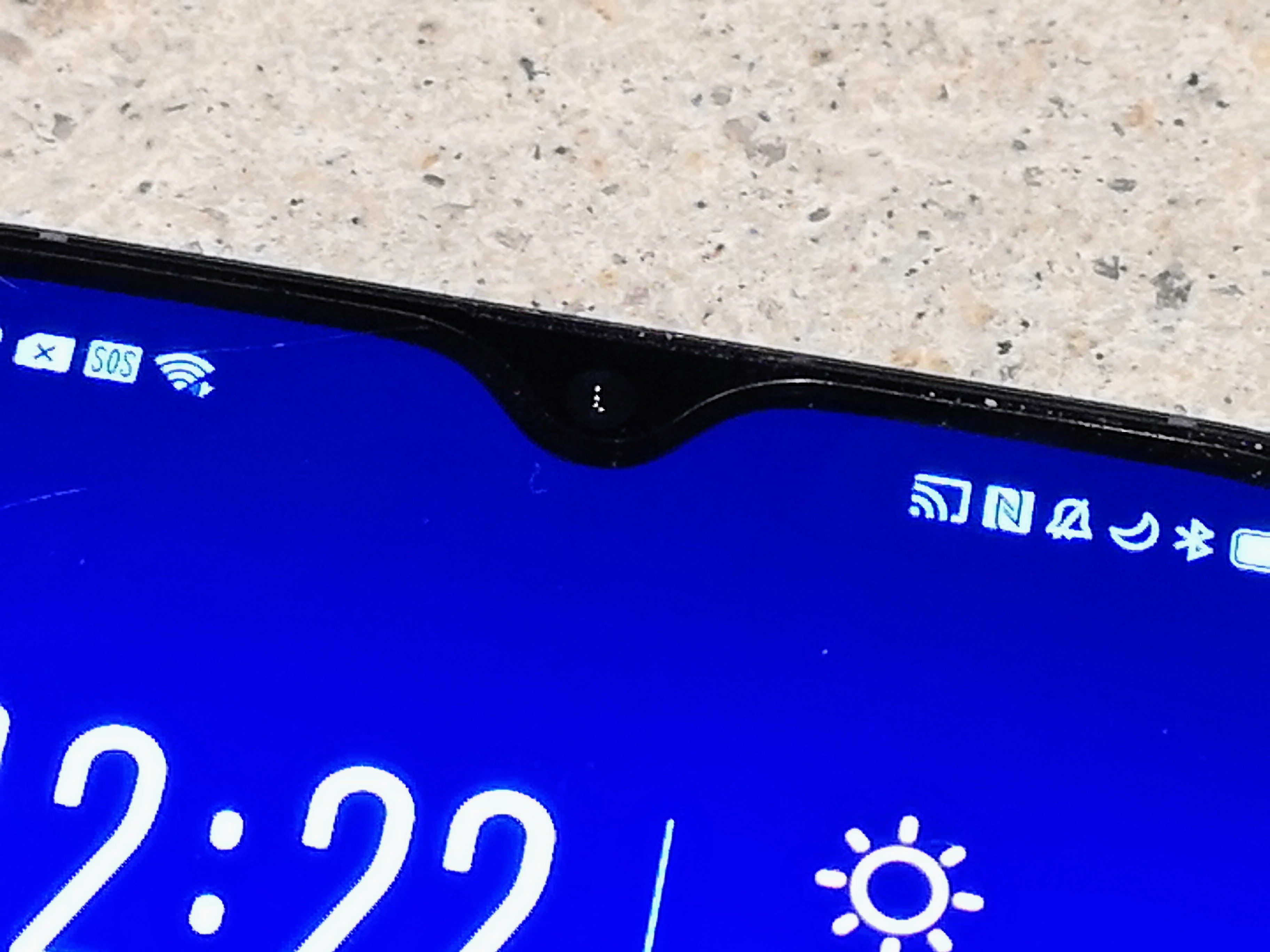
The waterdrop notch comes at the cost of the more advanced dot-projection face unlock system from the Find X, but Oppo’s been using the front camera for fast and reliable face unlock for a while now.
The R17 Pro also features an in-screen fingerprint reader, making it – along with the Mate 20 Pro – one of the first mainstream phones in Australia with the technology. Oppo’s become quite playful with this on the software front, too – the fingerprint icon pulses bright with neon inspired colours as it awaits your touch, and you can select an unlock animation from a few options when your fingerprint is recognised.
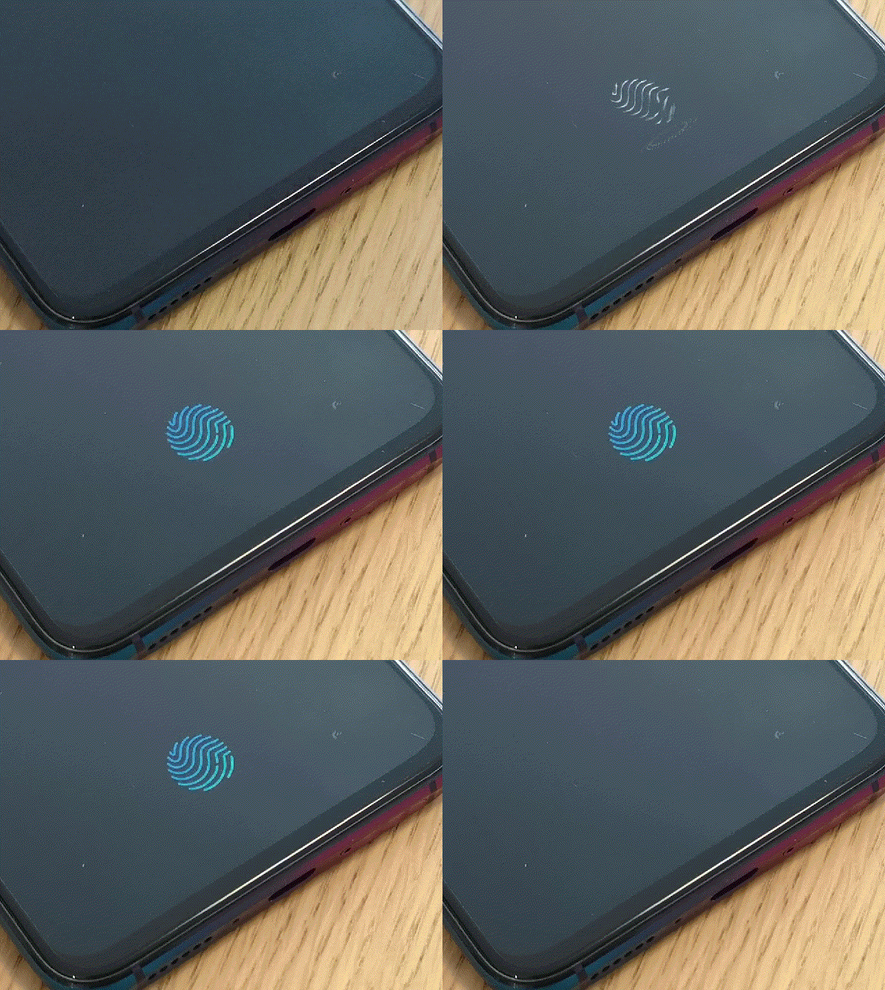
There’s a caveat on that fingerprint reader, though – it’s not exposed to the system, so you can’t use it to make purchases from the Play Store, or secure LastPass. It unlocks your phone (and Oppo’s custom private photo vault), and that’s about it. LastPass can only unlock when you enter your password, and Google Play doesn’t even have a fingerprint option.
The Battery
The R17 Pro has a 3,600 mAh battery inside it, or two 1,850 mAh batteries if you care about the distinction. It’s also got Oppo’s (the world’s?) fastest charging yet built into the phone – it can charge 40% of its battery in just 10 minutes.
Given all the other stuff Oppo has crammed into the phone it’s almost surprising there’s no wireless charging, but if it’s a choice between one and the other I’ll take Oppo’s “Super VOOC” rapid charging system every time.
It’s not like the phone actually draws that much from its battery power anyway – like so many of the phones we’ve looked at in the last couple of years, there’s a good chance you’ll have a sizeable percentage of battery power left in the tank at the end of a standard work day anyway, so there’s no real need to worry about having to charge the phone before you leave the office (and even if you did, give it 5-10 minutes on a Super VOOC charger and you’ll definitely be good for the night).
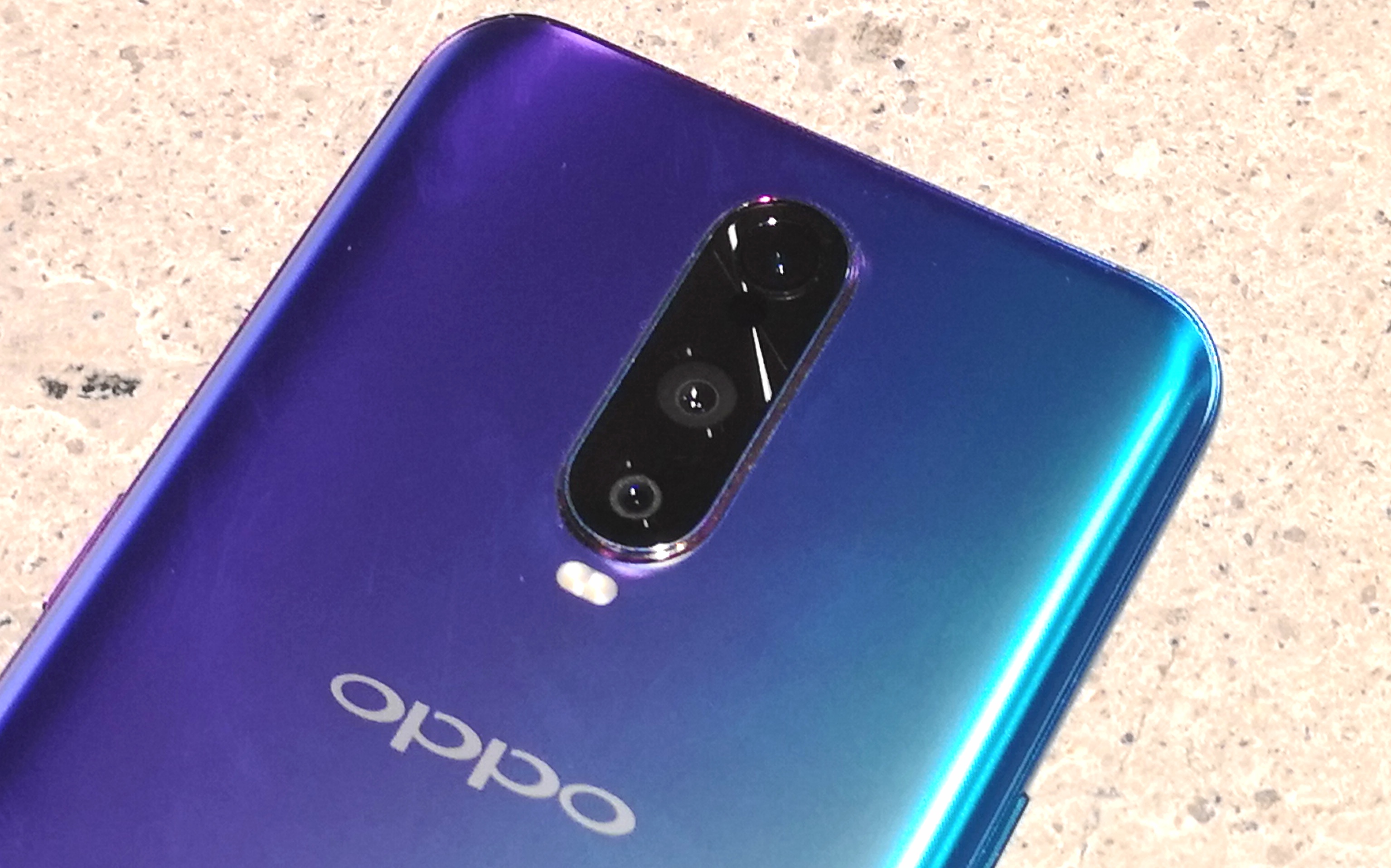
The Camera(s)
Oppo has well established photographic chops, and has usually punched well above their weight in midrange camera performance. The R17 Pro makes a really interesting case for itself on the photography front.
The company’s been paying attention to the big camera advancements of the last year, and served up a phone that offers both a dual aperture system (a la Samsung’s Galaxy S9 / Note 9) AND software smarts similar to Huawei’s Triple Camera system to perform multiple exposures for night mode exposures.
The phone has two sensors on the rear with 12MP (f/1.5-2.4) and 20MP resolution (f/2.6). The resolutions and apertures on offer there are pretty interesting – in a well lit environment, that 20MP sensor can offer a lovely bright shot with a deep focal length while the 12MP sensor has bigger pixels for low light photography AND can capture more light at f/1.5, an aperture we’re only really used to seeing pop up on high end premium phones. It gives the camera a few options for tackling whatever’s in front of it, and it works quite well.
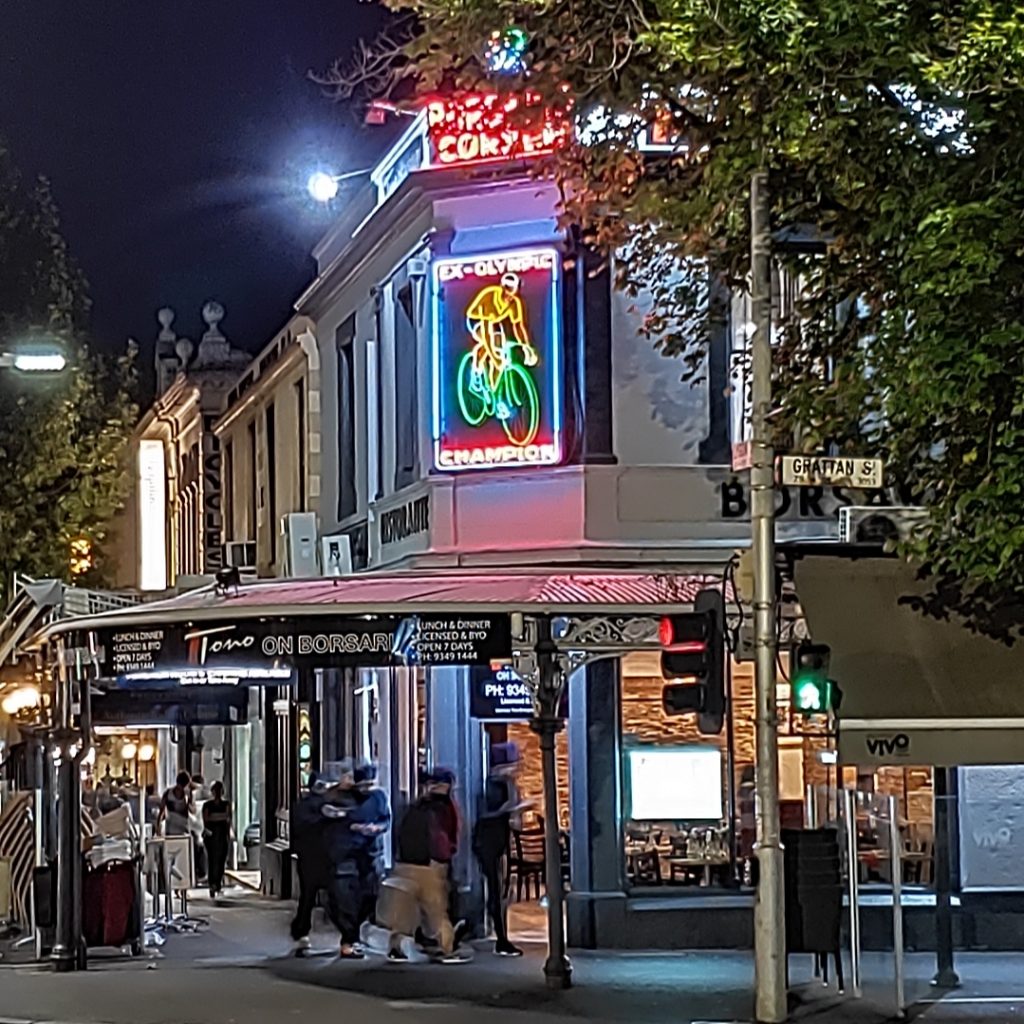
Oppo’s Night Mode gives Huawei’s a run for its money. It’s a trick that combines multiple exposures from the camera with some software smarts. and everyone’s getting in on it now. Here’s how Oppo’s software saw a street crossing:

Oppo’s shot ended up a slightly higher resolution due to the way its camera pulls off Night Mode, and that gave it an edge on the neon sign:
Nice work, Oppo.
AR Emojis
Everyone’s got their own “AR emoji” system by now – it’s the must-have software add-on of 2018, and Oppo’s got one of its own packed into the camera app on the R17 Pro. They needn’t have bothered, though – the results were terrible.
First of all, while I’m grateful for the lie, even I can see that that’s a completely unrealistic representation of my hair. It seems to be the default – it wasn’t just my AR Emoji that turned out this way.
Secondly, it appears that this is pretty much just a copy of Samsung’s AR Emoji system, right down to the options for attire. They couldn’t offer anything even slightly different?
Finally, it also looks like you can’t make videos from the AR dudes – just some photos.
I’ll give them this though – the face tracking is pretty good on that front facing camera!
Time of Flight
Oppo’s packed a third sensor into the camera array on the back of the R17 Pro, called “Time of Flight” (TOF). The sensor emits and collects light, giving the device the ability to take precise measurements within a few metres.
While it’s cool to have new technology packed into a phone, it matters more that the phone can take advantage of the hardware, and on this from the R17 Pro delivers a solid “maybe”. There’s no software on the phone out of the box that uses the TOF sensor, and the company’s been pretty upfront in telling us that they are still thinking up uses for the sensor. Okay then…
AR Measure
Oppo was kind enough to let us take a beta release of its first TOF app, AR Measure for a test run. AR Measure allows you to drop markers in real-world 3D space in front of you and around you, and operates in three modes.
Firstly, there’s a measurement of distance from the phone to a specific spot. You can tap the screen to drop a marker, and the AR Measure app will remember where that marker is as you move the camera around. The distance to the marker is updated in real time.
You can also use the app as a ruler. Point it at a starting point, press the button and move the camera around to move the target to another location. A virtual ruler will appear on screen showing the distance between the two points! Handy for a quick estimate of whether furniture will fit in available space while you’re at the store.
You can also measure angles and area within a user-defined boundary in the app.
As a promise of things to come, AR Measure is certainly interesting. It’s going to be delivered to R17 Pro devices with a software update in the coming weeks.
Software Story
You’ll note that most of the major points touched above are basically hardware. There’s a reason for that – Oppo’s hardware production prowess goes from strength to strength every year, and you’ll struggle to find another Android OEM packing in the specs and features at that asking price.
But there’s another component to every device that’s just as important – the software. Oh, the software. It’s where the wheels come off in most of our Oppo reviews, and the R17 Pro makes some admirable attempts but is undone by a lack of attention to detail on the software side.

While the criticism usually aimed at ColorOS is that it’s trying to be iOS, that’s not really the case here.
Oppo backed away from its extreme-iOS-ness a couple of generations back – notifications look like Android notifications (and can now be swiped away, at least in ONE direction), Quick Settings lives above the notification pull-down where it rightfully should be (and is a lot more like standard Android Quick Settings now), and you’re able to change the default launcher and SMS apps.
All in all, ColorOS is much more Android these days. So what’s wrong, then?
It’s the little things. Ironically, it’s a bit nanny-state.
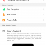
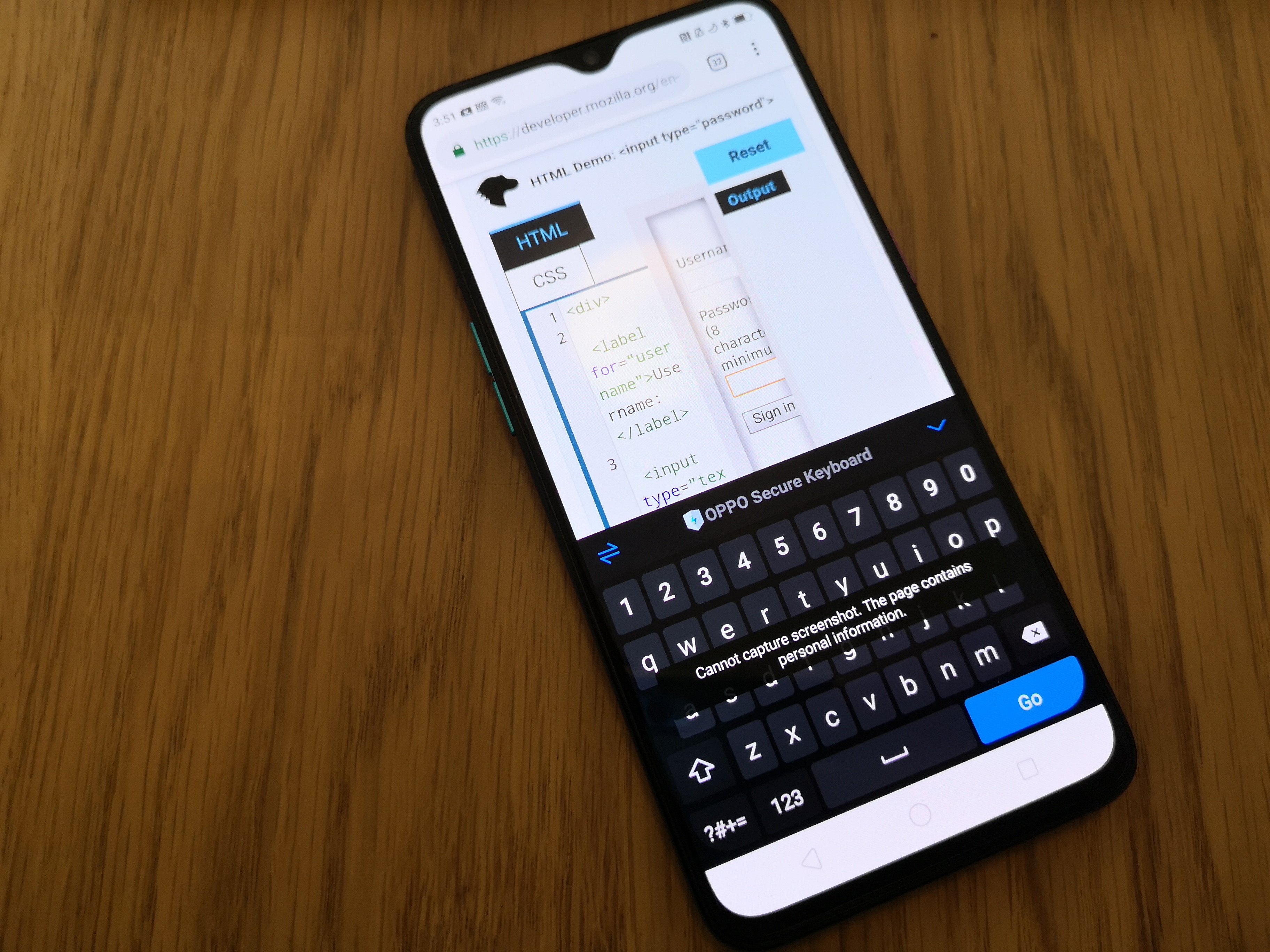
It’s the fact that the OS swaps to its own “secure keyboard” in a password entry field, regardless of the keyboard you’ve installed and configured. This is a practice that seemed to start on the R15 and I’m surprised there’s not a switch to turn it off (shift on the Oppo Secure Keyboard is caps lock, and it’s super annoying). I trust Gboard, sorry. DON’T FORCE A KEYBOARD ON ME!
It’s the Payment Protection dialog box that comes up EVERY TIME you enter the Google Pay app that warns you that you’ve set your SMS app to an app that’s not the Oppo default SMS app. I KNOW, I SET IT ON PURPOSE.
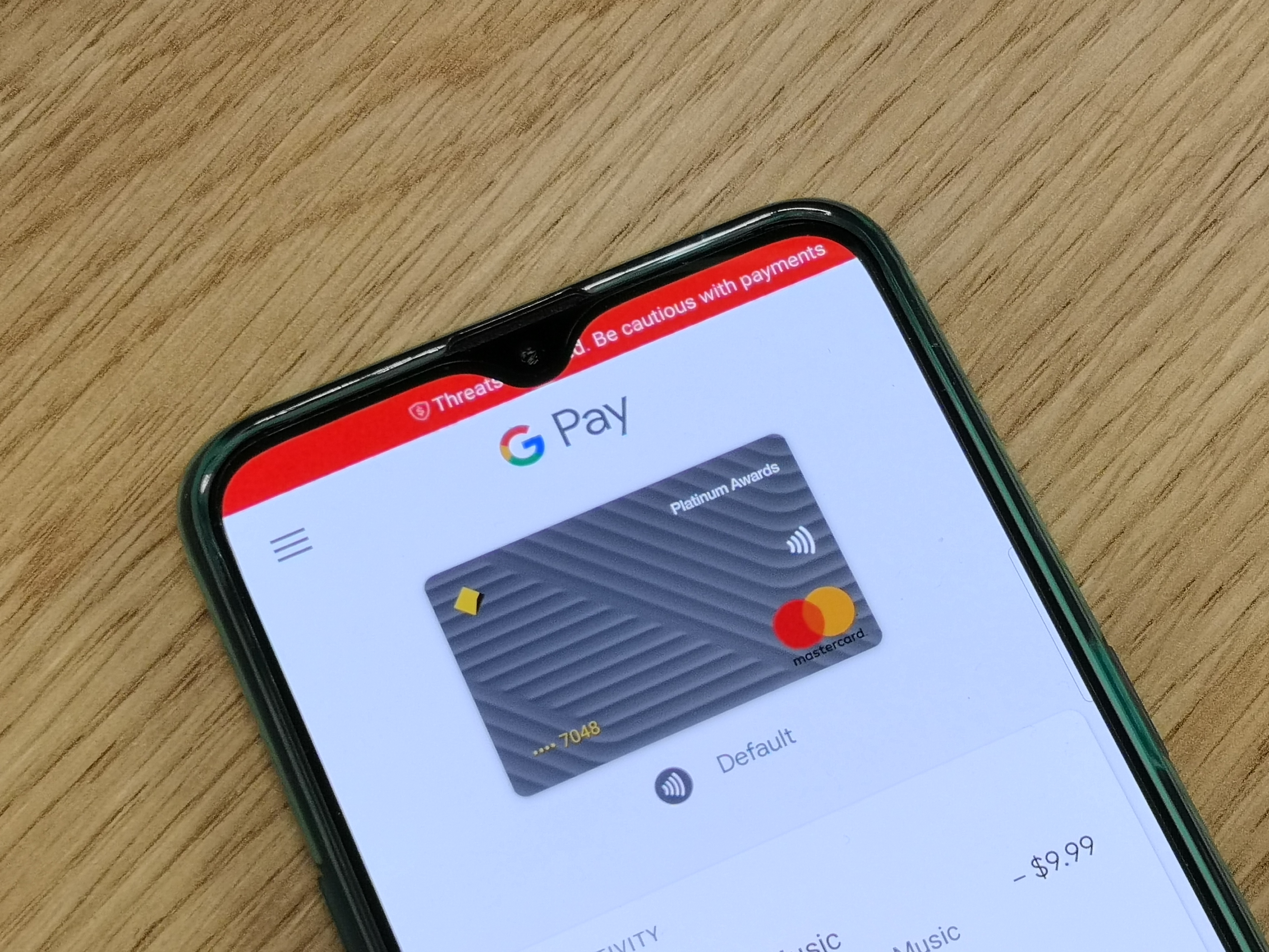
To be fair, you can disable this feature on a per-app basis but you can only stop it protecting its own list of apps, rather than adding new apps to its protection list. It recognises Commonwealth Bank, but DIDN’T recognise Beem It or Ubank. If you’re going to protect people, don’t half-ass it.
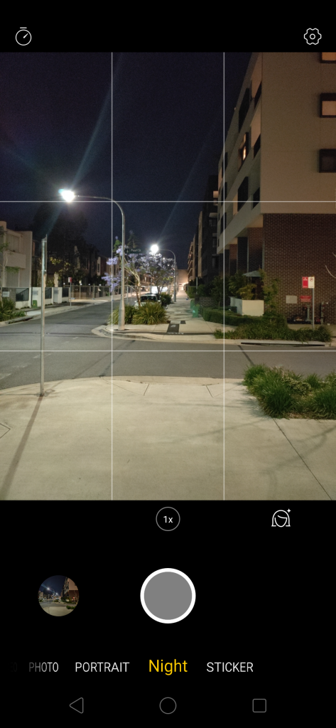
It’s the fact that Oppo’s camera app shows all the camera shooting modes in UPPERCASE – EXPERT, PHOTO, PANO, etc … then you get to “Night” and it sticks out like sore thumb.
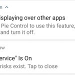
It’s the fact that you can’t use an app that uses the system Accessibility Service without a massive yellow warning showing up (and staying there while Accessibility is enabled) in your status bar warning you of… what, exactly? I know there’s an app using accessibility, I ENABLED IT.
It’s the fact that when you select a small font size in the system preferences, apps don’t get updated to reflect it.
It’s the fact that dialog boxes have weird layouts, brackets and timers on them and they’ll automatically dismiss themselves when the timer runs down. (Wait, you want me to approve what? Okay, let me think about that … hang on, where’d that dialog go?)
Yes, these might be nitpicky, but it’s not the first time many of these things have been pointed out – ColorOS as an Android skin has always felt a little rough around the edges, and it’s not getting any better. Whether this matters to you is up to you.
Let’s not be so negative.
There’s positives in ColorOS.
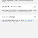
The OS has a lot of privacy and anti-harassment tools built in to it. I don’t know of any other Android OS that actually has a setting on it to block fake mobile base stations. You can define simple blacklist/whitelist rules for blocking calls and texts (and decide whether you want a notification that something was blocked). There’s an Emergency SOS feature that will dial a predefined number, text them your location AND send them photographs taken by the front and rear cameras if you press the power button 5 times in a row.
This focus on privacy extends into the default SMS app. Texts from unknown contacts are grouped together in a separate area of the app so you should only see messages from real legit people (and not your local Dominos Pizza shop) when you enter the app. This didn’t stop me from replacing it with Google’s Messages app, though – and you should see the number of warnings and complaints that this triggered from things like Payment Protection.
Oppo’s own Photos (gallery) app also has a lot of features designed with the user in mind – it performs its own face recognition and groups photos featuring the same person together (and lets you assign a name to them), has basic but easy to use editing tools for photos, videos and even collages built in (not surprisingly, it borrows more than a little from the iOS Photos app).
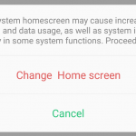
The truth however is that I’m being harsh on the OS because it’s a heavily customised version of Android, and it’s heavier than I feel it needs to be. It feels like Oppo’s broken some of the more obscure parts of Android’s core in order to perform their customisations and show these massive big warning messages, and in some cases it’s even broken functionality (like changing a default app) that’s based on its own customisations.
ColorOS feels like it’s more interested in telling the user when they’re doing something wrong than it is in helping them to do something right.
Oppo’s hardware is amazing. It deserves a better standard of software to run on it.
Should you buy an Oppo R17 Pro?
Oppo’s latest is undoubtedly it’s greatest phone so far. It’s drop dead gorgeous – especially in its Radiant Mist form – and it’s packed full of features. The RRP for the phone is also one of the company’s highest ever at $899, but coming in after the Find X and recent waves of premium $1500+ super phones, that’s almost a breath of fresh air. Look, someone’s still doing phones for under $1,000!
Like any of our Oppo reviews, this all comes down to the software, and Oppo’s commitment to providing software updates for your phone.
Ausdroid’s contention for a long time has been that ColorOS goes too far with its Android customisations. If you’re not an Android purist like us though, you can pretty much ignore the nitpicks and complaints on the software side and the phone will serve you well.
We’ve chided Oppo for a long time for failing to make a public commitment to providing software updates to phones once they’re sold. We’re talking both Android platform updates and monthly security patches here. This time around, the story is little different – Oppo’s committed to monthly security patches (but won’t be drawn on platform updates like Android 9.0 Pie), but on a 3-month delay from when Google makes them available in AOSP.
However, right now it’s just a promise. Ausdroid’s review unit is running Android 8.1 with October security patches, and it hasn’t moved from that version in the time we’ve had it.
We’re expecting to see November patches arrive sometime in February, and then a rolling monthly cycle from then on. A 90-day delay isn’t ideal, but it’s a damn sight better than we’re getting from some Android manufacturers.
If you’re looking for a new phone right now and the R17 Pro fits your budget and requirements, I say go for it. But be aware that around that asking price you can get a Samsung phone on sale, and at just $100 above it (& frequently cheaper on special) you’ll find Huawei’s excellent P20 Pro.
Disclosure Statement
OPPO has allowed the retention of this device to monitor future updates

