
Google recently began rolling out version 50 of their Chrome browser to Mac, Windows and Linux PC’s, as well as through the N Preview on Android. As part of the release, Google has also begun implementing the long awaited Material Design overhaul for the browser.
Sebastien Gabriel, Senior designer at Google, working on Chrome and Chrome OS has outlined the changes over at dribbble, which he says is available first for Chrome OS right now but Chrome Canary users on Windows or Mac, they too can sample the Material Design update if they enable the ‘Material design in the browser’s top chrome’ flag.
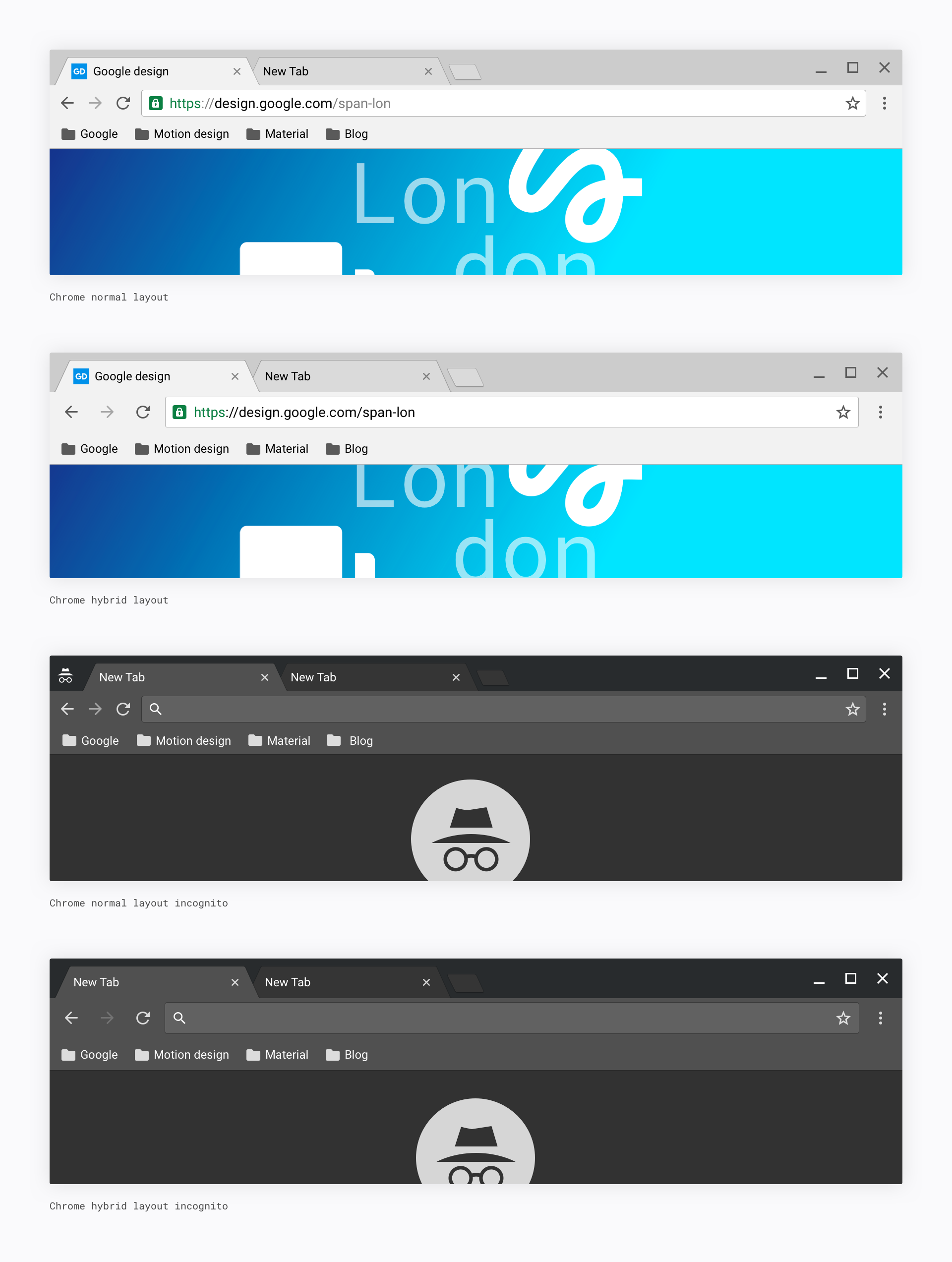
The update involves the usual Material Design features such as a ‘flatter, sharper and lighter design’, but also contains a complete revamp of how Google implements the Core UI.
With the new implementation, Google is able to render image assets programatically rather than relying on 1200px image assets. New features in the Material Design overhaul also includes:
– New default theme.
– Complete overhaul of the Incognito theme with a new dark color.
– Complete revamp of tab shapes, icons, and omnibox to match mobile.
– Introducing Material Design ripples and morphing buttons states.
– New color, more accessible color scheme.
– New info bars and buttons.
With the growing Chromebook market also now including more touchscreen devices like the Asus Chromebook Flip, there’s also a hybrid mode designed for touch interfaces. The Hybrid Mode is enabled by default for touchscreen devices and offers users ‘a more comfortable layout for touch-enabled and convertibles devices without compromising the productivity aspect of Chrome’.
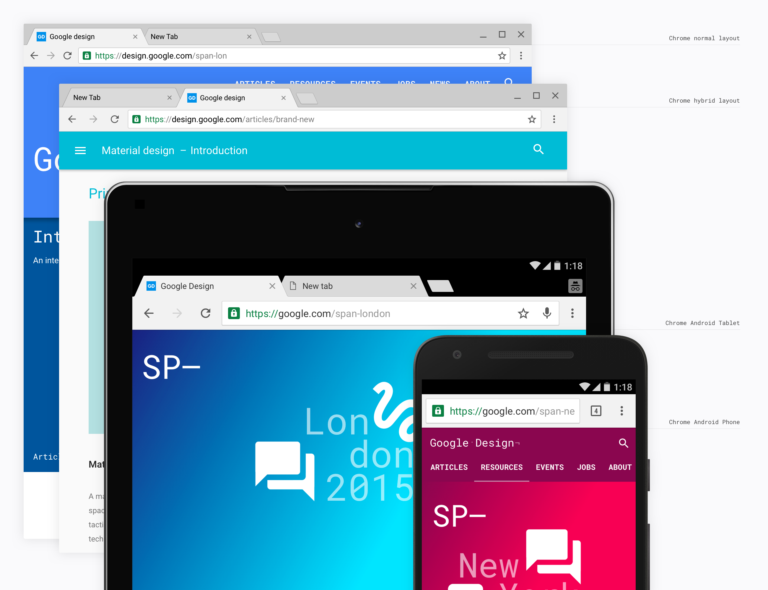
As well as Chrome OS and Chrome on the desktop, this update will also be heading to Chrome for Android on phones and tablets.
I haven’t seen Chrome 50 on either of the Chromebook Pixels as yet, but it surely can’t be too far away. This should hopefully prove quite a usable update for everyone, but maybe it’s time to check out the Asus Chromebook Flip.

Looks awesome!