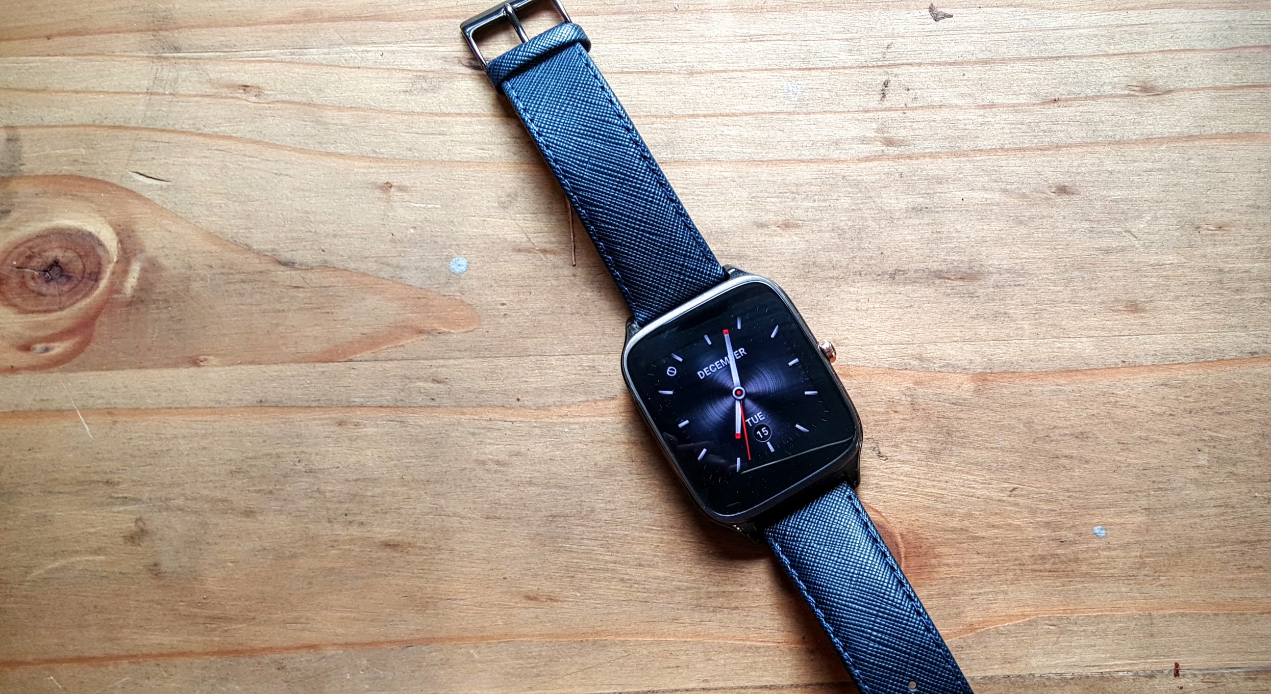
Asus has released its second Android Wear watch on the market with the ZenWatch 2, available at retail from $296 for the standard leather band edition or $366 for the stunning metal band.
The company hasn’t deviated far from the original in making the ZenWatch 2. At first glance, there’s little to distinguish Asus’ ZenWatch 2 from its older sibling. There’s two models on offer featuring 1.63″ or a 1.45″ screen size. Both models feature the same internal specs, save for a larger 400mAh battery behind the larger 1.63″ screen.
It’s not entirely clear why the difference in screen sizes exists – there’s not as clear a distinction as in other manufacturers’ lines. One model for example doesn’t seem skewed more towards the ladies’ end of the market as you’ll often see with smaller watches. You can get both sizes with a leather band, although you’ll be stuck with purchasing a particular colour leather band if you want a particular size. Oly the larger 1.63″ watches are available with metal bands though.
Our review unit is a 1.63″ “leather blue” model, with an attractive leather band with a blue finish, contrasting with a mostly-black watch body.
The physical properties remain much the same as the original ZenWatch, which sported an attractive finish yet never really found widespread success. Design-wise, this isn’t a bad thing. There are smooth edges and rounded curves in all the right places, giving you a feeling of quality as you run your finger over the watch’s face and body.
Some of the quirks of the original’s design have carried over, too – the watch’s screen remains puzzlingly off-centre, and the large bezels around it don’t seem to serve much of a purpose – they certainly don’t house an ambient light sensor a la the Moto 360s flat tire, leaving you wondering why your watch is larger than it needs to be, or whether Asus could have put a larger screen in there but simply didn’t.
The company’s persistence with the square face is interesting, and I think they should ultimately be complimented for sticking to their guns. At a time when many of their peers seem to be going round for their smart watches, both Asus and Sony are the notable mainstream holdouts.
It’s pretty rare to see an Android Wear app that doesn’t handle both square and round faces these days, making it a truly personal preference. I haven’t used a square Android Wear watch since early 2015, and I actually quite enjoyed the extra screen space over my usual G Watch R.
Should Asus go for a third iteration on this design – and really, there’s no reason not to – they really need to address the bezels. Small bezels are in.
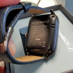
The charging port is yet another custom pogo-plug design. While I’d prefer everyone follow Sony’s lead and just give us a Micro USB port on the back of the watch, the cable here at least has a strong magnetic attachment that gives you a confident click when it snaps into place. It almost feels like the cable has a mind of its own, attaching itself quickly and securely whenever you hold it anywhere near the watch. It’s a much better
On The Wrist
Two things strike you immediately when you put the ZenWatch 2 on for the first time though – comfort and size.
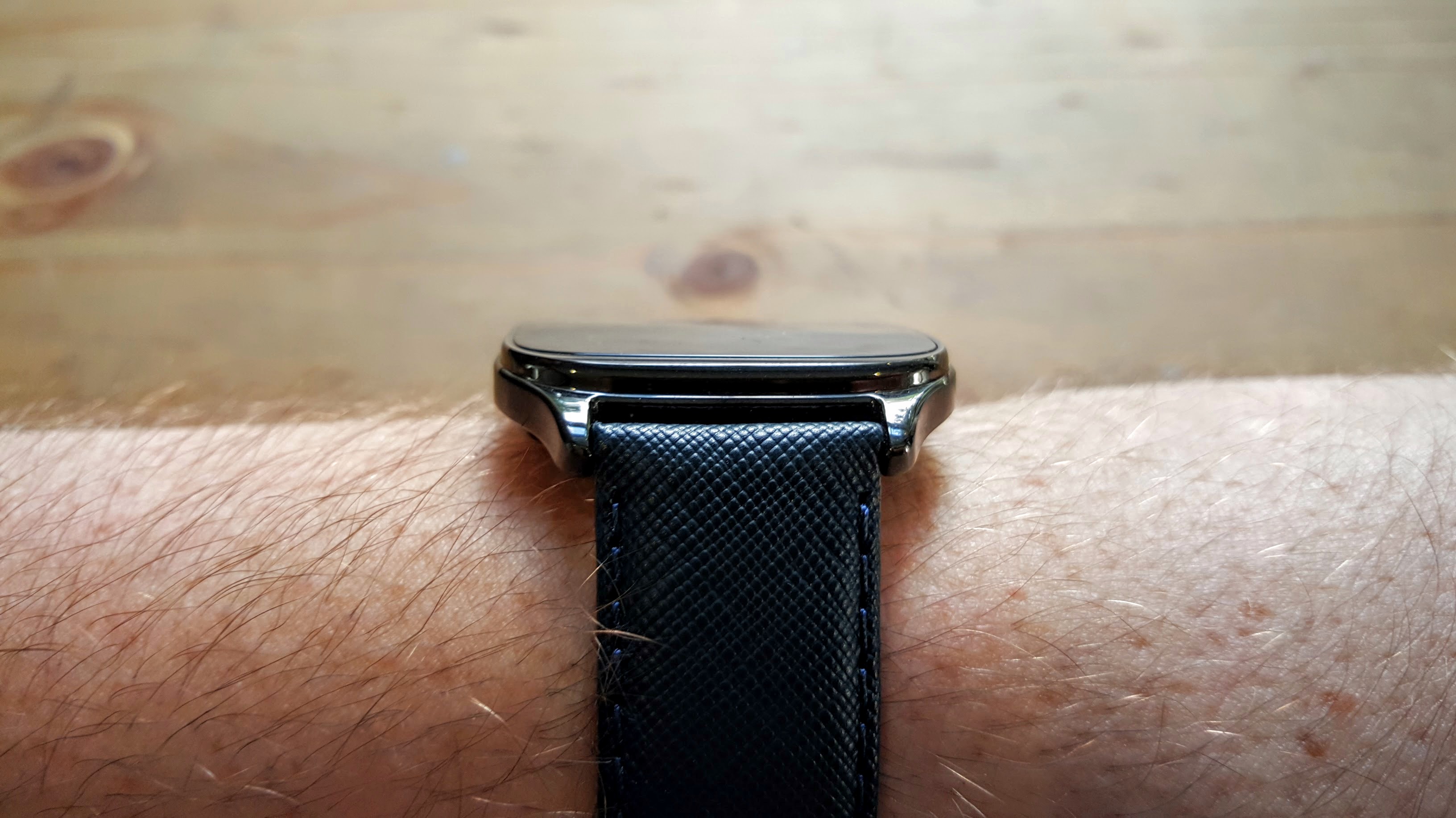
Despite its similarity to the original ZenWatch, there are a few subtle changes to the design, making it feel a lot nicer as it sits on your wrist. The connection points for the band are slightly lower than the watch body, giving the watch the feeling of following the contour of your wrist, even though the reality is that there’s still quite a large gap.

Special mention must also go to the leather band included with our review unit – it’s particularly good, high quality leather. The stainless steel band option is also particularly stunning and might make the ZenWatch 2 a great formal or dress watch instead of a smart casual.
You’d also be forgiven for thinking that the ZenWatch 2 is substantially thinner than other Android Wear devices out there. Asus has tapered and curved the back of the watch such that it tricks you into thinking it’s thinner than it really is – an effect we’ve seen so many times on phones that it’s surprising it took so long to see it happen on a watch.
Of course, there’s another reason the watch feels thinner – it actually is, but not by much (maybe 1mm). The reason for this isn’t so great – Asus has skipped the heart rate monitor, making this very much a dress watch instead of an exercise companion.
The ZenWatch 2 continues to use the single crown button, mounted at the right of the body. On other watches this position would lead to the button getting pressed inadvertantly when I bent my wrist upward – not so with the ZenWatch 2. It might be that the body design – with its pleasing, contoured rear panel – raises the button higher than it is on other watches. A plus for the design.
Software
Android Wear remains much the same from watch to watch, so I won’t go into its features so much. There are a number of attractive Asus-exclusive watch faces on offer though, ranging from a bit of shiny bling to playful fun. Despite this, I still ended up going back to my standard Krona watch face but that’s the point of having a choice.
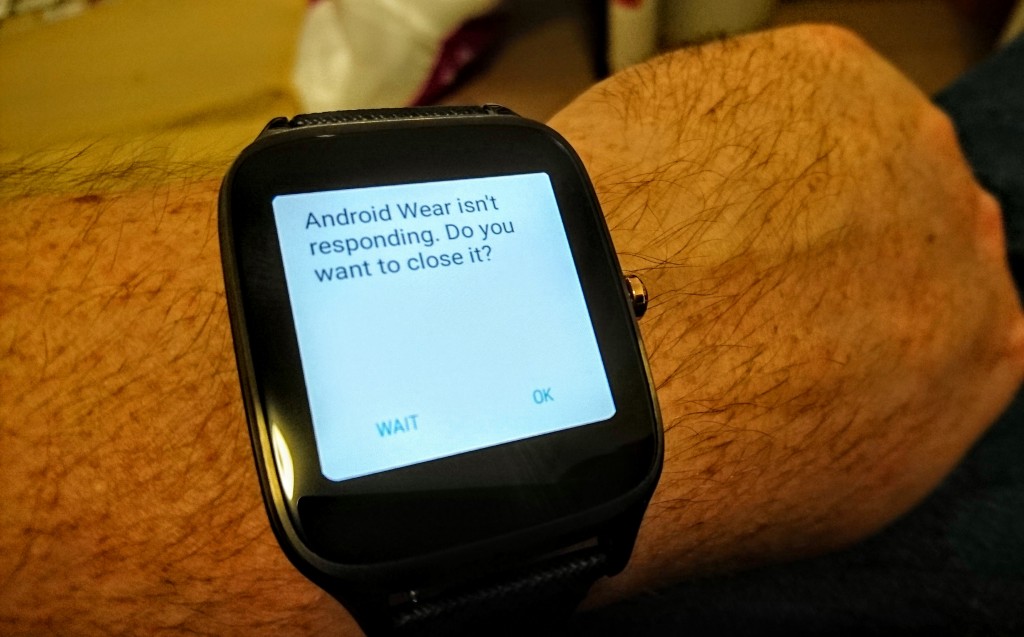
Disappointingly, the review unit suffered from performance issues. Animations (like swiping away cards) stuttered and skipped frames, and scrolling through the list of installed apps was also anything but smooth. If the watch was running last year’s hardware this might be forgivable, but in the 2016 (okay, late-2015) model, it’s puzzling.
If the stutters were limited to just dropping a few frames here and there you might look past them. Alas, it seems to point to a deeper problem – the ZenWatch 2 doesn’t seem able to keep up with what Android Wear is asking of it, leading the underlying Android OS to assume the worst. This happened way too often:
On the preloaded apps front, Asus was one of the first OEMs to preload their own apps on Android Wear and the ZenWatch 2 has squeezed in a few extra tricks beyond a normal Android Wear watch – there’s a Messenger app, a Smart Assistant, and a Wellness manager.
With the possible exception of the Smart Assistant (which sounds like a Google Now-alike), none of these apps really provide a compelling reason to switch away from solutions you might already be using – a large number of messenger apps now have Wear support, and Google Fit are the obvious choices, and the disappearance of the heart rate monitor makes the watch less suited to tracking workouts and renders it mostly just a step counter. Still, with 4GB storage on board I can’t really complain about them taking up much space.
The Smart Assistant does add a couple of neat features – you can now mute by covering the watch’s face (instead of just putting it to sleep / low-power mode), and there’s a find-my-phone mode and a bluetooth-tracker-like “distance alarm” that ensures you don’t leave your phone behind.
There are a few watch faces included too – every manufacturer includes their own faces. Once you stray from the pleasantly-restrained default face, Asus’ faces tend to skew towards super detailed, blinged-out designs which don’t suit my style, but that’s why you can change them.
If you’re coming from another Android Wear watch, you’ll probably have your own preferred face ready to go. If this is your first Android Wear watch, you’ll probably stick with the default for a while and then venture out into the wild with Asus’ built-in faces or, more likely, hit the Android Wear section in Google Play.
For the ultimate adventure, Asus also has a watch face designer in its companion phone app. It’s nice to see in that it’s an official, first-party take on things like Facer, but you’ll probably want to look further afield.
It feels like the ZenWatch 2 is counter-programming in the Android Wear space. It’s providing one of the few up to date square-faced watches in an increasingly round-faced world. If you’re not interested in the high end round watches on offer from Huawei, Samsung, Motorola and LG, then Asus pretty much commands your attention – the competition is aging.
The first ZenWatch wasn’t a huge success (indeed, it launched very late in Australia), but it still has a number of devotees who sing its praises. It feels like that appeal carries over to the ZenWatch 2. An increased focus on design carries the watch over the top in terms of style and sophistication, and should bring new fans to the device while impressing and encouraging upgrades from the original.
Asus is keeping the watch at a comparatively low price, but even at that price the slick design can’t disguise performance issues on the software side that simply shouldn’t be there.


“The ZenWatch 2 continues to use the single crown button, mounted at the right of the body.”
Continues..? The first ZenWatch doesn’t have a crown button.
In my opinion, this watch had been a local marketing disaster. The Australian website for the Zenwatch 2 was up much earlier than the watch was actually available… I lost interest and this review only makes me glad I did. It’s also marketed as if the large size is for men and small size is for women. As a thinner guy do they reckon I want an unstylishly large chunk of metal or the feminine band? Watches are partly about image, right? Sure, I could change the band at a cost but what a great way to marginalise a couple… Read more »
Very poor review guys! Usually you do a better job than this. You failed to mention that the watch recently updated to Marshmallow and allows calls to be made and received from the watch. This watch and the Huawei watch are the only two Android Wear watches that have speakers making them quite future-proof. I’ve owned this watch for a month now and it’s far better than you’ve given it credit for!
Only the Men’s version can make calls, There is no speaker for the women’s version, Which stopped me buying this for my wife
I agree. The speaker–and the ability to make and take phone calls from the watch–was the main reason I went with this watch. The sound quality is pretty good, too. Not mentioning this capability in a review is a major oversight.