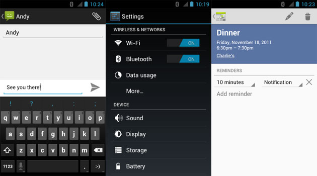
‘Android is ugly’ has been the catch cry of iPhone users for years. And they weren’t wrong. For the most part, despite its enormous feature set and flexibility, Android as a platform was ugly. Many applications simply reused assets from their far superior iOS versions, and those that did make use of native Android UI elements were neither attractive nor intuitive. I’ve never really liked iOS, and so couldn’t understand how iPhone owners could dismiss its many limitations so easily, instead focussing on how pretty it looked. Until I bought my first Windows Phone. I was captivated by the attractiveness and intuitiveness of Windows’ user interface, and loved that every application for the platform fitted in with Microsoft’s overall design philosophy. I was so caught up in its design that I (almost) forgot about the young platform’s failings. But the experience opened my eyes to the importance of good design, and I longed for a beautiful, unified experience on Android, which has always been the most feature-filled mobile platform.
Then Matias Duarte joined Google, and with Ice Cream Sandwich came Holo, which turned the proverbial ugly duckling into a beautiful swan. Android finally had carefully articulated design principles so that developers could easily make applications that were stunning and functional. Unfortunately, some of the big-name developers have, for whatever reason, decided to shun Google’s vision and persisted with their own design ideas, which frankly don’t fit with the cohesive experience Google has brought to Android. Fortunately, there are an increasing number of applications available that do respect the Android Design Guidelines, including some good replacements for official applications, as well as completely original apps that provide awesome features wrapped up in a neat, holo package. The following are my top five holo apps for this week:
Reddit Sync

I only ventured into the chasm of doom that is Reddit for the first time about three weeks ago. Since then, my productivity and social life have taken a massive turn for the worst. I have found, in my travels, that Reddit Sync is the best way to take my addiction to this real-life-destroying, incredible portal of information with me when I’m forced to leave my flat. I can quickly browse AdviceAnimals using Reddit Sync’s inline image preview, and tapping on the text will take me straight to the thread itself. You can completely customise which subreddits are displayed as scrolling tabs, but the application comes preconfigured with a number of the classics, such as the front page (obviously), r/pics, r/funny, and r/science. It has a number of sorting options, and pretty much all the features I imagine one would need in a mobile Reddit client. And most importantly, it is gorgeous. It makes full use of Google’s Android Design Guidelines and implements a beautiful and intuitive way user experience, which makes it all the more easy for conversations with strangers to begin with ‘did you see on Reddit today?’.
Reddit Sync is a fast, beautiful Reddit client, and is available for free (ad-supported), or you can buy the pro version for $1.55 if you hate ads.
Tasks
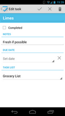 I don’t know why Google hasn’t integrated its Tasks functionality into Android yet, but never fear, Team Tasks are here! Tasks is simple and does exactly what its name suggests, and does it well. It defaults to a simple ‘Holo Light’ theme, but has the option for a dark theme if you’re into that kind of thing. It syncs with your Google Account, and allows you to manage all your task lists in style. You can set deadlines for your tasks, which is not a feature supported by Google Tasks itself, but Tasks will notify you with a neat Jellybean-style rich notification allowing you to set the task as completed without opening the app. If you are looking for a simple, easy to use task manager to sync across devices, look no further than Tasks. It even has a tablet view, and widgets!
Tasks comes in both a free (ad-supported) flavour, and a paid version for $0.99.
Tweet Lanes
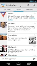 Now I know that the official Twitter application isn’t anywhere near as bad as the crime scene that is Facebook for Android, it doesn’t follow the Android Design Guidelines and therefore I declare that it belongs in the bin! A much better alternative is Tweet Lanes. It isn’t feature-complete yet, but it is quite impressive how quickly it has come together so far. Features include support for multiple accounts, inline image previews, a dark theme, ‘lane’ customisation, and volume button scroll. It isn’t as feature-rich as some of the Twitter clients, but the developer is constantly improving it, taking suggestions from his followers on Twitter and usually releases at least one new update every week. As you can see from the screenshots, this application exemplifies the Android Design Guidelines, and should be a model for all developers.
At this stage, Tweet Lanes is free and awesome. Once it’s complete, the developer may charge for the application, since there is a ‘Free for Life’ option in the settings, but even so, it would be worth the purchase.
Timer
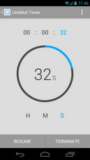 For some strange reason, the Android clock application in AOSP is missing a number of obvious features, namely a timer. When you’re as bad a cook as I am, being unable to easily keep time is kind of a bad thing. There are a number of different timer applications in the market, even a couple of holo-themed ones, but none are as beautiful and simplistic as Timer. You set a timer by rotating your finger around a circle in the middle of the screen, which has numbers in the middle to tell you how much time is left in your countdown. You can save frequently-used timers, which show up in a list when you first open the application on your phone, and on a tablet, they display in a side fragment. It is a fairly minimalistic application, and could use a stopwatch feature, but for what it does, and how it looks, Timer is brilliant. The tablet UI is a rad feature that makes good use of Android’s fragments, and honestly was the reason that I finally decided to cough up the $0.99.
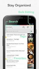 If any of you don’t know what Pocket does, it allows you to store articles, web pages and videos for reading later. But wait, there’s more! It strips out ads, unnecessary padding, and stitches multi-page articles together into one minimalist, easy-to-read festival of awesomeness. And it’s free, so there is no reason not to check it out. In case you haven’t realised, I love Pocket. And it made me the happiest boy in the village when their dated ‘Read It Later’ application was replaced by its fancy, holo-bearing successor, Pocket. It is often highlighted as a perfect example of a holo application that shows a distinct branding, and demonstrates that it is possible to create a distinct application that follows the Android Design Guidelines. Because it utilises the Android sharing intent properly, you can save from anywhere on your Android device, and Pocket will download and process it for you, ready to be read on the go. Pocket syncs through a central account, so you can view your saved pages on your PC, tablet or phone.
It defaults to a light theme, but a dark theme is available. Scrolling can be changed from vertical to paginated simply by swiping horizontally, and you can enable scrolling with the volume keys if you’re into that. Tags allow you to sort your saved pages however you like, which can come in handy if, like me, you tend to want to keep everything you read for future reference. I can’t recommend Pocket highly enough, particularly in an exposé of holo applications and beautiful Android design.
This article was a guest piece written by James Finnigan as part of our ongoing hunt for new writers – well done Jim!


Good article would add another free alternative for timing apps – Time Meter https://play.google.com/store/apps/details?id=com.rk.timemeter
The more apps using ADG that I see and use, the more dated iOS looks and feels.
Stupid article. Apps are Holo by default (that are targetted above API level 11, which any developer in the past 18 months would have done), there is no work at all required by the developers unless they go out of their way to style it otherwise. Holo apps certainly look better, but all recent apps should look Holo so there’s no point trying to single out apps that utilise it.
Hi Rob, thanks for your input. While technically that might be correct, some applications definitely make better use of the theme and the Android Design Guidelines than others. Take the official Facebook application for example – it is compiled against the correct API level to receive Holo styling, but it is not really a Holo application.
The point of articles like this one are to highlight the efforts of developers who make the effort to craft applications that make full use of the unique features and design of the Android platform.
Just wanted to add that by highlighting those that make full use of Holo theming we can recognise and reward them for their hard work.
Free alternatives to two of them: Timer & Stopwatch (https://play.google.com/store/apps/details?id=com.jakubd.timerandstopwatch) and Notes (https://play.google.com/store/apps/details?id=com.nononsenseapps.notepad). Different apps by different devs, but both have the great Holo styling and same functionality last time I checked.
Copied from the Play Store on my phone and the links aren’t working… Notes is by a dev named NONONSENSEAPPS and Timer & Stopwatch is by Jakub Dyszkiewicz.
Hi Glenn, you’re right those applications are great alternatives. If I recall, Notes was released slightly before Tasks. I used to use it, but switched to Tasks as I felt that it had more task-centric options such as reminders, which Notes did not have. Not sure if the situation has changed since then, but both are good examples of Holo.
I personally didn’t like Timer & Stopwatch. I thought it was too cluttered. It could be the small screen size of my dated Nexus S though!
Thanks for the feedback.
The best guest-written article yet. Good work Jim!
Nice read. 🙂
Nicely done, Jim!