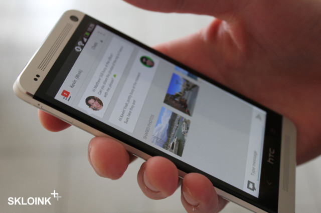
The other day, we posted a purported leak of Google’s supposed new integrated messaging client, Babble. Let’s face it though, the ‘leak’ was pretty ugly – the font sizes were all over the place, the English was terrible (‘You have started a voting’), and its general design is not even close to what Google has been doing lately.
This latest mockup, posted to Dutch site Skloink, just looks incredible. It’s obviously not real – for one, it’s being shown on an HTC One, rather than Google’s own Nexus 4. But still, it is stunning, and has exactly the kind of style and polish that I expect to see from Google these days. It’s obviously very heavily-influenced by the Google+ application, and the separated messages are evocative of Google Now’s cards, as well as the applications in the new Google Play Store.
I want a unified messaging application on my phone, and I want it to look like this. Come on Google, I know you’ve got it in you.


Google Groups is an existing product.. I can’t see them using that name.
Google has always used fairly straight-forward names for its products.. except the hyper-experimental ones (e.g. Wave.. Buzz..). Google Plus, Drive, Docs, Calendar.. all logical names.
I’d imagine it’ll be rebadged as Google Talk, Google Messenger, Google Messages, or something similarly simple. Babble just sounds a bit .. silly. Maybe that’s just its internal product name?
I’d like Messages. It’s nice.
Yeah that looks great. Much cleaner and more from what I expect from Google.
Google seem to be taking design seriously with this clean ‘card’ look. I’d like a unified messaging system that incorporates SMS, Google Talk, Google+ Messenger and all that. Would be much better than what we have right now.
Just don’t actually use the name “Babble”….
Babble is a horrible name, something like Google Groups might sound a little better.