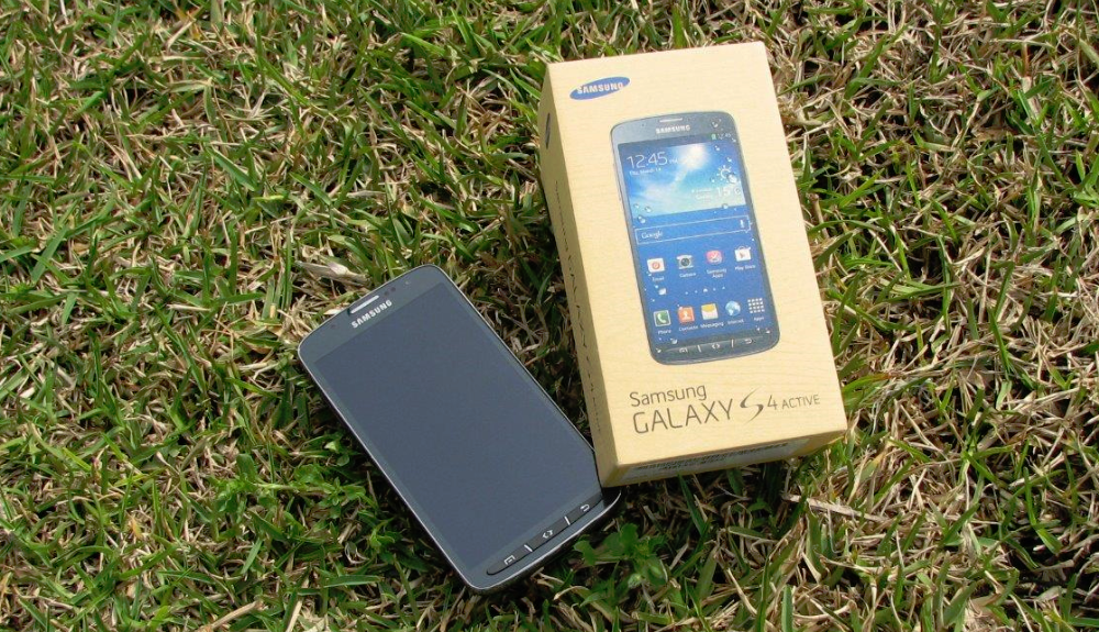
The Samsung Galaxy S4 is certainly one of the top three phones of 2013, but can its more-rugged cousin, the Galaxy S4 Active, live up to the ‘Galaxy S’ name?
There’s no denying Samsung have been the success story of the Android platform. Even before even Ice-Cream Sandwich was released, they had the flagship phone of the Android fleet with the Galaxy SII, followed by the Galaxy SIII and now the S4. There have been some huge contenders in 2013 with specs advancing at a rapid rate, and now that waterproof and dustproof designs are becoming more aesthetically pleasing, it’s hardly surprising that Samsung have followed the success of the Sony Xperia Z.
Despite the hesitation that some people have about ruggedised phones, there’s always going to be a market for a tough Samsung Galaxy phone simply because there is such a strong brand recognition. Be warned though, it’s not a cheap device coming in at $689.00 from Mobicity or $699 from the Samsung Experience Stores. For $5 a month handset payment on Vodafone with their $65 red plans, you can have the 16GB 4G version of the phone. It’s this version which we’ve reviewed.
- Rugged design, despite the extra size and weight it feels good
- Ringer volume is particularly loud compared to other devices
- 4G speed is faster and more consistent that S4
- Battery life appears to be lower than S4 with identical use
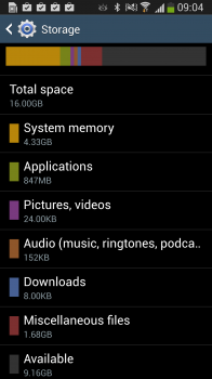
- Only 9GB storage is available out of the box
- The protector over the power MicroUSB is difficult to remove without fingernails
- 5″ Full HD TFT Screen at 1920 x 1080 resolution
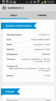
- 1.9Ghz Quad Core Processor
- 2GB RAM
- 16GB Onboard Storage + MicroSD Card Slot (up to 64GB)
- 8MP Rear Facing and 2MP front facing cameras
- 802.11 a/b/g/n/ac Wifi
- Bluetooth 4.0 Low Energy
- HSDPA 850 / 900 / 1900 / 2100, LTE 800 / 850 / 900 / 1800 / 2100 / 2600
- Android 4.2.2 Jelly Bean
- 2600mAh Battery
- 139.7 x 71.3 x 9.1mm at 153 grams
Hardware
A couple of things struck me as soon as I opened the box and picked up the device; the Galaxy S4 Active is not drastically, but noticeably, heavier than the original S4 and it’s also ever so slightly larger. That being said, the extra size and weight is obviously due to the IP67 rating (meaning it’s waterproof to a depth of 1 meter for 30 minutes) and the protection they need to put in place around the buttons and ports to ensure that water and dust wont get into your phone. This protection around the charging port for the phone became somewhat annoying after a few days because the cap was so tight fitting and I have no fingernails. I struggled repeatedly to get the cap off at night so I could charge the device. Wireless charging would have been a great inclusion (though you can add this yourself with third party accessories).
In the age of connectivity, there’s little doubt that users are looking to get more and more from their phones and as a by-product are very accepting of the extra size this requires from devices to meet their needs. Unfortunately, this results in phones becoming much more fragile as even members of Ausdroid have found when dropping Galaxy Nexus, Nexus 4 (the glass back was a terrible design flaw for clumsy people) and more recently the Galaxy S4.
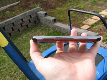
Designing a handset that can take a bit more of a knock or a spill makes sense, especially for users who work in more rigorous environments (for example, tradespeople or emergency services workers). The Galaxy S4 Active has rubberised edging that feels quite good in your hand with the subtle change of curve from the original S4. It looks great too and works well with the carbon fibre look that Samsung have given the physical buttons that have replaced the familiar capacitive buttons on previous models of Samsung phone. Samsung have even addressed the highest vulnerability of the smartphone by adding Corning Gorilla Glass 2 as the screen surface. You’d have to be making a concerted effort to crack this screen in day to day use.
Internals
Putting the minor gripes about the size and weight aside, the biggest gripe most users are likely to have is an “out of the box” issue that Samsung have been plagued with since the Galaxy S3: internal storage. The amount of storage available out of the box on the Galaxy S4 Active, advertised as a 16GB device, is a touch over 9GB. This really isn’t all that acceptable.
The physical layout of the device is very familiar and comfortable to any user of Samsung’s previous mobile devices; the power button on the right hand side of the device near the top, the volume buttons on the left about three quarters the way up the device, headphone jack at the top of the device, menu, home and back buttons at the bottom of the front face and charging/data port on the bottom in the center.
Some users might find surprising the volume range the Galaxy S4 Active is capable of producing. The vibrating ring function becomes almost unnecessary, because the volume is so loud that it alone will rattle your pocket! The speakerphone function uses the same speaker, and so it should come as no surprise that the speakerphone too is loud and clear, far more so than some other Samsung handsets.
Display
For those who primarily access the Internet through their mobile device, the screen is clearly an important deciding factor, and the Galaxy S4 Active has a great screen. Having become used to an AMOLED screen on my personal phone (a Galaxy S4), the TFT (Thin Film Transistor LCD display) screen on the Galaxy S4 Active is an interesting change, and in terms of clarity of picture and video, TFT comes out ahead.
The TFT display on the S4 Active runs at 1920 x 1080 resolution and 441 PPI (Pixels Per Inch). This pixel density puts the S4 Active on par with the screen output of the HTC One, considered to be one of the best screens on a current model Android device.
Comparisons aside, the screen is quite simply gorgeous. The colour saturation is fantastic and very close to natural colours without overcompensating for the fact it is a digital screen and oversaturating, video playback is pleasing to the eye even when playing back HD video. When reading on the device, whites are crisp and text all but lept off the screen making it very easy on the eyes when using for extended periods.
One thing that was of great interest to me and a question that came up from several readers was the screen responsiveness when wet. Unfortunately, when either the screen or your hands are wet, the responsiveness of the touchscreen is nothing short of horrible. It’s dreadfully inaccurate (if it responds at all) to your touch input. Pressing on-screen keys becomes virtually impossible, so that fun features — like taking a photo underwater, for example — can’t be reliably performed.
This is quite a disappointment when you consider that Samsung have marketed the S4 Active (in part) based on the underwater camera feature which frankly doesn’t work. While your S4 Active will survive a swim, don’t count on it working during said swim.
The last comment is about the oleophobic quality of the display — whatever Samsung have done, the S4 Active doesn’t accumulate oily marks and fingerprints like other contemporary handsets. It’s a great change from Samsung.
Battery
One thing I did notice though is that in identical use scenarios my Galaxy S4 with AMOLED screen lasted considerably longer than the S4 Active with TFT. On the average day, I needed to plug the S4 Active in as soon as I got home, and on some days, I was looking for power as early as 3pm. This isn’t a major problem for a desk jockey like me, but if you’re out and about (i.e. if you’re the target demographic for a handset like this), the lack of battery longevity is disappointing.
I found myself wondering if, given Samsung’s obvious target demographic for a device like the S4 Active, they could have used some of the space inside the larger handset construction to include some more battery capacity. A phone that can’t last a full day really isn’t very useful to people who aren’t typically near a power socket.
Performance
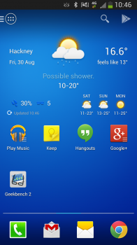
As I mentioned in my first impressions post the S4 Active offered me no surprises software-wise, as Touchwiz on the S4 Active is the same as Touchwiz on the S4. I’m not a huge fan of Touchwiz, so while I did try to stay with it for the duration of the review, it was replaced after a couple of days with my preferred launcher.
Ordinarily we wouldn’t advocate replacing standard software in a device review; we want to review it as it’s presented to the end user. However, it is worth considering in the case of the S4 Active (or the S4 itself for that matter) — TouchWiz does seem to require a bit more optimisation, as replacing it with another launcher does lead to significantly increased performance at the home screen, in applications and with multitasking.
While this is so, I do want to make clear there are no obvious performance issues with the S4 Active out of the box. The UI is pleasant to the eye, and it has many useful features, inputs and noises to make sure you know exactly what’s happening with your phone. These are certainly good things for those who need information and feedback at a glance. However, if you can do without those features, you will find better performance by replacing the TouchWiz launcher.
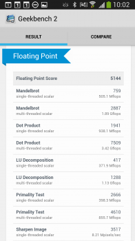
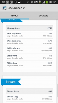
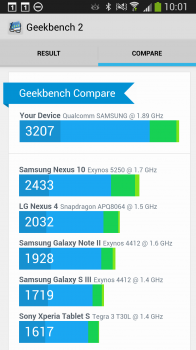
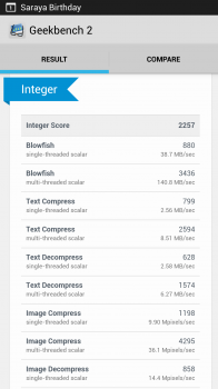
Regardless of what they throw at the Galaxy S4 Active I don’t think anyone, even the most demanding of power users will be disappointed in the performance. It’s snappy, responsive and doesn’t suffer any major stutter when loading apps even when there’s a lot of processes running in the background.
Connectivity
We’re now almost three quarters through 2013 and given the fact that even sleepy little Adelaide has 4G available from the three major carriers, any device that wants to be taken seriously as a competitor at the high end of the market needs to come with 4G capability. The Galaxy S4 Active certainly does, as well as the standard suite of other connectivity options.
I love Bluetooth, I won’t deny that. Having wireless accessories is often a fantastic productivity boost and means that you’re not physically hard wired to your device all the time. Coming from the first iteration of Bluetooth where just being connected would suck the life out of your device in a short period of time, the latest Bluetooth 4.0 Low Energy is the complete opposite. Regardless of the period of time that the device was connected via Bluetooth, either sharing Internet connectivity with my tablet or the hands free kit in my car, I was unable to notice any significant battery drain.
As a heavy wifi user, the ability to connect to the full range of 802.11 offerings (a/b/g/n and now ac) is important to me on any device, the Galaxy S4 Active delivers this functionality. I stream a lot of content to my phone either YouTube, Google Music or stored video on my home server and found that even streaming MKV files was no issue for the S4 Active on an 802.11n Network.

Software
Ed: We haven’t spent significant time discussing the software features on the Galaxy S4 Active, because (unsurprisingly) the software experience is precisely the same as that on the Galaxy S4. It’s trite to say, but TouchWiz is TouchWiz. We’ve included the software experience from the S4 below for the sake of completeness.
Touchwiz launcher
The default launcher on the Galaxy S 4 is not immediately horrible. Its animations are fast and fluid and actually add a nice touch to the experience. It isn’t until you’re feeling bold and crazy that you’ll notice that the standard launcher is missing some of the more advanced features, like the ability to re-arrange your dock icons. Seriously, you are stuck with the five icons that Samsung have decided are the best, and there is no way to change them. Don’t want to use Samsung’s browser? Too bad!
On top of that, Samsung insist on hiding basic features behind their menu button. For about a week, I actually thought that you couldn’t re-arrange home screen widgets or icons once they’d been placed. I thought the only way to do it was to remove it, and re-add it. It turns out that even though a long-press on a home screen item brings up exactly the same dialogue as when you first place the item, you have to first tap the legacy menu button and then tap on ‘Edit’ before you’re allowed to change anything. You need to go through a similar process to uninstall an application from the home screen.
None of this is intuitive, and Samsung have really made this an unpleasant experience.
Android 4.2.2
Unlike the HTC One, which launched with Android 4.1.2, the Galaxy S 4 ships with the most recent version to come out of the Android bakery, although you’d almost never know it. The two big features of Jelly Bean – Google Now and Project Butter – are hidden away as if they’re something shameful. Instead of Google Now, you get S-Voice, Samsung having removed any obvious way to access Google Now except from your launcher (you can access it from the task manager by long-pressing the home button, then the little ‘g’ icon); and the device’s performance is nowhere near as buttery-smooth as other Snapdragon-powered Android 4.2 phones. It’s a lot more responsive than my One X, but it also isn’t burdened with a Tegra 3. Still, the S 4 ships with all the necessary APIs, so even though Samsung have tried their hardest to make you forget you have an Android device, you’ll still be getting a device with the soul of Android 4.2.2 intact.
Touchwiz ‘features’
Samsung threw so many features into the Galaxy S 4’s software that the 16GB device only has about 7GB useable storage space out of the box. Apparently, Samsung are going to address this, but at the moment, it’s still a problem. I’m sure that each person who reads this review will find different features more or less useful, so I’ll try to give as much information as I can, but I can really only write about my experience. Feel free to disagree or ask questions in the comments, and hopefully we’ll get as much information out as possible.
Features I liked
Universal remote
Being able to use your phone or your tablet as a remote for your TV is awesome, and thankfully more devices are being released with IR blasters for this very purpose. I guess we can now add ‘remote control’ to the list of things our smartphones have replaced. On the Galaxy S 4, setting up WatchOn (the remote application) could not be simpler – you select your region for the TV guide, and pick your TV brand, and you’re good to go. The range of the Galaxy’s IR blaster is not as long as the TV’s actual remote, but it’s great when I can’t find (or can’t be bothered reaching for) the remote. You can switch directly to different shows from within the TV guide, and add the remote’s controls to the notification bar or lock screen.
AirView
AirView is a feature that Samsung ported over from the Galaxy Note II, where hovering over specific items on the screen will show a preview, or reveal more information about what you’re hovering over. For example, in the messaging application, hovering over a message thread will show a more detailed preview of the last message; and hovering over an album in the gallery will show a preview of the photos in the album. I thought that I would have quickly dismissed Air View as a gimmick and never given it another look, but it has really surprised me with how useful it is when it works.
The main problem with Air View is that sometimes the phone doesn’t correctly detect the hover gesture – either not registering it at all, or misinterpreting it as a touch event. Another issue is that very few applications other than those Samsung bundle with the phone support Air View.
Samsung Music Hub
Samsung Music Hub is a music streaming service, similar to Spotify or Xbox Music. It costs $9.99 per month for one device, and $12.99 for up to four devices. When you first set up your Galaxy, you are offered a free one-month trial of the premium package. Like Spotify, Samsung Music lets you create playlists and save tracks for offline use. The selection of music available isn’t as large as Spotify, but it has most popular music and some more uncommon artists as well.
Status bar brightness
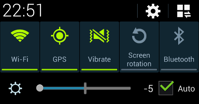
With most phones, auto brightness works pretty well, but there are times when you might want just a bit more or less brightness. In one of those ‘I can’t believe no one’s done this before’ moments, the Galaxy S 4 puts a slider in the notification bar that lets you switch auto brightness on and off easily, as well as being able to add or subtract a few lux from what the software would otherwise pump out. Samsung aren’t the first to have done this — for example, the LG Optimus G does similar — but it’s certainly a welcome tool for some.
Air gesture – quick glance
It’s features like quick glance that make me understand why people buy Samsung’s phones. Basically, the S 4 detects when you move your hand towards the phone, and it switches on the display to show you the time and any notifications you might have. When I saw this feature in the settings, I lit up. It’s such a cool idea, and even though it doesn’t always work terribly well, it makes you feel like a Jedi, which is a good thing in my book.
Features I disliked
Multi-window
Multi-window has been touted as Samsung’s killer feature, but I just wasn’t interested. It’s not that I actively disliked it, I just didn’t really think it was useful, and I think it could possibly have been done better. I see what Samsung were trying to do here, and I’m sure it works really well on a tablet, but I think on a phone, this kind of multitasking would be better served using floating windows, like Facebook’s chat heads or Cyanogenmod’s quick messaging popup. The only time that I’d find something like multi-window useful would be to reply to a text or email without having to switch out of whatever I happen to be doing at that time, and a floating window would work so much better than having to mess around with long-presses and window snapping and re-sizing.
Its lack of usefulness is further compounded by the fact that it doesn’t work with every application. There are some third-party applications that support multi-window, but the list is far from extensive. In addition to Samsung’s own applications, Gmail, Google Maps, Google Talk, Youtube, Chrome, Facebook, Twitter, Falcon Pro and QuickPic support snapping.
Keyboard
Apparently, the keyboard on the Galaxy S 4 is a modified version of Swiftkey, arguably the best third-party keyboard around, which has great autocorrect and can learn your typing style from your Twitter, Facebook and Gmail accounts, as well as SMS messages you’ve sent. I then naturally assumed that Samsung’s keyboard would be pretty good as well. I could not have been more wrong. By default, autocorrect is disabled, and I couldn’t think of a single good reason why this would be the case. Until I switched autocorrect on.
Once you enable autocorrect, you’ll soon wish you hadn’t. I don’t care what Samsung say, the keyboard on the Galaxy S 4 can’t possibly be built from Swiftkey. Samsung’s keyboard is truly horrible. Its autocorrect was consistently wrong, changing minor typos into completely different words (‘testinf’ became ‘yes’); it was not able to detect that the accidental ‘b’ or ‘n’ in between words was meant to be a space; and the dictionary was missing a lot of fairly common terms, such as ‘1080p’, which became ’10 0′. Even after telling the keyboard to learn from Facebook, Twitter, Gmail and messaging, it was still horrible. In fact, I think it actually got worse insisting that its predicted words were correct, even when I typed something completely. Needless to say, the real Swiftkey swiftly replaced Samsung’s version.
Smart Pause
‘Man, watching this movie is great, but I miss out on so much when I momentarily glance away from the screen! I wish the film would stop playing when I’m not looking directly at my phone.’ Said no one ever. And yet, this exactly what Smart Pause does, in a perfect example of Samsung solving problems that don’t exist.
Easy mode
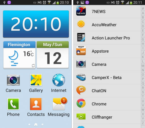
A carry-over from the Galaxy S III, ‘Easy Mode’ is basically a super dumbed-down launcher, and it should not be used by anyone ever. Apparently the standard launcher is too confusing for some people, and Samsung thought that this abomination would help. Seriously, check out these screenshots, and you’ll see what I mean:
Air Gestures – the rest
I loved the ‘quick glance’ gesture, but there are other Air Gestures with which I was less impressed. Basically, most of the time they don’t work, and are only supported in a couple of inbuilt applications. If you can get them to work, and you’re happy using Samsung’s standard apps, you can wave your hand in front of the Galaxy S 4 to scroll through web pages, skip back and forth in media applications or accept or reject phone calls.
S-Voice
S-Voice doesn’t work too badly for the most part, but it’s listed as a dislike because it has no reason to exist. Google Now is far superior and things like S-Voice are the cause of Samsung’s legal troubles. It’s clearly meant to be a Siri-ripoff, but it’s lacking the wise-cracking comebacks of Apple’s VI.
Samsung Apps and Hub
The cool thing about Samsung Apps on the original Galaxy S was that you could download some pretty cool premium applications for free. On the Galaxy S 4, this isn’t the case, and Samsung’s offering is just another alternative app store, but without the catalogue of the likes of Amazon. There are categories within the store called ‘Apps selected by Samsung’, and ‘Apps selected for Galaxy S 4’, which I thought would be a selection of applications that make great use of the unique features of the S 4, but in reality it’s largely a collection of mediocre applications seemingly selected at random.
The Samsung Hub looks really nice, but isn’t very useful. It’s meant to be a portal to various different types of content, but there isn’t a lot of content, and it certainly doesn’t offer anything over the Play Store. You do get a $20 credit to spend in the Learning Hub though, which is pretty cool.
Camera
One point of difference, however, is the S4 Active’s camera. Perfectly capable of taking some lovely pictures and producing some fantastic results, the S4 Active has a lower megapixel rating than its older cousin but the optics are extremely good and I had to take identical photos and zoom in a long way to see any difference. I did notice, though, that the camera on the S4 Active was not particularly capable indoors under artificial light; regardless of what I tried the results were either quite grainy or blurred due to the extended exposure required to capture the images.
It doesn’t matter what way you look at it, or even if the optics behind the camera truly are brilliant a 5MP drop from the parent device of this offshoot model is a bit disappointing. Unfortunately there are far too many people who don’t understand that the Megapixel rating of a camera is not the be all and end all of the picture quality it produces. It actually took me some significant zoom on a PC with near identical images side by side before I could see a difference in the image reproduction between the S4 and S4 Active.
Sample photos
Samsung Galaxy S4 Specs
The Galaxy S4 Active is a device that certainly lives up to the “Galaxy S” name and is worthy of appropriate recognition. There are a couple of minor disappointments with the device though. The hit and miss underwater/wet hands use is a let down, and Samsung’s native launcher could use some optimisation, but overall, the Galaxy S4 Active is of Samsung’s usual high standards.
As with any phone theres some strengths and weaknesses; the biggest strength of this one is the screen is gorgeous and a real winner in the equation if you’re looking at a Galaxy S4 Vs Galaxy S4 Active debate. The fact that your phone will survive accidental drop and spill, even the occasional swim is a big winner for a lot of people. The most likely deal breaker is for heavy users and the potential of running out of battery before the day is complete. This can be mitigated with car chargers or portable battery units.. but you shouldn’t have to do this. However, for the benefits the Active brings, the tradeoffs may be reasonable.
If you’re in the market for a new phone, it’s definitely worth your time to have a look at the Galaxy S4 Active.


Well.. my past few years were all about designing a computer interface for the elderly. You will be surprised how effective ‘easy mode’ launcher works for them. Same goes to well know computer program ‘eldy’. That particular launcher is not for geeks who visits site such as this. It is for those with limited knowledge using modern smart phones and it works much better than the standard touchwiz. I won’t say it is perfect (because it is not) but it does work in many positive ways. You may not like certain features but it does not mean it is abomination.
It is an abomination when the manufracturers interfarce is liberally applied to smother and bury as much of the vanilla OS and its interface as possible.
This is what…. things… like Samsung’s TouchWiz, HTC’s Sense, Huawei’s Emotion do. It’s what they were specifically designed to do. Prevent the user from accessing the real OS and its interface.
What needs to be done to such abominations is kill them dead, burn them with fire, nuke them from orbit.
naive random and senseless..
At least have some proper argument with supporting resources.If you believe pure android is the best interface ever, (in contrast you seem to believe manufacturer’s skinned interface is abomination). at least say why you believe this. You probably do not like 3rd party launchers too, or you simply do not appreciate android customization.
Third party launchers are not a problem as they do not apply wholesale modifications to the underlying OS.
The unremovable bloatage which manufracturers force into and on top of the OS is something which needs terminating. This garbage loving habit of theirs is something which actively works against the rapid rollout of OS updates.
Jeni – your reply to Daniel does not even address his comment about ‘easy mode’. It is just a pointless rant about skins. I agree with Daniel. I took a look at the homescreen image for easy mode in the review and my first thought was “that homescreen looks almost the same as the one I created on my father’s phone. His trusty old Nokia died and he had few options but to replace it with a budget touchscreen android phone. Having multiple homescreens was too confusing, so everything has to be on one. The only thing he has any… Read more »
How can it be the same PPI as the HTC One? Both are 1080p, but the Active is 5″, whereas the One is 4.7″. Something doesn’t add up.
HTC One is 468 PPI IIRC?
That’s near parity, but the One does come out on top slightly you’re correct.