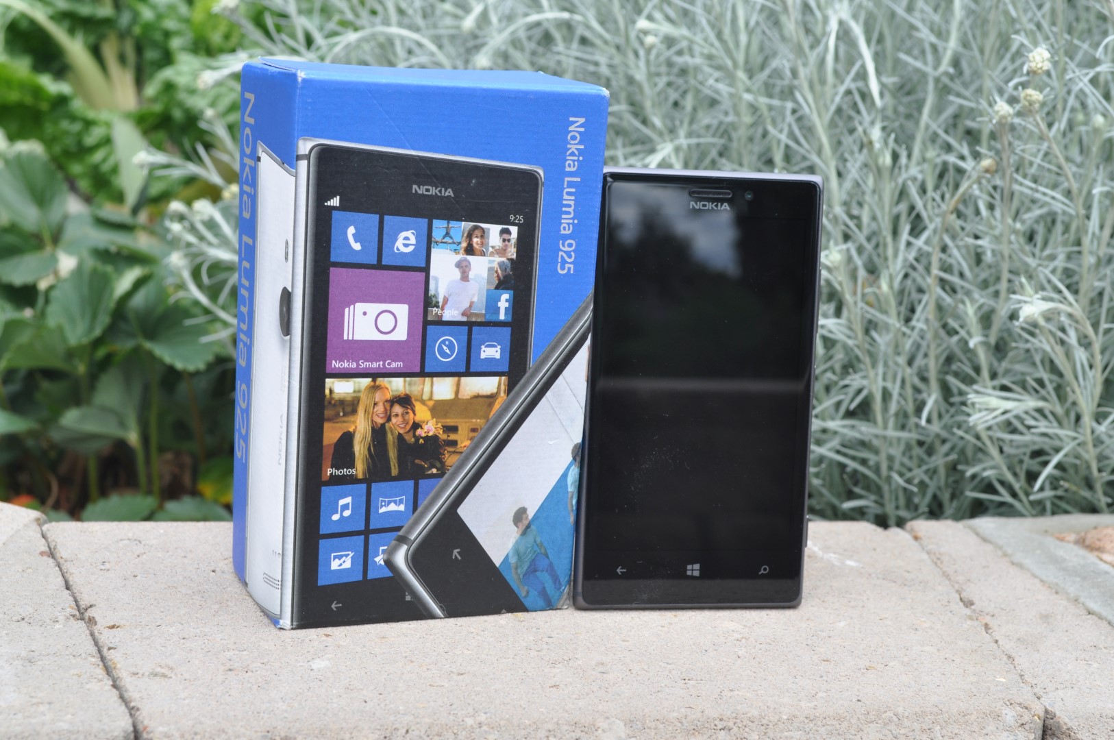
Ausdroid takes on the Nokia Lumia 925
This is a little out of the norm, we normally stick to the Android based handsets and devices that are available in Australia, but a recent challenge by the team over at TechGeek to review the Lumia 925 had us intrigued. With limited experience of the WP8 OS, I felt it was time to take a closer look. Don’t worry, this won’t be a regular thing but it’s nice to look at the competition sometimes.
Nokia Australia has kindly supplied a 16GB Black Lumia 925 to us to complete this review.
Phones from Nokia have traditionally been quite popular in Australia since the introduction of the earliest analogue devices through to the digital age but with the rise of the smartphones they experienced a drop in sales and market share based on their Symbian based devices not quite offering the same functionality as other devices. However, under the stewardship of ex-Microsoft employee Stephen Elop, Nokia adopted Windows Phone as their mobile Operating System of choice to continue their journey into the Smartphone era.
While the choice of Windows Phone received a mixed reaction within the tech community, there is no doubt that the hardware design prowess of the Finnish company is almost second to none, with Nokia consistently winning awards and accolades for hardware design.
The Lumia 925 comes along with all the usual accessories included, AC-50 MicroUSB Charger, Nokia Charging and Data Cable, Headset, Quick guide and SIM ejector tool.
With seemingly a great hardware design and a new mobile OS to investigate I used the Lumia 925 over the course of a fortnight and got intimately familiar with the device, here’s what I thought.
- Beautiful hardware
- Camera
- Battery Life
- Windows Phone 8
- Lack of Apps
- It’s not running Android
Hardware
With a thin aluminium frame and smooth polycarbonate back, in a squared off frame, the Lumia 925 is actually reminiscent of the Xperia Z with its squared off design but there’s a little more here; the Lumia 925 actually sits very comfortably in the hand as opposed to the Xperia Z which had sharpish edges to my mind and couldn’t be used for long periods of time. Overall, the Lumia 925 has a great feel in the hand, although the aluminium frame and smooth polycarbonate back can be a little slippery.
In terms of build quality, the Lumia 925 is second to none, the phone has a sleek feel to it, there’s no flex or bend in the chasis due to the Aluminium frame and it feels nice in the hand. The only downsides I found was on the review unit were on the back of the device, the first is a thin strip that exists between the polycarbonate back and the aluminium frame where it doesn’t quite meet up, perhaps a design choice to allow for easier dismantling of the phone for repair? The other was a small gap around the camera lens which allows dust and lint from your pocket to accumulate.
The buttons included on the phone feel as though they’re made of the same aluminium material that makes up the frame, they feel premium and the feedback when you depress them is quite solid.
The only downfall to the hardware design on the Lumia 925 is the lack of Teal colouring – a personal choice – or indeed any colouring. With the Lumia line of phones, Nokia has been spruiking their colour choices for some time now even going so far as to thank Apple for imitating them with the launch of the colourful iPhone 5c, but it appears the line of 925 phones is, with their choice of Aluminium frame, limited to a black or white colour choice.
With the Lumia 925, the bottom and left hand side of the device are completely devoid of buttons, ports or slots. The right hand side of the 925 is where you will find the Volume rocker, power switch and dedicated camera button.
The Lumia 925 also allows you to power it up with a double tap on the screen. After using the double tap to wake on both the LG G2 and the Lumia 925, I can now no longer use a phone without trying to wake it with this gesture, it’s brilliant.
The top of the device is where you’ll find the headphone jack, microUSB port and SIM card slot. The decision to place the headphone jack on the top is one that makes me unhappy, as I find it awkwardly placed. The decision to include the microUSB port on top can actually be seen as a positive with the phone sitting nicely in a stand whilst charging happily away on a desk.
The front of the phone is taken up with the 4.5″ screen with three capacative buttons located below – Back, Windows Home Key and Search – with multi-tasking in the OS achieved by holding the Back button. There is a speaker port located above the OLED display
The back of the phone you’ll find a speaker grill located towards the bottom and the camera located towards the centre with a flash above and Nokia branding on the back. The camera module protrudes slightly from the back of the Lumia 925, so when sat flat on a desk the phone is slightly raised towards you making the screen easier to read, if you need to. But as a flat Carl Zeiss glass lens covers the camera module, the phone doesn’t rock, instead sitting solidly flat on the table.
Screen
The Nokia Lumia 925 uses a 4.5″ AMOLED for its display, as I’ve used Samsung phones fairly extensively I’m more than used to the AMOLED screens available and the Lumia 925 screen isn’t great but it isn’t bad.
In terms of readability, it’s a legible screen in daylight and it does its job at all other times.
At 1280×768 it’s the same resolution as phones like the Nexus 4, but even that screen is beginning to show it’s age in an age where most flagship screens on Android devices are hitting the FullHD 1080P range. Coming from phones like the Galaxy S4 the lower resolution AMOLED screen is something that’s hugely noticeable, especially when you’re checking out text on webpages or reading, thankfully the recently released GDR3 release for WP8 will allow for future handsets to see FullHD screens but this won’t help the Lumia 925 not that the screen really needs it for day to day use.
Power and Battery life
Battery Life on the Lumia 925 was fairly impressive: it lasted me most of the day. However, while I tried to use it like my normal Android device, I found with some Apps lacking I simply wasn’t actually using it as much as I would my normal phone.
Nevertheless, it’s an admirable battery life for a 2,000mAh battery and possibly due to some good battery management from WP8.
Camera
Ahh, the camera. It’s a good camera on the Lumia 925, there’s really no arguing that. If you need to take a phone along somewhere instead of a full camera then you could do a lot worse than a Lumia 925 and often times, a lot better than your average point and shoot camera.
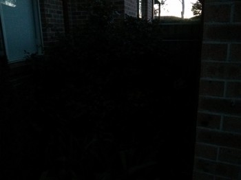
The Lumia 925 incorporates “floating lens technology” behind the Carl Zeiss lens that allows for some rock solid Optical Image Stabilisation when taking photos, so your low light shots are pretty impressive no matter which phone you’re used to using, the only phone I’ve used recently that gives it a run for its money would be the LG G2 with its 13MP camera with OIS.
Check out this low-light comparison :
 |
 |
Normal photos :
With video, the Lumia 925 can record 1080P video with no issues at all, but as with all phones with 16GB on-board storage and no expansion, you’ll fill that storage in no time at all. It’s very nice quality video and you wouldn’t be disappointed with it.
Connectivity
The Lumia 925 supports all the usual connectivity Wi-Fi IEEE 802.11 a/b/g/n but unfortunately no AC, but it connects to routers with no issues and maintains a fairly solid connection.
The Lumia 925 has Bluetooth but it’s version 3.0, so no BLE support with the 925.
Of course the Lumia 925 supports NFC. Nokia has supported NFC for a fair while and has a range of NFC pairable accessories you can purchase.
GPS wise you’ve got GPS with A-GPS and A-GLONASS that works in conjunction with Nokia HERE Maps and picks up satellites quite quickly.
The aluminium frame construction on the Lumia 925 was initially a worry for me when I was looking at making and receiving calls, connecting to WiFi and using the phone to surf the web or use it as a wireless hotspot, but it connects to 3G/WiFi with no issues at all, a testament to Nokia’s good design skills.
Performance
There’s really no issues with performance on the Lumia 925, with a 1.5 GHz Qualcomm Snapdragon S4 SoC and 1GB of RAM, it opens apps and switches into the menu with no issues. Transitions and animations are smooth as well.
There are some decent games available in the WP8 App Store like Asphalt 7, I paid the $0.99 for the game (for the second time now) and it, too, runs with no lag or issues.
Overall, it was actually a better overall experience than my previous experiences have been with lower end Lumia phones like the 520. The 925 was an eye-opener in terms of the possibilities of performance.
Software
Windows Phone 8
Well, this is where it gets into the real difference that is the divide between Android and WP8, we’ll start out with the interface. While I’m not terribly fond of the tile interface of WP8, it’s functional, the tiles are like a whole bunch of small widgets all nestled into place in columns.
The Live tiles can be set in three sizes Large – which spans the entire screen, Medium – which will let you fit two tiles across the screen or Small which will allow you to fit four tiles across the screen.
The App Launcher is accessed by swiping to the left, which gives you access to your complete list of apps and settings. You can pin these Apps to the front by simply long pressing on the app and selecting ‘Pin to Start’.
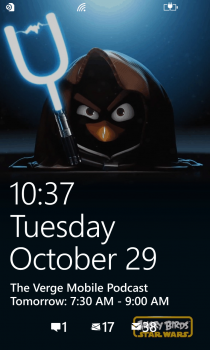
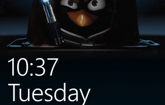
While you can add a wallpaper to your lockscreen and you can change the position, size, colour and exactly which tiles appear on your home screen, that’s really about it. If themeing your phone with backgrounds and different Icons is your thing, then you’re going to be disappointed here.
 |
 |
The visual style of Windows Phone 8 is very uniform. The style guide has been followed across the board with Apps all using the design guide that Microsoft have decreed is the way to go, but it’s not for everyone. I found the constant Bold/Normal text was a bit annoying to me personally but it’s a personal choice.
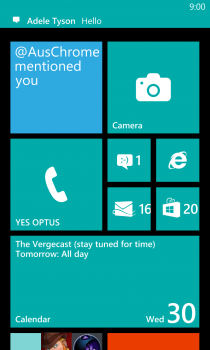
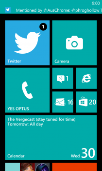
As an OS, compared to other offerings on the market there’s still some things missing or just not at the point I need them to be at as a mobile user for me to adopt it as a day to day offering. Apart from the tile interface not being for me, Notifications are still a large issue with me, large amounts of notifcations come in and they are a little harder to manage than other offerings available, the notifications come in on a one by one basis and there’s no way to see all of them if you don’t have time to attend to them at the time you receive them.
 |
 |
WP8 is a pretty decent operating system and after using it for a month, I feel it’s something I could use but I’d be constantly on the look out for the next update to improve functions but there’s a problem. The issue with updates on Windows Phone, that WP7/7.5 users know all too well, is that Microsoft is not above leaving those users behind if they think it’s necessary when it comes to updates. Don’t get me wrong, Android OEMs are doing this all the time, but Microsoft seems to want to keep all their phones up to date, WP8 users will just have to wait and see.
Bundled Apps
WP8 actually comes with a bucket load of functionality built-in if you’re heavily invested into the Microsoft Eco-System. There’s Office there, Internet Explorer, Hotmail and One Note.
Nokia too has enhanced WP8 with a bunch of default Apps – Nokia Care, Nokia Smart Cam, Here Maps and Cinemagraph to name a few and they’re all good apps – especially Nokia’s Here Maps. Google needs to watch this mapping service.
There’s a few other Apps included Facebook, Accuweather and all your basic phone functions – Calculator, Phone and Messaging apps.
The Apps on WP8 are all decent, they do the job, including the WP8 keyboard, it’s not bad, the dictionary leaves a little to be desired, there’s no gesture typing and it’s no Swiftkey or Stock Android keyboard but it’s quite decent and more than usable.
The only App I have to single out for derision is the Angry Birds Roost App – It does nothing. It’s more an App for Angry Birds Fans, there’s no game here or anything, it was quite disappointing to actually load it and discover it’s nothing more than an app to let you download Ringtones, Wallpapers or get news about the franchise. It just makes no sense.
App Eco System
Well, where do you start, the feeling I get from WP8 is that it’s where Android was when FroYo was introduced. WP8 still doesn’t have the market share that demands developer attention, but it’s starting to get it.
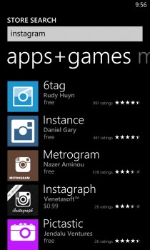
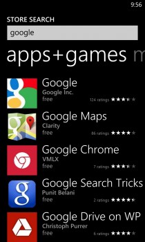
There’s a big hole with major apps missing. The recent announcements at Nokia World of Instagram, Flipboard and Vine coming to WP8 are a big win for the platform and more are coming, but there’s still countless other Apps and functions that are missing.
The good news for WP8 is that there is a good core of dedicated WP8 advocates who are also developers that are working to bring missing functions and Apps to WP8. Apps like FileBox(DropBox), MetroTube(YouTube), IM+(Google Hangouts) and so on, are there but then you run into other issues. The downside to third party developers building these Apps is that you aren’t guaranteed support, if the owner of the service (YouTube, Instagram or any others) decides to change the reverse engineered API that they’re using then you have no recourse.
 |
 |
 |
The argument expunded by Windows Phone fans for support from larger App developers is that they – Google, Instagram et al – should just make the App and release it for WP8, but with a market share that is less than 10% worldwide, where is the business incentive to do so?
As a long term Android user, we’ve been through this lack of Apps and personally I see that proliferation of Apps to the platform is certainly proceeding a bit quicker than it did when Android wasn’t the dominant mobileOS. Both Pizza Hut and Ticketek have even released a Windows Phone App before releasing an Android App and with Microsoft’s deep pockets I’m sure they are heavily invested in bringing more Apps to their platform as soon as possible.
Nokia Lumia 925
- 4.5″ 1280×768 @ 334 ppi, PureMotion HD+ OLED Display at 15:9AR
- 1.5 GHz Qualcomm Snapdragon S4
- 1 GB RAM
- 16GB On-board Storage
- 8.7 MP PureView Rear Camera with Dual LED flash, 1.2MP 1280 x 960 Front Facing camera
- WiFi IEEE 802.11 a/b/g/n, Bluetooth 3.0, NFC, A-GPS, A-GLONASS
- FM Radio
- 2000 mAh Battery
- Windows Phone 8
- 129×70.6×8.5 @ 139grams
Going into the is review, I had mixed feelings. As an ex-Windows Mobile 5/6 user I was a fan of the previous Microsoft mobile platform but hadn’t actually had a huge amount of exposure to WP7/7.5 or 8 so this was a good opportunity to see what is on offer and I was actually pleasantly surprised overall.
WP8 has some quite easy to use parts and things that are attractive, the consistent look and feel are certainly a bonus, it’s fairly easy to navigate through the OS, but there are definitely a lot more things that can be improved before I can personally use it on an ongoing basis.
Hardware wise, the Nokia Lumia 925 is an excellent piece of hardware and spending this time with the Lumia 925 just makes me wonder what could have been with another OS(Read Android) on board.
The recent purchase of Nokia by Microsoft will see new models, challenges and hopefully new functionality. A third mobile OS on the market will certainly encourage innovation from the two largest encumbent vendors. I look forward to seeing what Microsoft and Nokia designers can come up with in the future.

Met an Intel engineer heli-skiing recently and he showed me the movies he’d taken with it — they were several classes better than the I’d got on my Nexus 4.
Good review, Dan. Much more diplomatic than expected (especially considering some of our previous discussions re WP). 🙂
“… the only phone I’ve used recently that gives it a run for its money would be the LG G2 with its 13MP camera with OIS.” So you haven’t used the HTC One before? I’ve been very impressed with the One as it has ultrapixel and OIS which means great low light pictures.
Trouble with the One is that you can’t really zoom in on anything. With only 4MP, the resolution just isn’t there to have fine details.
What about manual focus? How many phones out there can do manual focus?
To me my One takes horrid pictures, great in low light, but it’s incredibly fuzzy. Also, because of the 4mp, zooming is practically a no no. They should of done what apple did with their 5S, because the 4mp is too much comprimise
Actually I have used the HTC One and found it to be lacking, especially when zooming in. The 8MP with OIS in the 925 and the 13MP with OIS in the G2 gives a much better picture than the HTC One.
It is just that you gave a demo of a low light photo and mentioned the G2. There is no doubt that the HTC One has been designed as one of the best low light cameras on the market. This has come at the cost of lower resolution pictures which means you can’t crop them as well (a poor man’s zoom). I guess you probably didn’t have a One handy to do the low light test? Now if the 925 takes low light pictures better than the One and at twice the resolution then that would be worth pointing out.
Really USB port on the top is good.. are you mad… I accept everyone has personal tastes but what about a dock ? having the USB port on the top does not work for me at all. Also headphone jack on the bottom is just painful.. Nicely written though and well done to remain open to alternatives.
I have seen this reaction to a headphone jack being on the top before. In fact I see it quite a lot. This is obviously a huge issue for many people. No one has really mentioned why this is a problem. I am absolutely not asking to start something here. I am genuinely confused as to why this is such an issue. Could someone enlighten me please?
Part the first:
The key issue for USB placement is his use of the word “dock”. If you dock the phone in any charging cradle or audio-dock it would be upside down. Any phone with hardware buttons, or launchers like stock android (refuses to rotate 180 degrees portrait) will be upside-down and a PITA to use.
Part the second: Headphone jack – you’ll need to oblige me with an experiment: Stand up, pick up your phone, use it, put it in your pocket – if you have human wrists and didn’t faff around with it in your hands then its upside down in your pocket. It rings, you bring it out, its right way up again, easy. Now connect the headphones so you can listen to some podcasts as you head into work. If you connected them to the bottom, everything is the same as above. If you connected your headphones to the top you have… Read more »
Exactly. But a lot of people don’t put their phone in their pocket upside down which is weird I think for the reasons that you have stated above. And, HTC insist on putting the on button on the top which means it quite often turns on in your pocket while you are walking! They really need to put it on the side or have it recessed.
I Guess the Cons are only valid if ur looking from a Android user prospective….else come on…this is a gd handset (not best), all we now need to do is to pray that the Nokia Microsoft deal to fail…..so that Nokia will then consider the implement Android on the next gen handsets 🙂
Agree 100% the hardware is good, it’s the WP8 that isn’t for me.
Dan, why wasn’t ‘Lack of customization capability’ listed as a Con?
You make specific mention of this limitation in the review, but it isn’t listed as an actual Con.