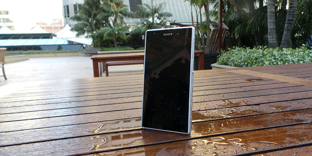
Sony’s second 2013 flagship phone doesn’t disappoint.
Earlier this year, we rather enjoyed our time with Sony’s Xperia Z. The company’s waterproof, dustproof, “lifeproof” device proved popular despite being the underdog in the annual HTC-Samsung duopoly of mega powerful flagship phones. It’s thought that the device’s popularity may have been assisted by the release window, which saw Sony get the Xperia Z to market a month or two before the One and the Galaxy S4, but the device wasn’t without its flaws.
Sony’s breaking with the accepted market trend of releasing one-flagship-per-year, taking a second bite at the Xperia Z cherry with its newest device – the Xperia Z1. It’s a curious time of year to release a flagship phone, and it might just appeal to owners of certain other devices as they come off their contracts at this time of year.
As the name implies, the Z1 represents more of an evolution than a revolution – the device still looks like its forebear, and it continues Sony’s “big power button” design language. While the major feature is the 20 MP rear camera featuring Sony’s Exmor R technology, the company is eager to make it known that they’ve listened to and addresses the biggest criticisms of the original Z – its core is now a strong aluminum frame with chamfered edges replacing the sharp edges of the original, there’s a dedicated camera button for photography and the headphone jack is no longer covered by a flap, although other ports remain hidden.
What’s unchanged is the amount of fun you can have with a phone that’s waterproof. My favourite trick while using the Z1 was to show the phone off to folks at a cafe or pub, slowly move everyone’s devices away and “accidentally” spill water on the device and watch everyone’s reaction. Every now and then a technological advancement comes along that makes you wonder how you’ve managed to live without it. HTC’s BoomSound speakers have become a standard by which we assess the sound performance on all news phones, and I’m disappointed that other companies haven’t adopted waterproofing as a standard feature.
The Z1 has much to recommend it, but will it be your next phone? Let’s find out.
- Solid construction
- Waterproof, dustproof
- High quality camera in the right circumstances
- Mostly untouched Android
- Exclusive bonuses for Xperia owners
- Camera hit and miss, and software surprisingly a bit simple
- Device is big and chunky with large bezels
- Buttons could be better placed
- Glass back adds weight to the device
Hardware
The Z1 is a 5 inch phone, but it’s noticeably larger than its competition at that screen size. While Samsung’s minimised the bezels on the Galaxy S4 and the Note 3, Sony has endowed the Z1 with rather large spaces above and below the screen – an area that would usually hold physical or capacitive buttons, had Sony not embraced Android’s on-screen buttons. The large vertical bezels also tend to distract from the left & right side, which aren’t really anything to write home about either. Framing the screen within such bezels makes the device bigger than its other 5-inch peers, but doesn’t offer an obvious benefit. It’s a design conceit that Sony may come to regret.
The added size also causes some added heft, although nothing that made the device particularly difficult to hold. The front and rear of the device are once again glass, which also contributes to the scale-tipping 170g weight. It’s not that 170 grams is particularly heavy, but it’s almost 1/3 the weight of a Galaxy S4 (130g) again, to say nothing of the Nexus 5s’ svelte 130g.
That said, the weight and construction is not without its benefits. The Z1 feels like an incredibly solid, well-built piece of technology when it’s in front of you. The aluminium frame can take a hit and give as good as it gets – knocking the corner of the device on a table, you’ll hear a reassuring thud rather than a disappointing smash. It doesn’t give, in a way I’ve not seen since looking at Motorola‘s RAZR M. It’s a nice-looking slab of premium quality glass and metal. That you could really lose yourself in while staring at it.
Sony seems to have given some thought to button and port placement on the Z1 than the Z Ultra, although it’s not perfect. The waterproof headphone jack is the only thing you’ll find on the top edge of the device, while the power button, volume rocker and 2-stage camera shutter button are all housed in the lower half of the right edge. The Micro USB port and Micro SD card are located under flaps at the top of the device’s left edge, while the Micro SIM card and a handy red hard reset button are under a similarly-placed flap on the right and a pair of stereo speakers peeking out of a waterproof grille on the bottom edge of the device.
The back is a flat piece of solid glass, interrupted only by the 20 MP camera, and thoughtfully has a small NFC logo to help you find the sensor. Sony’s also got a proprietary magnetic connector on the left for connecting the Z1 to accessories like its Charging Dock and Battery Case (Z Ultra linked, but Sony tells us one’s coming for the Z1).
While the power button is theoretically placed such that your index finger can fall naturally on it, the volume rocker juts out almost as much as the power button and it right next to it, meaning that you’ll often turn your volume up when you intend to turn the screen on. The distance between the shutter button and the camera itself (they couldn’t be further apart) leads to a bit of a shake on the device when using it to take photos one-handed.
Similarly disappointing is the SIM slot, which holds your Micro SIM card in a fairly flimsy plastic sleeve. It’s so thin and flimsy that you have to wonder why it even exists at all, and caused a couple problem for me when replacing the SIM card – it turned out the SIM wasn’t quite seated correctly and thus caused the device to not boot at all, requiring a hard reset.
Once famed for its industrial design, Sony seemed to make a few missteps during its early Android years – cheap plastic construction, chubby devices and questionable design decisions made us wonder whether it had lost its way in the design department. Happily, the company’s 2013 designs have us looking fondly at Sony products once more, and they’ve addressed everyone’s concerns about the Xperia Z with the chamfered edges that now adorn the body. If they haven’t recaptured the Sony design magic, they’ve come close and this confidence shows through in the overall design and feel of the phone. If anything, it should make 2014 really interesting.
Under the hood, Sony’s pulled out all the stops – like the enormous Z Ultra, the Z1 is powered by a brand new quad-core Snapdragon 800, running at 2.2 Ghz matched with 2 GB of RAM. This seems to be the new standard for an Android powerhouse, and we expect to see a lot of phones using this CPU in the next few months. Paired with a generous 3000 mAh battery, the Z1 seems well-equipped to hold its own against the next batch of flagships.
Indeed, the Z1 is probably one of the fastest and most responsive Android phones I’ve ever used. Apps open in a snap, and there’s no noticeable UI lag. You can’t ask for much more.
Notably, the Z1 is only available with 16 GB of built-in storage – and of that, 12 GB is user-accessible. There’s no 32 GB storage option, but the Micro SD slot can take up to 64 GB. While helpful for storing photos, the SD card won’t help for apps like Google Music that refuse to acknowledge the SD card’s existence.
Battery
While the phone’s a little larger than I’d like, Sony’s clearly made good use of the space within, packing a 3000 mAh battery – a welcome boost over the One’s 2300 and Galaxy S4’s 2600 mAh.
Such a large battery gives the device great stamina at games like Ingress, well known for draining batteries quickly but it also means that you can feel comfortable your phone won’t give up on you if you’re out in the evening after a full day at work. With light use, you could likely get a couple of days from a single charge.
Sony continues to offer its “Stamina Mode” software modification on top of Android. As Matt noted in his review of the Xperia Z Ultra, Sony’s Stamina Mode is one of the better battery life extension solutions out there at the moment. Rather than relying on a complex set of rules or triggers, Stamina mode is simple – when the screen is turned off, a number of features like wifi and mobile data go with it. You can also exclude certain apps from Stamina mode restrictions, so if you absolutely must get your Twitter notifications you can add it to the whitelist.
Display
Sony’s come back for another stab at a 1080p mobile display after the lacklustre performance of the original Xperia Z’s screen. It’s turned in a better performance this time around, although it’s still falling short in a couple of areas.
Packing a welcome – but unsurpsing – pixel density 441 PPI, Sony’s display is now branded “Triluminos”, referencing technology that has made its way down to mobile from the company’s high end TV line. It’s supposed to make colours pop in a way approaching what we’ve come to expect from AMOLED displays.
It’s paired with the company’s X-Reality Display Engine, which is constantly analysing the display, looking for opportunities to enhance brightness and colour depth – this all sounds pretty exhausting, but the result is a screen where colours are generally brighter and more vibrant saturated than you’d find on most other phones. This makes media consumption – viewing videos and photos – a pleasure.
The display performs better than its predecessor as you move off-axis – colours remain accurate for longer, and the backlight no longer turns everything on the screen white – but sadly, there’s still room for improvement.
Connectivity
The Z1 offers no surprises on the connectivity front – there’s support for Australian 3G and 4G networks (with the exception of Optus’ new 4G Plus network), 802.11 a/b/g/n/ac wifi on 2.4 and 5 Ghz bands, NFC, GPS with GLONASS support and Bluetooth 4.0. You also get Wifi Direct, which allows you to use Xperia Throw to send your display wirelessly to a Miracast-compatible receiver, and MHL support.
In-call audio quality is pretty much table stakes for a phone in 2013, and the Z1 offered audio that was as clear as you’d expect. It’s noticeable that the Z1 doesn’t offer HD Voice, but that’s unlikely to be a deal-breaker.
Sony’s put a lot of thought into the connection of accessories like bluetooth headphones and their upcoming QX lens-style cameras, relying on NFC taps to pair the devices together. While I didn’t have any of these devices on-hand to test them out during the review period, a demonstration at the launch event showed that the Z1 is quick to recognise the device presented to it and take the appropriate action. This is a welcome approach to device pairing that I wish more manufacturers would adopt, and it’s made even easier by the clearly-marked NFC logo on the back of the device.
Sound
The Z1’s placement of its stereo speakers – along the bottom edge of the device – manages to avoid the all-to-common pitfall of a rear-facing speaker. You’ll always be able to hear the device and, happily, it can produce a reasonable amount of noise before it hits a distortion point.
Every device that comes across our test bench now has to face a comparison with the HTC One’s BoomSound front-facing speakers, and while the Z1 ultimately does fall short, it still puts up a reasonable fight.
Sony offers a handy “low power audio playback” mode though its Walkman application, which sounds like it’s performing some similar functionality as that seen in Android 4.4 – presumably routing audio directly to the DSP for decoding and letting the dedicated hardware take care of the audio decoding duties.
Camera
Sony’s made a big deal of the Z1’s 20.7 MP camera. Offering an f2.0 aperture, the 1/2.3″ sensor delivered good results, with a few caveats.
While a big fuss has been made of the pixel count, the reality is that you’ll usually get 8 MP photos out of the Z1 by shooting in the device’s “auto” mode, cunningly named Superior Auto. In this mode, the image captured by the device’s 20.7 MP sensor is scaled down to 8 MP, theoretically increasing the amount of detail you’ll find in an area and making it better at capturing images in low light. It also means that you can pull off an approximate 3x zoom without moving to a pure digital zoom – a welcome trick, although you’ll lose the benefits brought about by scaling-down the full resolution of the sensor.
Images taken in Superior Auto mode in daylight and well-lit areas were indeed of a generally high standard as you’d expect from a phone with this much of a focus on photography, but as the sun disappeared or I went indoors the traditional weakness of mobile camera sensors made themselves known. Additionally, the auto focus seems to hunt around the image for focus when all you want to do is take a quick photo.
If you’d like to take photos at the full resolution of the sensor, you’ll have to move to Manual mode and make some tradeoffs. At a full 20.7 MP, you’re unable to pull off effects like HDR shooting – understandable given the size of the resulting files, and the bandwidth required to save them. Unfortunately this also makes the phone very susceptible to movement, including the movement that occurs when you use the physical button.
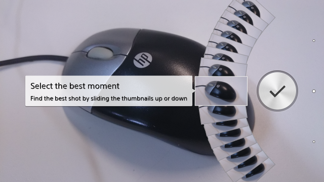
Sony’s brought an innovative UI to the camera for burst mode photography. After your photo is taken, you’ll see 60 frames – 30 before and 30 after you pressed the button – presented in an arc on the screen. You can drag your finger across the arc to change the image and tap the shutter again to select that shot. While it’s a simple way to select the shot you want, I couldn’t help but feel disappointed that the software lacked the option to turn all the burst shots into a movie, a la HTC’s Zoe functionality. I also noticed that the Z1 keeps all the 1080p image previews in a folder – this can confuse some software that imports all the photos from a device into a single folder, and you may have to do some cleanup of your file system after an import.

Another big push for Sony has been the “AR effects” mode which places a virtual scene into your surroundings, allowing you to move around and find the best place to photograph the virtual objects. The best effect, has to be the prehistoric landscape with a miniature volcano and trees with a T-rex prowling around, but there’s also a “carnival” mode which puts some funny headwear on your subjects or a slightly more wedding-friendly effect that places a floral arrangements and doves into a scene. AR effects can be a little hit-and-miss, often confusing elevated surfaces for “ground”, and the scenes lack a “start again” option, but they’re still fun to have a play with and are pretty impressive when you consider it’s all being done on a phone. If you hand your phone to nearby kids with AR effects enabled, don’t expect to get it back very quickly – but, also expect them to run from the T-rex.
Rounding out the camera software is a Google-Goggles-like Info-eye mode, which comes with all the same hints and tips (landmarks are great, objects may not do so well, etc) and an interesting addition for the “lifecasting” crowd in the form of Social Live, which allows you to stream live video from your device onto your Facebook wall.
For all the tricks and surprises of the camera software, it feels like Sony’s missed some basic usability features. There’s no way to overlay a grid to help you line up your photos, and switching shooting modes requires more steps than it should, while options remain buried under nondescript “tools” menus. You also can’t access things like HDR in Superior Auto mode, necessitating a mode switch AND an option switch. It’s not intuitive, and I expected better from Sony, who makes their own range of point-and-shoot and DSLR cameras and should be intimately familiar with what photographers want from their cameras.
You’ll be able to wield the Z1 and deliver some impressive results as you’ll see in the samples below, but it feels like it requires a little more effort and patience to get the results you want.
Camera UI
Sample Photos
Software
Android
The Z1 arrives with Android 4.2.2 out of the box, a respectable if now-dated (twice over) version of the core operating system.
Sony has been improving in its delivery of software updates for its phones in the last couple of years, and as the Z1 is its’ new flagship phone the company’s recent announcement of its 4.3 and 4.4 update plans brought no surprised.
The Z1 should see a 4.3 update in the next couple of months, with 4.4 to follow – though there are no specifics.
Customisations
Sony earned praise for hewing close to Android’s “stock” (AOSP) feel with the Xperia Z, a trend that’s continued here. While the Z1’s software shows clear “Sony touches” like a slightly more stylised “Sony” font and some textured UI elements, for the most part it doesn’t fix what isn’t broken.
While Sony hasn’t changed much on the launch, the app drawer now has a pseudo-Navigation-Drawer (a slide-in menu on the left side the screen) that offers sorting and searching options for the app list. It’s a welcome customisation that many users may not use, but power users will appreciate.
Sony’s also chosen a more “traditional” approach to Quick Settings whereby configurable toggles run across the top of the notification shade instead of the full-screen method introduced in Android 4.2.
Bundled Apps
If there’s one area that might start to earn some scorn from power users, it’s the number of apps Sony’s including with their new devices. These range in importance from light customisation of the Settings UI through an FM radio (always a welcome inclusion) up to a full replacement ecosystem for video and music content and Sony’s Playstation Mobile games system, with some third-party apps included to boot.
While many of us are happy to live within Google’s ecosystem, it’s not the only one out there. Sony is well known as a powerhouse in the music and movie worlds, operating its own labels and studios and occasionally standing its ground on licensing its content to the competition. From that perspective, it’s not a bad idea to keep an eye on the content offered in Sony’s bundled Music and Movies Unlimited apps – you might find a gem.
While Sony duplicates Google’s media ecosystem, it does no such thing to its Android app system – a good thing when taking into account recent cautioning against installation of apps from non-Google sources. Sony’s Xperia Conceirge app will occasionally offer you exclusive deals for Xperia owners – during my time testing the device I was able to download an Xperia-specific version of PullPullPic (a fun picture manipulation app) for free, while the normal app is $2.61 in the Play store. Sony seems to be negotiating with the authors of these apps to put alternative versions of their apps in the Play Store that are restricted to their devices, a welcome tactic that avoids unnecessary duplication of Google’s app ecosystem – security, payment and all.
In the same vein, Sony also provides an app called Sony Select, which curates a list of apps from Google Play and promotes them to users of the app. It’s like Sony’s guide to apps for users of their devices, but only goes so far as to suggest apps – all transactions still take place in Google Play.
All in all, the list of bundled apps visible from the launcher and app drawer:
- Backup & Restore
- FM Radio
- Movies
- PlayStation Mobile
- Reader by Sony (a shortcut to download the full app)
- Sketch
- Sony Select
- Track ID
- Track ID TV
- Videos Unlimited
- Walkman
Sony also includes a number of third-party apps:
- McAfee Security
- OfficeSuite
- Pixlr Express
- SocialLife
- Temple Run 2
Sony Xperia Z1
C6903
- 1080p Triluminos LCD display
- 2.2 Ghz quad-core Snapdragon 800 CPU
- 2 RAM
- 16 GB storage, Micro SD up to 64 GB
- 20.7 MP rear camera (Exmor R sensor), 2 MP front
- 801.11 a/b/g/n/ac Wifi, Bluetooth 4.0, NFC)
- 3G: UMTS HSPA+ 850, 900, 1700, 1900, 2100 MHz
- LTE: Bands 1, 2, 3, 4, 5, 7, 8, 20
- Android 4.2.2
- 3000 mAh battery
- 144 x 74 x 8.5 mm, 170 grams
Buy it now
RRP: $779 from Sony.
Sony’s delivered a strong contender in the Xperia Z1. It’s got extremely powerful hardware, a big battery, a great-looking screen and a compelling camera.
Compared to its contemporaries, the Z1 is a better-feeling and more sturdy device than the Galaxy S4, with a slightly better camera and (subjectively) a better user experience, but it’s also bulkier and heavier for it. The HTC One’s display outclasses the Z1, it offers more internal storage, but the Ultrapixel can only take the crown in low-light situations. Its larger battery should ensure that it lasts longer than any of its competitors.
The Z1 will happily outperform both devices in terms of sheer power though, with the Snapdragon 800 besting the lower-specced incumbents. This may ultimately prove to be the ace up the Z1’s sleeve – it’s leading the pack out of the gates with a brand new CPU, and it clearly runs rings around 2013’s flagships.
Ultimately, whether the Z1 is the phone for you will depend on your willingness to carry a slightly more portly device, and that may depend on whether the camera suits your needs or not. If you’re coming off contract and want to find your next phone, the Z1 won’t disappoint. If you’re buying outright, though, you’ll probably want to save your money and look at a Nexus 5, which comes in over $200 cheaper than the Z1’s RRP – but you’ll miss out on Sony’s unique features.

I’ve seen the ultra and Z1 and lots of wasted space on the top/bottom bezel.
The Z1 sounded so promising, till I read the point about it not able to use a microSD for apps and data. That single point turned a possible sale into a definite no sale. Looks like my thoroughly antiquated LG Optimus One has to be kept going longer still. 🙁
Where does it say you can’t use it for apps and data?
Phil, directly above the section headed ‘Battery’ there are 6 photos. The paragraph above those photos. I’ll quote that paragraph in full below.
Notably, the Z1 is only available with 16 GB of built-in storage – and of that, 12 GB is user-accessible. There’s no 32 GB storage option, but the Micro SD slot can take up to 64 GB. While helpful for storing photos, the SD card won’t help for apps like Google Music that refuse to acknowledge the SD card’s existence.
Jenni, that’s a problem with the app not the phone! I have no problem storing documents, photos and music on the micro SD card and accessing them with the supplied apps like Walkman or Album, or 3rd party apps like QuickOffice, or ES File Explorer. Hope this helps!
Thanks Peter. That does help somewhat.
🙂
You may be able to use it for some apps and some data. I don’t recall seeing an App2SD solution on the device, though. For me, Google Music is the biggest consumer of data on any device because of the cache and pinned music, which is always stored on the device – you don’t get a choice in this, although it’s perhaps possible you could trick the system into putting this on an SD with root and a judicious symlink. Ultimately, this is why I buy 32 GB devices. It seems likely you’d be able to store photos – also… Read more »
Sounds like a great phone. Too big for me though, looking forward to the Z1S (mini)
I too am looking forward to the Mini, if it ever comes out here.
Give credit to Sony here but purchasing the Galaxy Note 3 was extremely easy for me. Plain and simple nothing beats Samsung or the Galaxy Note products period.
My contract with telstra ended and was tossing up between the note 3 and the z1. Went into the telstra store today and ended up getting the z1. The display on the device is very clear and the ui compared to touchwiz is much much better (mind you I am a touchwiz fan). The aesthetics of the phone are second non in opinion its just got class written all over it. The device is quite weighty which I wasnt expecting but after like half hour with playing with the phone it actually felt good to have it a little on… Read more »
Touchwiz fan? I didn’t know such people existed 🙂
could be those who love gingerbread UI so much? touchwiz is retro look
I was so looking forward to and going to buy this until I unfortunately saw the bezels. Ended up with a n5 instead 🙂 Same screen size but more suitable overall size
Haha exactly the same as me. I was convinced on the Z1 until I played with it in Telstra store and the price point of the N5 rocks.
Thinking of getting one for my wife, her Galaxy Nexus is getting a little old and she did manage to spill a glass of Baileys on it a year ago, took my ages to clean it out after opening the phone up… a water proof phone will be best for her and the fact she lets the kids play with it, probably important it be sturdy too.
Some friends used the Z1 to move spilled cider around a table at the pub, then handed it back to me. I dutifully poured water over it to clean it (what else was I supposed to do?) – it’s certainly funnny to consider using water to clean a phone.
I’ll wait for the Z1 mini