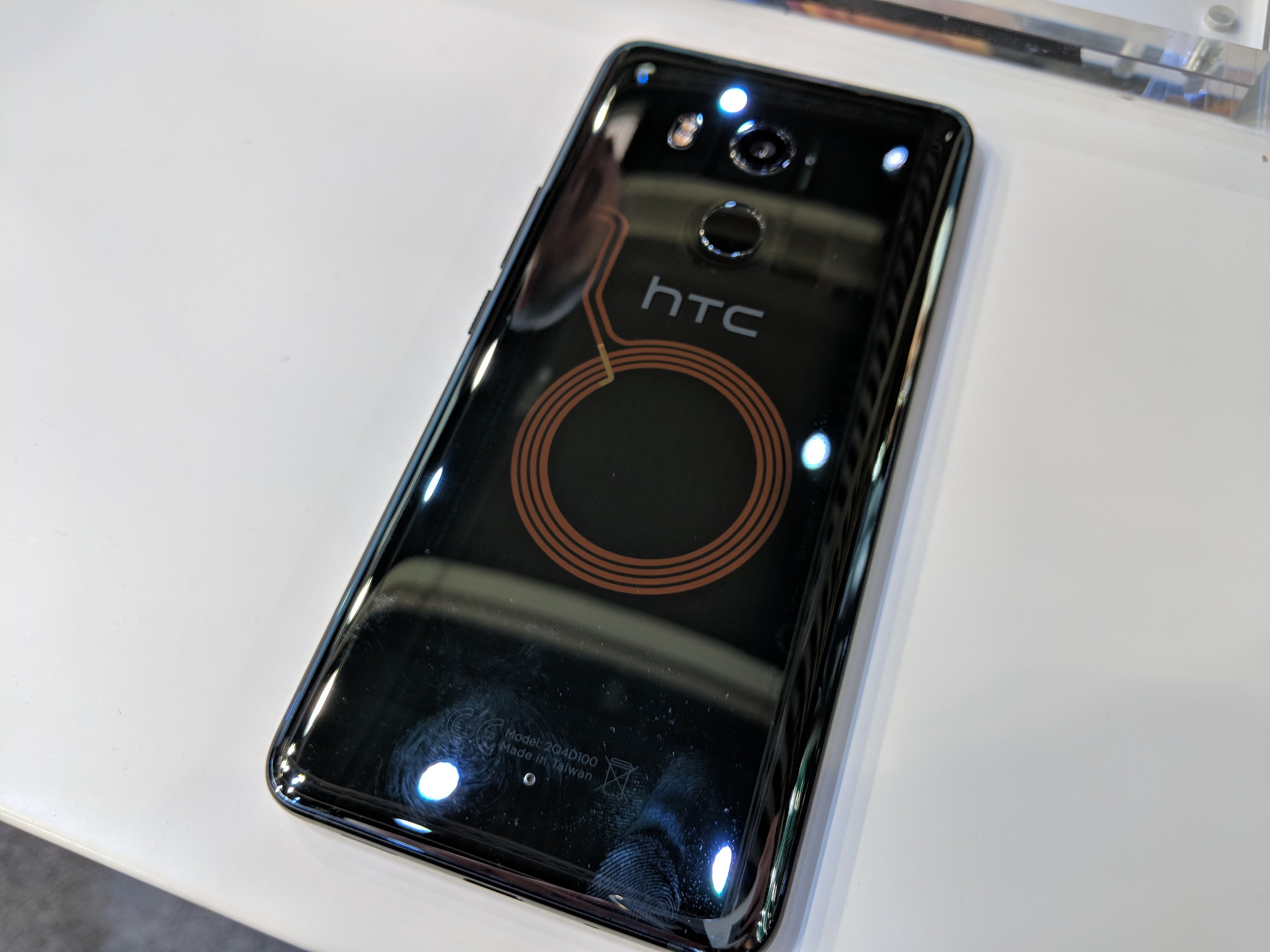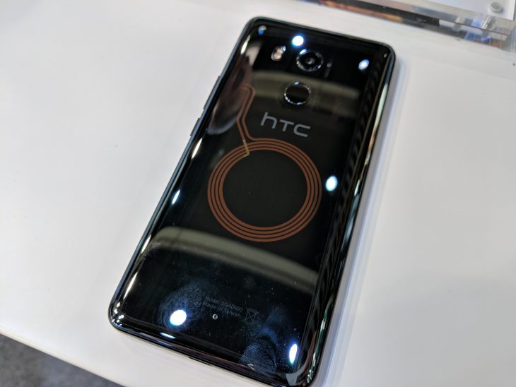
HTC last year announced the updated HTC U11+ in November, it was launched in three colours – Black, Silver and, for the real fans, a Translucent Black. The U11+ was unfortunately never coming to Australia in any of the colours but at Mobile World Congress it’s here and they brought the Translucent Black with them – and it’s gorgeous.
As a refresher, the U11+ is a big phone with 6″ 2880×1440 resolution display with support for HDR10 – in other words, it’s big, and beautiful in theory and in the flesh it lives up to the hype. Under the hood it’s powered by the 2017 high-end processor, the Snapdragon 835 processor and comes in two configurations: 4GB RAM/64GB storage or 6GB RAM/128GB. It’s a big phone and they packed a 3,930mAh battery inside which keeps it running all day
The camera is also top of the line with a 12MP UltraPixel 3 sensor behind an f/1.7 aperture that should allow for amazing low-light photography – unfortunately in a brightly lit trade-show booth there wasn’t much chance to try it out. HTC has included full-sensor phase detection autofocus on the U11+ and Acoustic Focus for recording focused audio in videos. The U11+ has an 8MP camera on the front which has an 85-degree field of view.
So for all that, basically the HTC U11+ has got it where it counts in terms of hardware. But it also has it in looks. The Black and Silver look good, but it’s the Translucent Black that caught my eye, and judging by feedback on the announcement post when it went live – it caught a lot of your eyes as well.
Up close the Translucent Black is unassuming, it’s not ‘in your face’ transparent, instead it’s a more laid back translucent design that encourages you to look a little closer. The most obvious feature is the NFC antenna – yes, it’s an NFC antenna, not a wireless charging coil. There’s a slight trace of circuit board there, but there’s more to see up towards the lens of the camera where there’s more circuitry on display.
It’s possibly a little too understated, but I like that the HTC Designers didn’t just go all the way transparent instead leaving a little to the imagination. The design blends in with the Liquid Surface of the HTC U11, but it also leaves the possibility of going a little more translucent next time. I still don’t want an all the way clear model – but this is just enough to whet my appetite.
HTC won’t comment on rumours about any potential new flagship for 2018 (we did ask) – but hopefully there’s a Translucent Black option in that when it’s finally announced.

