OnePlus have a history of including all the best specs in their phones and 2018 looks to be no different according to rumours Android Central have uncovered today.
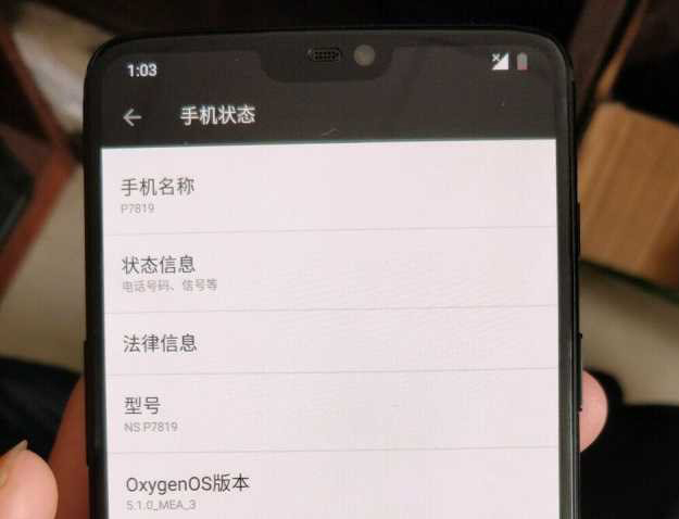
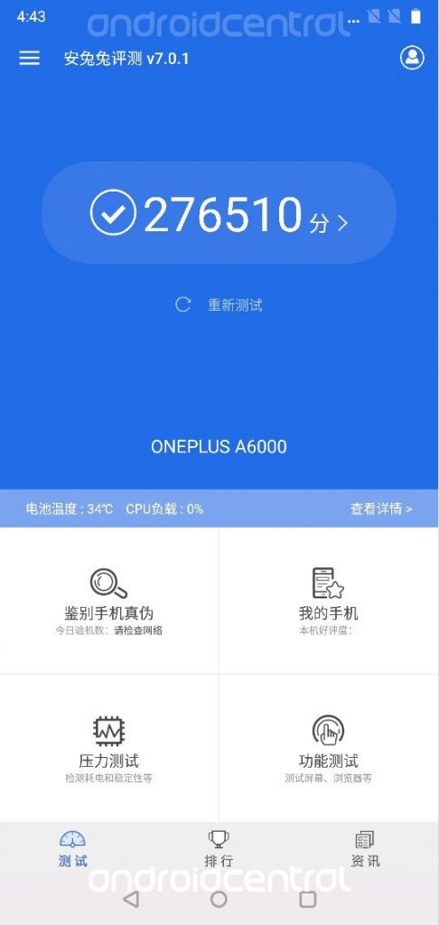
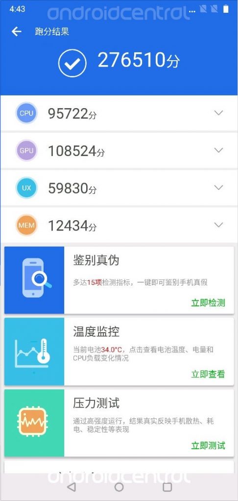
Images obtained from one of Android Central’s sources who is “close to OnePlus” reveal the AnTuTu benchmark scores from their upcoming flagship, the OnePlus 6. The benchmark scores are impressive to say the least with the device codenamed A6000 topping the recorded scores. This of course implies that it will be packing Qualcomm’s latest and greatest, the Snapdragon 845. This is no surprise of course given the fact that OnePlus have nearly always included the best Qualcomm chip available in their phones in the past.
According to Android Central, the screenshots also reveal that the mid portion of the status bar is taller than normal and is bereft of any icons or markings of any sort. Obviously this fits with the previous rumour that the OnePlus 6 will be sporting a notch. The aspect ratio of the screenshots is also 19:9 which is similar to all the other notched phones on the market — it’s 18:9 with a bit of extra real estate to accommodate the notch.
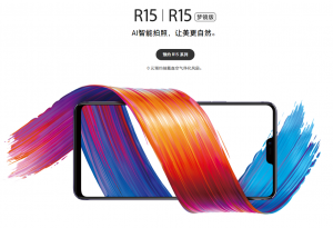
None of this is incredibly surprising of course given that OnePlus have followed their sister company’s design very closely in the last year with the OnePlus 5 and 5T being extremely similar to the OPPO R11 and R11s — the OPPO R15 most definitely does have a notch and full screen display.
It seems very early for all this to be leaking considering OnePlus usually release their phones towards the middle of the year. We did hear last year that they were aiming for a March release and with OPPO releasing their R15 very soon it would not surprise us if the OnePlus 6 arrived earlier in the year than the OnePlus 5 did last year.
As for the design, I am not against it — yet. In the end we may all love it but until we try the notch on an Android phone I feel it is difficult to give any accurate opinion. What about you?


I can see I will have difficulty buying my next phone. I wonder if the gmsarena phone finder will get the option to specify “no notch” and “yes bezel”. Also, get off my lawn :).
No one says he I’ll only buy a phone with a notch, I’d call that an anti-spec.
“18:9 with a bit of extra real estate to accommodate the notch”
Rather than think of the notch being placed in the screen, it makes more sense to think of the notification bar being moved out of the normal screen into the “dead space” either side of the camera and sensors. Effectively, we are getting more usable screen real estate with the notch than without.
I guess it would be less visually offensive if the notification bar went back to being black all the time.
Remember LG or was it HTC (or maybe one copied the other and there were two manufacturers with this silly implementation) with their 2nd display for notifications or ‘tickers’
This was generally considered offensive and had no notch.
The bigger problem is how it handles landscape content – videos and websites in landscape look like someone’s taken a bite out of their left side. IMO the notch will be a temporary design feature until someone engineers displays that can turn partially transparent or act as 1-way glass to give the camera and sensors underneath exposure.