At Google IO this year, Google gave us a sneak peak into the new design for Android Auto that they were hoping to introduce this year. It has been a long wait since Google IO but it seems that the new UI is now starting to roll out to a number of users.
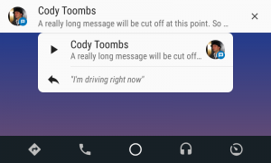
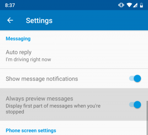
The new interface brings not just a “revised music player” but also “optional message previews”. The new message previews allows the user to decide whether or not they want to see message previews, or see message notifications at all. The preview is only a short snippet of the message but is enough for a quick overview, allowing for short conversations using Google Assistant to send messages back.
The new messaging previews seems to be striking a balance between rifling through your phone to check a message and getting no idea of the message at all. Hopefully it will be a solution that will allow users to get their message while also keeping their eyes on the road for safe driving.
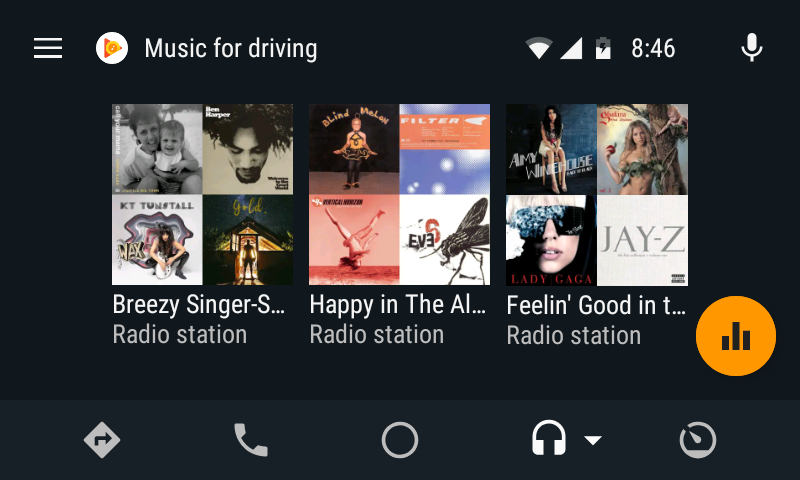
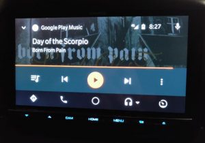
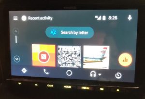
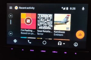
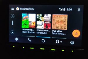
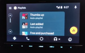
The redesigned music interface brings with it what we expected to see — album cover art thumbnails instead of a list of the albums/songs. Within most of the choices in the menu for the music player, the text list is replaced with album art, and there is an ever=-resent orange button on the right for navigating back to the player screen with a single press. Obviously this is designed to allow you to get your eyes back on the road a lot faster.
Android Police also performed an APK teardown on the app which shows possible future support for picture messaging but that seems to fly in the face of eyes on the road so it is doubtful.
While features seem to take a while to roll out to Google products after they talk about them at Google IO it is great when they finally do arrive. If you are impatient like me you can go and grab this Android Auto APK file thanks to Android Police and install it (I did). It works great, and you will see that the best auto UI has just gotten even better.




Auto mate is the best.