Chromebooks are an interesting platform; many users haven’t engaged with them yet and can’t see the pathway to full engagement. Personally I’ve used them since 2013 when I got my first Chromebook, the Acer C7. I’m fortunate enough to have the Acer Chromebook Spin 13 on the testbench. After having it setup and spending a couple of short sessions testing, I can honestly say they’ve come a very long way.
In the early stages, Chromebooks were low end hardware but that changed when the first generation of Pixelbook was launched. The shine I’m feeling towards this Chromebook Spin from Acer is very similar to that when I first laid eyes on a Pixelbook.
The Hardware
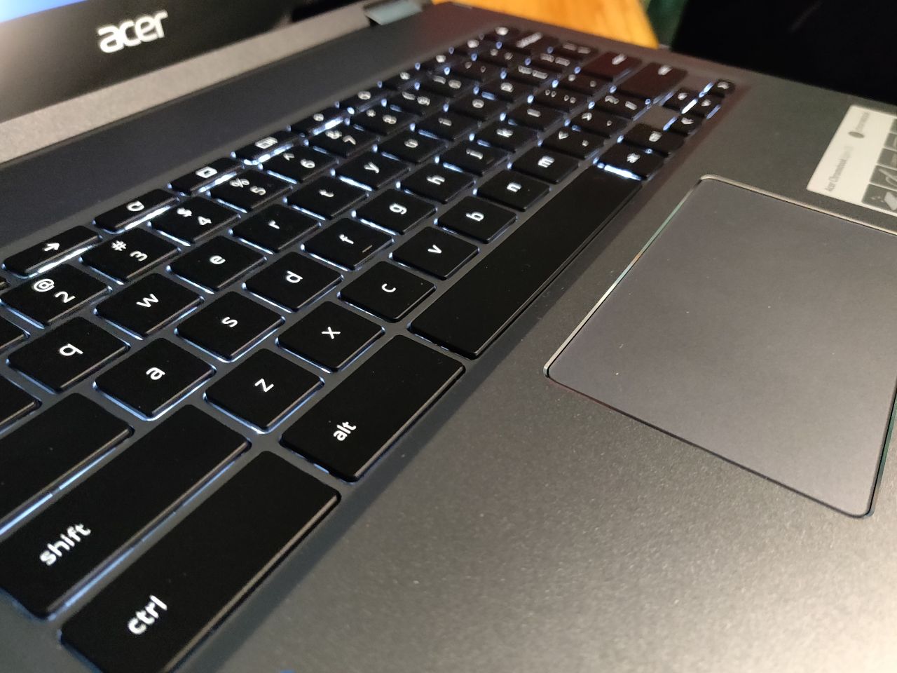
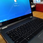
Without spoiling the review there’s a lot about the hardware that has me very keen to keep on using it. Starting with the input, I love the keyboard. It’s a great size and the touch response is very similar feel to my Macbook. The touchpad is very responsive, but has a slight “click” to it for single light touch which feels a little strange and somewhat out of place.
I’m a big fan of USB-C functionality and thankfully Acer have seen that this is the future. They’ve included USB-C for charging and output options, with two ports (one each side) and it makes the Chromebook Spin 13 relevant to current standards and somewhat future proof.
The look and feel
I really like the look of this Chromebook. Compared to some others I’ve used in the past, it’s pretty hefty but honestly given the advancements of Chrome OS and Chromebooks as a platform, I’m ok with that — they’re 98% of the way there to being a fully functional as a daily driver for a lot of users.
Given how well optimised ChromeOS is for Chromebooks these days, the performance is very good, provided you’re not trying to play top flight games that require DirectX support. It’s highly likely that this will not just meet your needs but also add to functions you’ve not got with a current laptop such as the touchscreen controls when in an A frame setup watching Netflix.
On the subject of the screen… Wow, this is lovely! It’s a 3:2 ratio touchscreen that runs at a more-than sufficient resolution to please the vast majority of users. At 2256 x 1504 it’s really easy to read and very easy on your eyes in high or low light situations with a huge amount of adjustability on the brightness.
The full review is in the works and we’ll have that on the site fairly soon, until then let us know in the comments what you’d like to know about the Chromebook Spin 13.



What’s the point of a Chromebook, over an Android tablet?
I’ve used my tablet significantly less since unpacking this. I’ve barely touched my MacBook. It’s very good hardware, Chrome OS has come a long way – honestly for people that can take their tin foil hats off, make some minor workflow adjustments and live in the cloud – it’s ready for daily use
Thanks Phil. 🙂 That’s what I couldn’t figure out from this article.
I’ll leave any detailed questions for the review itself.