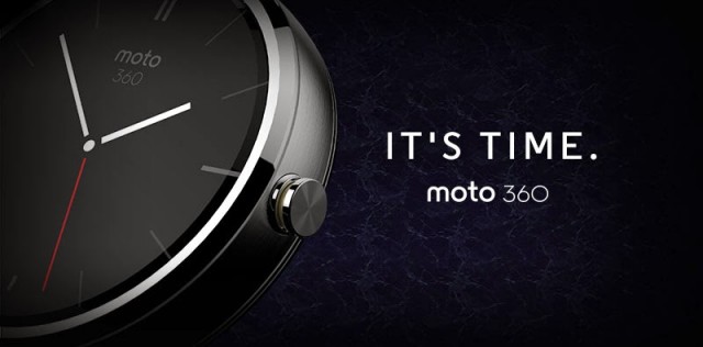
Say hello Moto – Hello Moto360 that is, with Motorola this morning announcing one of the first smartwatches that will support the Android Wear ‘wearables’ platform that Google has just announced.
It’s a bold new concept for smartwatches – it’s round. While other smartwatches have traditionally been square or rectangular, with the Android Wear SDK supporting round watch faces and notifications, Motorola decided to go round, in fact in the introduction video their designers talk about how it was the natural choice as it speaks to the classic design of the watch.
Moto 360: It’s Time
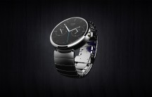
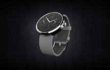
The Moto 360 will seemingly offer some personalisation options from watch bands to perhaps colour choices, with Motorola promising that the Moto 360 will arrive ‘in a variety of styles’ and from what we can see, these styles look good.
The Moto 360 will support all the Android Wear functions, from telling you the time, to keeping you up to date with notifications. Motorola is pushing the ease of use to get notifications with the Moto 360 advising ‘With just a twist of the wrist you can see who’s emailing or calling, what time your next meeting is or a friend’s latest social post’.
The Moto360 will be rolling globally in Summer 2014(read – this winter for us in the southern hemisphere) beginning in the US. For more information you can head over to the Motorola Moto360 micro-site and signup to a mailing list for updates. We’ll definitely be approaching Motorola Australia about the launch of the Moto 360 locally and will let you know when we have further information.


Finally a smartwatch to get excited about! Gorgeous round watch design with the brains of Google Now. That’s a tough combo to beat… Apart from battery life, I hope Moto have the screen down as well. Seeing as Qualcomm is a partner I wonder if Moto will go with their mirasol display tech for its visibility in direct sunlight and low power drain over the OLED used in the Moto X. If this lands down under before Christmas at a decent price then I’d be really tempted. The M360 probably wouldn’t have been possible had Moto not had the financial… Read more »
Moto 360 is gorgeous but I still want to know these 4 things for it to be worth it:
1.batter
life 2. phone compatibility (please not just Motorola phones.) 3. when
will it be released outside the USA 4. The price point
I’m very keen. I was hanging out on the smartwatch thing until someone did a non-rectangular design. Chances are if they were innovative to do that, they’ve done a pretty respectable job of everything else. If it has a heart rate monitor in it I’ll put money down. Even if it doesn’t I’ll still consider it. I think there’s a high chance the iWatch will be round or elliptical, or have some severe rounded edges. Great chance it will have more sensors than the Moto 360 too. But I fkn love the fact Motorola and Android announced their product first… Read more »
Me likely the round design. I’m not going to jump on the bandwagon and get the first generation of smart watches. Maybe when the second generation comes out?
Smartwatches have been around for years now – this isn’t a first generation anymore and hasn’t been for a while. Off the top of my head I can think of: Metawatch, Metawatch Strata, Pebble, Pebble Steel, Sony SmartWatch, SmartWatch 2, Samsung Gear, Samsung Gear 2, Kreyos, and I’m sure there’s numerous more.
Wow, that’s kinda awesome. Or maybe ‘beautiful’ would be a better word. Almost enough to make me hopeful that function will be as good as form with this one. I am worried though that, based on the video, the priorities may have been hardware design then hardware engineering with software a distant third. It is very pretty though.
Will be interesting to see how the SDK or API’s render for a square or circular watch face. I’d hate to think that apps need to be written separately for the displayed dimensions.
That looks freakin’ sexy!
It’s probably the least dorkish of the looks so far – but even so, I just don’t see the point.
Google Now rarely provides useful information if you are outside the US, and do I really want to be talking at my watch?
Frankly the calculator digital watches of yore had more point to them – and look what happened to those.
What’s next, Android shoes communicating via tap dance and electric shocks to your toes?
I’ve found Google Now quite useful in Australia while on holidays. Gathered all my travel bookings, accommodation arrangements, e.t.c. Suggested touristy places to visit.
It isn’t just about Google Now.
More Big Thick and Chunky. Nothing for women, again.
Seems that apart from Qualcomm, no smartwatch manufacturers attempt to think of how to design a smartwatch for women.
I suspect the issue is still preserving a level of battery life for a device that needs to get through an entire day. The round shape is truly gorgeous. Stunning. The next step will be slimming it down. With every generation, smart watches will get thinner and thinner from all manufacturers. That said, the Moto 360 doesn’t appear to be much thicker than a heavy, thick analogue watch of today.
This is very new technology. We can’t have the future now.
Whispy, you missed what I was getting at.
The Qualcomm smartwatch is just as big and thick as all the others, but the white version of it looks very feminine due to how it’s styled band flows into the watch casing, which makes the whole device look like a wide, white women’s bracelet.
All the other smartwatch designers miss that.
With the right band and casing design, the thickness of the device becomes hidden, and when the band blends properly with the casing, it no longer looks chunky and masculine.
All fair comment. Hopefully as traditional watch makers like Fossil, etc. come to market we’ll start to see an even greater variety of styles, shapes and form factors that please everyone.
All things considered though, Android wear looks like a super platform!