The Z Ultra was a success for Sony (according to my source at the Sony Centre Nunawading) and Sony once again have decided to release a phablet along with their flagship for 2014, the Xperia Z2. As far as phablets go the Samsung Note (1,2 and 3) is king. HTC and LG have both tried their hands at it with mixed success. Sony had relative success with the Z Ultra but have listened to the criticisms of their first foray and are hoping to make more of a hit with the second incursion into the phablet market. The Z2 may not have the specs of it’s older sibling but Sony are aiming for a more affordable phablet market with this offering.
Have Sony succeeded in creating a phablet that can slice into Samsung’s dominance of this section of the market?
- It’s big
- Camera sub-par
- 8GB built in memory
- Poor speaker
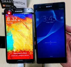
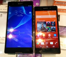
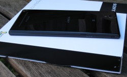
The T2 Ultra packs a midrange list of specifications including a Qualcomm MSM8928 Snapdragon 400 (1.4GHz), with a mid-lower range GPU, the Adreno 305 and only 1GB of RAM. All of these are a step down from the Z Ultra which had a Snapdragon 800, an Adreno 330 and 2GB of RAM. Considering these lower specs the phone still does not miss a beat. The body of the phone is 165.2 x 83.8 x 7.7mm and houses a 6.0in 720×1280 pixel IPS display, once again a step down from the Z Ultra. Sacrificing 0.4in off the display from the Z Ultra and shaving the bezels a bit more has resulted in a size that is 1.4cm smaller and nearly a centimetre off the width of the phone. Although the phone is smaller than the Z Ultra it still does not feel very comfortable in the hand. Whether it is the size or the blockiness of the shape it is difficult to easily wrap the hand around the phone.Hardware
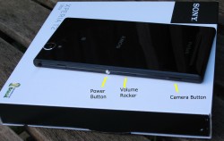
The buttons are all down the right hand side of the device with there being a nice silver power button, a small volume rocker and a dedicated camera button which can also be used to launch the camera as well as take the photo. The microsim card slot sits at the top of the right hand side, just below the headphone jack. It is an interesting place to put the headphone jack, the side. It makes it difficult to listen to music with headphones with the phone in a pocket. The buttons are all on the bottom half of the phone so they are easily reachable while holding the phone in one hand.
The left hand side of the device houses the sd card slot and the micro USB charging port. Sony are saying that the phone will only take a microSD card up to 32GB whereas the Z Ultra was able to handle 64GB. I did not have a card bigger than 32GB to test this.
The phone comes with only 8GB of inbuilt storage which is actually an issue if you would like to install large games. I was unable to have both NFS Most Wanted installed along with a playlist pinned to the device. Obviously the solution is to store your own music on the sd card but I listen to all my music thru Google Play Music streaming service so it was a major drawback for me. There are solutions for moving apps and data to the sd card but these are quite involved and Google is moving away from SD card use with their updates in the KitKat release. I think Google forgot to tell the manufacturers they were doing this because in this case 16GB is not good enough. If someone pays $500-900 for a phone they expect to be able to install whatever they want on it and not be limited to only 16GB (actually less depending on the system size).
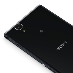
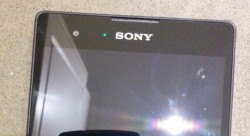
There is a 13MP rear facing camera with LED flash and a 1.1MP front facing camera for those video chats (or selfies as you may prefer). Its older sibling, the Z Ultra only had an 8MP rear camera without a flash but had a 2MP front facing camera. Along with the front-facing camera there is also a notification LED on the front top left of the phone. This LED is possibly the smallest I have ever seen on a phone. It was near impossible to see when not looking directly at the phone.
The T2 Ultra is splash proof unlike most other Sony devices these days which are generally water proof. For me the splash proof protection is enough as I don’t plan on using my phone under water nor dropping it into the toilet.
Build Quality
Sony have always made elegant looking devices which have a premium feel to them (and often a premium price to match). The T2 Ultra is no exception. The device, while huge, is amazingly well built. While it weighs only a couple of grams more than the Samsung Note 3 it feels a lot more premium in my opinion. Whether its the hard composite plastic on the back or the lack of a removable back cover I’m not sure, but the T2 Ultra just feels like a premium device.
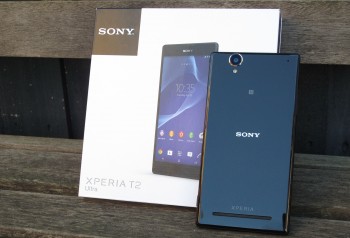
A couple of criticisms I do have though are related to the finish of the device and the shape. The finish of the device reminds me of the Nexus 4. It is a shiny, solid plastic material that is a magnet for fingerprints. After using the device for only a few minutes the entire back of the device is covered in fingerprints. With having to perform so much hand and finger gymnastics while using the device I found that my hands were touching the device and moving over it a lot more than usual resulting in a fair covering of the device with fingerprints.
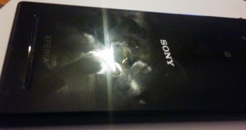
The plain slate shape of the device result in a very harsh device that sits squarely in the hand and there is a distinct lack of curvature that would allow the hand to wrap around the device easily.
fingerprint magnet
Screen
The display of the T2 Ultra is a 6.0″ IPS Triluminos display with a resolution of 720 x 1280. This is mid range when you consider the Z Ultra had a 6.4in 1080p display and the Note 3 has a 5.7in 1080p display. While the display is only 720p I had no issues at all with it. It was still an absolute pleasure to use the display. My eyes were unable to notice much of a difference between that and the display on my Nexus 5. The whites on the T2 Ultra were much warmer than that on the Nexus 5 (although I must admit that I have tweaked the display on it a bit) but the colours when watching a video really popped on the T2 Ultra. The colours were extremely vivid without being over-saturated and movie watching was an absolute delight.
Although the T2 Ultra uses the Mobile BRAVIA engine 2 instead of the newer X-reality engine seen in the Z2 and the Z Ultra the screan is perfect for visual media consumption. An evolution of Mobile BRAVIA Engine the second iteration delivers “an ever better viewing experience by adding a new real-time contrast optimisation and improving sharpness enhancement on top of high quality colour management and noise reduction” and I have to agree with them. Well, whether it’s the type of display or the software, or a combination of both the result speaks for itself.
The T2 Ultra also includes a glove mode which when turned on allows for use of the screen with a gloved hand. Not sure how useful this is in Australia where our temperatures rarely get to freezing but I am sure there are some people out there who wear gloves who it might be handy for.
Battery life
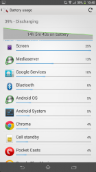
Coming from using a Nexus 5 my threshold for battery life is fairly low. This device was nothing short of amazing. With a big device comes a big battery. This 3000mAh only has to push a quad core Snapdragon 400 and a 720p display and thus the battery life was well over 12hours. I was able to unplug it at 8am, use it for nearly two hours of streaming music via Google Play (not cached to the device) over bluetooth, a lot of surfing and Google+ interaction, testing the screen using YouTube, listening to podcasts in the car via bluetooth for another couple of hours and yet after 14hours I still had 39% left on the battery! This was with auto brightness turned on for the display, LTE on, wifi on for a third of the day when at home. To say I am impressed with the battery on the T2 Ultra is an understatement.
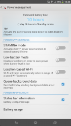
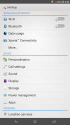
Sony have also included a power management option in the settings with some preset profiles to choose based on what you are trying to achieve. A nice addition although I didn’t use them at all. I expect they would be perfect for non-power users who know less about the use of the device.
If you worry about running short on battery after watching movies and listening to music to and from work (or uni etc) then this device will put your mind at ease. Not once did I leave the house with a concern that the battery would not last out the day.
Camera
The rear camera on the T2 Ultra is a 13MP with an LED flash while the front facing carea is only 1.1MP. The camera on Sony devices should always be good considering Sony make some of the best camera hardware out there. The camera on the T2 Ultra goes in the face of that. It is a sub par camera, producing images of less detail and poorer colour reproduction than my Nexus 5. For inside, low light and night time shots the difference was even greater. The T2 Ultra struggled to focus and when it thought it did the picture was often out of focus and the colours terrible. The flash always seemed to go off too early as well, resulting in a poorly lit image. My Nexus 5 on the other hand, although infamous because of it’s camera, produced much better photos much faster. It focussed faster and more accurately and had better colour reproduction than the T2 Ultra did. Needless to say I think Sony don’t expect you to be using this device much for taking photos. It’s older sibling, the Z Ultra did not even include a flash.
I would say the daytime photos are barely a pass but the night or low light photos were a major fail.
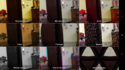
Sony has added a few of their own effects to the camera app but very few of them seemed actually worthwhile. There was a superior auto which I am assuming most people would use, manual mode, a Social Live mode which allows you to share videos live onto social media (sounds dangerous to me), timeshift burst which allows you to choose the best image out of a few images taken before and after yours (handy for shots of your kids), and AR effect which adds characters into scenes (useless and difficult to use imo), a picture effect which allows you to see in real time artistic effects you can take the photo in, panorama mode, portrait retouch (great for those selfies) and a background defocus mode that every other manufacturer seems be jumping onto (didn’t work for me- the Google implementation is much nicer and works much better).
I feel that Sony spent too much time on the fluff and not enough time on the guts of the camera. Make the photos look decent to start with and then work on the extra effects after that. If you have a decent photo to start with then most of the other stuff can be done with post-processing.
Sound
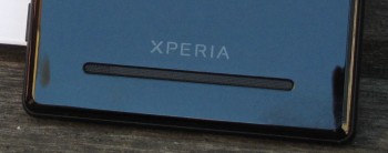
I was thoroughly confused here at first. There seems to be two speaker grills on the front much like boom sound on the HTC but the top speaker was just the earpiece and the bottom speaker grill was actually just a grill covering the main microphone. I consider that false advertising. I spent a lot of time trying to get music/media to come out of the front speakers only to find out that they all is not what it seems.
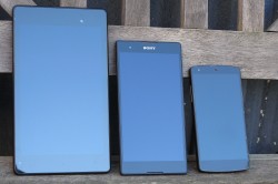
There is a decent sized speaker on the back. While it is a decent size and the sound of it wasn’t bad for a handheld device it did lack the punch of a Nexus 7 tablet (similar size). In saying that, how often do you really listen to music or watch movies using the speakers on your phone. If you want good quality sound then plug some headphones in.
Sony, unlike most manufacturers these days, included headphones in the box. These are just standard headphones, nothing special. They are still a good idea to include them in my opinion. Some people may not actually own headphones and this device is meant to me a media consumers device so headphones are a necessity. If my parents were to buy this device they would not have any headphones to plug in so while the quality of the headphones may not be top shelf the simple addition of them is a nice touch.
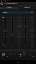
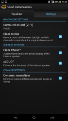
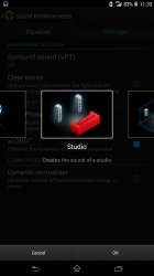
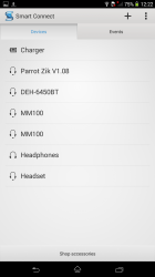
The bluetooth sound out of them was really good although not better than my Nexus 5 with audio mods it certainly wasn’t worse by any great stretch. I paired with both my Sennheiser MM100s at the gym and my Parrot Zik at home and pumped out some loud music. At full volume the sound did begin to distort but that was easily adjusted using the equaliser Sony have included in the software. The equaliser has presets but can also be set manually by the user.
Performance
The speed of the T2 Ultra, while not nexus-like, was still relatively snappy. There is no over-bearing manufacturer skin slowing down the phone or hogging the ram. Considering the processor is “only” a Snapdragon 400, with 1GB of RAM the phone did not have any significant slowdowns or laggy moments. The apps took longer than a Nexus 5 to open but still opened without any issues. The only app that took a while to open was the camera and I suspect that is due to connecting to the hardware of the camera rather than the processor itself.
Considering where it appears Sony have positioned this device (mid-range) the phablet gave a great response to all touches with very few, if any, miss-touches. While nothing spectacular the performance certainly did not have me pulling my hair out like some former owners of some high end devices. I managed to play NFS Most Wanted without any slowdowns or lag (except those caused by my slow reflexes).
Sony have made a concious choice I believe to price this device mid-range and thus have added mid range specs with respect to CPU, GPU and RAM. The addition of a mid-range display resolution (720p) and very minimal manufacturer skinning means that the device can still achieve a positive user experience (ie. smooth without any lag).
Software
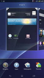
Sony have provided a very minimal skin over the top of a stock Google Android OS. It is more a theme rather than a skin in my opinion. Skins in the sense I think of them are where a manufacturer creates their own Android framework that the rest of the device relies upon. Sony have made it so that you can change certain highlights or the Android look/theme and have applied a light theme to the settings but the rest of the device is Android close to what Google makes it.
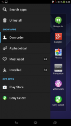
Sony have added their own launcher which has a few options but still lacks a lot compared to custom launchers available on the market. While it has some good options such as a hamburger menu in the app drawer allowing you to change the order of the apps to your own order, alphabetical, most used or last installed I doubt anyone once they know about custom launchers will choose the Sony launcher over them. Manufacturers need to take note. The source for all these launcher mods is out there. Get it. Use it.
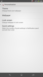
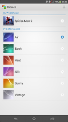
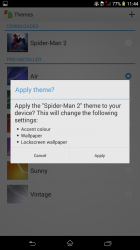
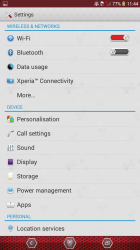
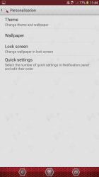
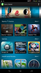
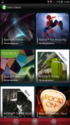
Sony have included a section for personalisation which allows you to change the theme. There is even a Spiderman theme to plug the latest movie I am assuming. The theme not only changes the wallpaper and the theme throughout the device it changes the navigation buttons and the boot animation. I did like this personalisation touch (yes I did choose Spiderman- there was no Hulk theme) and the extensive nature of it was impressive. Additional themes can be downloaded from the Sony Select app included on the device (which ends up just linking the device to the Play Store where the theme can be downloaded from).
Android OS
Disappointingly the device launches with Jelly Bean 4.3 but apparently a KitKat 4.4.2 update is planned for it soon. There is no word on when it will arrive and knowing Sony’s updating track record, it may be months down the track. To release a device with an OS version nearly 12 months old is not a good look. Although this is a mid range device Motorola have shown that mid-range is no excuse for out-dated, being able to introduce the latest versions of Android onto their devices at release.
Bundled Apps
Rather than including all of their products into a skin that relies on a proprietary framework Sony have elected to include each of their apps as a separate standalone app and I commend them for it. It allows the device to maintain its fast, responsive nature that we have come to expect from minimally skinned Android devices. The sheer number of apps they have included though is extremely extensive and include:
|
|
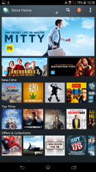
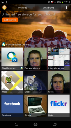
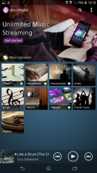
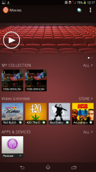
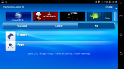
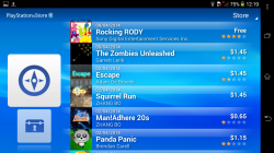
You will notice from above that although Sony include the usual Google Play apps such as the Play Store, Google Play Movies, Books, Music and Newsstand, Sony offer an alternative for every single on of those. They offer an alternative to the Play Store for their games with the Playstation although the quality of games within Playstation Store was severely lacking. I was expecting top name Playstation games but was sorely disappointed. Rocking RODY is not in my list of top end games. Sony offer a subscription service for their Walkman music which is obviously in direct competition with Play Music and although their movies app is called Video Unlimited there is no such subscription service for it. False advertising I say. Just as for Play Movies you have to pay for every single movie as you watch it. Prices are the same as for Play Movies as well too. The sooner someone comes up with a decently priced streaming movie service the better (but that is a story for another day).
Sony have done a good job with the themes and design of each of their own apps and I understand why they try and get people to buy into their own store I just feel that it is not needed. It seems superfluous when everyone has a Google Play account already. For those who have a Sony Playstation account already it may be easy to use and handy but for a majority of people it is a waste of time and space.
Sony Xperia T2 Ultra
- 6inch 1280×720 IPS Display
- Qualcomm MSM8928 Snapdragon 400
- Adreno 305 GPU
- 1GB RAM
- 8GB ROM expandable up to 32GB with microSD
- 13MP Rear Camera with LED Flash
- 1.1MP front-facing Camera
- Wi-Fi 802.11 a/b/g/n, dual-band
- Bluetooth v4.0
- NFC
- HSDPA up to 42 Mbps,LTE Cat4 (D5303 version)
- Dual SIM (D5322 version)
- Mobile BRAVIA engine 2
- Android v4.3 (Jelly Bean)
- 3000mAh Li-ion Battery
- 165.2 x 83.8 x 7.7 mm, 171.7gm
- Available in Black, White and Purple
The build of the Sony Xperia T2 Ultra is solid with a large screen and thus an even larger footprint on the world. The learning curve for using such a large phone is slow but once used to it I liked the large phone. I am now convinced that larger phones around the 5in size are not too large for everyday use. Some prefer the smaller devices but the larger phones definitely have aplace and are preferred by many people. I haven’t met too many people who have purchased a phablet, used it extensively for more than a week and been disappointed with the size of the device.
The phone is designed for those who love to watch movies/YouTube etc and listen to music and are on a tight budget. It is priced mid range and houses mid range specs and, except for the sub-par rear camera, it still performs all required functions admirably. The screen is impressively vibrant and made watching movies a delight (The Lorax on YouTube is my standard test). Surfing the net, using Google+, Play Music and all other apps worked well without any lag.
If you are after a large phone to keep you entertained on those long train/bus rides for a mid range price then I recommend the Sony Xperia T2 Ultra as a phone you should at least consider. You will only get mid range specs but this is not translated into the user experience when using the device. The user experience was definitely a pleasant one.
There are two models of the Sony Xperia T2 Ultra available : Dual SIM and Single SIM. The Dual SIM is GSM only, while the Single SIM is LTE compatible. We reviewed the Single SIM edition although the rest of the hardware between the two is identical. The LTE version (D5303) is available from both MobiCity and from The Good Guys. The Dual SIM version (D5322) is available from Sony stores, MobiCity and Allphones.









Very very ppor camera of sony t2 ultra 13mp and front facing camera is too grainy, when compared to other phones with below 10000 rs. And also i am facing prolem with chrome browser accessing camera after taking a photo that browser showing unable to complete previos operation due to low memory. I cleaned my ram and internal storage and clear cache of chrome all cache cleared then also facing the same issue. Not only me i tested in some other t2 ulta phone these also having same issue. It is sony’s software error. I tested in xperia c it… Read more »
“Obviously the solution is to store your own music on the sd card but I listen to all my music thru Google Play Music streaming service so it was a major drawback for me.”
I agree that 8gb is too little but you know Google Play Music can save music to the SD card too right? it’s just a toggle in the settngs.
Hey are you able to post a screen shot of screen-on time w/ apps usage percentage? Interested as I don’t often use my device for streaming or playing content with the screen off. I know the lack of 1080p would irk me but sometimes its a well enough trade off for real world usage. Thanks ^ ^
I’ll check it- i think for the one above in the post it was about 4.5 hours screen time. I know i had one day of over 5hrs screen on time. Amazing difference compared with my nexus 5. :-
Missing from the cons: It’s got a 6in screen that is below FHD resolution.
Actually I found the LG G Flex to be similar – 720P screen on 6″ but still very nice to use. Also as people like to keep reminding me – as if I didn’t know – less pixels to push equals better battery.
And the Flex was put out as a mid to high end device.
When I made my post, yesterday, I’d forgotten that.
Thanks Dan.
🙂
It’s a mid-tier device. And priced as one. Well, overseas I can find it quite a bit cheaper…
Your Aldi tablet is top notch too…lolz