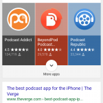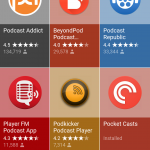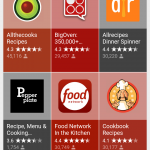
Google appears to have tweaked the way they’re displaying results for app categories in mobile search, displaying results in a really beautiful new way.
The search results for queries on app categories such as ‘Cooking Apps’ or ‘Podcast Apps’ is showing up this beautifully laid out grid. The results vary on different searches, with the results for cooking apps showing adds before the new display, while podcast apps was right up the top. Initial results show a 1×3 grid, with an option to expand to more.
Statistics displayed on each entry include the star rating, as well as an indication of how many people have reviewed the app on Google Play. Tapping an entry takes you straight into the entry on Google Play.
It’s a very nice way to display the results, check it out now in your own Google Search and see what you think.


Mine doesn’t do that. Just displays the same old way it always has.