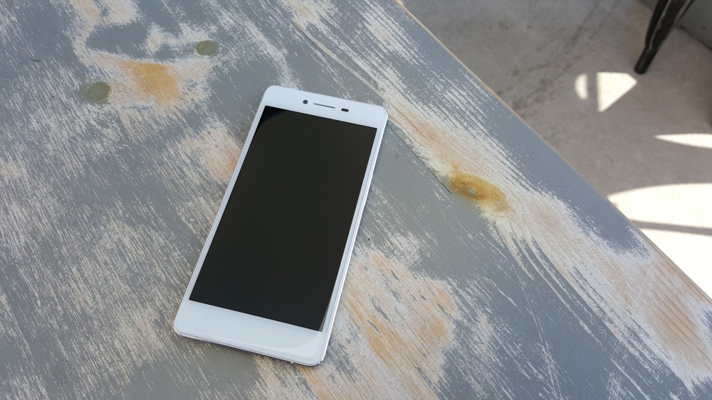
Oppo has made some pretty significant inroads into the Australian market in the last 18 months. Where the company’s phones used to be import-only, they’re now sold direct-to-public online and at retailers like Allphones and Dick Smith Electronics (where they’ve also launched “experience zone” demo benches). Oppo’s pushing their brand hard, and as their profile rises they need the right products in market to match.
The R7 is the second generation of Oppo’s super-thin R series. That series started with the R5 late last year, a phone that was perhaps too thin for its own good, making too many compromises like removing the headphone jack and the camera bump protruding from the otherwise sleek body. In the R7, Oppo’s corrected one of those omissions by making the phone ever so slightly thicker, but it’s still sporting an amazingly thin profile with a sexy metal construction.
In the box, besides the R7, you’ll get a VOOC rapid charger (wall adapter) and matching USB cable, SIM ejector pin, headphones and a clear plastic bumper case. The last thing there is especially welcome, as it can be hard to find a case for some phones and the clear nature of it means it doesn’t detract from the phone’s good looks. Also notable is that the phone actually ships with a screen protector over the glass front – I mistook this for a shipping protector and removed it – whoops.
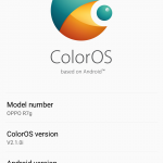
On the software side, Oppo’s delivered a phone running the absolute latest version of Android – for the moment, anyway – but running it under ColorOS. Oppo’s own flavour of Android seems more interested in being an iPhone than an Android phone to some, but all the phone functions are intact and ColorOS presents a clean, if unexciting, user interface.
The R7 is launching into the Australian market at $450, with support for all the standard 3G and 4G bands and 4G+/4GX services from the major carriers. It’s half the price of the current generation flagships from the big boys and acquits itself on the specs front
- Impressive specs for the price
- Great at multitasking
- Quality camera
- ColorOS needs an overhaul
- Limited onboard storage
Hardware
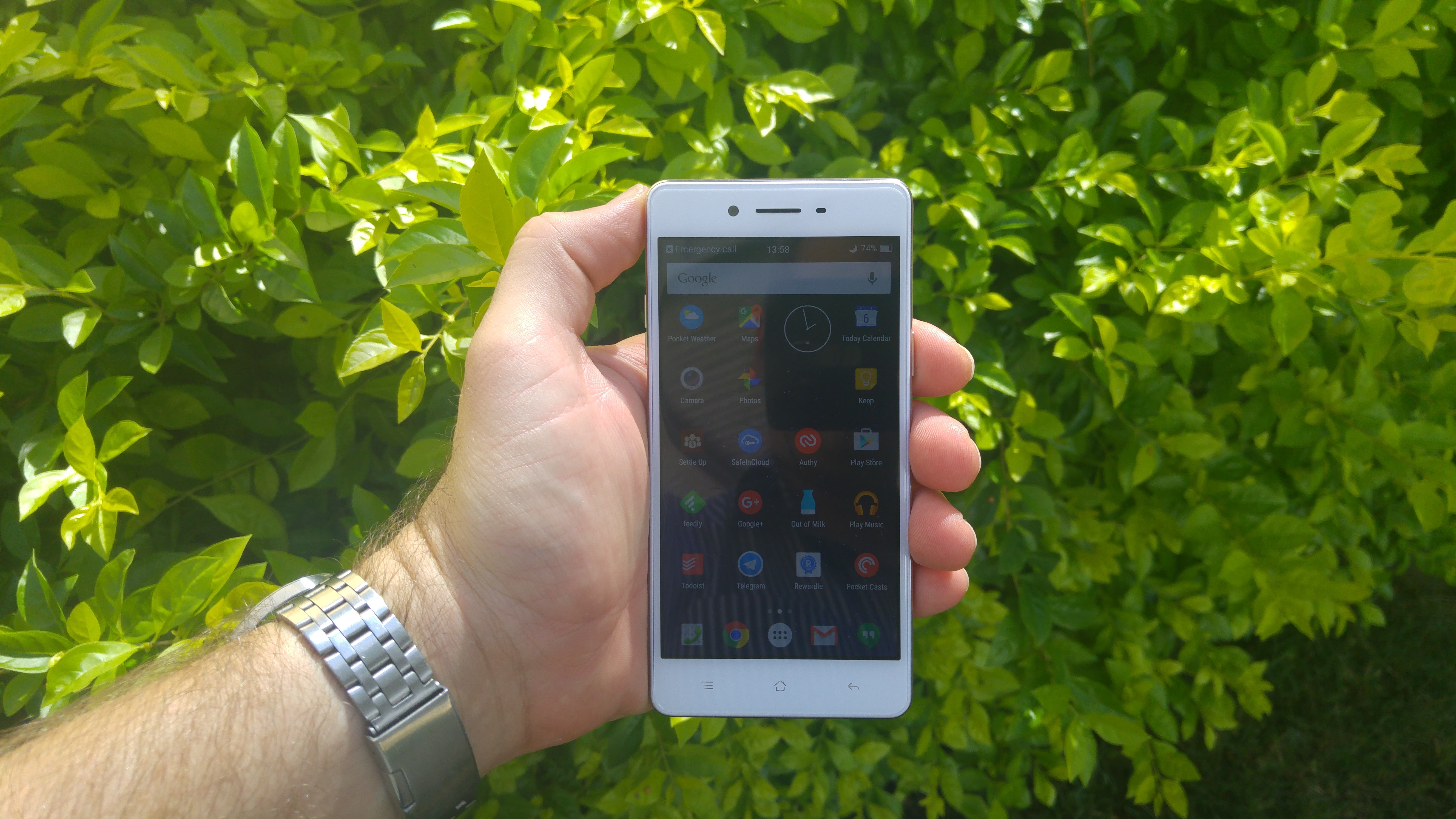
The R7 is quite comfortable in the hand. It’s got a 5.0-inch screen, so it’s a touch smaller than this year’s flagships but it’s not quite down to Sony’s Compact size either. 5 inches appears to be a sweet spot for phone sizes though, so the size is very welcome. It does make you wonder why there’s a “7” in the name though.
Like the R5 before it, the R7 at first glance bears a striking resemblance to a certain iDevice, especially given the white, brandless face framed by the metallic edge and the soft curved on the rounded metal back. On the back you’ll once again find a camera bump, though this time it’s far less pronounced than that of the R5. It’s balanced with a small bump in the plastic strip at the bottom of the phone ensuring it sits flat on a flat surface.
There’s a similar design aesthetic to the One M9 at play on the edges of the phone, where the metal ends on the edges it does so with a small bezel that leads to inset glass with a lovely rounded edge on the front. The end result is that the front of the phone presents a smaller surface to the user than the back, giving you the impression that the phone is smaller than it is.
The rounded edge on the glass front bears a revisit, too. We saw a few years ago with the Nexus 4 how much this can affect the perception of a phone. Here, the soft edge is present on all four edges of the phone’s face, and like the Nexus 4 it presents a surface you want to touch and run your fingers around. It’s pleasant to the touch, which pretty much sums up the phone phone. There’s a white notification LED that pulses slowly in a pleasant way at the top-left of the phone’s face too.
Along the phone’s edges you’ll find the returning 3.5mm headphone jack up top and Micro USB at the bottom, with the power button on the left and a volume rocker and SIM tray recess on the right. This is a bit flipped around to the standards set by others, and takes some getting used to.
Oppo’s stuck with capacitive buttons on the R7. That’s not a bad thing in and of itself, but the company has continued to eschew the recent apps button in favour of the old-style menu button, and that menu button is actually used in many of ColorOS’ built-in apps. The recent apps list is found behind a long-press on the menu button.
There’s no way to describe this other than “disappointing”. Swapping apps is one of the most common tasks on the phone, and Oppo’s hidden it away behind a long-press on a button that most apps don’t need. Further, when you activate multitasking you end up activating a menu or a navigation drawer within the app you’re switching away from, so your recent apps list quickly becomes full of navigation drawers and menus. This needs to change for future hardware.
Inside, Oppo’s put up a strong fight on specs. The Snapdragon 615 isn’t going to win any awards, but it’s also no slouch and connected to a 5.0-inch 1080p screen it doesn’t end up too taxed. There’s 3GB of RAM on offer though – usually reserved for phones with higher resolution screens – and that means the phone can multitask really well. Swapping back to applications that haven’t been in the foreground for a while often doesn’t require a relaunch and occasionally I’ve had games like Ingress come back into the foreground without a restart overnight.
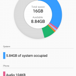
The phone’s got 2 SIM slots – one Micro and one Nano – and the Nano slot can carry a MicroSD expansion if the phone’s internal 16GB storage isn’t enough for you. This is becoming a common trick in Chinese phones, after we saw Huawei lead the pack with it in the Mate 7 last year. If you’re going to spend a long period of time with the R7 you’ll probably want to get your carrier to give you a Micro SIM. Honestly, I’d rather have a separate slot for a Micro SD card.
Screen
Oppo’s used some fantastic displays in their phones of late, and the R7 is no different. It’s an AMOLED display but without the oversaturation you get from some manufacturers and you can amp up the brightness to make the screen visible in daylight. Viewing angles are great, and the display doesn’t lose colour accuracy when you look at it on an angle.
There’s also extensive support for gesture control when the screen is off. You can double tap to wake it up (pretty much the most useful gesture) and launch the camera with an “O”. It can also be configured with M, W, up/down arrows and up/down/left/right strokes to do whatever you like (as long as that’s one of unlock the phone, call a contact or launch an app).
There are also screen on gestures like volume control, screenshots and again, launching the camera. They’re a bit more complicated (you have to pinch with multiple fingers to launch the camera, for exampe) and I tended to leave them disabled.
Battery
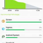
On an average use day, the R7 gets through most of a working day and evening without much trouble. If I was to play a couple of games travelling to/from work and browse a lot at lunchtime though, it would start to struggle. This isn’t an unfamiliar story for phones in this class, but Oppo’s got a secret weapon up its sleeve if you can accept the trade-off.
VOOC rapid charging gets your battery off the floor in next to no time. It takes the form of a custom power adapter and USB cable with extra pins to send the current across, but that combination of hardware works well. If you’re often deskbound in the office, you might want to grab an extra cable and adapter to keep at your desk, give the R7 a little boost in the afternoon and it’ll be ready to see you through the night.
If you don’t have a VOOC charger handy, the R7 still charges off a standard Micro USB connector, and can handle a 2.1A charge into its modest-sized battery quite nicely.
Connectivity
If there’s one place Oppo’s hit something out of the park on the R7 compared to its peers, it’s cellular connectivity. I’ve been struggling with a Galaxy S6 that has trouble reconnecting to the network after losing a weak 4G signal in some areas, and the R7 didn’t even lose its connection.
The phone supports all 3G and 4G bands for Australia – even Optus band 40 TD-LTE 4G Plus – and it supports Wi-Fi b/g/n along with Bluetooth 4.0.
What is missing though is NFC. If you want to get into mobile payments like Android Pay or any of the NFC-powered contactless systems that rely on your phone, you’ll have to look elsewhere (or just use your card). It also means you’ll have to connect Bluetooth headphones the standard way with discovery mode and pairing requests. It’s not the end of the world, but it’s an interesting omission.
I also had trouble using my LG G Watch R with the R7. There’s no problem with the actual connection, but Android Wear’s notification access (needed to allow the app to read your notifications and sync them to your watch) kept getting reset by the OS.
Finally, GPS – or rather, any location lock whether assisted or otherwise – wasn’t as good as you’d expect. While both GPS and GLONASS are supported, the R7 will sometimes struggle to set my location in Maps or in Ingress without any kind of pattern. Additionally, if the GPS signal is weak a notification appears asking if you’d like to turn off GPS. No, I really don’t want to do that – and there’s no option to disable this behaviour.
Camera
Oppo’s had a well-deserved reputation for camera quality in their phones, and the R7 doesn’t do anything to dissuade us of this notion. On the back of the phone is a 13MP sensor paired up with Schneider-Krusnauch lens and phase-detection autofocus, while the front camera is a pretty standard 5MP shooter. It’s not going to go toe-to-toe with the Galaxy S6 or the G4 with an f/2.2 aperture and lack of Optical Image Stablisation, but it does very well for the price tag.
The R7 will capture daytime & brightly-lit scenes well, with bright exposure and vibrant colours. It does especially well on skies too, and accurately captures the scene in terms of light and colour – you can see obvious differences in time-of-day and light/shade in the sample shots below – they’re unretouched and unprocessed from the phone, so you can see for yourself. There’s also a good depth of field so that elements are brought into focus well against the background.
Daylight shots are table stakes for phone cameras these days – low light is the new battleground. The R7 can struggle in the dark, but the review unit still managed some impressive low light scenes. If you take the time to set them up and know your subjects & framing, you’ll get impressive results. Moving subjects is a no-no, but still scenes (and sleeping cats) will come out rather nicely. It also means you need to be careful to hold the phone still to catch detail when the light goes down.
Like most of its peers, there’s a “beauty shot” mode that can produce some pretty scary results at its max setting on the front camera, but if you only set it to “weak” then maybe you can get away with it…
On the downside, I found a bit of shutter lag creeping into my photos with the R7, sometimes even up to a couple of seconds. It might be dependant on the environment (there seemed to be some focus-hunting going on too in low light) but it was noticeable enough to be annoying.
Sound
Compromises get made to bring in a phone at $450, and it seems that sound continues to be one of them. Oppo doesn’t seem to be ready to move to front-facing speakers and is still pumping out audio from a single speaker on the rear of the phone.
Given the bumps on the rear that keep the metal back slightly off whatever flat surface you’ve placed the phone on, the sound reverberates out nicely and isn’t muffled – a welcome benefit. Unfortunately though, if there’s a lot going on, the speaker can’t really cope with the sound it’s been asked to put out, and you’ll get a bit of distortion.
As it stands, you can hear the sound the phone makes. If you’re after better sound, plug in a headset or use some bluetooth speakers.
Performance
The R7’s Snapdragon 615 doesn’t appear stressed by anything I’ve thrown at it (including Ingress, Transformers Battle Tactics and a great deal of mobile photography and messaging apps), with only an occasional glitch instead of a slowdown in some games. Navigating around the phone’s home screens and menus and swapping between apps, it didn’t miss a beat. Boot time is also pretty good, at a little over 20 seconds.
Where it really shines is in its multitasking performance. The 3GB of RAM allows it to keep a lot more information in memory for longer when switching between aps.
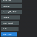
It also benchmarks pretty well for the price range, with Antutu and Geekbench setting the phone up as comparable to a HTC One and a little under a Galaxy S5:
Software
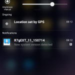
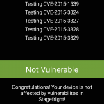
Oppo’s to be commended for getting the phone to market with the absolute latest Android version in 5.1.1 – and even managed a couple of software updates that handle Stagefright vulnerabilities.
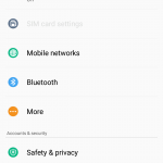
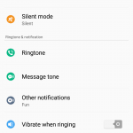
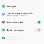
We’ve softened a lot on our “stock-or-bust” attitude towards Android customisations in the last few years, but it does feel like Oppo’s pushing its luck with Color OS. It’s not that the software is bad – far from it, in fact – it just seems to be more interested in being an iOS device than it is an Android one, and Oppo’s customisations haven’t moved with the times as much as some of its 2015 peers.
To a certain extent, this is understandable. Android’s had to work hard to claw back a reputation as a “beautiful” operating system, and so OEMs making their own software for their phones have tried to find ways to differentiate themselves. If “iOS-like” is a distinction that Android OEMs want to go for (I’m also looking at you, Xiaomi), then okay – that’s your draw card.
It’s not an anti-Apple bias at play, either… well maybe just a little. Google’s apps are some of the most-used apps on the platform, and when your OS design doesn’t gel with the design of the apps that you’re running, the result is quite jarring. ColorOS is grey and green, pretty static and restrained in its design while Google’s apps are bold and bright with Material design and animated transitions in and out of screens. As more and more apps move to a Material UI design this will only get worse.
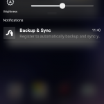
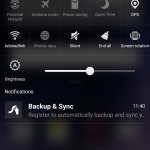
ColorOS seems to be a hybrid of Android’s Holo design (Holo Light, really) days and Apple’s iOS. You’ve still got the old Android lockscreen that allows you to place widgets on it, the camera UI is best described as “familiar”, and there’s even an opaque glass effect on the pull-down notification drawer.
Ultimately, ColorOS is pleasant enough, and easy to use but compared with Lollipop’s bright vibrant colours it’s a little colder. We’ve heard from other OEMs that Australians are quite used to “stock” Android and like to see that particular user interface on their phones. Oppo might be better served in future by coming into line with the design guidelines and specifications that govern the platform they’ve called home.
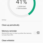
One other part that’s just plain weird is how apps get push notifications. On every other phone, apps get push notifications just fine and I can disable them if I want to. On the R7 you need to add the apps to a whitelist that allows them to run in the background to receive their notifications. That’s odd, because push notifications are supposed to allow you to receive notifications without the app actually running.
Launcher and Apps
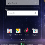
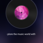
ColorOS’ launcher is another in the growing list of launchers that doesn’t have an app tray. App icons line up on the screens to the right of the home screen, and to the left there’s a full-page widget space that’s taken up with a music player by default. It’s serviceable and you can customise transitions between pages. There’s also a theme switcher that houses a “stock” Android theme, although it seems more based on Jelly Bean than Lollipop.
As you’d expect, ColorOS also has customised Clock, Weather, Email, Music, Video and Photos apps that look more at home with its colour palette and user interface design.
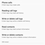
There’s also a Security Center app that offers memory cleanup operations, a data usage monitor that lets you allow or deny wi-fi or cellular Internet access on a per-app basis, contact blocking, granular app permission management, power saving options and a do-not-disturb system called “Quiet Time”. There are actually some serious power-user options hidden away in here.
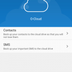
Out of the box, you also get Kingsoft Office, Oppo’s O Cloud service for backing up contacts and SMS messages, a sound recorder app and the usual suite of Google apps.
- 5.0 inch 1080p AMOLED w Gorilla Glass 3
- Qualcomm MSM8939 Snapdragon 615 (4 x 1.5 Ghz, 4 x 1.0 Ghz)
- 3GB RAM
- 16GB Storage, microSD up to 128GB
- 13MP rear camera, f/2.2, Schneider-Kreuznach lens, phase detection
- 8MP front camera, f/2.4
- Wi-fi b/g/n, Bluetooth 4.0
- GPS, GLONASS
- Cellular:
- GSM: 850/900/1800/1900 MHz
- WCDMA: 850/900/1900/2100 MHz
- 4G LTE: 1/3/5/7/8/28/TD-40
- Dual SIM (Micro, Nano)
- Android 5.1.1
- 2,320 mAh battery with VOOC rapid charging
- 143 x 71 x 6.3 mm, 146 grams
At $450, Oppo’s R7 is a little north of the third generation Moto G ($380), but for the extra money you get a 1080p screen, a better camera and – most importantly – 3GB of RAM with a Snapdragon 615 processor. You also get ColorOS. The R7’s OS might frustrate a power user who expects their Android device to look and feel a certain way. In many ways it’s a bit of a throwback to Android of years past, but it’s still running the latest version of Android.
Oppo is also getting updates to the OS out in a timely fashion, in a significant change to what we’ve seen in the past – the R7 was one of the first phones on the market to be patched against Stagefright vulnerabilities and it received 3 software updates during the review period. Can any other phones claim that track record?
I used the R7 for about a month, and didn’t feel a particular rush to make the move back to my normal phone. When I fired it up again to check some items to finish off this review, it felt friendly and familiar despite the points I’ve dinged it on above. The phone is a bit different to other things you’ve seen, and some of those differences are actually quite endearing.
You don’t need to fork out $1,000 for a great Android phone – Oppo’s managed to cram great design, a high quality screen, generous RAM and a quality camera it $450, making the R7 a hard act to beat.







seems like a solid mid range phone
I feel they could’ve done much better in the SoC department especially for the + version considering the~$150 price difference