Samsung is the big name in the Android market, so much so that many people will ask what Samsung people have versus what Android. The hard work was done in the early days, now they clearly dominate the field.
We’re starting our in-depth look at the Samsung Galaxy Note 20 Ultra 5G — a $1,999 phone — with the user interface, an area that can make or break a user experience with a phone.
Lots of users, myself included, have something of an affinity for stock Android. That’s for a multitude of reasons, but consistently the feedback is that it’s smoother, elegant and doesn’t have a detrimental effect on the performance of the phone. Gone are the days of the Samsung skin doing any of those annoying things, in fact — while it’s not stock — it’s not intrusive. One UI is easy to understand, easy to navigate and offers predictable behaviour that is user friendly.
You’re looking at Android 10 with One UI 2.5 which, essentially means you’re getting the latest software available.
Settings galore
The Galaxy Note range has long been touted as a “workhorse” device, which often means there’s more customisation. That, in turn, means more settings to tweak but I’m really pleased to say that they’re easy to navigate and find. Sometimes a couple of layers deep in the menus, but again easy enough to find.
If you unwittingly navigate to the wrong area, there is usually a helpful hint pointing on to the correct area. There are plenty of options and tweaks available, but a couple of highlights and omissions should be highlighted.
Sound sliders
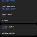
I’m actually really enjoying the Samsung sound sliders. I work in a pretty quiet office, so the ability to turn the notifications right down while still having the ringer up is very welcome. I’m also enamoured of the ability to control media volumes (particularly via Bluetooth) separately.
Display settings
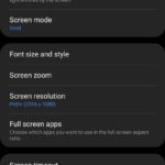
There’s actually quite a lot to digest here, so much so that we’ll be covering the screen (along with fingerprint sensor) in a more focussed post at a later date. But for now, in the context of the software controlling the screen, it’s worth a quick look.
Given the current state of Android, displays and user expectations – having Dark Mode as the initial presenting option in screen settings is smart. I’d like it to be a touch smarter in that once users make a selection, the option either descends to the bottom of the menu or into a sub-menu.
I like adaptive brightness on displays so it doesn’t burn my retina out in a dark room and is still visible in a brightly lit area. This was a bit of a disappointment to me because the adaptive brightness just wasn’t fast enough to respond. I could actually open the settings and manually adjust the brightness before the software responded on more than one occasion.
Beyond that, the screen settings are pretty easy to understand. The Samsung screen is once again capable of 120Hz refresh but only at FHD (1080P), if you’re running the screen at WQHD you’ll only get 60Hz which, day to day isn’t an issue, but you can see the difference if you’re looking for it.
I don’t like some of the Samsung inclusions
There’s a lot to like in the Samsung software, but some of their inclusions just don’t work for me. The keyboard, calendar, Bixby (mostly gone, but there are some remaining areas of inclusion) and contacts particularly. While they’re functional, it feels like they’re re-inventing the wheel when Gboard, Assistant and Google Contacts are, simply put, better. Particularly the keyboard I find frustratingly slow, inaccurate and the autocorrect is like having a child send a text message for you — you need to check it twice before sending.
As for Bixby — can we just accept that it wasn’t implemented well and never widely used? On first trigger of a smart assistant on this phone, I confirmed Google Assistant was my preferred option and haven’t looked back!
Samsung have some useful extras in One UI
Of the inclusions specific to Samsung there are a couple that are really good for making the phone exceptionally easy to use. For users who aren’t familiar with the edge panel and edge lighting, they’re simple additions that make apps and notifications far more accessible.
Nearly every manufacturer has their own take on themes these days, Samsung is no different to the others. There is plenty to choose from, but being an extremely subjective matter it’s not really worth going into too deeply here. Users know how they want their phone to “look”, the theme options offered by Samsung are pretty broad and worth exploring.
Edge Screen
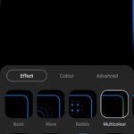
The Edge screen options are fantastic, I’m particularly fond of the edge lighting as it allows you to have a good visual, as well as vibrate and/or audible notification. If you’re in an office space or have people sleeping in your home then this is fantastic.
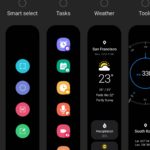
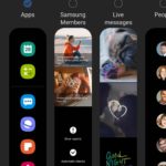
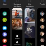
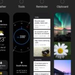
The other option here is the edge panel which can be set up with a few of your common use apps stored there, as well as recently used. Or you can choose from a variety of other options including regular contacts, tasks, smart select and weather.
Security and Biometrics
I’m the sort of person who sets up every possible way to unlock a phone. I don’t have anything to hide from my wife, but she can’t unlock my phone with her face or fingerprint. So I also set up a swipe pattern as a default. Unfortunately, I’ve found the in-screen fingerprint reader to be a bit slow and very hit and miss.
Fortunately, the screen touch response is excellent so swiping to unlock is very quick and easy. I’ve set up the facial recognition as well, that works pretty well providing you’re in decent light. But in the current world climate, facial recognition won’t work when your face is covered. Neither face unlock or fingerprint reader were particularly quick or consistent which is a bit disappointing. This hasn’t caused major impact aside from a couple of moments when I needed to unlock my device to tap-pay for something.
Motions and gestures
I’ve found gestures to be a bit divisive since their introduction. I know users who used them and now won’t go back, I know some who won’t touch them and I’m somewhat ambivalent. My experience is that they work very well on some phones, others not so much… So I’ve learned to switch between traditional navigation and gestures with little transition time.
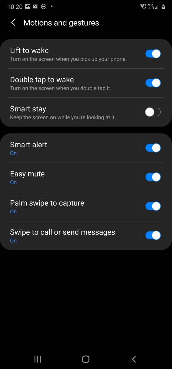
I love that Samsung includes all of the mainstream, recognised gestures that users are familiar with. Lift to wake, double-tap to wake, Smart stay (screen stays on while you’re looking at it) and a few others are all here.
I’d love to see gestures like OnePlus have for music controls while the screen is off. It’s a tiny additional feature – surely not hard to implement — but it adds a nice polish to an already impressive array of software features.
So where do we stand?
I said in my first impressions post over the weekend that the Note 20 Ultra wasn’t thrilling me yet. It still isn’t but it is very quickly growing on me. The software delivered is clean, tidy and most importantly on One UI 2.5, it is great user experience. Advanced users can tweak and play all they like, while less technically inclined users can accept that the phone will just work.
One UI isn’t my favourite skin on Android, but at times I’m even disappointed with some of the behaviours from “stock” Android devices. So in the current state of the Android world, the Note 20 Ultra honestly has one of the better implementations of a custom skin that doesn’t intrusively take over your phone and your life. Well worth a closer look if you’re in the market for a new device soon.

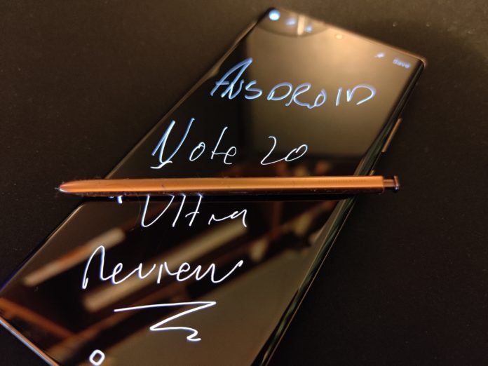





You should investigate the Samsung Apps deeper. For example, you can write on the Samsung calendar with the pen.
What Samsung should do is bring that write on apps, to the stock Google apps, instead of forcing the unwanted and unneeded Samsung clones of the Google apps, on users.
I actually find that some of the Samsung apps, especially the email and calendar apps are better than the Google apps.