Google Maps has to be one of Google’s tentpole products and today they made it just a little bit more gorgeous. The two new visual improvements focus on bringing more detail and granularity to Google Maps.
Thanks to the vast array of satellite imagery available, Google has developed what they are calling a new colour-mapping algorithm to convert the satellite images of how the world really looks and translate that to enhanced colour depictions of the natural environment on Google Maps.
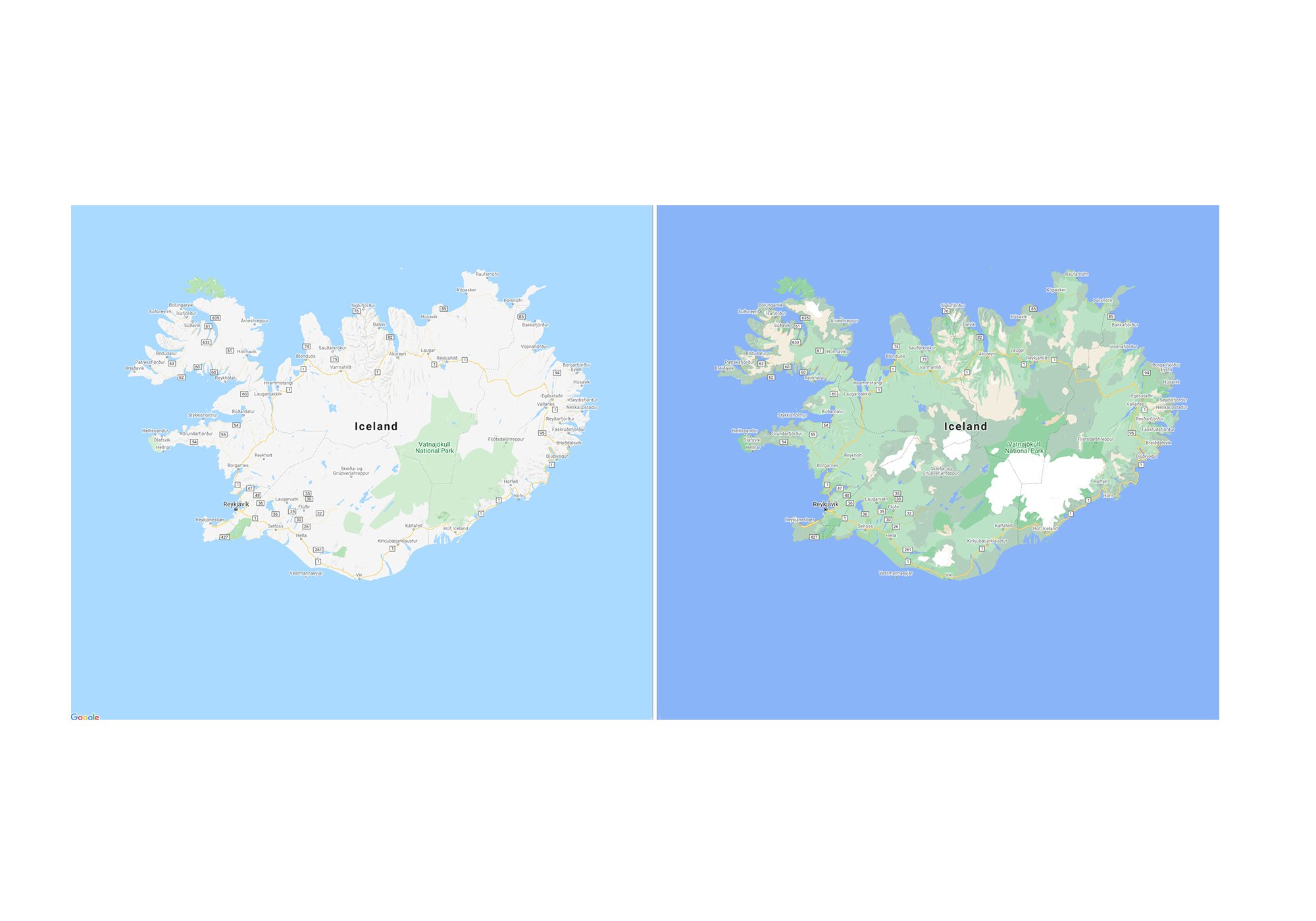
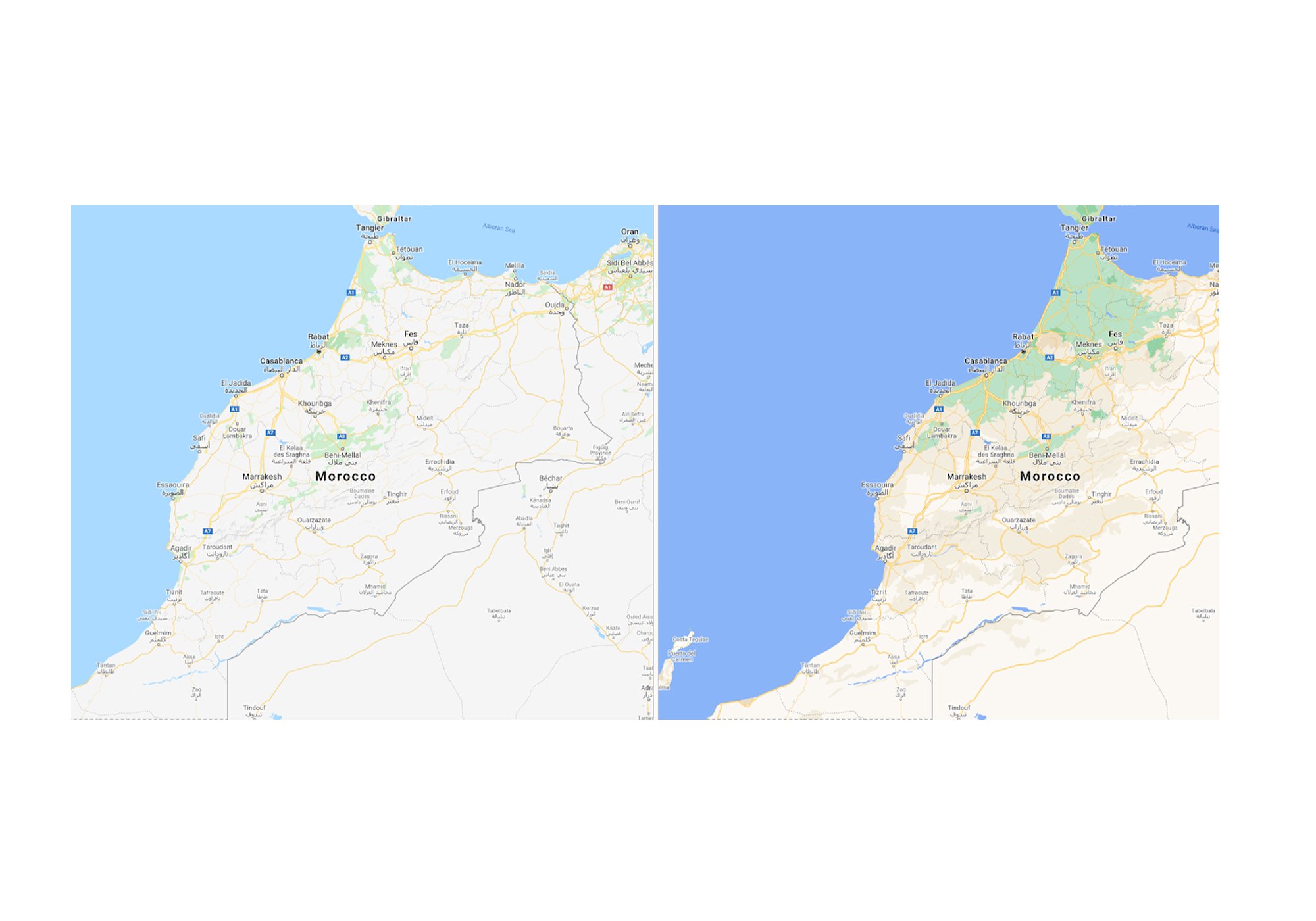
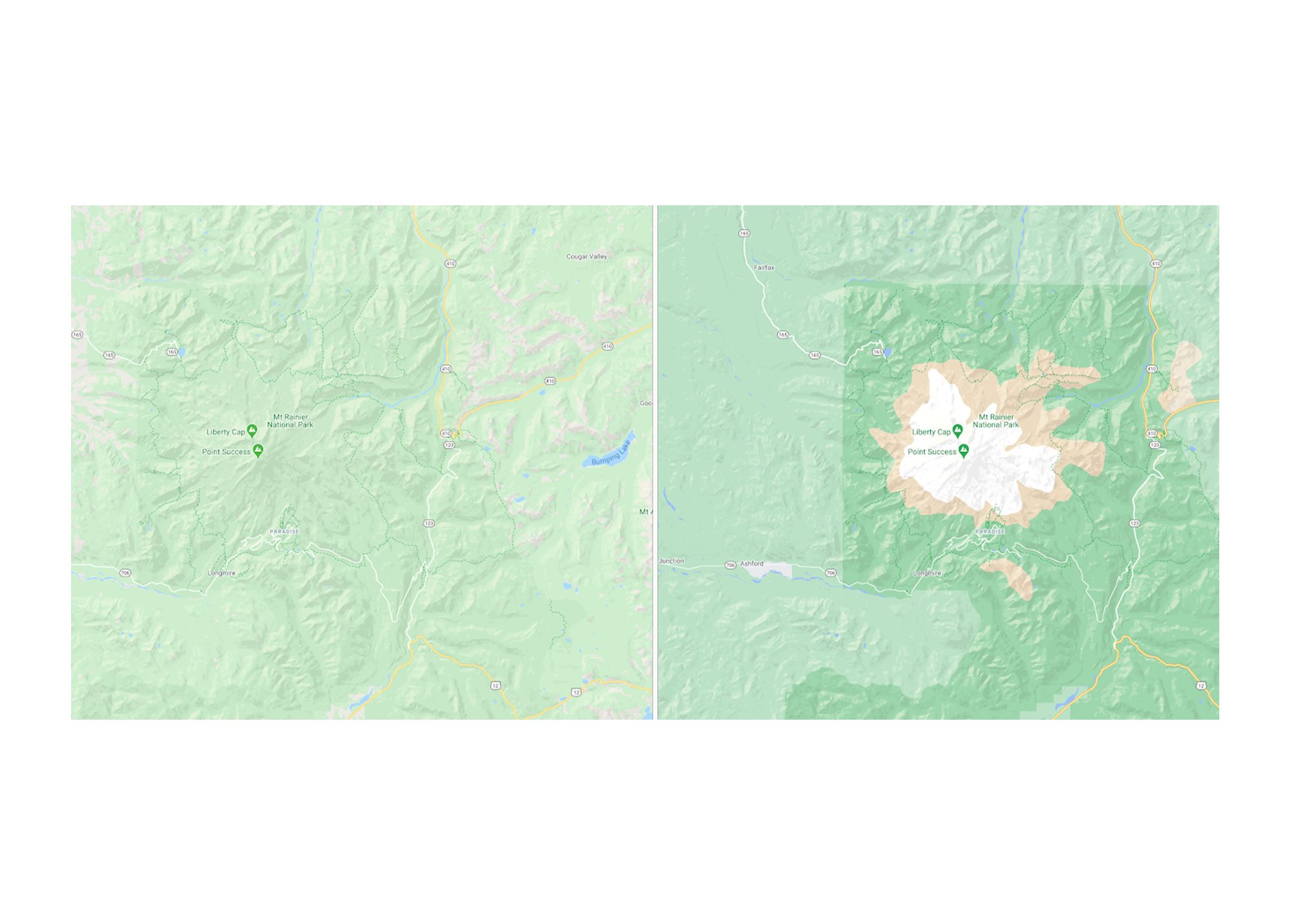
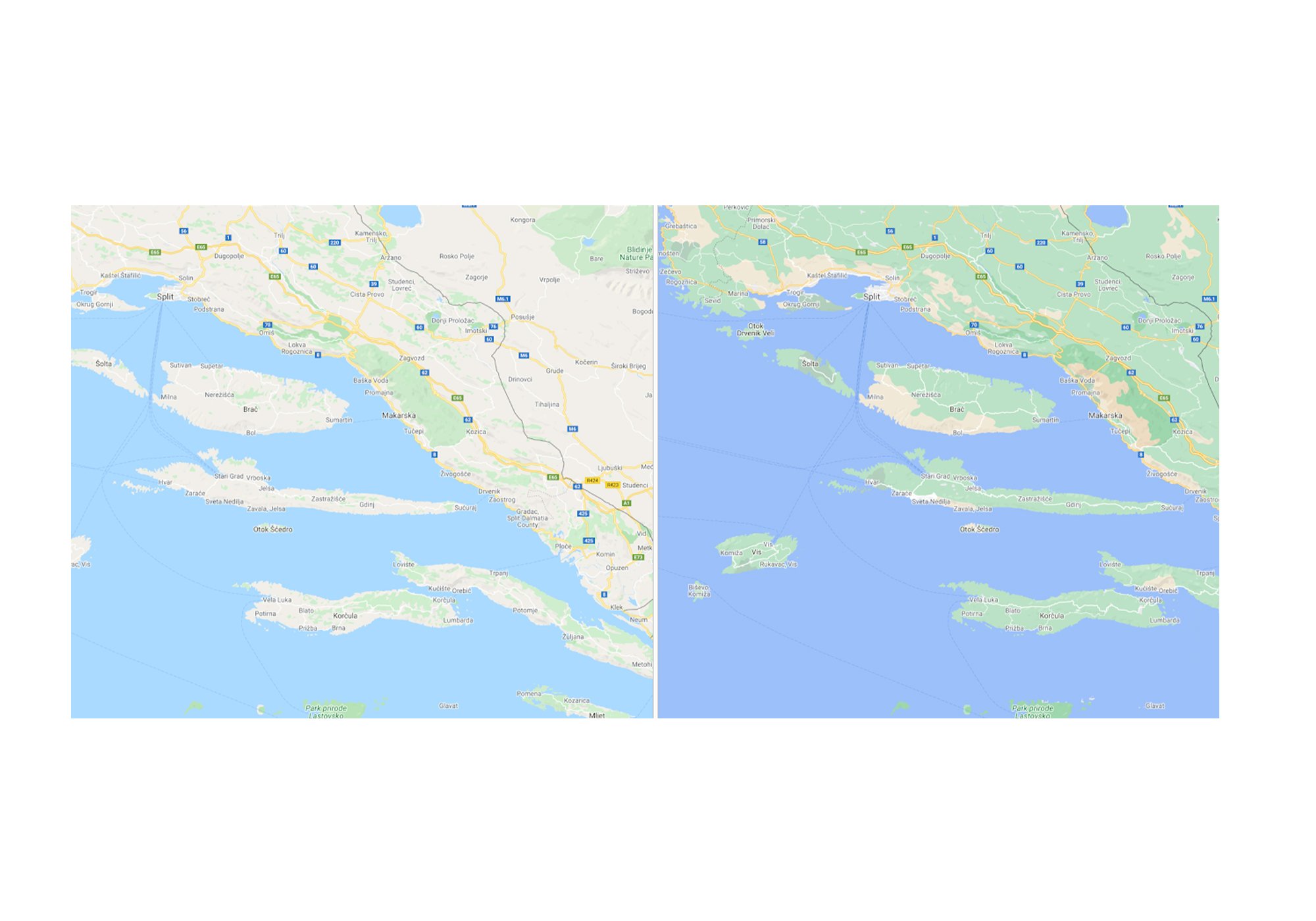

Exploring anywhere on Google maps you will be able to visualise its natural features and easily distinguish between different environments such as tan, arid beaches and deserts, blue lakes, rivers, oceans and ravines. You can know at a glance how lush and green a place is with vegetation, and even see if there are snow caps on the peaks of mountaintops.
Google will be rolling out the enhanced maps to the entire of Google Maps which covers over 100 mission square kilometres of land. The rollout starts this week so keep your eyes open for a more beautiful Google Maps experience.
The second update is an enhancement to the urban environment with Google including more details regarding pedestrian spaces such as sidewalks, crosswalks, and pedestrian islands. Unfortunately, this rollout is a little less widespread.
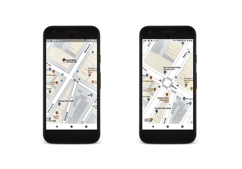
Google will be initially rolling out to London, New York, and San Francisco in the coming months, with plans to expand to more cities over time.
These are two more refinements to Google Maps that we think could make a genuine improvement to the overall usability of the platform.