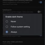
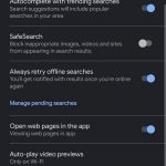
We’re not alone and we love some dark mode action at Ausdroid. We’ve seen a lot of apps already transition: Chrome, Keep and Contacts to name just a few, but now the Google App itself is seeing a bit of a UI overhaul.
The update (according to a post on XDA Developers) appears to be server side and rolling out steadily. It can be enabled to work with the system wide dark mode, or manually enabled as a permanent setting within the app. It is interesting to note some areas aren’t dark themed yet.
The widely recognised benefits of dark mode include the improved battery life and the darker background being easier on the eyes, but with the continued transition to dark mode for many apps – it’s becoming more apparent when you’re using a non-dark mode app with your eyes feeling like they’re being burned out.
One thing is for sure, the updates will continue as they need to be ready across the Google suite of apps for the final release of Android Q. So keep your eyes out for further dark mode offerings in the near future.


