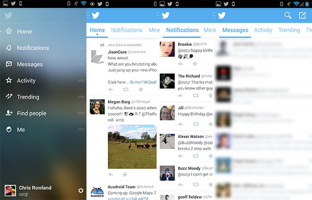
Twitter for Android is about to receive a major update to version 5.0, and it’s currently being tested in beta right now. Ausdroid has managed to take a sneak peek, and we’ll show you some of the new appearance below.
The main changes in this version are that it has Android-style tabs, in-line media previews, hamburger navigation, and a proper action bar.
The new interface allows you to scroll from side to side between tabs (like you could in the prior version, but it works a little better). The slide-out hamburger navigation panel allows you to quickly jump to other parts of the app, but it doesn’t quite feel finished yet — it’s a bit slow. Inline image previews are cool — we’ve had them for years in third party apps — but now finally the official app has them too.
The one thing still missing, in my humble opinion, is the ability to mute certain hashtags or keywords, a much loved feature in 3rd party apps that for some reason Twitter still hasn’t embraced in the first party app. Maybe one day.
If you’re keen to get your hands on a copy to play with, check out these links below:


This new Twitter UI is horse shit. They’ve made an ok app notably worse. There’s way too much going on at the top of the screen – so much so that you have to scroll to see all the options. I understand it’s a beta so things can change but this looks like a very sketchy direction to take. The only positive is the hamburger slide out menu.
And what’s happening with the dedicated tablet UI, Twitter?