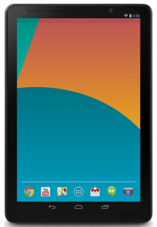
This render popped up on Phonearena yesterday, where it was reported that it was possibly a render of the upcoming Asus built Nexus 10. Except that it really isn’t, and there’s a number of reasons why we can safely say that it isn’t.
Android Version.
Any new Nexus device released in the next few days/weeks/months will come running Android 4.4(Kit Kat), so in line with this the time in this render is incorrect. Google releases renders with the time set to the corresponding version of the Android release it comes with : Nexus S – Android 2.3 – 2:30, Galaxy Nexus – Android 4.0 – 4:00, Nexus 4 – Android 4.2 – 4:20, Nexus 7(2013) – Android 4.3 – 4:30. Nexus 5 – Android 4.4 – 4:40
Notification Area
The leaks we have seen, including the render pulled from Google’s own server shows two things, first it confirms that the time should be 4:40 and secondly the notification icons should be grey/white in colour as it seems Google is saying goodbye to Holo Blue in the next Android release. The leaks have also shown that Android 4.4 should be using a transparent notification area, this render uses the Black bar, although there does appear to be a shaded area below that could be an attempt at transparent notification area :
That Wallpaper
The range of 2013 Nexus devices won’t come with the same wallpaper, the range last year showed similar theming however they actually were still distinctly different :

The Nexus 7(2013) came with an angular style wallpaper which if you squint actually looks like a ‘7’, similarly, the official Nexus 5 render has a wallpaper that looks like a 5. The wallpaper used on this supposed Nexus 10 render is the wallpaper used from the Nexus 5.
Tablet vs Phone orientation
When Google launched the Nexus 7 last year, it actually used a phone layout, indicating that it should be used in portrait as opposed to landscape when not being used to playback media. With DPI changes, modders have changed this and Google did eventually relent and allow landscape when in the launcher, but unless a major change has occured, the Nexus 10 should still be a landscape device.
Icons
Renders and leaks so far have shown a number of things – First the App launcher will no longer have a ring around it, this render shows a ring around the icon. Second – the divider between the Quick Launch icons has been replaced in Android 4.4 with a line of dots indicating which home screen you’re currently on. Third – Check out the missing chunk on the Google Maps Icon.
![]()
I want to know some information about the Nexus 10, I purchased last years model and I intend to purchase this years model, but this render, is NOT the Nexus 10. Move along. Nothing further to see here.


i really wish it comes in 4:3 ratio like ipad, its very gd for browsing. also if its 16:9 we look stupid to hold it in portrait mode (still better than surface 🙂
Nice analysis!!
This is why I come to Ausdroid, great work!
Good work Daniel. Good to see someone not copy and paste like every other site. 😀