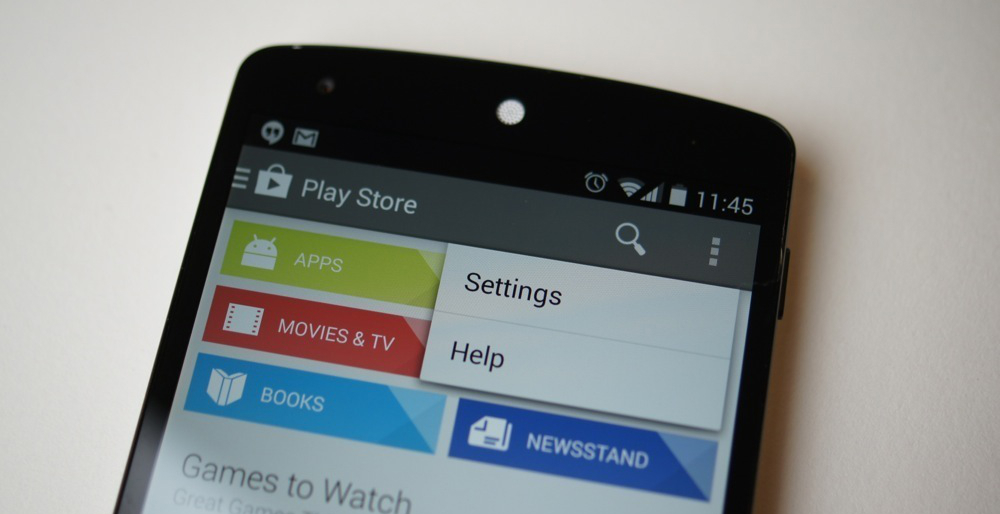
In a move to put the nail in the coffin of the hardware menu button, Google has changed the code in KitKat which regulates the display of the overflow button (the three vertical dots shown in the image above).
Whereas previously the overflow buttons would be hidden on devices that feature a hardware menu key, such as the Samsung Galaxy S4, Google has decided to give OEMs a kick in the right direction by enabling the action overflow button permanently, regardless of the presence of a hardware menu button.
This is bound to increase the consistency of user experience, particularly across devices — users will be able to expect an on-screen overflow button regardless of the device they’re using, and thus make the transition between different devices in their upgrade cycle just that little bit easier.


I steer clear of all Samsung devices only because of their button layout.
I’ve never really understood why the software keys haven’t just added the Overflow button to them in lieu of it being placed ever so inconsistently within various apps – assuming they even have it!
Well played El Googs. I really like what CM/GPE do with key mapping for the HTC One due to it’s lack of a multi task button. I must confess I’ve never run stock on my N7 due to the soft keys showing over video playback. Just swapped from PA to CM on it and as much as I loved Pie, the new extended desktop with immersive mode on the N7 is stellar
No hardware buttons on phones is no big deal but on tablets it is different.
Put a Samsung tablets next to an Ipad and the screen space saved by the hardware buttons makes perfect sense.
Google needs to perfect on screen buttons first so as not to make 10 inch tablet look like 9 inch ones.
Good. I hate hardware buttons so much – Samsung’s implementation in particular is ridiculous.
Samsung won’t care. They’ll put hardware buttons on their devices for as long as they’re making them. I personally think Samsung will stop making Android phones before getting rid of the hardware buttons. Just look at their tablets – at first they didn’t have hardware buttons, and now they do. So stupid.
Should’ve been like this since 4.0.
Good change imo.. I find myself a bit disoriented these days when using a device with a menu button…